Python | Plotting scatter charts in excel sheet using XlsxWriter module (original) (raw)
Last Updated : 25 Jan, 2023
Prerequisite: Create and Write on an excel file. XlsxWriter is a Python library using which one can perform multiple operations on excel files like creating, writing, arithmetic operations and plotting graphs. Let’s see how to plot different type of Scatter charts using realtime data. Charts are composed of at least one series of one or more data points. Series themselves are comprised of references to cell ranges. For plotting the charts on an excel sheet, firstly, create chart object of specific chart type( i.e Scatter etc.). After creating chart objects, insert data in it and lastly, add that chart object in the sheet object. Code #1 : Plot the simple Scatter Chart. For plotting the simple Scatter chart on an excel sheet, use add_chart() method with type ‘Scatter’ keyword argument of a workbook object.
Python3 `
import xlsxwriter module
import xlsxwriter
Workbook() takes one, non-optional, argument
which is the filename that we want to create.
workbook = xlsxwriter.Workbook('chart_scatter.xlsx')
The workbook object is then used to add new
worksheet via the add_worksheet() method.
worksheet = workbook.add_worksheet()
Create a new Format object to formats cells
in worksheets using add_format() method .
here we create bold format object .
bold = workbook.add_format({'bold': 1})
create a data list .
headings = ['Number', 'Batch 1', 'Batch 2']
data = [ [2, 3, 4, 5, 6, 7], [80, 80, 100, 60, 50, 100], [60, 50, 60, 20, 10, 20], ]
Write a row of data starting from 'A1'
with bold format .
worksheet.write_row('A1', headings, bold)
Write a column of data starting from
'A2', 'B2', 'C2' respectively .
worksheet.write_column('A2', data[0]) worksheet.write_column('B2', data[1]) worksheet.write_column('C2', data[2])
Create a chart object that can be added
to a worksheet using add_chart() method.
here we create a scatter chart object .
chart1 = workbook.add_chart({'type': 'scatter'})
Add a data series to a chart
using add_series method.
Configure the first series.
= Sheet1 !$A$1 is equivalent to ['Sheet1', 0, 0].
note : spaces is not inserted in b / w
= and Sheet1, Sheet1 and !
if space is inserted it throws warning.
chart1.add_series({ 'name': '= Sheet1 !$B$1', 'categories': '= Sheet1 !$A$2:$A$7', 'values': '= Sheet1 !$B$2:$B$7', })
Configure a second series.
Note use of alternative syntax to define ranges.
[sheetname, first_row, first_col, last_row, last_col].
chart1.add_series({ 'name': ['Sheet1', 0, 2], 'categories': ['Sheet1', 1, 0, 6, 0], 'values': ['Sheet1', 1, 2, 6, 2], })
Add a chart title
chart1.set_title ({'name': 'Results of data analysis'})
Add x-axis label
chart1.set_x_axis({'name': 'Test number'})
Add y-axis label
chart1.set_y_axis({'name': 'Data length (mm)'})
Set an Excel chart style.
chart1.set_style(11)
add chart to the worksheet
the top-left corner of a chart
is anchored to cell E2 .
worksheet.insert_chart('E2', chart1)
Finally, close the Excel file
via the close() method.
workbook.close()
`
Output: 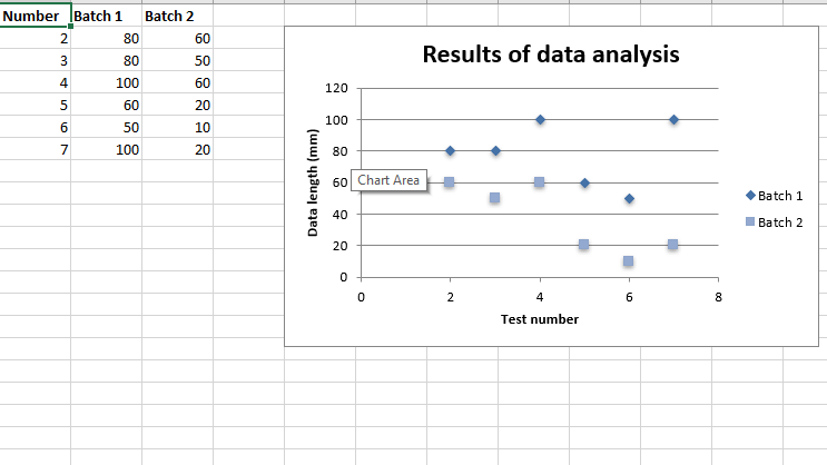 Code #2 : Plot the Scatter Chart sub-type with straight lines and markers. For plotting this type of chart on an excel sheet, use add_chart() method with type ‘scatter’ and subtype ‘straight_with_markers’ keyword argument of a workbook object.
Python3 `
import xlsxwriter module
import xlsxwriter
Workbook() takes one, non-optional, argument
which is the filename that we want to create.
workbook = xlsxwriter.Workbook('chart_scatter2.xlsx')
The workbook object is then used to add new
worksheet via the add_worksheet() method.
worksheet = workbook.add_worksheet()
Create a new Format object to formats cells
in worksheets using add_format() method .
here we create bold format object .
bold = workbook.add_format({'bold': 1})
create a data list .
headings = ['Number', 'Batch 1', 'Batch 2']
data = [ [2, 3, 4, 5, 6, 7], [80, 80, 100, 60, 50, 100], [60, 50, 60, 20, 10, 20], ]
Write a row of data starting from 'A1'
with bold format .
worksheet.write_row('A1', headings, bold)
Write a column of data starting from
'A2', 'B2', 'C2' respectively .
worksheet.write_column('A2', data[0]) worksheet.write_column('B2', data[1]) worksheet.write_column('C2', data[2])
Create a chart object that can be added
to a worksheet using add_chart() method.
here we create a Scatter chart sub-type with
straight lines and markers object .
chart1 = workbook.add_chart({'type': 'scatter', 'subtype': 'straight_with_markers'})
Add a data series to a chart
using add_series method.
Configure the first series.
= Sheet1 !$A$1 is equivalent to ['Sheet1', 0, 0].
chart1.add_series({ 'name': '= Sheet1 !$B$1', 'categories': '= Sheet1 !$A$2:$A$7', 'values': '= Sheet1 !$B$2:$B$7', })
Configure a second series.
Note use of alternative syntax to define ranges.
[sheetname, first_row, first_col, last_row, last_col].
chart1.add_series({ 'name': ['Sheet1', 0, 2], 'categories': ['Sheet1', 1, 0, 6, 0], 'values': ['Sheet1', 1, 2, 6, 2], })
Add a chart title
chart1.set_title ({'name': 'Results of data analysis'})
Add x-axis label
chart1.set_x_axis({'name': 'Test number'})
Add y-axis label
chart1.set_y_axis({'name': 'Data length (mm)'})
Set an Excel chart style.
chart1.set_style(11)
add chart to the worksheet
the top-left corner of a chart
is anchored to cell E2 .
worksheet.insert_chart('E2', chart1)
Finally, close the Excel file
via the close() method.
workbook.close()
`
Output: 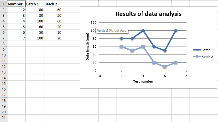 Code #3 : Plot the Scatter Chart sub-type with straight lines and no markers. For plotting this type of chart on an excel sheet, use add_chart() method with type ‘scatter’ and subtype ‘straight’ keyword argument of a workbook object.
Python3 `
import xlsxwriter module
import xlsxwriter
Workbook() takes one, non-optional, argument
which is the filename that we want to create.
workbook = xlsxwriter.Workbook('chart_scatter3.xlsx')
The workbook object is then used to add new
worksheet via the add_worksheet() method.
worksheet = workbook.add_worksheet()
Create a new Format object to formats cells
in worksheets using add_format() method .
here we create bold format object .
bold = workbook.add_format({'bold': 1})
create a data list .
headings = ['Number', 'Batch 1', 'Batch 2']
data = [ [2, 3, 4, 5, 6, 7], [80, 80, 100, 60, 50, 100], [60, 50, 60, 20, 10, 20], ]
Write a row of data starting from 'A1'
with bold format .
worksheet.write_row('A1', headings, bold)
Write a column of data starting from
'A2', 'B2', 'C2' respectively .
worksheet.write_column('A2', data[0]) worksheet.write_column('B2', data[1]) worksheet.write_column('C2', data[2])
Create a chart object that can be added
to a worksheet using add_chart() method.
here we create a Scatter chart sub-type with
straight lines and no markers object .
chart1 = workbook.add_chart({'type': 'scatter', 'subtype': 'straight'})
Add a data series to a chart
using add_series method.
Configure the first series.
= Sheet1 !$A$1 is equivalent to ['Sheet1', 0, 0].
chart1.add_series({ 'name': '= Sheet1 !$B$1', 'categories': '= Sheet1 !$A$2:$A$7', 'values': '= Sheet1 !$B$2:$B$7', })
Configure a second series.
Note use of alternative syntax to define ranges.
[sheetname, first_row, first_col, last_row, last_col].
chart1.add_series({ 'name': ['Sheet1', 0, 2], 'categories': ['Sheet1', 1, 0, 6, 0], 'values': ['Sheet1', 1, 2, 6, 2], })
Add a chart title
chart1.set_title ({'name': 'Results of data analysis'})
Add x-axis label
chart1.set_x_axis({'name': 'Test number'})
Add y-axis label
chart1.set_y_axis({'name': 'Data length (mm)'})
Set an Excel chart style.
chart1.set_style(11)
add chart to the worksheet
the top-left corner of a chart
is anchored to cell E2 .
worksheet.insert_chart('E2', chart1)
Finally, close the Excel file
via the close() method.
workbook.close()
`
Output: 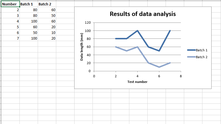 Code #4 : Plot the Scatter Chart sub-type with smooth lines and markers. For plotting this type of chart on an excel sheet, use add_chart() method with type ‘scatter’ and subtype ‘smooth_with_markers’ keyword argument of a workbook object.
Python3 `
import xlsxwriter module
import xlsxwriter
Workbook() takes one, non-optional, argument
which is the filename that we want to create.
workbook = xlsxwriter.Workbook('chart_scatter4.xlsx')
The workbook object is then used to add new
worksheet via the add_worksheet() method.
worksheet = workbook.add_worksheet()
Create a new Format object to formats cells
in worksheets using add_format() method .
here we create bold format object .
bold = workbook.add_format({'bold': 1})
create a data list .
headings = ['Number', 'Batch 1', 'Batch 2']
data = [ [2, 3, 4, 5, 6, 7], [80, 80, 100, 60, 50, 100], [60, 50, 60, 20, 10, 20], ]
Write a row of data starting from 'A1'
with bold format .
worksheet.write_row('A1', headings, bold)
Write a column of data starting from
'A2', 'B2', 'C2' respectively .
worksheet.write_column('A2', data[0]) worksheet.write_column('B2', data[1]) worksheet.write_column('C2', data[2])
Create a chart object that can be added
to a worksheet using add_chart() method.
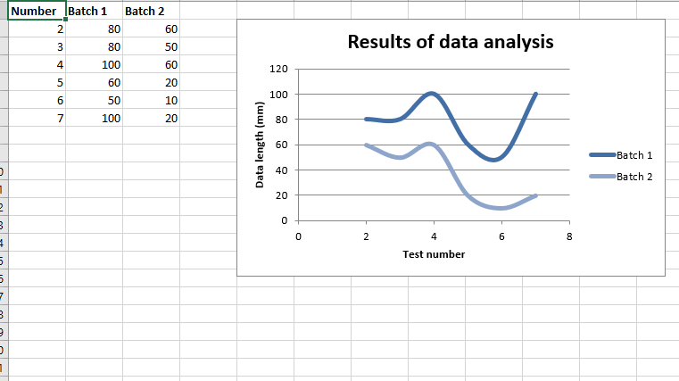
here we create a Scatter chart sub-type with
smooth lines and markers object .
chart1 = workbook.add_chart({'type': 'scatter', 'subtype': 'smooth_with_markers'})
Add a data series to a chart
using add_series method.
Configure the first series.
= Sheet1 !$A$1 is equivalent to ['Sheet1', 0, 0].
chart1.add_series({ 'name': '= Sheet1 !$B$1', 'categories': '= Sheet1 !$A$2:$A$7', 'values': '= Sheet1 !$B$2:$B$7', })
Configure a second series.
Note use of alternative syntax to define ranges.
[sheetname, first_row, first_col, last_row, last_col].
chart1.add_series({ 'name': ['Sheet1', 0, 2], 'categories': ['Sheet1', 1, 0, 6, 0], 'values': ['Sheet1', 1, 2, 6, 2], })
Add a chart title
chart1.set_title ({'name': 'Results of data analysis'})
Add x-axis label
chart1.set_x_axis({'name': 'Test number'})
Add y-axis label
chart1.set_y_axis({'name': 'Data length (mm)'})
Set an Excel chart style.
chart1.set_style(11)
add chart to the worksheet
the top-left corner of a chart
is anchored to cell E2 .
worksheet.insert_chart('E2', chart1)
Finally, close the Excel file
via the close() method.
workbook.close()
`
Output : 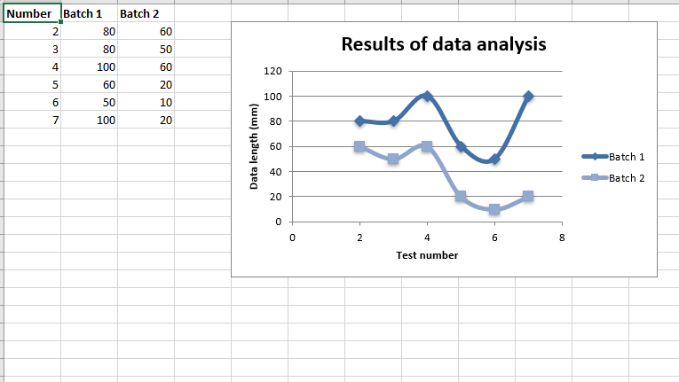 Code #5 : Plot the Scatter Chart sub-type with smooth lines and no markers. For plotting this type of chart on an excel sheet, use add_chart() method with type ‘scatter’ and subtype ‘smooth’ keyword argument of a workbook object.
Python3 `
import xlsxwriter module
import xlsxwriter
Workbook() takes one, non-optional, argument
which is the filename that we want to create.
workbook = xlsxwriter.Workbook('chart_scatter5.xlsx')
The workbook object is then used to add new
worksheet via the add_worksheet() method.
worksheet = workbook.add_worksheet()
Create a new Format object to formats cells
in worksheets using add_format() method .
here we create bold format object .
bold = workbook.add_format({'bold': 1})
create a data list .
headings = ['Number', 'Batch 1', 'Batch 2']
data = [ [2, 3, 4, 5, 6, 7], [80, 80, 100, 60, 50, 100], [60, 50, 60, 20, 10, 20], ]
Write a row of data starting from 'A1'
with bold format .
worksheet.write_row('A1', headings, bold)
Write a column of data starting from
'A2', 'B2', 'C2' respectively .
worksheet.write_column('A2', data[0]) worksheet.write_column('B2', data[1]) worksheet.write_column('C2', data[2])
Create a chart object that can be added
to a worksheet using add_chart() method.
here we create a Scatter chart sub-type with
smooth lines and no markers object .
chart1 = workbook.add_chart({'type': 'scatter', 'subtype': 'smooth'})
Add a data series to a chart
using add_series method.
Configure the first series.
= Sheet1 !$A$1 is equivalent to ['Sheet1', 0, 0].
chart1.add_series({ 'name': '= Sheet1 !$B$1', 'categories': '= Sheet1 !$A$2:$A$7', 'values': '= Sheet1 !$B$2:$B$7', })
Configure a second series.
Note use of alternative syntax to define ranges.
[sheetname, first_row, first_col, last_row, last_col].
chart1.add_series({ 'name': ['Sheet1', 0, 2], 'categories': ['Sheet1', 1, 0, 6, 0], 'values': ['Sheet1', 1, 2, 6, 2], })
Add a chart title
chart1.set_title ({'name': 'Results of data analysis'})
Add x-axis label
chart1.set_x_axis({'name': 'Test number'})
Add y-axis label
chart1.set_y_axis({'name': 'Data length (mm)'})
Set an Excel chart style.
chart1.set_style(11)
add chart to the worksheet
the top-left corner of a chart
is anchored to cell E2 .
worksheet.insert_chart('E2', chart1)
Finally, close the Excel file
via the close() method.
workbook.close()
`
Output: