How to Calculate Autocorrelation in Python? (original) (raw)
Last Updated : 23 Jul, 2025
**Autocorrelation measures how a signal or time series relates to a delayed version of itself over varying time lags. **For example, given a time series [2, 3, 5, 7, 11], the autocorrelation at lag 1 can reveal how the series correlates with itself shifted by one time step. Let’s explore different methods to calculate autocorrelation efficiently.
In these examples, we will use the dataset [daily-minimum-temperatures-in-blr] Click here to download the dataset.
Using lagplot()
**lag_plot() function from pandas. plotting provides a quick visual check for autocorrelation at a specific lag. For example, lag=1 checks whether the value today is correlated with yesterday’s value.
Python `
import pandas as pd
d = pd.read_csv("daily-minimum-temperatures-in-blr.csv", header=0, index_col=0, parse_dates=True, squeeze=True)
d.head(15) pd.plotting.lag_plot(d, lag=1)
`
**Output
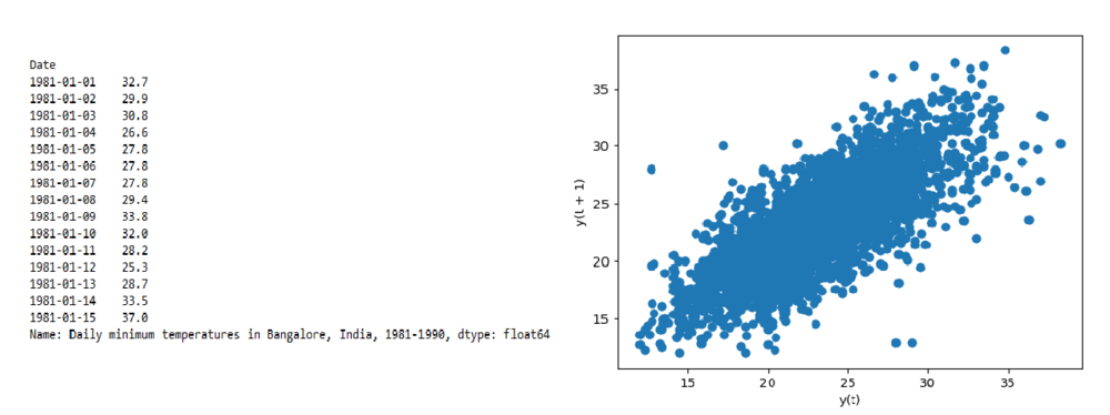
**Explanation: This code sets the date column as the index and displays the first 15 records. It then uses **lag_plot(d, lag=1) to create a scatter plot that compares each day’s value with the previous day’s; a linear pattern suggests strong autocorrelation.
Using corr() method
Sometimes, a numeric matrix of correlations across multiple lags is helpful. You can use shift() to create lagged versions of your time series and then use pandas.corr() to find how strongly past values relate to the current value.
Python `
import pandas as pd d = pd.read_csv("daily-minimum-temperatures-in-blr.csv", header=0, index_col=0, parse_dates=True, squeeze=True)
val = pd.DataFrame(d.values)
Create lagged dataset
df = pd.concat([val.shift(3), val.shift(2), val.shift(1), val], axis=1)
Set column names
df.columns = ['t', 't+1', 't+2', 't+3']
res = df.corr() print(res)
`
**Output
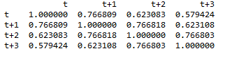
**Explanation: This code creates a lagged dataset by shifting values for 3, 2, and 1 days ago alongside the current day. It then computes a correlation matrix to show how strongly past values relate to the present, indicating autocorrelation.
Using plot_acf()
**plot_acf() function from the statsmodels library generates an autocorrelation plot (also known as a correlogram), showing autocorrelation values across a range of lags along with confidence intervals.
Python `
import pandas as pd from statsmodels.graphics.tsaplots import plot_acf
d = pd.read_csv("daily-minimum-temperatures-in-blr.csv", header=0, index_col=0, parse_dates=True, squeeze=True) plot_acf(d)
`
**Output

Using plot _acf
**Explanation: plot_acf() from **statsmodels generates an autocorrelation plot that displays correlation values across multiple lags, helping identify patterns and significant autocorrelations over time.