Exponential Distribution in NumPy (original) (raw)
Last Updated : 10 Dec, 2025
The Exponential Distribution is a continuous probability distribution that describes the time between two events in a Poisson process, where events occur independently and at a constant average rate. NumPy provides a simple method to generate such random values: numpy.random.exponential().
**Example: This example shows how to generate one exponential random value using the default parameters.
Python `
import numpy as np x = np.random.exponential() print(x)
`
**Explanation:
- np.random.exponential() generates one value following the exponential distribution.
- Since no parameters are passed, it uses scale = 1 by default.
Syntax
numpy.random.exponential(scale=1.0, size=None)
**Parameters:
- **scale: Inverse of the event rate (β = 1/λ).
- **size: Shape of output array.
Examples
**Example 1: This example generates one exponential random value using a custom scale.
Python `
import numpy as np x = np.random.exponential(scale=2) print(x)
`
**Explanation:
- scale=2 values will be more spread out.
- x holds a single exponential random number.
- Larger scale values make the distribution longer and wider.
**Example 2: This example generates five random numbers from the exponential distribution.
Python `
import numpy as np arr = np.random.exponential(scale=1.5, size=5) print(arr)
`
Output
[2.14106221 1.93254045 0.03957526 0.58763751 1.12814399]
**Explanation
- scale=1.5 moderate spread.
- size=5 returns 5 values.
- arr stores the array like [0.21, 1.33, 0.94, ...].
Visualizing the Exponential Distribution
Visualizing the generated numbers helps in understanding their behavior. Below is an example of plotting a histogram of random numbers generated using numpy.random.exponential.
Python `
import numpy as np import matplotlib.pyplot as plt import seaborn as sns
s = 2 # scale n = 800 # number of points
data = np.random.exponential(scale=s, size=n) sns.histplot(data, bins=30, kde=True, edgecolor='black')
plt.title(f"Exponential Distribution (Scale={s})") plt.xlabel("Value") plt.ylabel("Frequency") plt.grid(True) plt.show()
`
**Output
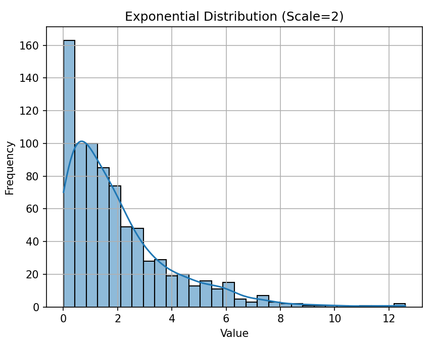
Exponenetial Distribution Plot
**Explanation:
- s = 2 sets the spread of the distribution.
- n = 800 creates enough data points for a smooth histogram.
- sns.histplot() shows: Bars -> simulated data and Curve (kde) -> smooth theoretical shape
- The graph shows high frequency near 0 and a long decreasing tail, which is typical of exponential distributions.