Analyzing Social Media Brand Mentions in R (original) (raw)
Last Updated : 24 Jul, 2025
In today's digital age, having a strong online presence is key to a successful brand. One important aspect of understanding and improving brand awareness and consumer engagement is analyzing brand mentions on social media. With the massive amount of data generated on various social media platforms, businesses have a golden opportunity to gain valuable insights into consumer behavior, preferences, and how people feel about their brand. But with such a huge amount of data to handle, it can be overwhelming. That's where sophisticated tools like R for data analysis come in. They can make the task much easier by turning raw data into actionable intelligence.
Overview of Social Media Data Analysis for Businesses and Brands
This article aims to give you a step-by-step guide on how to use R to analyze brand mentions on social media. It covers everything from the importance of social media data analysis for businesses and brands to the process of collecting, cleaning, preprocessing, and analyzing data
- Data analytics plays a crucial role in social media marketing by giving businesses valuable insights into their audience's behavior and preferences. This information is essential for tailoring marketing strategies and creating content that resonates with the target audience.
- Social media analytics is absolutely vital for brands as it helps them gather and analyze data to extract meaningful insights, making their social media efforts more impactful. With billions of users on social media, brands have access to a wealth of data that can help them better understand their target audience and fine-tune their marketing approach.
- Keeping an eye on social media mentions is crucial for businesses as it gives them a real-time reflection of their brand's image and allows them to effectively manage their reputation.
- The benefits of social media analytics go beyond just monitoring performance; they enable businesses to identify customer complaints and issues in real-time, which in turn improves brand reputation and customer satisfaction. By analyzing social media data, businesses can identify the type of content that performs best on different platforms and for specific target audiences.
Relevant R Packages for Data Collection and Preprocessing
In the world of R Programming Language there are several packages specifically designed to make data collection and preprocessing from social media platforms easier. These packages not only simplify the process of acquiring data but also enhance the efficiency of cleaning and preparing it. They're like indispensable tools for social media data analysts.
- **rtweet : If you're collecting Twitter data, rtweet is a powerful R package that you should check out. It lets you access Twitter's REST and stream APIs seamlessly, allowing you to gather real-time tweets, user data, and other relevant information. With rtweet, you can extract tweets using specific keywords, hashtags, or user mentions, which is crucial for analyzing brand mentions and understanding public sentiment towards a brand.
- **Rfacebook : For those focusing on Facebook data, Rfacebook is the go-to package. It provides a comprehensive solution for connecting to the Facebook Graph API. This enables you to retrieve posts, comments, and likes from public pages and groups. Using Rfacebook, you can effectively track and analyze interactions on Facebook pages, gaining valuable insights into user engagement and content performance.
- **rvest : When it comes to web data, rvest is a must-have tool. It's incredibly useful for scraping web pages and collecting data that might not be easily accessible through standard APIs. With rvest, you can extract data from web pages, clean it up, and format it into a usable structure for further analysis. This is especially handy when combining social media data with other web-based sources to get a comprehensive view of digital interactions.
- **tm : The tm package, short for Text Mining, is essential for preprocessing text data from social media. It provides a range of tools for manipulating text, making tasks like removing stopwords, stemming, and creating term-document matrices a breeze. These preprocessing steps are crucial for preparing social media text data for sentiment analysis and other advanced analytical techniques.
Step By Step Approach To Analyze language Brand Mentions
To conduct this analysis, we're turning to the wealth of online content on YouTube, a bustling hub of discussions, tutorials, and community interactions. Specifically, we're using data from GeekforGeeks YouTube videos, a treasure trove of programming tutorials and discussions frequented by enthusiasts and professionals alike.
Setp 1 : Import required libraries
We load required R packages for data manipulation (dplyr, tidyr), string manipulation (stringr), data visualization (ggplot2), date-time manipulation (lubridate), and additional functionality from the tidyverse package collection.
R `
Load necessary libraries
library(dplyr) library(tidyr) library(stringr) library(ggplot2) library(lubridate) library(tidyverse)
`
Step2: Loading dataset
We reads the dataset stored in the CSV file named "gfg.csv" into a data frame called gfg_data.
Dataset Link: Analyzing Social Media Brand
R `
gfg_data<-read_csv('C:\Users\GFG19565\Downloads\gfg.csv')
str(gfg_data)
`
**Output:
'data.frame': 3784 obs. of 9 variables: $ video_link : chr "https://www.youtube.com/ijSJMr0lPko" "https://www.youtube.com/ $ thumbnail_link: chr "https://i.ytimg.com/vi/ijSJMr0lPko/hqdefault.jpg" "https://i.ytimg.com/vi/FbfeCOgNuc $ duration : chr "16 minutes, 56 seconds" "46 minutes, 18 seconds" "33 minutes, 40 seconds" "40 minut $ title : chr "How I got hired via GFG Job Portal" "Understanding Sorting Techniques in an hour | $ views : chr "392" "2,220" "905" "1,051" ... $ likes : chr "21" "131" "26" "52" ... $ comments : chr "0" "3" "0" "1" ... $ date : chr "Streamed live 8 hours ago" "Streamed live on 10 Apr $ description : chr "In this webinar, Vedant Thakur will talk about their experience of getting hired at........
Step 3: Remove Rows with Any Missing Values
In this we calculates the number of missing values in each column of the gfg_data data frame using the colSums function.
R `
colSums(is.na(gfg_data))
`
**Output:
video_link thumbnail_link       duration          title          views
         0              0              0              0              0
     likes       comments           date    description
         0              0              0              0
Step 4: Visualize the Analyzing Social Media Brand Mentions data
Visualize the analysis of social media brand mentions, you typically need to consider various types of data and the appropriate visualization techniques.
R `
gfg_data_clean <- gfg_data %>% mutate(date = as.Date(date, format="%Y-%m-%d"))
gfg_data_clean <- gfg_data_clean %>% mutate(views = as.numeric(views), likes = as.numeric(likes))
ggplot(gfg_data_clean, aes(x = views)) + geom_histogram(bins = 30, fill = "blue", color = "black") + labs(title = "Distribution of Video Views", x = "Views", y = "Frequency")
`
**Output:

Distribution of video views
This code creates a histogram to visualize the distribution of video views (views variable) in the gfg_data_clean data frame using ggplot2. The histogram is filled with blue color and has black borders. The x-axis label is set to "Views," the y-axis label is set to "Frequency," and the title of the plot is "Distribution of Video Views."
Distribution of Video Likes
This one creates a histogram to visualize the distribution of video likes (likes variable) in the gfg_data_clean data frame. The histogram is filled with green color and has black borders. The x-axis label is set to "Likes," the y-axis label is set to "Frequency," and the title of the plot is "Distribution of Video Likes."
R `
ggplot(gfg_data_clean, aes(x = likes)) + geom_histogram(bins = 30, fill = "green", color = "black") + labs(title = "Distribution of Video Views", x = "Views", y = "Frequency")
`
**Output:

Distribution of video likes
Distribution of Video Comments
This code creates a histogram to visualize the distribution of video comments (comments variable) in the gfg_data_clean data frame. The histogram is filled with red color and has black borders. The x-axis label is set to "Comments," the y-axis label is set to "Frequency," and the title of the plot is "Distribution of Video Comments."
R `
ggplot(gfg_data_clean, aes(x = comments)) + geom_histogram(bins = 30, fill = "red", color = "black") + labs(title = "Distribution of Video Comments", x = "Comments", y = "Frequency")
`
**Output:
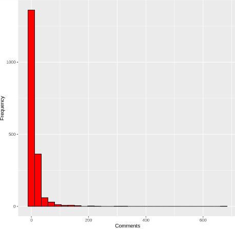
Distribution of video comments
Programming Language Defining
This code creates a bar plot to visualize the counts of mentions for each programming language stored in the language_counts data frame. Each bar represents a programming language, with the height indicating the count of mentions. The bars are sorted in descending order based on the count of mentions. The plot title, axis labels, and theme are customized to enhance readability and aesthetics.
R `
languages <- c("Python", "Java", "C++", "JavaScript", "Ruby", "PHP", "C#", "R", "Swift", "Go", "Kotlin", "Scala")
Convert text to lowercase for case-insensitive matching
gfg_data$text <- tolower(gfg_data$text)
Initialize a data frame to store the counts
language_counts <- data.frame(language = languages, count = 0)
Count mentions
for (language in languages) { language_counts$count[language_counts$language == language] <- sum (str_detect(gfg_data$text, tolower(language))) }
Plot the counts
ggplot(language_counts, aes(x = reorder(language, -count), y = count, fill = language)) + geom_bar(stat = "identity") + labs(title = "Most Discussed Programming Languages in GeeksforGeeks YouTube Videos", x = "Programming Language", y = "Count of Mentions") + theme_minimal() + theme(axis.text.x = element_text(angle = 45, hjust = 1))
`
**Output:
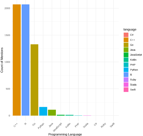
Most Discussed Programming Languages in GeeksforGeeks YouTube Videos
Visualization of Top Trending Language Brands
This code sorts the language_counts data frame by the count of mentions in descending order and adds a new column named "trending" to indicate whether a language is trending or not based on its rank. The top 3 languages are labeled as "Trending," while the rest are labeled as "Not Trending." Then, it creates a bar plot to visualize the counts of mentions for each language, with trending and non-trending brands distinguished by different colors. The plot is customized with appropriate axis labels, legend, and theme for clarity and aesthetics.
R `
Sort the language counts by count in descending order
language_counts <- language_counts[order(-language_counts$count), ]
Add a column to indicate trending status
language_counts$trending <- ifelse(rank(-language_counts$count) <= 3, "Trending", "Not Trending")
Create a color palette for trending and not trending brands
trending_colors <- c("Trending" = "blue", "Not Trending" = "black")
Visualize the top trending language brands
ggplot(language_counts, aes(x = reorder(brand, count), y = count, fill = trending)) + geom_bar(stat = "identity") + scale_fill_manual(values = trending_colors) + labs(x = "Brand", y = "Count", fill = "Trending Status") + theme_minimal() + theme(axis.text.x = element_text(angle = 45, hjust = 1))
`
**Output:
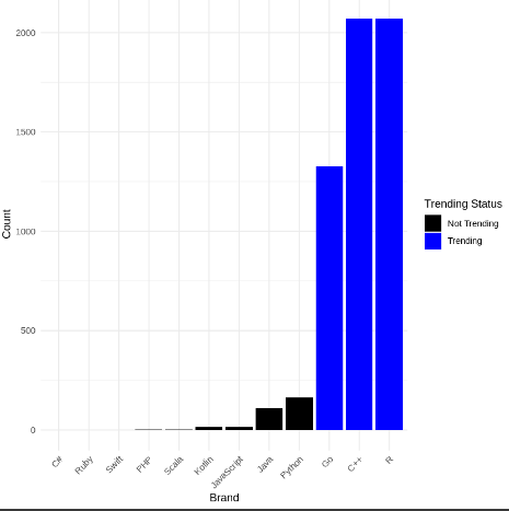
Visualiization of top trending language brands
Conclusion
To sum it up, our deep dive into social media buzz around programming languages shows a lively scene shaped by community interactions, industry shifts, and cultural vibes. With the help of R and data from platforms like YouTube, we've gotten some real insights into how programming languages are seen as brands. As tech keeps evolving, the stories around these iconic languages will too, driving creativity, teamwork, and community involvement in the digital world.