Create Scatter plot from CSV in R (original) (raw)
Last Updated : 23 May, 2024
In R Programming Language we use plot() function to display scatterplot. It takes eight parameters.
Syntax: plot(x, y, main, xlab, ylab, xlim, ylim, axes)
Parameters:
- x: sets variable to be used for horizontal coordinates.
- y: sets variable to be used for vertical coordinates.
- xlab: label for horizontal axis.
- ylab: label for vertical axis.
- main: title of the chart.
- xlim: limits of x for plotting values of x.
- ylim: limits of y for plotting values of y.
- axes: it indicates whether both axes should be drawn on the plot.
To set attributes of scatter plot like color and shape of scatter plot points we use "col" attribute to set the color of scatter plot and to set shape we use "pch", where pch takes numeric values between 0 and 25.
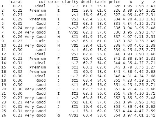
Creating DataFrame:
Here we are going to create dataframe from this dataset. We use read.csv() to read csv file and store that data in a variable.
R `
csv_data<-read.csv("diamonds.csv") print(csv_data)
`
Output:
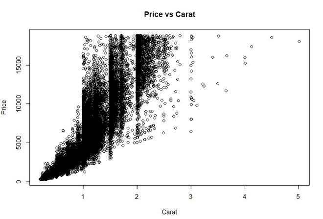
Example 1: In this example we create a simple scatter plot, where x is set to carat and y, is set to price. We label the plot as Price vs Carat.
Syntax: plot(x, y, main, xlab, ylab, col, pch)
Where x is carat data, y is price data, xlab is label for x as "Carat" and ylab is label for y as "Price".
R `
plot(x = csv_data$carat, y = csv_data$price, xlab = "Carat", ylab = "Price", main = "Price vs Carat")
`
Output:
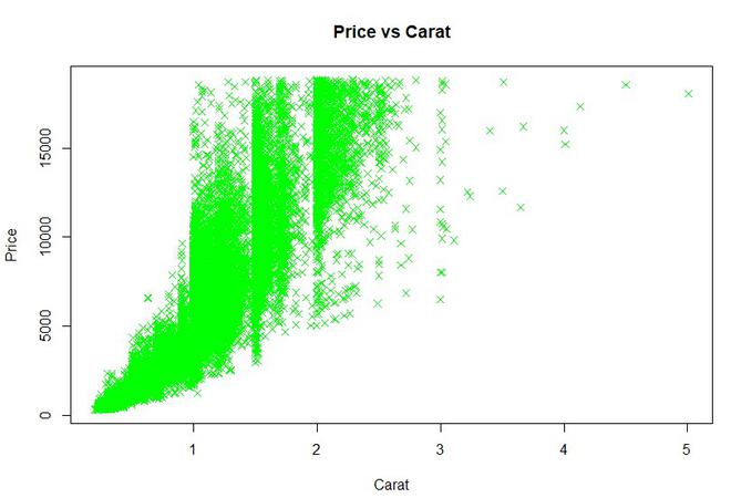
Example 2: In this example we try to set attributes of scatter plot like color and shape of scatter plot points. We set pch value 4 where value 4 is represented as "x" and color is set to green.
R `
plot(x = csv_data$carat, y = csv_data$price, xlab = "Carat", ylab = "Price", col = "green", pch = 4, main = "Price vs Carat")
`
Output:
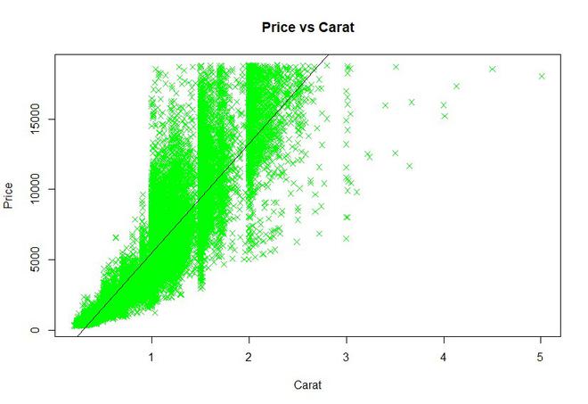
Example 3: We can also add a regression line to our scatter plot by using abline() function. We pass 2 parameters in which first we pass lm() function(lm() function is used to fit linear models.) where we specify x and y of our dataset and name of our data and, the second parameter is color of the line.
R `
plot(x = csv_data$carat, y = csv_data$price, xlab = "Carat", ylab = "Price", col = "green", pch = 4, main = "Price vs Carat")
abline(lm(csv_data$price ~ csv_data$carat, data = csv_data), col = "black")
`
Output: