Draw a QuantileQuantile Plot in R Programming (original) (raw)
Draw a Quantile-Quantile Plot in R Programming
Last Updated : 6 Aug, 2025
A Quantile-Quantile plot is a graphical method for comparing two probability distributions by plotting their quantiles against each other. Typically, it is used to compare the distribution of the observed data with a theoretical distribution, such as the normal distribution.
When to Use Q-Q Plot in R
Q-Q plots are often used in statistical analysis to:
- **Check for Normality: They help assess whether a dataset is approximately normally distributed, which is a common assumption in many statistical tests.
- **Detect Skewness or Kurtosis: If the data has heavy tails or is skewed, this will show up in the Q-Q plot.
- **Compare Two Distributions: It can be used to check if two datasets come from the same distribution.
Implementation of Drawing Q-Q Plots in R
We are plotting Q-Q (Quantile-Quantile) plots to visually assess whether the sample data comes from a theoretical distribution like normal, exponential or t-distribution.
1. Installing and Loading Required Packages
We install the ggplot2 package and load it to allow advanced Q-Q plotting.
- **install.packages: Installs external R packages.
- **library: Loads the installed package into the R session. R `
install.packages("ggplot2") library(ggplot2)
`
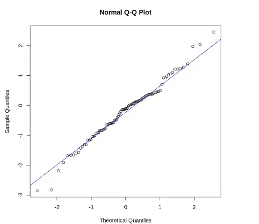
2. Drawing a Basic Q-Q Plot Using qqnorm
We are using base R's qqnorm function to create a basic Q-Q plot with a reference line.
- **rnorm: Generates random values from a normal distribution.
- **qqnorm: Creates a Q-Q plot against the normal distribution.
- **qqline: Adds a straight reference line to the Q-Q plot. R `
data <- rnorm(100) qqnorm(data) qqline(data, col = "blue")
`
**Output:
Output
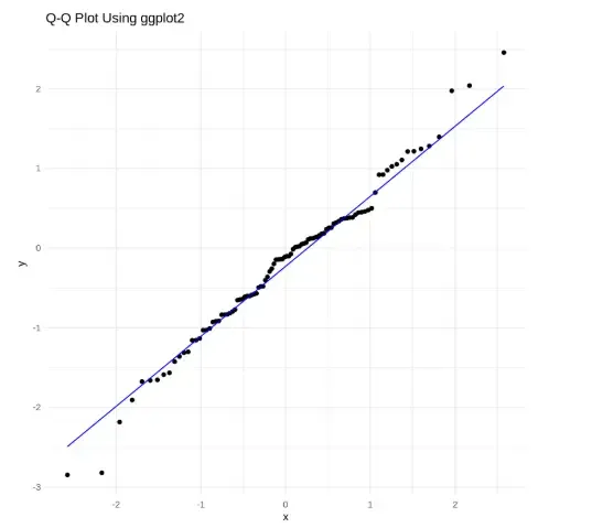
3. Drawing a Q-Q Plot Using ggplot2
We are creating a Q-Q plot with ggplot2 for better customization and visual clarity.
- **ggplot: Initializes a plot using a data frame and aesthetic mapping.
- **aes: Defines the variables used in the plot.
- **stat_qq: Plots sample quantiles against theoretical quantiles.
- **stat_qq_line: Adds a reference line to the Q-Q plot.
- **theme_minimal: Applies a minimal theme to the plot.
- **ggtitle: Adds a title to the plot. R `
ggplot(data = data.frame(sample = data), aes(sample = sample)) + stat_qq() + stat_qq_line(col = "blue") + theme_minimal() + ggtitle("Q-Q Plot Using ggplot2")
`
**Output:
Output
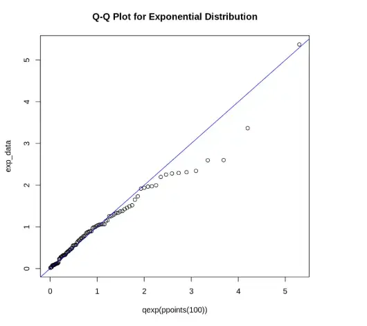
4. Creating a Q-Q Plot for Exponential Distribution
We are plotting a Q-Q plot to compare sample data with an exponential distribution.
- **rexp: Generates random values from an exponential distribution.
- **ppoints: Generates theoretical probabilities for plotting.
- **qexp: Calculates theoretical quantiles for the exponential distribution.
- **qqplot: Plots one set of quantiles against another.
- **abline: Adds a straight reference line to the plot. R `
exp_data <- rexp(100, rate = 1) qqplot(qexp(ppoints(100)), exp_data, main = "Q-Q Plot for Exponential Distribution") abline(0, 1, col = "blue")
`
**Output:
Output
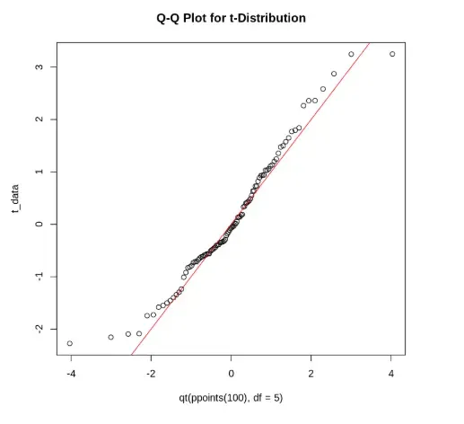
5. Creating a Q-Q Plot for t-Distribution
We are plotting sample data against a t-distribution to check its conformity.
- **rt: Generates random values from a t-distribution.
- **qt: Computes quantiles of the t-distribution. R `
t_data <- rt(100, df = 5) qqplot(qt(ppoints(100), df = 5), t_data, main = "Q-Q Plot for t-Distribution") abline(0, 1, col = "red")
`
**Output:
Output
The output shows a Q-Q plot comparing sample data with a t-distribution, where most points lie along the red line, indicating the data approximately follows a t-distribution.