Draw Histogram with Logarithmic Scale in R (original) (raw)
Last Updated : 23 Jul, 2025
A Histogram is commonly used to depict the frequency distribution of variables. It is also used to summarize both continuous and discrete data. Unlike bar chart where the frequency is indicated by height of bars, here the frequency is indicated by area of bar.
**Logarithmic Scale
A logarithmic scale compresses the data at higher values and expands it at lower ones. When there is a requirement to display data in a way that highlights relative changes across a range and data contains a wide range of values then logarithmic scales are used in data visualization. In order to create a more balanced depiction of data.
Now lets see how to draw histogram with logarithmic scale in R
**Method 1: Using Base R
**1. Creating a Normal Histogram
A vector **A is taken which contains the numerical values to be used by the histogram. The vector **A is plotted using the **hist() function, and the title of the plot is set to **Histogram using the main parameter.
R `
A <- c(10, 10, 10, 20, 15, 15, 20, 20, 20, 20)
hist(A, main = "Histogram")
`
**Output:

Histogram with Logarithmic Scale in R
The hist() function creates histograms.
**Syntax:
hist( v, main, xlab, xlim, ylim, breaks, col, border)
Parameters:
v: Data to plot.main: Title of the histogram.xlab: Label for the x-axis.xlim: Limits for the x-axis.ylim: Limits for the y-axis.breaks: Number of bins.col: Color of the bars.border: Color of the bar borders.
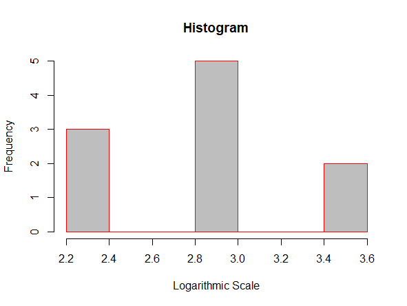
**2. Creating a Histogram with Logarithmic Scale in R
If we want to convert the values of our histogram to a logarithmic scale we can use the **log() function within the **hist() function .
A vector **A is taken which contains the numerical values to be used by the histogram and the vector **A is plotted using the **log() function inside the **hist() function. The title of the plot is set to Histogram, color of the bar is set to **grey, border color of the bar is set to red and the xlabel is set to **Logarithmic Scale using the main, col, border, xlab parameters respectively.
R `
A <- c(10, 10, 10, 20, 20, 20, 20, 20, 30, 30)
hist(log(A), main = "Histogram", col = "grey", border = "red", xlab = "Logarithmic Scale")
`
**Output:
Histogram with Logarithmic scale in R
**Syntax:
hist(log(v))
**Parameters:
- **v : The vector containing the numeric values to be used in histogram.
**Method 2: Using ggplot2 Package
We can also plot histograms using the ggplot2 package in R programming language. We can Install and load **ggplot2package using the **install.packages():
R `
install.packages("ggplot2") library("ggplot2")
`
**1. Creating a Normal Histogram:
A vector "**A" is taken which contains the numerical values to be used by the histogram. The histogram is plotted using the function **ggplot() function and the **geom_histogram() function
R `
library("ggplot2")
A <- c(10, 10, 10, 20, 15, 15, 20, 20, 20, 20)
ggplot(data.frame(A), aes(A)) + geom_histogram(bins = 5)
`
**Output:

Histogram with Logarithmic scale in R
**Syntax:
ggplot(data.frame(x), aes(x)) + geom_histogram()
**Parameters:
x: A vector containing numerical values for the histogram.data.frame(x): Converts the vectorxinto a data frame.aes(x): Specifies the aesthetic mapping for thexvariable in plots.geom_histogram(): Plots the histogram based on the data and aesthetics provided.
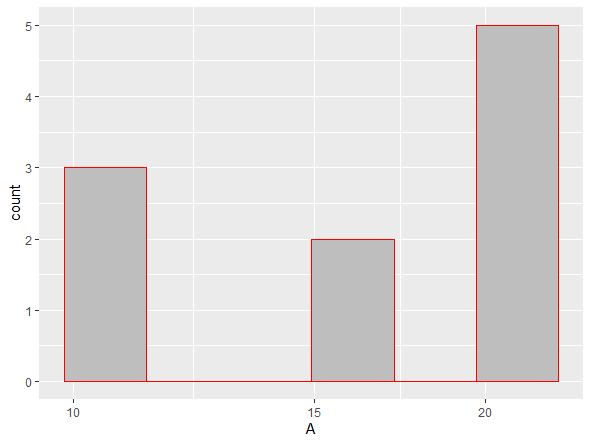
**2. Using ggplot2 Package and scale_x_log10() function
If we want to convert the values of our histogram to a logarithmic scale we can use the scale_x_log10() function along with the ggplot() and geom_histogram() function.
A vector '**A' is taken which contains the numerical values to be used by the histogram. Plot the vector '**A' using the **ggplot() function. The color of the bars is set to grey and the border colour is set to red using **fill and **color respectively.
R `
library("ggplot2")
A <- c(10, 10, 10, 20, 15, 15, 20, 20, 20, 20)
ggplot(data.frame(A), aes(A)) + geom_histogram(color = "red", fill = "grey", bins = 6) + scale_x_log10()
`
**Output:
Histogram with Logarithmic Scale in R
**Syntax:
ggplot(data.frame(x), aes(x)) + geom_histogram() + scale_x_log10()
**Parameters:
- **x is the vector which contains the numerical values to be used by the histogram.
- **data.frame(x) creates a data frame from **x.
- **aes(x) is often used within other graphing elements to specify the desired aesthetics
- **geom_histogram() is used to plot the histogram
- **scale_x_log10() is used to convert the x-axis to logarithmic scale
In this article we saw how to draw a histogram with a Logarithmic scale in R Programming Language using Base R and ggplot2 package.