GE Stock Price Analysis Using R Language (original) (raw)
Last Updated : 23 Jul, 2025
Stock analysis is a technique used by investors and traders to make purchasing and selling choices. Investors and traders strive to obtain an advantage in the markets by making educated judgments by researching and analyzing previous and current data.
In this article, we will analyze the 'GE Stock Price' dataset using the R Programming Language.
The used libraries:
- dplyr - The dplyr package of the R Programming Language is a data manipulation framework that provides a consistent set of verbs to help with the resolution of the most frequent data manipulation difficulties faced.
- stringi - The stringi package in the R programming language is used for string/text processing in any locale or character encoding that is highly fast, portable, accurate, consistent, and easy.
Importing Library
We will initially start by installing the dplyr package and the stringi library
R `
Importing the library stringi
for string manipulation
library(stringi)
Using the library function
to import the dplyr package
library(dplyr)
`
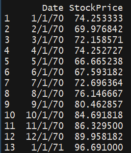
We will now read the CSV file in order to perform the analysis.
Importing Dataset
We start by defining the path where the CSV file is located on our local machine. We then read the CSV file and store the data in variable names df. We further display the content of the data frame 'df'
The dataset can be downloaded and accessed from the following link: here
R `
Defining the path where
the csv file is located
path = 'please paste your path here'
Reading the csv file and storing
the data in a variable named df
df <- read.csv(path)
Displaying the data frame on
the screen
df
`
Output:
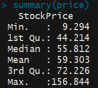
Columns Selection
We will now explore the numerical characteristics 'StockPrice' column. We obtained a numerical summary of the Stock price column using the 'summary' function. This displays the Minimum Stock Price, the 1st Quartile, the median Stock Price, the mean Stock Price, the 3rd Quartile, and the maximum Stock Price.
R `
Getting only the price
price <- select(df,StockPrice)
Obtaining a numerical summary
of the price column
summary(price)
`
Output:
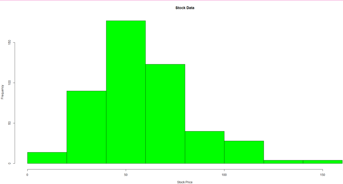
Data Visualization
We will now produce a histogram of the Stock Price Data using the 'hist' function. We pass the 'Stock Price' column and apply labels and headings to the histogram. We add color to the histogram using the col parameter.
R `
Producing a histogram of the
Stock Price Data
hist(as.vector(price$StockPrice), xlab='Stock Price', main='Stock Data', col='green')
`
Output:
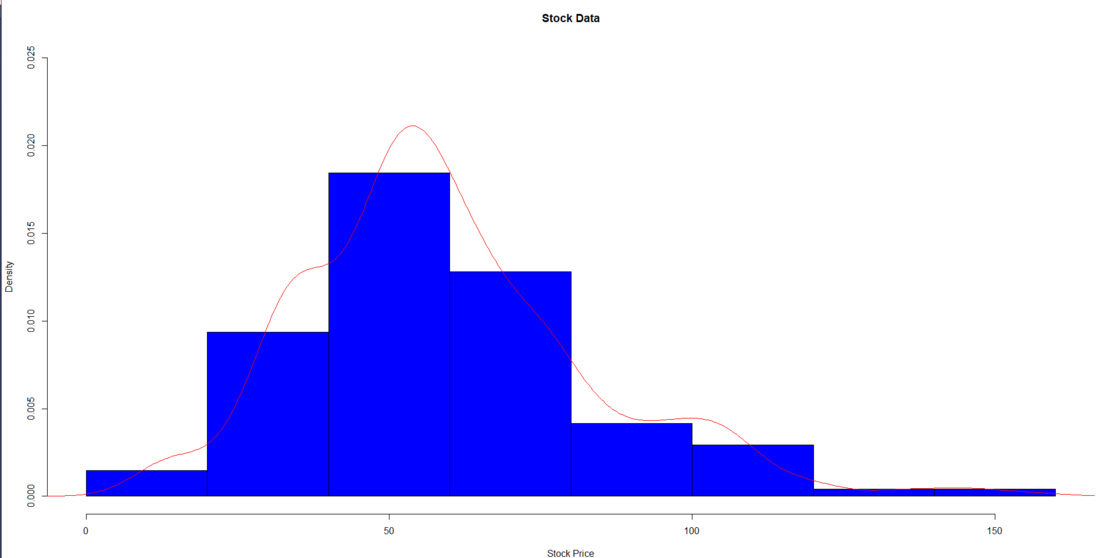
We will now produce a density-based histogram of the Stock Price Data. To produce the density-based histogram, we have used the 'lines' function and passed the kernel density values Stock Price column. To obtain the kernel density values we have used the density function. We have then applied labels and headings to the histogram. We add color to the histogram using the col parameter.
R `
Producing a density based histogram
hist(as.vector(price$StockPrice), xlab='Stock Price', main='Stock Data', col='blue', prob=TRUE, ylim=c(0,0.025)) lines(density(price$StockPrice),col='red')
`
Output:
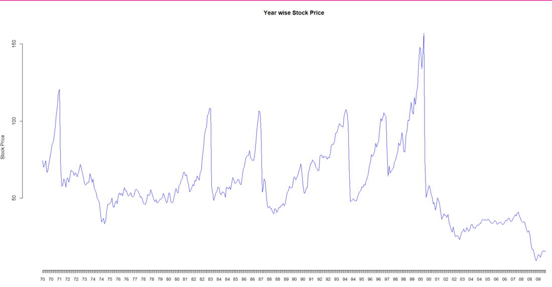
We will now plot a line graph of the Stock Price data that would be segregated year-wise. We have extracted the year from the Date. (We have extracted the last 2 digits of the date that represents the year).
For extracting only the year from the date column we have followed this process:
- Check the class of the Date column
- Convert the Date column's data to a character data type
- Extract only the year from the Date column using a stri_sub function and apply it to all the data using the mutate function
We then finally plot the graph of the data. We then pass the mutated df's date column as the label for the x-axis
R `
Extracting only the year
from the Date column
Checking the class of
the Date column
class(df$Date)
Converting the Date column
data to a character
as.character(df$Date)
Extracting only the year from
the Date column
Mutateddf < - df % > % mutate(Date=stri_sub(Date, -2)) Mutateddf
Plotting a line graph of the data
plot(Mutateddf$StockPrice, type='l', axes=FALSE, xlab='Year', ylab='Stock Price', main='Year wise Stock Price', col='blue') axis(1, at=1: 480, labels=Mutateddf$Date, cex.axis=0.9) axis(2)
`
Output:
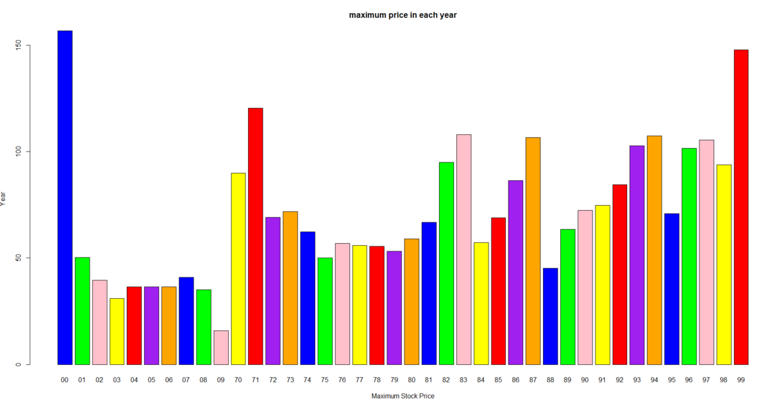
We will now group the data based on their year and plot a bar graph of the maximum stock price in that year
We firstly group the data of Mutated df based on the year. and then we get the maximum stock price for each year and finally using the 'bar plot' function we plot the bar graph showing the maximum stock price in each year.
R ``
Plotting a bar plot of
the maximum price in a year
Grouping the data by the Date
(Year)
groupeddf <- group_by(Mutateddf,Date)
Extracting the maximum share
price for each year
maxdf <- summarize(groupeddf,max(StockPrice))
Plotting the data in a bar chart
barplot(maxdf$max(StockPrice),
main='maximum price in each year',
xlab='Maximum Stock Price',
ylab='Year',
names.arg=maxdf$Date,
col=c('blue','green','pink','yellow',
'red','purple','orange'))
``
Output:
Conclusion:
The study shown above may be used to comprehend a stock's short-term and long-term behavior. Depending on the risk tolerance of the investor, a decision support system may be further developed to aid the user in choosing which stock to select from the industry.
Note: In the date column, only the last 2 digits of the date are there. Hence 1/1/70 means 1st January 1970.