How to Create Correlation Heatmap in R (original) (raw)
Last Updated : 12 Jul, 2022
In this article let's check out how to plot a Correlation Heatmap in R Programming Language.
Analyzing data usually involves a detailed analysis of each feature and how it's correlated with each other. It's essential to find the strength of the relationship between each feature or in other words how two variables move in association to each other. If the variables grow together in the same direction it's a positive correlation otherwise a negative correlation. This correlation can be visualized via various graphs such as scatter plots etc.
Loading data
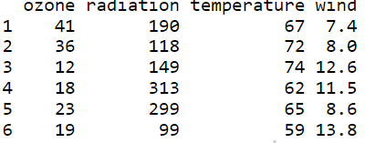
Let's load the environmental dataset and view the first 6 rows of the data using the head( ) function.
R `
Loading package,data and
viwing 1st 6 rows of data
install.packages("lattice") library(lattice)
Load the New York City
environmental dataset.
data(environmental)
data <-environmental head(data)
`
Output:
Create Correlation Matrix
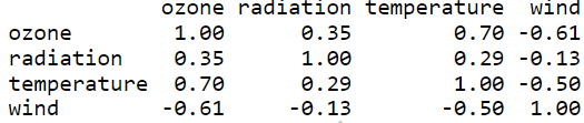
Let's create a correlation matrix for our data using cor( ) function and round each value to 2 decimal places. This matrix can be used to easily create the heatmap.
R `
create a correlation matrix of the data
rounding to 2 decimal places
corr_mat <- round(cor(data),2)
head(corr_mat)
`
Output:
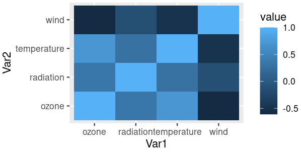
Correlation Heatmap using ggplot2
Using ggplot2 let's visualize correlation matrix on a heatmap.
Function: ggplot(data = NULL, mapping = aes(), ... , environment = parent.frame())
Arguments:
- data - Default dataset to use for plot.
- mapping - Default list of aesthetic mappings to use for plot
- environment - DEPRECATED. Used prior to tidy evaluation
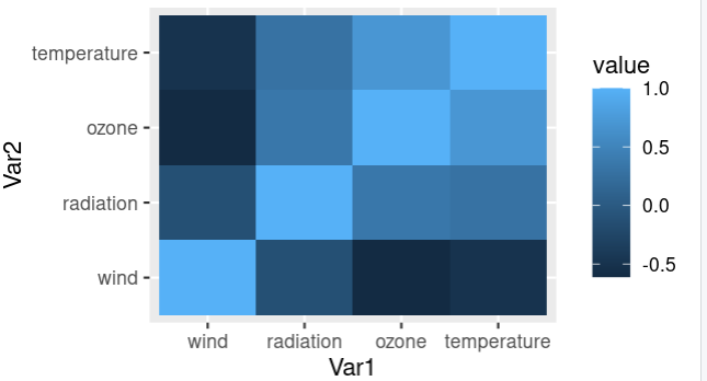
Let's reduce the size of the correlation matrix by plotting the heatmap using melt( ) function and using ggplot to plot the heatmap. From this heatmap we can easily interpret which variables/features are more correlated and use them for in-depth data analysis. The ggplot function takes in a reduced correlation matrix and aesthetic mappings.
R `
Install and load reshape2 package
install.packages("reshape2") library(reshape2)
creating correlation matrix
corr_mat <- round(cor(data),2)
reduce the size of correlation matrix
melted_corr_mat <- melt(corr_mat)
head(melted_corr_mat)
plotting the correlation heatmap
library(ggplot2) ggplot(data = melted_corr_mat, aes(x=Var1, y=Var2, fill=value)) + geom_tile()
`
Output:
Reorder the Correlation matrix and Plot Heatmap
Reordering or sorting the correlation matrix with respect to coefficient helps us to easily identify patterns between the features/variables. Let's check out how to reorder the correlation matrix using hclust( ) function by clustering the features hierarchically(hierarchical clustering).
R `
Code to plot a reorederd heatmap
Install and load reshape2 package
install.packages("reshape2") library(reshape2)
creating correlation matrix
corr_mat <- round(cor(data),2)
reorder corr matrix
using corr coefficient as distance metric
dist <- as.dist((1-corr_mat)/2)
hierarchical clustering the dist matrix
hc <- hclust(dist) corr_mat <-corr_mat[hc$order, hc$order]
reduce the size of correlation matrix
melted_corr_mat <- melt(corr_mat) #head(melted_corr_mat)
#plotting the correlation heatmap library(ggplot2) ggplot(data = melted_corr_mat, aes(x=Var1, y=Var2, fill=value)) + geom_tile()
`
Output:
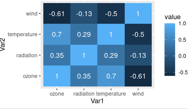
Adding Correlation coefficients to Heatmap
Correlation coefficients are a measure that represents how strong the relationship is between two variables. The higher the absolute value of the coefficient, the higher is the correlation.
Let's visualize a correlation heatmap along with correlation coefficients on the map using the "value" column in the correlation matrix as text. Using geom_text( ) function annotations can be added on the heatmap and use "value" as labels.
R `
Install and load reshape2 package
install.packages("reshape2") library(reshape2)
creating correlation matrix
corr_mat <- round(cor(data),2)
reduce the size of correlation matrix
melted_corr_mat <- melt(corr_mat) head(melted_corr_mat)
plotting the correlation heatmap
library(ggplot2) ggplot(data = melted_corr_mat, aes(x=Var1, y=Var2, fill=value)) + geom_tile() + geom_text(aes(Var2, Var1, label = value), color = "black", size = 4)
`
Output:
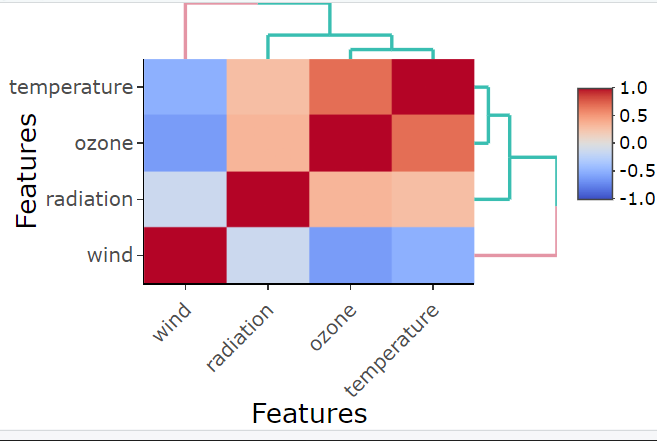
Correlation Heatmap using heatmaply
Let's use the heatmaply package in R to plot a correlation heatmap using the heatmaply_cor( ) function. Correlation of the data is the input matrix with "Features" column as x and y axis parameters.
Function: heatmaply_cor(x, limits = c(-1, 1), xlab, ylab, colors = cool_warm,k_row, k_col ...)
Arguments:
- x - can either be a heatmapr object, or a numeric matrix
- limits - a two dimensional numeric vector specifying the data range for the scale
- colors - a vector of colors to use for heatmap color
- k_row - an integer scalar with the desired number of groups by which to color the dendrogram's
- branches in the rows
- k_col - an integer scalar with the desired number of groups by which to color the dendrogram's branches in the columns
- xlab - A character title for the x axis.
- ylab - A character title for the y axis.
R `
Load and install heatmaply package
install.packages("heatmaply") library(heatmaply)
plotting corr heatmap
heatmaply_cor(x = cor(data), xlab = "Features", ylab = "Features", k_col = 2, k_row = 2)
`
Output:
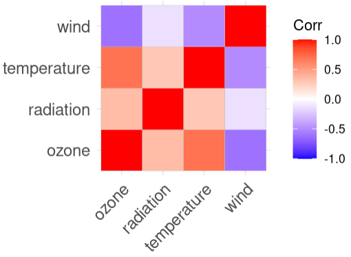
Correlation Heatmap using ggcorplot
Let's use the ggcorplot package in R to plot a correlation heatmap using ggcorrplot( ) function. The correlation matrix of the data is given as the input corr matrix.
Function: ggcorrplot(corr,method = c("square", "circle") ... )
Arguments:
- corr - the correlation matrix to visualize
- method - character, the visualization method of correlation matrix to be used
R `
load and install ggcorplot
install.packages("ggcorplot") library(ggcorrplot)
plotting corr heatmap
ggcorrplot::ggcorrplot(cor(data))
`
Output:
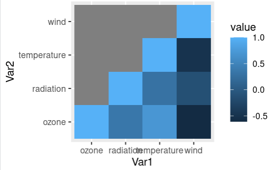
Plotting the lower triangle of the correlation heatmap
Let's check out how to plot the lower triangle of the correlation heatmap and visualize it. This can be done by replacing the upper triangle values of the correlation matrix as NA and then this matrix is reduced by melting process and plotted.
R `
get the corr matrix
corr_mat <- round(cor(data),2)
replace NA with upper triangle matrix
corr_mat[upper.tri(corr_mat)] <- NA
reduce the corr matrix
melted_corr_mat <- melt(corr_mat)
plotting the corr heatmap
library(ggplot2) ggplot(data = melted_corr_mat, aes(x=Var1, y=Var2, fill=value)) + geom_tile()
`
Output:
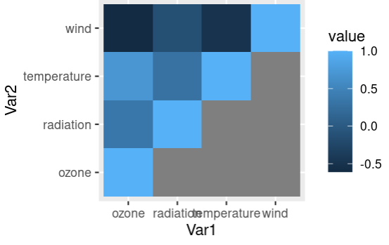
Plotting the upper triangle of the correlation heatmap
Let's check out how to plot the upper triangle of the correlation heatmap and visualize it. This can be done by replacing the lower triangle values of the correlation matrix as NA and then this matrix is reduced by melting process and plotted.
R `
get the corr matrix
corr_mat <- round(cor(data),2)
replace NA with lower triangle matrix
corr_mat[lower.tri(corr_mat)] <- NA
reduce the corr matrix
melted_corr_mat <- melt(corr_mat)
plotting the corr heatmap
library(ggplot2) ggplot(data = melted_corr_mat, aes(x=Var1, y=Var2, fill=value)) + geom_tile()
`
Output:
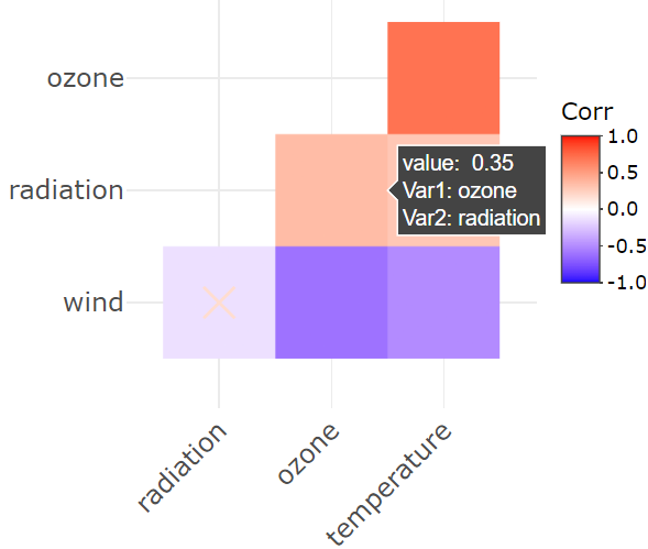
Creating an Interactive Correlation Heatmap
An interactive plot shows detailed information of each data point when the user hovers on the plot. Let's check out how to plot an interactive correlation heatmap using the correlation matrix and p-value matrix. ggplotly( ) function takes in a correlation matrix of the data and gives an interactive heatmap plot and the details can be viewed on hovering on the map.
Function: ggplotly( p = ggplot2::last_plot(), width = NULL, height = NULL ... )
Arguments:
- p - a ggplot object
- width - Width of the plot in pixels (optional, defaults to automatic sizing)
- height - Height of the plot in pixels (optional, defaults to automatic sizing)
R `
install and load the plotly package
install.packages("plotly") library(plotly) library(ggcorrplot)
create corr matrix and
corresponding p-value matrix
corr_mat <- round(cor(data),2) p_mat <- cor_pmat(data)
plotting the interactive corr heatmap
corr_mat <- ggcorrplot( corr_mat, hc.order = TRUE, type = "lower", outline.col = "white", p.mat = p_mat )
ggplotly(corr_mat)
`
Output: