How To Make Violin Plots with ggplot2 in R (original) (raw)
Last Updated : 30 Apr, 2026
Violin plots are used to visualize the distribution of numerical data across one or more categories. They are similar to box plots, but instead of only showing summary statistics, they also display the data’s probability density, providing a more detailed view of the distribution.
Syntax
ggplot( dataframe, aes( x, y, fill, color)) + geom_violin()
**Where:
- **ggplot(dataframe, ...): Starts the plot using the given data frame.
- **dataframe: determines the dataset used in the plot.
- **aes(): used to map data variables to visual properties like x, y, color and fill in a ggplot.
- **geom_violin(): Adds a violin plot to show data distribution using kernel density estimation.
1. Creating basic Violin Plots
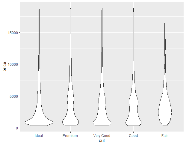
We create a violin plot to show the distribution of diamond prices across different cut categories using the built-in diamonds dataset.
- **ggplot(): Initializes the plot with the given data.
- **aes(): Maps variables like
x=cutandy=priceto plot aesthetics. - **diamonds: Built-in dataset in R containing details like price, cut, clarity, etc.
- **x=cut, y=price: Plots cut type on the x-axis and price on the y-axis.
- **geom_violin(): Draws the violin plot to visualize the distribution of values. R `
library(ggplot2)
ggplot(diamonds, aes(x=cut, y=price)) +
geom_violin()
`
**Output:
Violin Plots with ggplot2 in R
2. Color Customization (Outline)
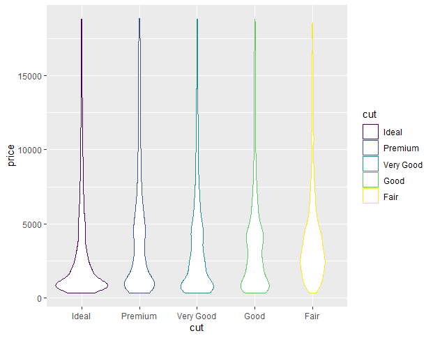
We create a colored violin plot by mapping cut to the color aesthetic which changes the outline color of each violin based on the cut type.
- **color=cut: Adds color to the boundary of each violin based on cut categories. R `
ggplot(diamonds, aes(x=cut, y=price, color=cut)) +
geom_violin()
`
**Output:
Violin Plots with ggplot2 in R
3. Fill Customization (Interior)
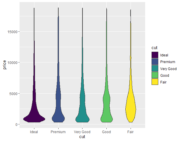
We change the interior fill color of each violin by mapping cut to the fill aesthetic which colors the inside of the violin based on the cut type.
- **fill=cut: Fills the inside of the violin based on cut categories. R `
library(ggplot2)
ggplot(diamonds, aes(x=cut, y=price, fill=cut)) +
geom_violin()
`
**Output:
Violin Plots with ggplot2 in R
4. Horizontal Violin Plot
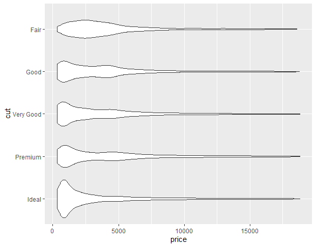
To convert a normal violin plot to a horizontal violin plot we add the coord_flip() function to the ggplot() function. This flips the coordinate axis of the plot and converts any ggplot2 plot into a horizontal plot.
Syntax
plot+ coord_flip()
- **coord_flip(): Flips the x and y axes to make the plot horizontal.
- **plot: A visual display of data using charts or graphs.
Here, is a horizontal violin plot made using the coord_flip() function.
R `
library(ggplot2)
ggplot(diamonds, aes(x=cut, y=price)) +
geom_violin()+
coord_flip()
`
**Output:
Violin Plots with ggplot2 in R
5. Mean marker customization
In ggplot2, we use the stat_summary() function to compute new summary statistics and add them to the plot. We use the stat_summary() function with ggplot() function.
Syntax
plot+ stat_summary(fun.y, geom, size, color)
**Where:
- **fun.y: determines the function according to which marker has to be placed i.e. mean, median, etc.
- **geom: determines the shape of marker.
- **size: determines size of marker.
- **color: determines the color of marker.
- **plot: A visual display of data using charts or graphs.
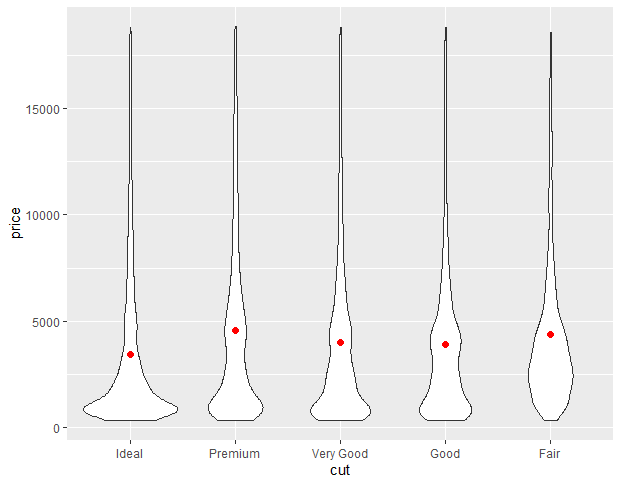
**Example:
In this example, we will compute the mean value of the y-axis variable using fun.y argument in the stat_summary() function.
R `
library(ggplot2)
ggplot(diamonds, aes(x=cut, y=price)) +
geom_violin()+
stat_summary(fun=mean, geom="point", size=2, color="red")
`
**Output:
Violin Plots with ggplot2 in R
Here, the point in the center of the violin shows the variation of the mean of the y-axis for each category of data on the x-axis.
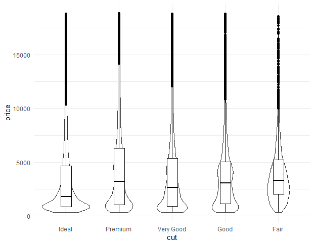
6. Adding Box Plot in Violin Plot
We add a box plot inside the violin plot using the geom_boxplot() function to show summary statistics like median, quartiles and outliers.
- **geom_violin(): Draws the violin shape showing data distribution.
- **geom_boxplot(): Adds a box plot inside each violin for quick comparison.
- **width = 0.2: Controls the width of the box plot.
- **fill = "white": Fills the box plot with white color.
- **color = "black": Sets the border color of the box plot. R `
library(ggplot2)
ggplot(diamonds, aes(x = cut, y = price)) +
geom_violin() +
geom_boxplot(width = 0.2, fill = "white", color = "black")
`
**Output:
Violin Plots with ggplot2 in R
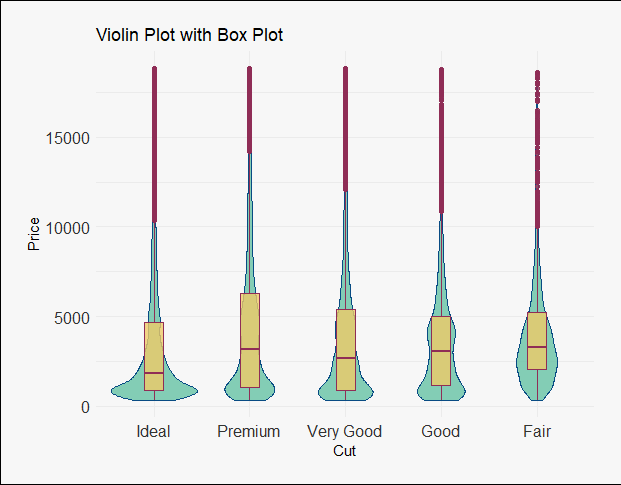
7. Customization of the Box Plot
We customize the box plot and violin plot by adding colors, transparency, labels and themes using built-in functions from ggplot2.
- **theme_set(theme_minimal()): Applies a minimal theme to the entire plot.
- **geom_violin(): Adds a violin plot with custom fill, border color and transparency using alpha.
- **geom_boxplot(): Adds a box plot with a different fill and border color, also using alpha for transparency.
- **labs(): Sets axis labels and the plot title.
- **theme(): Customizes the appearance of axis text, plot background, legend and margins.
- **margin(): Adds space around the plot for better layout. R `
library(ggplot2) theme_set(theme_minimal())
ggplot(diamonds, aes(x = cut, y = price)) + geom_violin(fill = "#66C2A5", color = "#084B83", alpha = 0.8) + geom_boxplot(width = 0.2, fill = "#EFCB68", color = "#8F2D56", alpha = 0.8) +
labs(x = "Cut", y = "Price", title = "Violin Plot with Box Plot") +
theme(axis.text = element_text(size = 12, color = "#333333")) +
theme(plot.background = element_rect(fill = "#F7F7F7")) +
theme(legend.background = element_rect(fill = "#F7F7F7"), legend.position = "bottom") +
theme(plot.margin = margin(20, 20, 20, 20))
`
**Output:
Violin Plots with ggplot2 in R