Normal Probability Plot in R using ggplot2 (original) (raw)
Last Updated : 6 Aug, 2025
A normal probability plot is a graphical representation of the data. A normal probability plot is used to check if the given data set is normally distributed or not. It is used to compare a data set with the normal distribution. If a given data set is normally distributed then it will reside in a shape like a straight line.
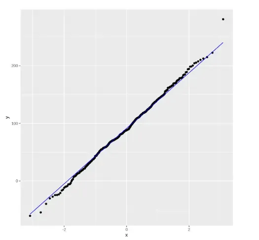
**Example 1: We are plotting a Q-Q plot using only ggplot2 to visualize how sample data compares to a normal distribution using quantile points and a reference line.
- **library: Loads the
ggplot2package into the session. - **set.seed: Ensures the same random values are generated every time.
- **random_values: A numeric vector of 500 normally distributed values.
- **rnorm: Generates random numbers from a normal distribution.
- **data.frame: Creates a data frame to hold the random sample.
- **ggplot: Initializes the plot with the given data and aesthetics.
- **aes: Maps the sample values for Q-Q plotting.
- **stat_qq: Plots sample quantiles against theoretical normal quantiles.
- **stat_qq_line: Adds a straight reference line to the Q-Q plot. R `
install.packages("ggplot2") library(ggplot2) set.seed(1) random_values <- rnorm(500, mean = 90, sd = 50) ggplot(data = data.frame(sample = random_values), aes(sample = sample)) + stat_qq() + stat_qq_line(col = "blue")
`
**Output:
Output
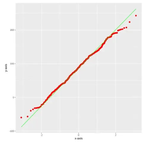
**Example 2: Plotting data points with line using stat_qq_line() function.
- **aes(): Defines the aesthetic mappings like which variable to plot.
- **stat_qq(): Plots the quantile-quantile points on the graph.
- **stat_qq_line(): Adds a reference line to indicate the theoretical quantile distribution.
- **xlab(): Sets the label for the x-axis.
- **ylab(): Sets the label for the y-axis.
- **random_values: The dataset created using rnorm() containing normally distributed random values. R `
library(ggplot2)
random_values = rnorm(500, mean = 90, sd = 50)
ggplot(mapping = aes(sample = random_values)) + stat_qq(size = 2, color = "red") + stat_qq_line(color = "green") + xlab("x-axis") + ylab("y-axis")
`
**Output:
Output
The output will display a Q-Q plot that compares the sample data to a theoretical normal distribution. If the data is normally distributed, the points will closely follow the green reference line. Deviations from this line suggest departures from normality. The red dots represent the actual quantile values of the sample.