Scatter plots in R Language (original) (raw)
Last Updated : 17 Jun, 2025
A scatter plot is a set of dotted points representing individual data pieces on the horizontal and vertical axis. In a graph in which the values of two variables are plotted along the X-axis and Y-axis, the pattern of the resulting points reveals a correlation between them.
We can createa **scatter plot in **R Programming Language using the **plot() function.
**Syntax:
plot(x, y, main, xlab, ylab, xlim, ylim, axes)
**Parameters:
- **x: Sets the horizontal coordinates.
- **y: Sets the vertical coordinates.
- **xlab: Label for the horizontal axis.
- **ylab: Label for the vertical axis.
- **main: Title of the chart.
- **xlim: Defines the x-axis range.
- **ylim: Defines the y-axis range.
- **axes: Indicates whether both axes should be drawn.
Loading the Data
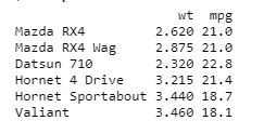
In order to create Scatterplot Chart, we use the data set "**mtcars". We will use the columns "**wt" and "**mpg" in mtcars.
**Example:
R `
input <- mtcars[, c('wt', 'mpg')] print(head(input))
`
**Output:
1. Creating a Scatterplot Graph
We are using the required parameters to plot the graph. In this 'xlab' describes the X-axis and 'ylab' describes the Y-axis.
**Example:
R `
input <- mtcars[, c('wt', 'mpg')]
plot(x = input$wt, y = input$mpg,
xlab = "Weight",
ylab = "Milage",
xlim = c(1.5, 4),
ylim = c(10, 25),
main = "Weight vs Milage"
)
`
**Output:
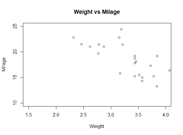
Scatter plots in R Language
2. Scatterplot Matrices
When we have two or more variables and we want to correlate between one variable and others so we use a R scatterplot matrix. The **pairs() function is used to createR matrices of scatterplots.
**Syntax:
pairs(formula, data)
**Parameters:
- **formula: the series of variables used in pairs.
- **data: the data set from which the variables will be taken.
**Example:
R `
pairs(~wt + mpg + disp + cyl, data = mtcars, main = "Scatterplot Matrix")
`
**Output:
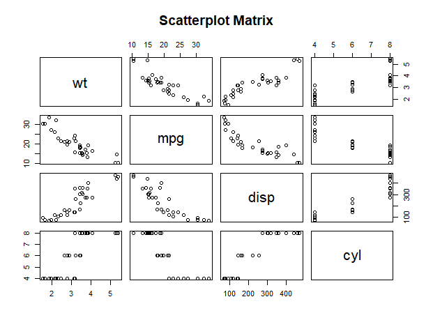
Scatter plots in R Language
3. Scatterplot with fitted values
We are using the **ggplot2 package provides **ggplot() and **geom_point() function for creating a scatterplot. Also we are using the columns "wt" and "mpg" in mtcars.
**Example:
R `
install.packages("ggplot2") library(ggplot2)
ggplot(mtcars, aes(x = log(mpg), y = log(drat))) + geom_point(aes(color = factor(gear))) + stat_smooth(method = "lm", col = "#C42126", se = FALSE, size = 1)
`
**Output:
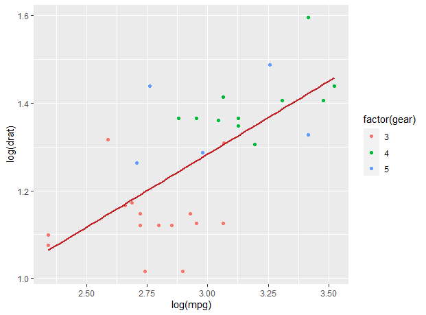
Scatter plots in R Language
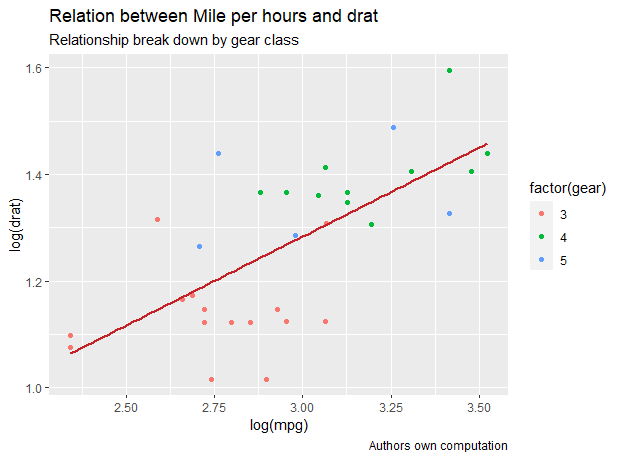
3.1 Adding title with dynamic name
In ggplot we add the data set "mtcars" with this adding 'aes', 'geom_point'. We will use the Title, Caption, Subtitle.
**Example:
R `
library(ggplot2)
new_graph<-ggplot(mtcars, aes(x = log(mpg), y = log(drat))) + geom_point(aes(color = factor(gear))) + geom_smooth(method = "lm", col = "#C42126", se = FALSE, size = 1)
new_graph + labs( title = "Relation between Mile per hours and drat", subtitle = "Relationship break down by gear class", caption = "Authors own computation")
`
**Output:
Scatter plots in R Language
4. 3D Scatterplots
Here we will use the **plotly package to create interactive 3D scatter plots. The plot_ly() method in **plotly can be used to create 3D scatter plots, where you can define the x, y, and z coordinates for the points.
R `
install.packages("plotly") library(plotly)
data(mtcars)
fig <- plot_ly(data = mtcars, x = ~mpg, y = ~wt, z = ~qsec, type = 'scatter3d', mode = 'markers', marker = list(color = 'blue', size = 5))
fig <- fig %>% layout(title = '3D Scatter Plot of mtcars', scene = list( xaxis = list(title = 'Miles Per Gallon (mpg)'), yaxis = list(title = 'Weight (wt)'), zaxis = list(title = '1/4 Mile Time (qsec)') ))
fig
`
**Output:
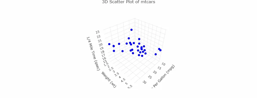
3D Scatterplot