Analyzing Google Play Store Reviews in R (original) (raw)
Last Updated : 23 Jul, 2025
Analyzing Google Play Store reviews can provide valuable insights into user sentiments, app performance, and areas for improvement. In this project, we'll explore how to analyze Google Play Store reviews using R Programming Language covering theoretical concepts, dataset creation, and multiple visualization examples to extract meaningful information from the reviews.
Understanding the Google Play Store Reviews
Google Play Store reviews provide users feedback and ratings for various mobile apps. Analyzing these reviews can help app developers understand users' sentiments, identify common themes or issues, and make data-driven decisions to enhance app performance and user experience.
Now take on practical example for Analyzing Google Play Store Reviews in R.
Creating a Sample Dataset
Let's create a sample dataset and then provide multiple visualization examples in R.
R `
Create a sample dataset for Google Play Store reviews
reviews <- data.frame(
reviewId = paste0("gp:", 1:1000), # Review ID
userName = sample(c("John Doe", "Alice Smith"), 1000, replace = TRUE), # User name
content = sample(c("Great app!", "Needs improvement."), 1000, replace = TRUE), # Review content
rating = sample(1:5, 1000, replace = TRUE), # Rating (1 to 5 stars)
sentiment = sample(c("Positive", "Negative", "Neutral"), 1000, replace = TRUE), # Sentiment
thumbsUpCount = sample(0:100, 1000, replace = TRUE), # Number of thumbs up
reviewCreatedVersion = sample(c("1.0", "2.0", "3.0"), 1000, replace = TRUE),
reviewTime = sample(seq(as.Date('2022-01-01'), as.Date('2022-12-31'), by="day"),
1000, replace = TRUE) # Review time
)
Show the first few rows of the dataset
head(reviews)
`
**Output:
reviewId userName content rating sentiment thumbsUpCount reviewCreatedVersion reviewTime
1 gp:1 Alice Smith Needs improvement. 1 Neutral 47 2.0 2022-03-15
2 gp:2 Alice Smith Great app! 5 Neutral 25 1.0 2022-01-03
3 gp:3 Alice Smith Needs improvement. 4 Negative 2 2.0 2022-09-22
4 gp:4 John Doe Great app! 3 Neutral 19 1.0 2022-08-03
5 gp:5 John Doe Needs improvement. 1 Positive 47 3.0 2022-01-31
6 gp:6 John Doe Great app! 4 Neutral 65 2.0 2022-06-27
- **reviewId: Unique identifier for each review.
- **userName: Name of the user who left the review.
- **content: Text content of the review.
- **rating: Rating given by the user (1 to 5 stars).
- **sentiment: Sentiment label of the review (Positive, Negative, or Neutral).
- **thumbsUpCount: Number of thumbs up given to the review.
- **reviewCreatedVersion: Version of the app when the review was created.
- **reviewTime: Date when the review was created.
Visualize Google Play Store Reviews in R
Here are multiple visualization examples for the provided Google Play Store reviews dataset:
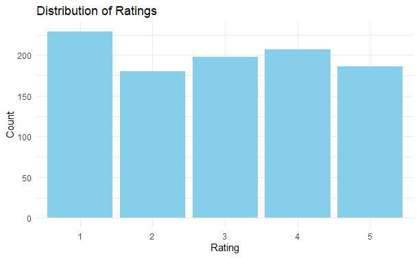
Distribution of Ratings
To visualize the distribution of ratings in the Google Play Store reviews dataset, we can create a histogram or a bar plot. Here's how you can do it using a bar plot:
R `
Load necessary library
library(ggplot2)
Bar plot of Rating distribution
ggplot(reviews, aes(x = factor(rating))) + geom_bar(fill = "skyblue") + labs(title = "Distribution of Ratings", x = "Rating", y = "Count") + theme_minimal()
`
**Output:
Analyzing Google Play Store Reviews in R
The code creates a bar plot showing the count of each rating value in the dataset. Each bar represents a rating value (1 to 5 stars), and the height of the bar represents the frequency or count of reviews with that rating.
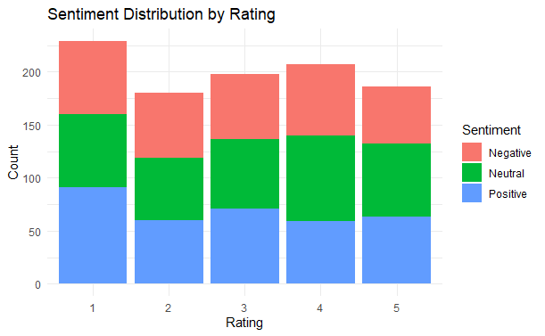
Sentiment Distribution by Rating
To visualize the sentiment distribution by rating in the Google Play Store reviews dataset, we can create a stacked bar plot. Here's how you can do it using ggplot2:
R `
Load necessary library
library(ggplot2)
Stacked bar plot of Sentiment distribution by Rating
ggplot(reviews, aes(x = factor(rating), fill = sentiment)) + geom_bar(position = "stack") + labs(title = "Sentiment Distribution by Rating", x = "Rating", y = "Count", fill = "Sentiment") + theme_minimal()
`
**Output:
Analyzing Google Play Store Reviews in R
This code creates a stacked bar plot where each bar represents a rating value (1 to 5 stars), and the height of each segment within the bar represents the count of reviews with a particular sentiment (positive, negative, neutral) for that rating value.
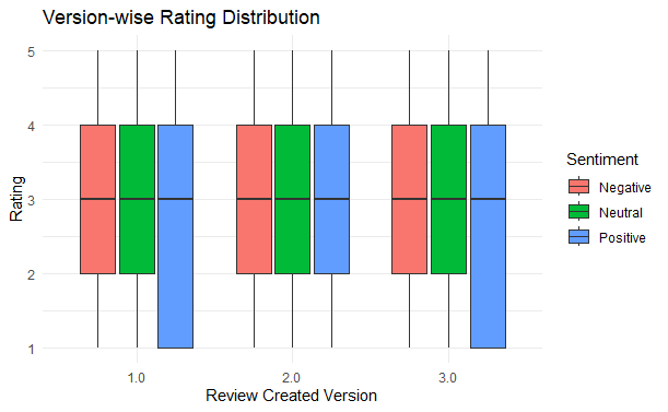
Version-wise Rating Distribution
To visualize the version-wise rating distribution in the Google Play Store reviews dataset, we can create a box plot. Here's how you can do it using ggplot2:
R `
Load necessary library
library(ggplot2)
Box plot of Version-wise Rating Distribution
ggplot(reviews, aes(x = reviewCreatedVersion, y = rating, fill = sentiment)) + geom_boxplot() + labs(title = "Version-wise Rating Distribution", x = "Review Created Version", y = "Rating", fill = "Sentiment") + theme_minimal()
`
**Output:
Analyzing Google Play Store Reviews in R
This code creates a box plot where each box represents the distribution of ratings for a specific version of the app. The box extends from the lower to the upper quartile values of the data, with a line at the median. The whiskers extend to the most extreme data points not considered outliers, and outliers are plotted individually.
Heatmap for Review Creation Time by Sentiment
R `
Convert reviewTime to month-year format
reviews$reviewMonthYear <- format(reviews$reviewTime, "%Y-%m")
Create a data frame for heatmap
heatmap_data <- table(reviews$reviewMonthYear, reviews$sentiment)
Generate heatmap
ggplot(data = as.data.frame(heatmap_data), aes(x = Var1, y = Var2, fill = Freq)) + geom_tile() + scale_fill_gradient(low = "lightblue", high = "darkblue") + labs(title = "Review Creation Time by Sentiment", x = "Month-Year", y = "Sentiment", fill = "Frequency") + theme(axis.text.x = element_text(angle = 45, vjust = 1, hjust = 1))
`
**Output:

Analyzing Google Play Store Reviews in R
The heatmap generated by this code visualizes the frequency of reviews over time, categorized by sentiment. Here is what the output tells us:
- **X-Axis (Month-Year): The horizontal axis represents the review creation time, aggregated by month and year.
- **Y-Axis (Sentiment): The vertical axis represents the sentiment of the reviews (e.g., Positive, Negative, Neutral).
- **Tiles: Each tile represents the count of reviews for a specific month-year and sentiment combination. The color intensity of the tile indicates the frequency:
- **Lighter Colors: Indicate lower frequencies of reviews.
- **Darker Colors: Indicate higher frequencies of reviews.
- **Interpretation: By examining the heatmap, you can quickly identify patterns and trends in the review data. For instance, you can see which months had a high number of negative reviews or if there was a surge of positive reviews at a particular time.
This visualization helps in understanding temporal trends in user sentiment, which can be valuable for identifying periods of high user dissatisfaction or satisfaction.
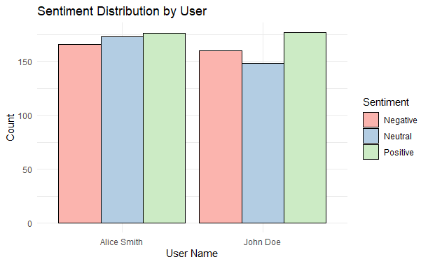
Sentiment Distribution by User
To visualize the sentiment distribution by user, we can create a bar plot that shows the count of each sentiment type for different users. This can help us understand how individual users are contributing to the overall sentiment of the reviews.
R `
Sentiment Distribution by User
ggplot(reviews, aes(x = userName, fill = sentiment)) + geom_bar(position = "dodge", color = "black") + theme_minimal() + scale_fill_brewer(palette = "Pastel1") + labs(title = "Sentiment Distribution by User", x = "User Name", y = "Count", fill = "Sentiment")
`
**Output:
Analyzing Google Play Store Reviews in R
This visualization helps in identifying which users are more negative or positive in their feedback, providing insights into user behavior and sentiment trends.
Pie Chart of Sentiment Distribution
reating a pie chart to visualize the sentiment distribution is a great way to understand the overall sentiment of the reviews at a glance.
R `
Pie Chart of Sentiment Distribution
reviews %>% count(sentiment) %>% ggplot(aes(x = "", y = n, fill = sentiment)) + geom_bar(stat = "identity", width = 1) + coord_polar("y") + theme_minimal() + scale_fill_brewer(palette = "Pastel2") + labs(title = "Pie Chart of Sentiment Distribution", fill = "Sentiment")
`
**Output:

Analyzing Google Play Store Reviews in R
pie chart shows the sentiment distribution of the reviews. The chart will have slices of different sizes and colors representing the count of positive, negative, and neutral reviews.
- **Positive Sentiment: If the positive sentiment slice is larger, it indicates that most reviews are positive.
- **Negative Sentiment: If the negative sentiment slice is larger, it indicates that most reviews are negative.
- **Neutral Sentiment: If the neutral sentiment slice is visible, it indicates that there are some reviews that are neither positive nor negative.
This visualization provides a quick overview of the overall sentiment in the reviews, which is useful for understanding customer satisfaction and areas for improvement.
Conclusion
Analyzing Google Play Store reviews in R provides insights into user satisfaction, app performance, and areas for improvement. Visualizations like sentiment distribution pie charts, time series plots, and version-wise rating analysis help identify trends and user feedback patterns. Key takeaways include addressing negative feedback, enhancing positively reviewed features, and monitoring updates closely. Engaging with users based on their reviews fosters loyalty and improves app quality. Continuous analysis aids in prioritizing development efforts and improving user experience.