Retail Store Location Analysis in R (original) (raw)
Last Updated : 23 Jul, 2025
Choosing the right location for a retail store is crucial for its success. Location analysis involves examining various factors such as demographics, foot traffic, competition, and accessibility to determine the most favorable sites. In this article, we will explore how to perform retail store location analysis using R Programming Language a powerful tool for statistical analysis and data visualization.
Objectives and Goals
The main objectives of this article are:
- To highlight the importance of location analysis for retail stores.
- To demonstrate the use of R for analyzing potential store locations.
- To provide insights and recommendations based on the analysis to aid in decision-making.
Location Analysis
Location analysis in R involves several steps:
- **Data Preprocessing: Clean and prepare the data for analysis by handling missing values, normalizing data, and ensuring consistency.
- **Descriptive Statistics: Summarize the data to understand key metrics and trends.
- **Geospatial Analysis: Use geographic information system (GIS) tools in R to visualize and analyze the spatial distribution of data points.
- **Cluster Analysis: Identify clusters of high-performing stores using clustering algorithms.
- **Regression Analysis: Use regression models to identify factors that significantly impact sales performance.
Creating the Dataset
To start with, we need a dataset that includes information relevant to retail store locations. This can include data on potential locations, demographic information, competition, foot traffic, and other relevant variables. For this example, we'll create a synthetic dataset with the following variables:
- Location ID
- Latitude
- Longitude
- Population
- Median Income
- Competitor Count
- Foot Traffic
Here is a code snippet to create such a dataset in R:
R `
Load necessary libraries
library(tidyverse)
Set seed for reproducibility
set.seed(123)
Create synthetic dataset
n <- 100 dataset <- tibble( location_id = 1:n, latitude = runif(n, 40, 41), # Latitude range longitude = runif(n, -74, -73), # Longitude range population = round(runif(n, 5000, 50000)), median_income = round(runif(n, 30000, 100000)), competitor_count = round(runif(n, 0, 10)), foot_traffic = round(runif(n, 200, 2000)) )
View the dataset
print(dataset)
`
**Output:
A tibble: 100 × 7
location_id latitude longitude population median_income competitor_count
1 1 40.3 -73.4 15743 84920 10
2 2 40.8 -73.7 48306 30660 1
3 3 40.4 -73.5 32061 84535 9
4 4 40.9 -73.0 28176 81057 6
5 5 40.9 -73.5 23116 74109 4
6 6 40.0 -73.1 44611 63664 4
7 7 40.5 -73.1 21384 40965 7
8 8 40.9 -73.4 17971 30575 1
9 9 40.6 -73.6 12679 61672 3
10 10 40.5 -73.9 12748 64461 7
Visualizing the Data
Visualization is key to understanding the geographical and statistical aspects of potential retail locations. We will use several visualization techniques to explore our dataset.
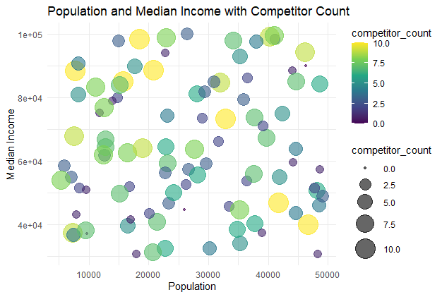
Population and Median Income with Competitor Count
A bubble chart showing the relationship between population, median income, and competitor count.
R `
Bubble Chart: Population and Median Income with Competitor Count
ggplot(dataset, aes(x = population, y = median_income, size = competitor_count, color = competitor_count)) + geom_point(alpha = 0.6) + scale_size_continuous(range = c(1, 10)) + scale_color_viridis_c() + ggtitle('Population and Median Income with Competitor Count') + xlab('Population') + ylab('Median Income') + theme_minimal()
`
**Output:
Retail Store Location Analysis in R
The bubble chart visualizes the relationship between population and median income, with bubble sizes and colors representing competitor count. Larger and darker bubbles indicate locations with more competitors.
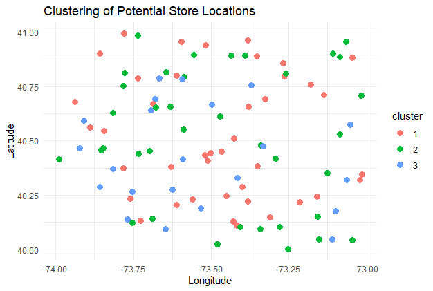
Clustering of Locations
Clustering helps to group locations based on their characteristics.
R `
Load necessary library for clustering
library(cluster)
Perform k-means clustering
set.seed(123) clusters <- kmeans(dataset %>% select(population, median_income, competitor_count, foot_traffic), centers = 3)
Add cluster information to the dataset
dataset <- dataset %>% mutate(cluster = as.factor(clusters$cluster))
Visualize clusters
ggplot(dataset, aes(x = longitude, y = latitude, color = cluster)) + geom_point(size = 3) + ggtitle("Clustering of Potential Store Locations") + xlab("Longitude") + ylab("Latitude") + theme_minimal()
`
**Output:
Retail Store Location Analysis in R
Each color represents a cluster of locations with similar characteristics. This can help identify areas with similar potential for retail success, facilitating targeted strategies for different regions.
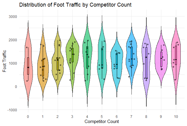
Distribution of Foot Traffic by Competitor Count
A violin plot showing the distribution of foot traffic by competitor count.
R `
Violin Plot: Distribution of Foot Traffic by Competitor Count
ggplot(dataset, aes(x = factor(competitor_count), y = foot_traffic, fill = factor(competitor_count))) + geom_violin(trim = FALSE, alpha = 0.6) + geom_boxplot(width = 0.1, color = "black", alpha = 0.8, outlier.shape = NA) + geom_jitter(shape = 16, position = position_jitter(0.2), color = "black", alpha = 0.5) + ggtitle('Distribution of Foot Traffic by Competitor Count') + xlab('Competitor Count') + ylab('Foot Traffic') + theme_minimal() + theme(legend.position = "none")
`
**Output:
Retail Store Location Analysis in R
The violin plot shows the distribution of foot traffic for different competitor counts, with embedded box plots and jittered points providing detailed data insights.
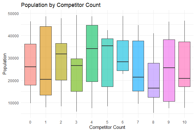
Population by Competitor Count
A box plot showing the population distribution across different competitor counts.
R `
Box Plot: Population by Competitor Count
ggplot(dataset, aes(x = factor(competitor_count), y = population, fill = factor(competitor_count))) + geom_boxplot(alpha = 0.6) + ggtitle('Population by Competitor Count') + xlab('Competitor Count') + ylab('Population') + theme_minimal() + theme(legend.position = "none")
`
**Output:
Retail Store Location Analysis in R
The box plot displays the population distribution for each competitor count, highlighting medians, quartiles, and outliers for comparison.
Distribution of Median Income
A histogram showing the distribution of median income.
R `
Histogram: Distribution of Median Income
ggplot(dataset, aes(x = median_income)) + geom_histogram(binwidth = 5000, fill = "blue", color = "black", alpha = 0.6) + ggtitle('Distribution of Median Income') + xlab('Median Income') + ylab('Frequency') + theme_minimal()
`
**Output:
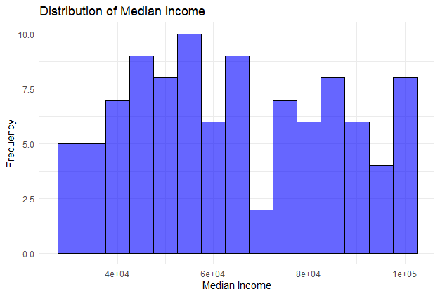
Retail Store Location Analysis in R
The histogram illustrates the frequency distribution of median income values, allowing for easy identification of income ranges and central tendencies.
Average Foot Traffic by Competitor Count
A bar chart showing the average foot traffic for different competitor counts.
R `
Calculate average foot traffic by competitor count
average_foot_traffic <- dataset %>% group_by(competitor_count) %>% summarize(average_foot_traffic = mean(foot_traffic))
Plotting
ggplot(average_foot_traffic, aes(x = factor(competitor_count), y = average_foot_traffic, fill = factor(competitor_count))) + geom_bar(stat = "identity", alpha = 0.6) + ggtitle('Average Foot Traffic by Competitor Count') + xlab('Competitor Count') + ylab('Average Foot Traffic') + theme_minimal() + theme(legend.position = "none")
`
**Output:
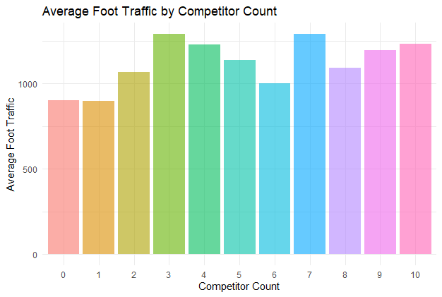
Retail Store Location Analysis in R
The bar chart displays the average foot traffic for each competitor count, providing insights into how competition affects foot traffic at different locations.
Conclusion
Advanced data visualization techniques in R provide powerful tools for retail store location analysis. By creating and visualizing datasets with various types of charts, businesses can gain deep insights into potential store locations. These visualizations help in understanding geographical distribution, population density, income levels, competitor presence, and foot traffic, enabling informed decision-making for optimal store placement.