Scaffold class in Flutter with Examples (original) (raw)
Last Updated : 28 Feb, 2025
The **Scaffold is a class in **flutter that provides many widgets or we can say APIs. The **Scaffold will expand or occupy the whole available space in device screen .
The class Hierarchy is as follows:
Object
↳ Diagnosticable
↳ Diagnosticable Tree
↳ Widget
↳ StateFul Widget
↳ Scaffold
**The constructor of the Scaffold class:
const Scaffold({
Key key,
this.appBar,
this.body,
this.floatingActionButton,
this.floatingActionButtonLocation,
this.floatingActionButtonAnimator,
this.persistentFooterButtons,
this.drawer,
this.endDrawer,
this.bottomNavigationBar,
this.bottomSheet,
this.backgroundColor,
this.resizeToAvoidBottomPadding,
this.resizeToAvoidBottomInset,
this.primary = true,
this.drawerDragStartBehavior = DragStartBehavior.start,
this.extendBody = false,
this.drawerScrimColor,
})
**Properties of Scaffold Class
| Aspect | Description |
|---|---|
| **app-Bar | It displays a horizontal bar which mainly placed at the top of the _Scaffold. _appBar uses the widget _AppBar which has its own properties like title, leading, actions , etc. |
| body | It will display the main or primary content in the Scaffold. It is below the _appBar and under the _floatingActionButton. The widgets inside the body are at the left-corner by default. |
| **floatingActionButton | _FloatingActionButton is a button that is placed at the right bottom corner by default. _FloatingActionButton is an icon button that floats over the content of the screen at a fixed place. If we scroll the page its position won't change, it will be fixed. |
| **drawer | _drawer is a slider menu or a panel which is displayed at the side of the Scaffold. The user has to swipe left to right or right to left according to the action defined to access the drawer menu. In the Appbar, an appropriate icon for the drawer is set automatically at a particular position. The gesture to open the drawer is also set automatically. It is handled by the Scaffold. |
| **bottomNavigationBar | _bottomNavigationBar is like a menu at the bottom of the Scaffold. We have seen this navigationbar in most of the applications. We can add multiple icons or texts or both in the bar as items. |
| **backgroundColor | used to set the color of the whole _Scaffold widget. |
| **floatingActionButtonAnimator | used to provide animation to move _floatingActionButton. |
| **primary | it is a Boolean value used to tell whether the _Scaffold will be displayed at the top of the screen or not.if true then Appbar contains some top padding else top padding won't applied. by default it set to true. |
| **drawerScrimColor | used to define the color for the primary content while a drawer is open. |
| **bottomSheet | This property takes in a widget (final) as the object to display it at the bottom of the screen. |
| **drawerDragStartBehaviour | This property holds _DragStartBehavior enum as the object to determine the drag behaviour of the drawer. |
| **drawerEdgeDragWidth | This determines the area under which a swipe or a drag will result in the opening of the drawer. And it takes in a _double as the object. |
| **drawerEnableOpenGesture | This property holds in a _boolean value as the object to determine the drag gesture will open the drawer or not, by default it is set to true. |
| **endDrawer | The _endDrawerproperty takes in a widget as the parameter. It is similar to the Drawer, except the fact it opens in the opposite direction. |
| **endDrawerEnableOpenGesture | Again this property takes in a _boolean value as the object to determine whether the drag gesture will open the _endDrawer or not. |
| **extendBody | The extendBody property takes in a _boolean as the object. By default, this property is always false but it must not be null. If it is set to true in the presence of a _bottomNavigationBar or _persistentFooterButtons, the height of these is added to the body and they are shifted beneath the body. |
| **extendBodyBehindAppBar | This property also takes in a _boolean as the object. By default, this property is always false but it must not be null. If it is set to true the _app-Bar instead of being on the body is extended above it and its height is added to the body. This property is used when the color of the _app-Bar is not fully opaque. |
| floatingActionButtonLocation | This property is responsible for the location of the _floating Action Button. |
| **persistentFooterButtons | This property takes in a list of widgets. Which are usually buttons that are displayed underneath the _scaffold. |
| **resizeToAvoidBottomInset | This property takes in a B__oolean_ value as the object. If set to true then the floating widgets on the _scaffold resize themselves to avoid getting in the way of the on-screen keyboard. |
Example of Scaffold Class in Flutter
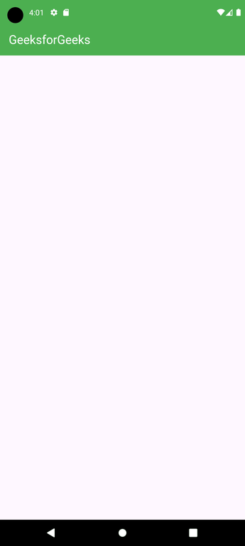
**1. app-Bar
Below is the example of app-Bar:
Dart `
Widget build(BuildContext context) { return Scaffold( // App bar with a title appBar: AppBar( backgroundColor: Colors.green, title: const Text( "GeeksforGeeks", style: TextStyle(color: Colors.white), ), ),
`
**Output:
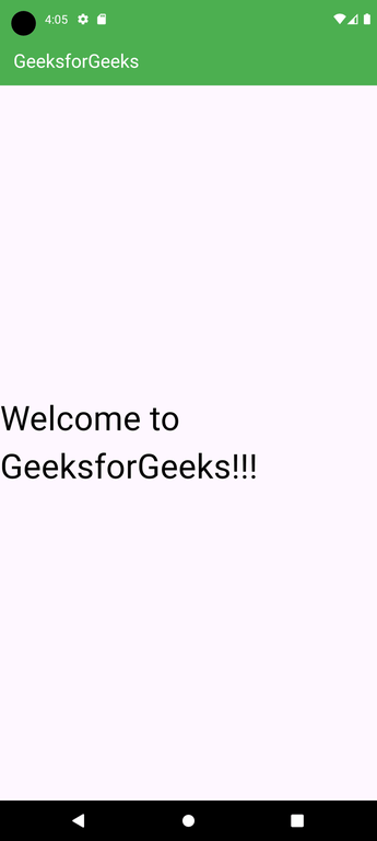
**2. body
Below is the example of body:
Dart `
Widget build(BuildContext context) { return Scaffold( // App bar with a green background and a title appBar: AppBar( backgroundColor: Colors.green, title: const Text( "GeeksforGeeks", style: TextStyle(color: Colors.white), ), ), // Centered body text body: const Center( child: Text( "Welcome to GeeksforGeeks!!!", style: TextStyle( color: Colors.black, fontSize: 40.0, ), ), ), ); }
`
In this example, we have displayed the text _Welcome to GeeksforGeeks!!! in the body. We have displayed the text in the center of the page using _Center widget. For styling the text, we have used _TextStyle widget.
**Output:
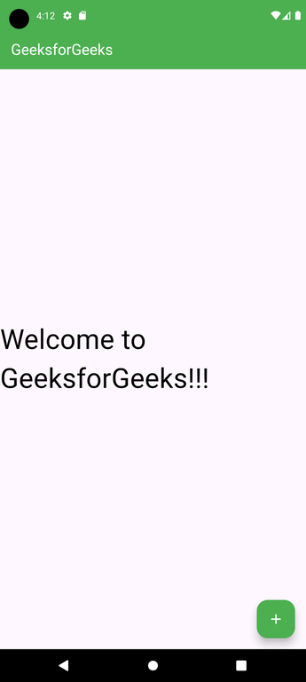
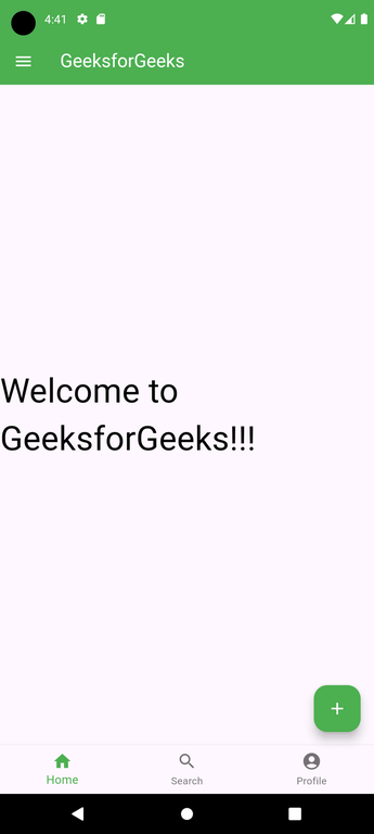
**3. floatingActionButton
Below is the implementation of floatingActionButton:
Dart `
Widget build(BuildContext context) { return Scaffold( // App bar with a green background and a title appBar: AppBar( backgroundColor: Colors.green, title: const Text( "GeeksforGeeks", style: TextStyle(color: Colors.white), ), ), // Centered body text body: const Center( child: Text( "Welcome to GeeksforGeeks!!!", style: TextStyle( color: Colors.black, fontSize: 40.0, ), ), ), // Floating action button with an add icon floatingActionButton: FloatingActionButton( backgroundColor: Colors.green, elevation: 10.0, child: const Icon( Icons.add, color: Colors.white, ), onPressed: () { // Action on button press }, ), ); }
`
Here the elevation property is used to give a shadow effect to the button. _Icon is used to put the icon of the button using some preloaded icons in flutter SDK. The _onPressed() is a function that will be called when the button is pressed and the statements inside the function will be executed.
**Output:
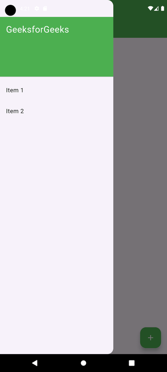
**4. drawer
Below is the Example of drawer:
Dart `
  drawer: Drawer(
    child: ListView(
      children: const <Widget>[
        DrawerHeader(
          decoration: BoxDecoration(
            color: Colors.green,
          ),
          child: Text(
            'GeeksforGeeks',
            style: TextStyle(
              color: Colors.white,
              fontSize: 24,
            ),
          ),
        ),
        ListTile(
          title: Text('Item 1'),
        ),
        ListTile(
          title: Text('Item 2'),
        ),
      ],
    ),
  ),
`
As a parent widget we took _ListView and inside it, we divided the panel into two parts, Header and Menu._DrawerHeader is used to modify the header of the panel. In header we can display icon or details of user according to the application. We have used _ListTile to add the items to the menu.
**Output:
We can also add icons before the items using the property _leading of _ListTile, inside which we have to use the _Icon widget.
**Example:
Dart `
ListTile( title : Text('Item 1'), leading : Icon(Icons.people), ), ListTile( title : Text('Item 2'), leading : Icon(Icons.mail), ),
`
**Output:

**5. bottomNavigationBar
Below is the implementation of bottomNavigationBar:
Dart `
bottomNavigationBar: BottomNavigationBar( currentIndex: 0, fixedColor: Colors.green, items: const [ BottomNavigationBarItem( label: "Home", icon: Icon(Icons.home), ), BottomNavigationBarItem( label: "Search", icon: Icon(Icons.search), ), BottomNavigationBarItem( label: "Profile", icon: Icon(Icons.account_circle), ), ], onTap: (int indexOfItem) {}),
`
We use _BottomNavigationBar widget to display the bar. For the color of active icon, we use the _fixedColor property. To add items in the bar we use _BottomNavigationBarItems widget, inside which we give text and icon. For the action performed on the tapping on the items, we have _onTap(int indexOfItem) function which works according to the index position of the item.
**Output:
**Full code (main.dart):
Dart `
import 'package:flutter/material.dart';
void main() { runApp(MyApp()); }
class MyApp extends StatelessWidget { @override Widget build(BuildContext context) { return MaterialApp( debugShowCheckedModeBanner: false, title: 'Scaffold Example', home: MyHomePage(), ); } }
class MyHomePage extends StatefulWidget { @override _MyHomePageState createState() => _MyHomePageState(); }
class _MyHomePageState extends State { int _selectedIndex = 0;
// Method to handle bottom navigation bar item taps void _onItemTapped(int index) { setState(() { _selectedIndex = index; }); }
@override Widget build(BuildContext context) { return Scaffold( appBar: AppBar( title: Text('Scaffold Example'), foregroundColor: Colors.white, backgroundColor: Colors.green, ), body: Center( child: Text( 'Selected Index: $_selectedIndex', style: TextStyle(fontSize: 24, color: Colors.black), ), ), floatingActionButton: FloatingActionButton( onPressed: () { ScaffoldMessenger.of(context).showSnackBar( SnackBar(content: Text('Floating Action Button Pressed')), ); }, child: Icon( Icons.add, color: Colors.white, ), backgroundColor: Colors.green, ), drawer: Drawer( child: ListView( padding: EdgeInsets.zero, children: [ DrawerHeader( decoration: BoxDecoration( color: Colors.green, ), child: Text( 'GeeksforGeeks', style: TextStyle( color: Colors.white, fontSize: 24, ), ), ), ListTile( title: Text('Item 1'), onTap: () { // Handle item 1 tap Navigator.pop(context); }, ), ListTile( title: Text('Item 2'), onTap: () { // Handle item 2 tap Navigator.pop(context); }, ), ], ), ), endDrawer: Drawer( child: ListView( padding: EdgeInsets.zero, children: [ DrawerHeader( decoration: BoxDecoration( color: Colors.blue, ), child: Text( 'End Drawer', style: TextStyle( color: Colors.white, fontSize: 24, ), ), ), ListTile( title: Text('End Drawer Item 1'), onTap: () { Navigator.pop(context); }, ), ], ), ), bottomNavigationBar: BottomNavigationBar( items: const [ BottomNavigationBarItem( icon: Icon(Icons.home), label: 'Home', ), BottomNavigationBarItem( icon: Icon(Icons.search), label: 'Search', ), BottomNavigationBarItem( icon: Icon(Icons.person), label: 'Profile', ), ], currentIndex: _selectedIndex, selectedItemColor: Colors.green, onTap: _onItemTapped, ), persistentFooterButtons: [ TextButton( onPressed: () {}, child: Text('Footer Button 1'), ), TextButton( onPressed: () {}, child: Text('Footer Button 2'), ), ], backgroundColor: Colors.white, resizeToAvoidBottomInset: false, drawerScrimColor: Colors.black.withOpacity(0.5), ); } }
`
**Output: