Time Series Analysis & Visualization in Python (original) (raw)
Every dataset has distinct qualities that function as essential aspects in the field of data analytics, providing insightful information about the underlying data. Time series data is one kind of dataset that is especially important. This article delves into the complexities of time series datasets, examining their unique features and how they may be utilized to gain significant insights.
**What are time series visualization and analytics?
Time series visualization and analytics empower users to graphically represent time-based data, enabling the identification of trends and the tracking of changes over different periods. This data can be presented through various formats, such as line graphs, gauges, tables, and more.
The utilization of time series visualization and analytics facilitates the extraction of insights from data, enabling the generation of forecasts and a comprehensive understanding of the information at hand. Organizations find substantial value in time series data as it allows them to analyze both real-time and historical metrics.
What is Time Series Data?
Time series data is a sequential arrangement of data points organized in consecutive time order. Time-series analysis consists of methods for analyzing time-series data to extract meaningful insights and other valuable characteristics of the data.
Importance of time series analysis
Time-series data analysis is becoming very important in so many industries, like financial industries, pharmaceuticals, social media companies, web service providers, research, and many more. To understand the time-series data, visualization of the data is essential. In fact, any type of data analysis is not complete without visualizations, because one good visualization can provide meaningful and interesting insights into the data.
Basic Time Series Concepts
- **Trend: A trend represents the general direction in which a time series is moving over an extended period. It indicates whether the values are increasing, decreasing, or staying relatively constant.
- **Seasonality: Seasonality refers to recurring patterns or cycles that occur at regular intervals within a time series, often corresponding to specific time units like days, weeks, months, or seasons.
- **Moving average: The moving average method is a common technique used in time series analysis to smooth out short-term fluctuations and highlight longer-term trends or patterns in the data. It involves calculating the average of a set of consecutive data points, referred to as a “window” or “rolling window,” as it moves through the time series
- **Noise: Noise, or random fluctuations, represents the irregular and unpredictable components in a time series that do not follow a discernible pattern. It introduces variability that is not attributable to the underlying trend or seasonality.
- **Differencing: Differencing is used to make the difference in values of a specified interval. By default, it’s one, we can specify different values for plots. It is the most popular method to remove trends in the data.
- **Stationarity: A stationary time series is one whose statistical properties, such as mean, variance, and autocorrelation, remain constant over time.
- **Order: The order of differencing refers to the number of times the time series data needs to be differenced to achieve stationarity.
- **Autocorrelation: Autocorrelation, is a statistical method used in time series analysis to quantify the degree of similarity between a time series and a lagged version of itself.
- **Resampling: Resampling is a technique in time series analysis that involves changing the frequency of the data observations. It’s often used to transform the data to a different frequency (e.g., from daily to monthly) to reveal patterns or trends more clearly.
Types of Time Series Data
Time series data can be broadly classified into two sections:
****1. Continuous Time Series Data:**Continuous time series data involves measurements or observations that are recorded at regular intervals, forming a seamless and uninterrupted sequence. This type of data is characterized by a continuous range of possible values and is commonly encountered in various domains, including:
- _Temperature Data: Continuous recordings of temperature at consistent intervals (e.g., hourly or daily measurements).
- _Stock Market Data: Continuous tracking of stock prices or values throughout trading hours.
- _Sensor Data: Continuous measurements from sensors capturing variables like pressure, humidity, or air quality.
2. **Discrete Time Series Data: Discrete time series data, on the other hand, consists of measurements or observations that are limited to specific values or categories. Unlike continuous data, discrete data does not have a continuous range of possible values but instead comprises distinct and separate data points. Common examples include:
- _Count Data: Tracking the number of occurrences or events within a specific time period.
- _Categorical Data: Classifying data into distinct categories or classes (e.g., customer segments, product types).
- _Binary Data: Recording data with only two possible outcomes or states.
**Visualization Approach for Different Data Types:
- Plotting data in a **continuous time series can be effectively represented graphically using line, area, or smooth plots, which offer insights into the dynamic behavior of the trends being studied.
- To show patterns and distributions within discrete time series data, bar charts, histograms, and stacked bar plots are frequently utilized. These methods provide insights into the distribution and frequency of particular occurrences or categories throughout time.
Time Series Data Visualization using Python
We will use Python libraries for visualizing the data. The link for the dataset can be found here. We will perform the visualization step by step, as we do in any time-series data project.
Importing the Libraries
We will import all the libraries that we will be using throughout this article in one place so that do not have to import every time we use it this will save both our time and effort.
- **Numpy – A Python library that is used for numerical mathematical computation and handling multidimensional ndarray, it also has a very large collection of mathematical functions to operate on this array.
- **Pandas **– A Python library built on top of NumPy for effective matrix multiplication and dataframe manipulation, it is also used for data cleaning, data merging, data reshaping, and data aggregation.
- **Matplotlib – It is used for plotting 2D and 3D visualization plots, it also supports a variety of output formats including graphs for data. Python `
import pandas as pd import numpy as np import seaborn as sns import matplotlib.pyplot as plt from statsmodels.graphics.tsaplots import plot_acf from statsmodels.tsa.stattools import adfuller
`
Loading The Dataset
To load the dataset into a dataframe we will use the pandas read_csv() function. We will use head() function to print the first five rows of the dataset. Here we will use the ‘**parse_dates’ parameter in the read_csv function to convert the ‘Date’ column to the DatetimeIndex format. By default, Dates are stored in string format which is not the right format for time series data analysis.
Python `
reading the dataset using read_csv
df = pd.read_csv("stock_data.csv", parse_dates=True, index_col="Date")
displaying the first five rows of dataset
df.head()
`
**Output:
Unnamed: 0 Open High Low Close Volume Name Date
2013-02-08 NaN 15.07 15.12 14.63 14.75 8407500 AAL
2013-02-11 NaN 14.89 15.01 14.26 14.46 8882000 AAL
2013-02-12 NaN 14.45 14.51 14.10 14.27 8126000 AAL
2013-02-13 NaN 14.30 14.94 14.25 14.66 10259500 AAL
2013-02-14 NaN 14.94 14.96 13.16 13.99 31879900 AAL
Dropping Unwanted Columns
We will drop columns from the dataset that are not important for our visualization.
Python `
deleting column
df.drop(columns='Unnamed: 0', inplace =True) df.head()
`
**Output:
Date Open High Low Close Volume Name
2013-02-08 15.07 15.12 14.63 14.75 8407500 AAL
2013-02-11 14.89 15.01 14.26 14.46 8882000 AAL
2013-02-12 14.45 14.51 14.10 14.27 8126000 AAL
2013-02-13 14.30 14.94 14.25 14.66 10259500 AAL
2013-02-14 14.94 14.96 13.16 13.99 31879900 AAL
**Plotting Line plot for Time Series data:
Since, the volume column is of continuous data type, we will use line graph to visualize it.
Python `
Assuming df is your DataFrame
sns.set(style="whitegrid") # Setting the style to whitegrid for a clean background
plt.figure(figsize=(12, 6)) # Setting the figure size sns.lineplot(data=df, x='Date', y='High', label='High Price', color='blue')
Adding labels and title
plt.xlabel('Date') plt.ylabel('High') plt.title('Share Highest Price Over Time')
plt.show()
`
**Output:
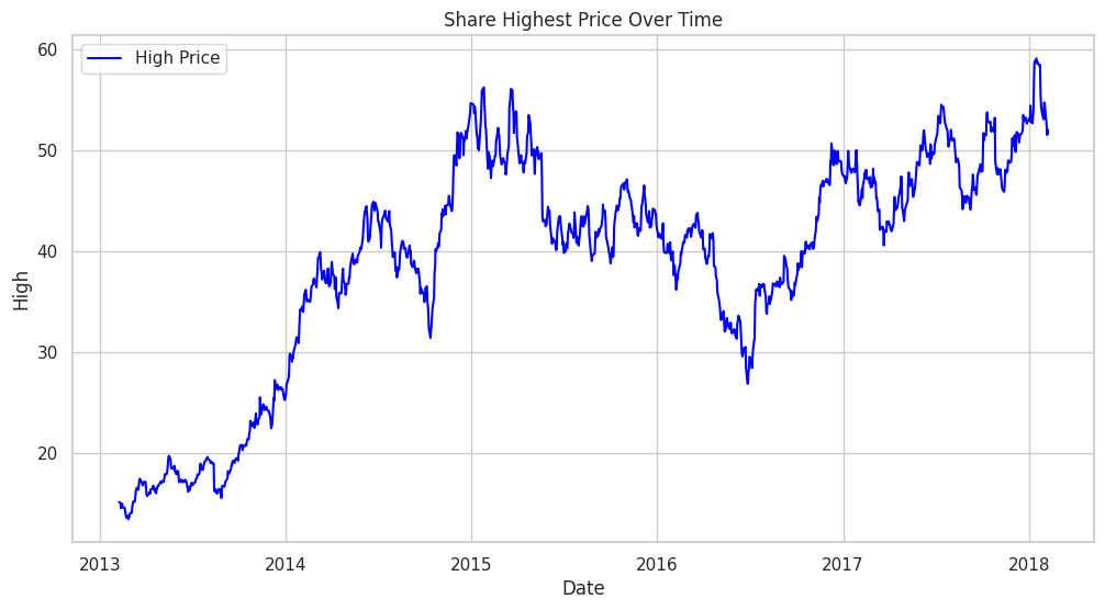
Line plot
Resampling
To better understand the trend of the data we will use the resampling method, resampling the data on a monthly basis can provide a clearer view of trends and patterns, especially when we are dealing with daily data.
Python `
Assuming df is your DataFrame with a datetime index
df_resampled = df.resample('M').mean(numeric_only=True) # Resampling to monthly frequency, using mean as an aggregation function
sns.set(style="whitegrid") # Setting the style to whitegrid for a clean background
Plotting the 'high' column with seaborn, setting x as the resampled 'Date'
plt.figure(figsize=(12, 6)) # Setting the figure size sns.lineplot(data=df_resampled, x=df_resampled.index, y='High', label='Month Wise Average High Price', color='blue')
Adding labels and title
plt.xlabel('Date (Monthly)') plt.ylabel('High') plt.title('Monthly Resampling Highest Price Over Time')
plt.show()
This code is modified by Susobhan Akhuli
`
**Output:
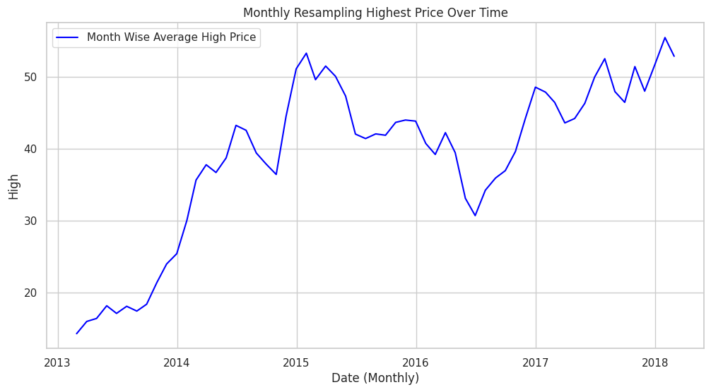
line plot
We have observed an upward **trend in the resampled monthly volume data. An upward trend indicates that, over the monthly intervals, the “high” column tends to increase over time.
Detecting Seasonality Using Auto Correlation
We will detect Seasonality using the autocorrelation function (ACF) plot. Peaks at regular intervals in the ACF plot suggest the presence of seasonality.
Python `
Check if 'Date' is already the index
if 'Date' not in df.columns: print("'Date' is already the index or not present in the DataFrame.") else: df.set_index('Date', inplace=True)
Plot the ACF
plt.figure(figsize=(12, 6)) plot_acf(df['Volume'], lags=40) # You can adjust the number of lags as needed plt.xlabel('Lag') plt.ylabel('Autocorrelation') plt.title('Autocorrelation Function (ACF) Plot') plt.show()
This code is modified by Susobhan Akhuli
`
**Output:
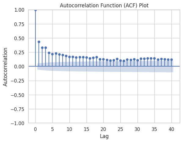
Autocorrelation Function
The presence of seasonality is typically indicated by peaks or spikes at regular intervals, as there are none there is no seasonality in our data.
Detecting Stationarity
We will perform the ADF test to formally test for stationarity.
The test is based on the;
- Null hypothesis that a unit root is present in the time series, indicating that the series is non-stationary.
- The alternative hypothesis is that the series is stationary after differencing (i.e., it has no unit root).
The ADF test employs an augmented regression model that includes lagged differences of the series to determine the presence of a unit root.
Python `
from statsmodels.tsa.stattools import adfuller
Assuming df is your DataFrame
result = adfuller(df['High']) print('ADF Statistic:', result[0]) print('p-value:', result[1]) print('Critical Values:', result[4])
`
**Output:
ADF Statistic: -2.0394210870439844
p-value: 0.2695601609296777
Critical Values: {'1%': -3.4355629707955395, '5%': -2.863842063387667, '10%': -2.567995644141416}
- Based on the ADF Statistici.e > all Critical Values, So, we accept the null hypothesis and conclude that the data does not appear to be stationary according to the Augmented Dickey-Fuller test.
- This suggests that differencing or other transformations may be needed to achieve stationarity before applying certain time series models.
Smoothening the data using Differencing and Moving Average
Differencing involves subtracting the previous observation from the current observation to remove trends or seasonality.
Python `
Differencing
df['high_diff'] = df['High'].diff()
Plotting
plt.figure(figsize=(12, 6)) plt.plot(df['High'], label='Original High', color='blue') plt.plot(df['high_diff'], label='Differenced High', linestyle='--', color='green') plt.legend() plt.title('Original vs Differenced High') plt.show()
`
**Output:
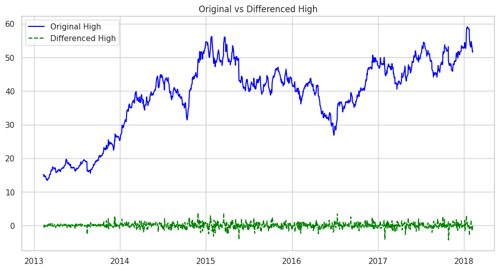
Original vs Differenced High
The df['High'].diff() part calculates the difference between consecutive values in the ‘High’ column. This differencing operation is commonly used to transform a time series into a new series that represents the changes between consecutive observations.
Python `
Moving Average
window_size = 120 df['high_smoothed'] = df['High'].rolling(window=window_size).mean()
Plotting
plt.figure(figsize=(12, 6))
plt.plot(df['High'], label='Original High', color='blue') plt.plot(df['high_smoothed'], label=f'Moving Average (Window={window_size})', linestyle='--', color='orange')
plt.xlabel('Date') plt.ylabel('High') plt.title('Original vs Moving Average') plt.legend() plt.show()
`
**Output:
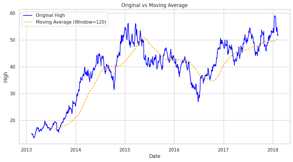
Original vs Moving Average
This calculates the moving average of the ‘High’ column with a window size of 120(A quarter) , creating a smoother curve in the ‘high_smoothed’ series. The plot compares the original ‘High’ values with the smoothed version.Now let’s plot all other columns using a subplot.
Original Data Vs Differenced Data
Printing the original and differenced data side by side we get;
Python `
Create a DataFrame with 'high' and 'high_diff' columns side by side
df_combined = pd.concat([df['High'], df['high_diff']], axis=1)
Display the combined DataFrame
print(df_combined.head())
`
**Output:
High high_diff Date
2013-02-08 15.12 NaN
2013-02-11 15.01 -0.11
2013-02-12 14.51 -0.50
2013-02-13 14.94 0.43
2013-02-14 14.96 0.02
Hence, the ‘high_diff’ column represents the differences between consecutive high values .The first value of ‘high_diff’ is NaN because there is no previous value to calculate the difference.
As, there is a NaN value we will drop that proceed with our test,
Python `
Remove rows with missing values
df.dropna(subset=['high_diff'], inplace=True) df['high_diff'].head()
`
**Output:
high_diff Date
2013-02-11 -0.11
2013-02-12 -0.50
2013-02-13 0.43
2013-02-14 0.02
2013-02-15 -0.35
dtype: float64
After that if we conduct the ADF test;
Python `
from statsmodels.tsa.stattools import adfuller
Assuming df is your DataFrame
result = adfuller(df['high_diff']) print('ADF Statistic:', result[0]) print('p-value:', result[1]) print('Critical Values:', result[4])
`
**Output:
ADF Statistic: -30.782419342418
p-value: 0.0
Critical Values: {'1%': -3.4355629707955395, '5%': -2.863842063387667, '10%': -2.567995644141416}
- Based on the ADF Statistici.e < all Critical Values, So, we reject the null hypothesis and conclude that we have enough evidence to reject the null hypothesis. The data appear to be stationary according to the Augmented Dickey-Fuller test.
- This suggests that differencing or other transformations may be needed to achieve stationarity before applying certain time series models.
You can download the dataset and source code from here:
- **Dataset: Stock Dataset
- **Source Code: Time series analysis and visualization