What is Widgets in Flutter? (original) (raw)
Last Updated : 09 Apr, 2025
Flutter is Google's UI toolkit for crafting beautiful, natively compiled iOS and Android apps from a single code base. To build any application we start with widgets - The building block of Flutter applications. Widgets describe what their view should look like given their current configuration and state. It includes a text widget, row widget, column widget, container widget, and many more.
What are Widgets?
Each element on the screen of the Flutter app is a widget. The view of the screen completely depends upon the choice and sequence of the widgets used to build the apps. The structure of the code of apps is a tree of widgets.
**Category of Widgets
There are mainly 14 categories into which the flutter widgets are divided. They are mainly segregated on the basis of the functionality they provide in a flutter application.
**Design systems
| Widgets | Description |
|---|---|
| Cupertino | These are the iOS-designed widgets. |
| Material Components | This is a set of widgets that mainly follow the material design by Google. |
**Base widgets
| **Widgets | Description |
|---|---|
| Accessibility | These are the set of widgets that make a Flutter app more easily accessible. |
| Animation and Motion | These widgets add animation to other widgets. |
| Assets, Images, and Icons | These widgets take charge of assets such as display images and show icons. |
| Async | These provide async functionality in the Flutter application. |
| Basics | These are the bundle of widgets that are necessary for the development of any Flutter application. |
| Input | This set of widgets provides input functionality in a Flutter application. |
| Interaction Models | These widgets are here to manage touch events and route users to different views in the application. |
| Layout | This bundle of widgets helps in placing the other widgets on the screen as needed. |
| Painting and effects | This is the set of widgets that apply visual changes to their child widgets without changing their layout or shape. |
| Scrolling | This provides scrollability to a set of other widgets that are not scrollable by default. |
| Styling | This deals with the theme, responsiveness, and sizing of the app. |
| Text | This displays text. |
**Types of Widgets
There are broadly two types of widgets in the flutter:
1. Stateless Widget
Stateless Widget is a type of widget which once built , then it's properties and state can't be changed. These widgets are immutable, once created can't be modified.
**Note: These are used for static content or UI content that don't need a change after time.
Key Characterstics of Stateless Widgets are: **Immutable , **No State and **Lightweight .
**Examples: Display Text, Icons, Images, etc.
Refer to this article to know more about the stateless widget app - A Hello World App using Flutter
2. Stateful Widget
Stateful Widgets is a type of widget that can change state. It can maintain and update the appearance in the response to change in state.
**Note: These are used for dynamic change in the properties and appearance over the time.
Key Characterstics of Stateful Widgets are:**Mutable State , **State Lifecycle and **Dynamic Updates .
**Examples: Buttons, Sliders, Text Fields, etc.
Refer to this article to know more about stateful widget app - Retrieve Data From TextFields in Flutter.
Implementation of Stateful and Stateless Widgets
Below is the Image showing the Layout Tree:

Descriptions of the widgets used are as follows:
- Scaffold - Implements the basic material design visual layout structure.
- App-Bar - To create a bar at the top of the screen.
- Text - To write anything on the screen.
- Center - To provide center alignment to other widgets.
**Example: The Layout Tree of basic app screen using Stateless Widgets:
Dart `
import 'package:flutter/material.dart';
void main() => runApp(const MyApp());
// MyApp is the root widget of the application class MyApp extends StatelessWidget { const MyApp({Key? key}) : super(key: key);
@override Widget build(BuildContext context) { return const MaterialApp( home: HomePage(), ); } }
// HomePage is the main screen of the app class HomePage extends StatefulWidget { const HomePage({Key? key}) : super(key: key);
@override _HomePageState createState() => _HomePageState(); }
class _HomePageState extends State { @override Widget build(BuildContext context) { return Scaffold( appBar: AppBar(
    // Set the background color of the app bar
    backgroundColor: Colors.green,

    // Set the title of the app bar
    title: const Text("GeeksforGeeks"),
  ),

  // The main body of the scaffold
  body: const Center(

    // Display a centered text widget
    child: Text(
      "Hello Geeks!!",

      // Apply text styling
      style: TextStyle(

        // Set font size
        fontSize: 24,

        // Set font weight
        fontWeight: FontWeight.bold,
      ),
    ),
  ),
);
} }
`
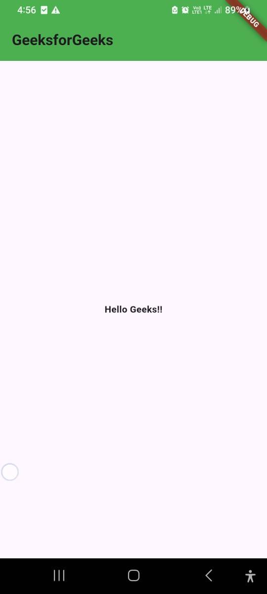
**Output:
**Example:
The Layout Tree of basic app screen using Stateful Widgets. This is a simple counter app , which can increase the number in the center when the user taps on the button.
Dart `
import 'package:flutter/material.dart'; void main() => runApp(const MyApp());
// MyApp is the root widget of the application class MyApp extends StatelessWidget { const MyApp({Key? key}) : super(key: key);
@override Widget build(BuildContext context) { return const MaterialApp( home: HomePage(), ); } }
// HomePage is the main screen of the app class HomePage extends StatefulWidget { const HomePage({Key? key}) : super(key: key);
@override _HomePageState createState() => _HomePageState(); }
class _HomePageState extends State {
// Variable to store the counter value int _counter = 0; @override Widget build(BuildContext context) { return Scaffold( appBar: AppBar(
    // Set the background color of the app bar
    backgroundColor: Colors.green,

    // Set the title of the app bar
    title: const Text("GeeksforGeeks"),
  ),

  // The main body of the scaffold
  body: Center(

    // Display a centered text widget
    child: Text(
      "$_counter",

      // Apply text styling
      style: TextStyle(

        // Set font size
        fontSize: 24,

        // Set font weight
        fontWeight: FontWeight.bold,
      ),
    ),
  ),
  floatingActionButton: FloatingActionButton(
    backgroundColor: Colors.green,
    onPressed: () {

      // Increment the counter value by 1 using setState
      setState(() {
        _counter++;
      });
    },
    child: Icon(
      Icons.add,
      color: Colors.white,
      ),
  ),
);
} }
`
**Output: