The Amazing (and Puzzling) Manufacturing Recovery (original) (raw)
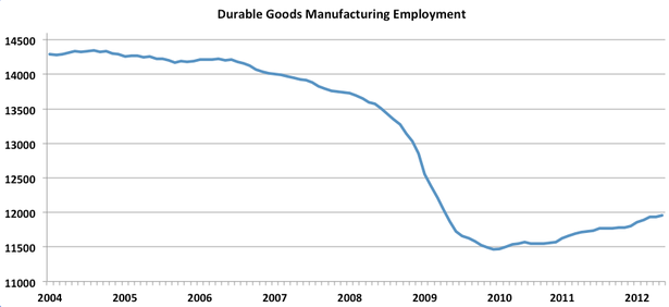
What if I told you that this graph explained the U.S. recovery?
(Y-axis in thousands of jobs)
You'd tell me I'm crazy. Rightly so. This graph is hideous. It shows manufacturing employment in durable goods (planes, trains, cars, machines, computers) falling by three million between 2004 and 2008 and recovering by a few hundred thousand. Does that look like a recovery to you? Heck no.
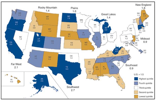
But durable goods manufacturing accounted for a third of U.S. growth in 2011. It grew more than twice as fast as any large industry. In some regions, it dominated overall output. In Oregon, the second-fastest growing state last year, durable good manufacturing accounted for an astonishing 80% of growth, as Binyamin Applebaum reported. In the Great Lakes region, it accounted for half. In Washington, D.C., it accounted for zero percent. In Alaska, the fourth-fastest growing state, durable goods actually declined.
This presents a conundrum. In the first graph, manufacturing has accounted for 12% of private sector job gains since 2010. In the second graph, manufacturing accounts for fully 33% of the economic recovery. Why the 3X gap?
Part of the answer is that high-tech manufacturing produces expensive and exportable final products. Fully 30% of economic growth recently has been from car sales alone -- just one category of durable goods. Another part of the answer is that 12% becomes 33% by the magic of productivity. Some of these output gains are coming from workers using the latest super-productive technology. Some of it might come from manufacturing firms squeezing production out of global supply chains or overseas labor. The equation is the same either way: Fewer workers can make more valuable stuff.

