Tutorial # 6 (original) (raw)
| [ | Tags | | | tutorials | ] |
|---|---|---|---|---|
| [ | Current Location | | | Home | ] |
| [ | Current Mood | | |  cold cold |
] |
| [ | Current Music | | | TV | ] |
Tutorial # 6
Made with GIMP 2.2.10. Not sure if it can be translated into other programs.
Learn how to go from this to this
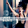 .
.
Other Icons made using the same method.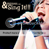
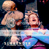
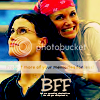
Please make your icon your own. Credit and comment if you use. I love to see what people have done so feel free to post your finished icon:)
So last night I was playing around with GIMP. I have been trying to figure out something equivalent to that nasty thing us GIMPers see in tutorial sites every day called Selective Coloring. Don't get too excited this has nothing to do with even coming close. I did however like the effect and the end result and so this morning I thought that I would try to duplicate it and share with all of you.
So the tutorial for now and I will continue to try and crack the mystery of Selective Coloring for us all:)
Again we are working with a Rent screen cap because once again Rent is love!
1. Find the picture you want to use. Crop it to make a 100x100 px base. Sharpen at 20 power.
Result=
2. Duplicate your base one time and invert this layer. Layer-->Color-->Invert. Set this layer to Dodge 29.8%.
Result=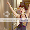
3. Duplicate your base again and drag it to the top of your other 2 layers. You need to Equalize this layer. Layers-->Colors-->Auto-->Equalize. Set this layer to Hard Light at 30%.
Result=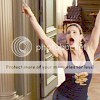
4. Duplicate your base again and drag it to the top of your other 3 layers. Set this layer to Screen 40%.
Result=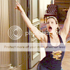
5. Now make a new layer in transparent. Flood it with #bbd5cf. Set this layer to Burn 100%.
Result=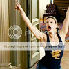
6. Make another new transparent layer. Flood it with #f0c2f4. Set this layer to Burn as well 100%.
Result=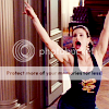
7. Make another new transparent layer. Flood it with #f9e6cd. Set this layer to Divide 100%.
Result=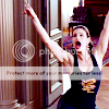
8. Yet another new transparent layer. Flood with the previous color #f9e6cd. Set this layer to Multiply 100%.
Result=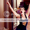
9. Duplicate your base again and drag it to the top of all of your previous layers. Ok this layer is a little bit more involved. If you have any question please ask:)
Get you Color Levels Dialog box out 'cause that is what you will need for this layer. Layers-->Colors--Levels
In the same dialog box you will want to drop down the little menu called Channels.
Click on red and set your sliders to these numbers (you will need to change the input and output for all three colors and you will do this same way as you do the red just different levels.)
Red
INPUT LEVELS
Left Slider =6 Right Slider=204
OUTPUT LEVELS
Left Slider=34 Right Slider=201
Green
INPUT LEVELS
Left Slider=0 Right Slider=165
OUTPUT LEVELS
Left Slider=19 Right Slider=255
Blue
INPUT LEVELS
Left Slider=0 Right Slider=255
OUTPUT LEVELS
Left Slider=76 Right Slider=255
Once you have these settings click OK on the bottom right hand side of your Levels Dialog box.
Set this layer to Saturation 100%
Result=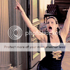
10. It looks a little funny at this point and I did not like the color tone of her skin. So I erased it.
Result=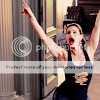
11. Make another new transparent layer. Flood it with #98daf3. Set this layer to Burn 100%.
Result=
12. Make another new transparent layer. Flood it with #f0c2f4. Set this layer to Soft Light 60%.
Result=
13. Again this color looks good for the surrounding background of the icon but I was not super crazy about how it made her skin look so once again I erased the color off of her skin.
Result=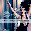
14. Duplicate your base for the last time and drag it to the top of all of your previous layers. Set this layer to Soft Light 40%.
Result=ooops I forgot to save an image for this step. My bad.
*You can stop here if you do not want to put any text on your icon. Just merge all your layers and save it:) However, most people know how to apply text to an icon, but just in case.......here are steps 15 and 16:)
15. The text layer. Of course the text is completely up to you. Be creative.....do what you like. I used Steamer Ultra-Light Font in 11 px size. Color=#fbebd6.
16. Picking, placing and text phrases are not my strongest points when it comes to icons. I usually spend the most time on the text towards the end. So like some of my other tutorials I have to have something else to make the text 'pop' out so that it is legible. Hah Weird obsession I know, but we all have our hang ups.
So anyway I took a small round fuzzy paint brush. Made a new transparent layer right beneath my text layer and picked a dark blue color and brushed behind it so that you could see it. You, of course, do not have to do this step. I did 'cause I am anal retentive like that. Ha!
17. Merge all your layers together to get your finished Icon.
Ta Da
Have fun!


