Callback Button - Execute MATLAB code using button - Simulink (original) (raw)
Execute MATLAB code using button
Libraries:
Simulink / Dashboard
Description
The Callback Button block runs MATLAB® code in response to a click (immediate release of the pointer) or a press (delayed release of the pointer). You can specify different code for the click than the press. When you press the button, the code either executes after a time span or at time intervals that you specify. You can customize the appearance of the Callback Button block to look like a button in a real system. Use the Callback Button block with other dashboard blocks to create an interactive dashboard to control your model.
When a Callback Button block is active, you can interact with the gadget the block represents. Clicking an active Callback Button block pushes a virtual button. While you press your pointer, the button is pushed. When you release your pointer, you release the button. Callback Button blocks are active when the simulation is running, the block is in a panel that is open in its own window or docked and unlocked, or at least one of the callbacks triggered by a click or press has a nonempty value. To select an activeCallback Button block without pushing the button, pressShift, and then click the block. To open the Block Parameters dialog box of an active Callback Button block, pressShift, and then double-click the block.
When a block is inactive, you can only interact with the block, for example, taking actions such as resizing or dragging the block. To temporarily activate an inactiveCallback Button block, click the block. When you deselect theCallback Button block, the block becomes inactive again.
Specify what you want pushing the button to do using callback functions:
PressFcnfunctions run while the button is pushed. You can configure the button to run thePressFcnfunction only once while the button is pushed, or you can specify a repeat interval. To run the function only once, specify a repeat interval of0.ClickFcnfunctions run when you release the button.
You can configure the button to remain pushed when you release the pointer by setting the Button Type to Latched. When you choose the latched button type:
- To latch the button, click the button.
- To unlatch the button, click the button again.
The PressFcn function runs while the button is latched. TheClickFcn function runs once when you latch the button and once when you unlatch the button.
You can use states to specify how the appearance of the Callback Button block changes when you interact with the button:
- While you push the button, the block is in the
Pressedstate. - When the button is latched and you are not pushing it, the block is in the
Latchedstate. - When the button is latched and you are pushing it, the block is in the
Latched and Pressedstate. - When the block is not in any of these three states, it is in the
Defaultstate.
A state pairs pointer actions with:
- A state label
- A state icon
- A state image
Customize Callback Button Blocks
When you add a Callback Button block to your model, the block is preconfigured with a default design. You can use the block with the default design or customize the appearance of the block.
To customize the appearance of the block, use design mode. After selecting the block, you can enter design mode in one of three ways:
- In the Simulink® Toolstrip, on the block-specific tab, underDesign, click Edit.
- In the Property Inspector, on the Design tab, clickEdit.
- Pause on the ellipsis that appears over the block and click the Edit Custom Block button
 .
.
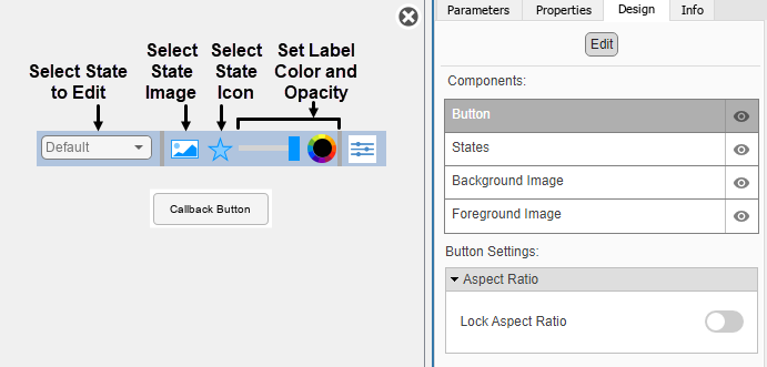
When you design a Callback Button block, you configure the block appearance for each possible state. When you configure the Block Type as Momentary, the block has two states. When you configure the Block Type asLatch, the block has four.
You can use the toolbar above the block to switch states. For each state, you can:
- Upload a state image.
- Upload a state icon and specify the position of the icon relative to the state label.
- Specify the State Label text, color, opacity, and position.
You can also upload a foreground or a background image, or set a solid background color. The foreground and background apply to all states.
Use the toolbar above the block to configure the image, the icon, and the State Label color and opacity.
You can use the Design tab in the Property Inspector for fine control over the block design and to enter exact values for design settings.
Use the Design tab to:
- Specify the State Label text and position.
- Specify the icon position.
- Upload a foreground image.
- Upload a background image.
- Set a solid background color.
When you finish editing the design, to exit design mode, click theX in the upper right of the canvas.
Examples
You can use a Callback Button block to control a parameter value before or during simulation. For example, in the model callbackGain, three Callback Button blocks are configured to set the Gain parameter of the Gain block to a value of 5, 10, or 15.
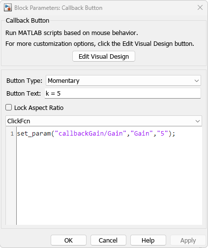
Simulate the model. To change the gain value, click the Callback Button blocks.

Extended Examples
Parameters
Use the Property Inspector and the Block Parameters dialog box to specify the values of the block parameters. To set the core parameters of the dashboard block, use the Block Parameters dialog box or the Parameters tab in the Property Inspector. To customize the block, use the Design tab in the Property Inspector. To open the Block Parameters dialog box for a block, double-click the block. To open the Property Inspector, on the Modeling tab, underDesign, select Property Inspector.
Parameters
To set the core parameters of the dashboard block, open the Property Inspector and click the Parameters tab.
Main
Specify how the block responds to a click.
Momentary— The button changes state only while pressed. When you release the click, the button returns to its default state.Latch— The button latches the state change when clicked. The button remains in the pressed state until you click it again.
When you configure Button Type asMomentary, the block has these states:
Default— Default state for the block when it is not pressedPressed— Block state when the block is pressed
When you configure Button Type asLatch, the block has these states:
Default— Default state for the block when it is not pressed.Pressed— Transitional state when you press the button while it is in theDefaultstate. The block transitions to theLatchedstate when you release the click.Latched— Latched state for the block when it is not pressed.Latched and Pressed— Transitional state when you press the button while it is in theLatchedstate. The block transitions to theDefaultstate when you release the click.
Programmatic Use
| Block Parameter: ButtonType |
|---|
| Type: string or character array |
| Value: 'Momentary' | 'Latch' |
Specify the text for the button label. The label is applied to the button for the state that is selected in the Select State section of the States component on the Design tab.
Programmatic Use
Specify the ButtonText parameter for the block as a string or a character vector.
| Block Parameter: ButtonText |
|---|
| Type: character vector | string |
Select this parameter to maintain the aspect ratio when resizing the block in the Simulink canvas.
When the aspect ratio is locked, adding a new background image changes the aspect ratio of the block to match the aspect ratio of the background image. When the aspect ratio is unlocked, adding a new background image does not change the aspect ratio of the block, but instead changes the aspect ratio of the background image to fit the size of the block.
When the aspect ratio is locked, pressing the Shift key while resizing a block temporarily unlocks the aspect ratio. When you release theShift key, the aspect ratio locks. When the aspect ratio is unlocked, pressing the Shift key while resizing a block temporarily locks the aspect ratio. When you release the Shift key, the aspect ratio unlocks.
Callbacks
MATLAB code that executes in response to a click of the button.
Every time you click the button, the ClickFcn code executes once, at the point in time when you release the click.
To specify code for the ClickFcn, selectClickFcn from the drop-down menu. Enter the code in the text box below the menu.
Programmatic Use
Specify the ClickFcn parameter for the block as MATLAB code that is formatted as a string or a character vector.
| Block Parameter: ClickFcn |
|---|
| Type: character vector | string |
| Values: MATLAB code |
MATLAB code that executes in response to a press of the button.
While the button is in the pressed state, the PressFcn code executes once when the Press Delay time has elapsed and periodically at every Repeat Interval.
To specify code for the PressFcn, selectPressFcn from the drop-down menu. Enter the code in the text box below the menu.
How you press the button to execute the PressFcn code depends on the Button Type.
- If the Button Type is
Momentary, hold down your click for the duration that you want to press the button. - If the Button Type is
Latch, click to press the button, but do not hold down your click. The button remains pressed until you click it again.
Note
Every time that you click on the button, even when you do so as part of the process for pressing the button, the ClickFcn code executes once, at the point in time when you release the click.
Programmatic Use
Specify the PressFcn parameter for the block as MATLAB code that is formatted as a string or a character vector.
| Block Parameter: PressFcn |
|---|
| Type: character vector | string |
| Values: MATLAB code |
Amount of time required to cause the PressFcn code to execute.
Dependencies
Press Delay (ms) is visible only whenPressFcn is selected as the callback.
Programmatic Use
Specify the PressDelay parameter for the block as a positive scalar value.
| Block Parameter: PressDelay |
|---|
| Type: scalar |
Time interval after which the PressFcn code executes again if the Callback Button block is still pressed.
Dependencies
Repeat Interval (ms) is visible only whenPressFcn is selected as the callback.
Programmatic Use
Specify the RepeatInterval parameter for the block as a positive scalar value.
| Block Parameter: RepeatInterval |
|---|
| Type: scalar |
Design
To customize the dashboard block, open the Property Inspector, click the Design tab, and click Edit.
Button
Select this parameter to maintain the aspect ratio when resizing the block in the Simulink canvas.
When the aspect ratio is locked, adding a new background image changes the aspect ratio of the block to match that of the background image. When the aspect ratio is unlocked, adding a new background image does not change the proportions of the block but instead stretches or scales the background image to fit the size of the block.
When the aspect ratio is locked, pressing the Shift key while resizing a block unlocks the aspect ratio. When you release the Shift key, the aspect ratio locks. When the aspect ratio is unlocked, pressing theShift key while resizing a block locks the aspect ratio. When you release the Shift key, the aspect ratio unlocks.
States
Select a state that you want to configure from the drop-down menu in theSelect State section of the States component. When the Button Type isMomentary, you can select these states:
Default— Default state for the block when it is not pressedPressed— Block state when the block is pressed
When the Button Type is Latch, you can select these states:
Default— Default state for the block when it is not pressed.Pressed— Transitional state when you press the button while it is in theDefaultstate. The block transitions to theLatchedstate when you release the click.Latched— Latched state for the block when it is not pressed.Latched and Pressed— Transitional state when you press the button while it is in theLatchedstate. The block transitions to theDefaultstate when you release the click.
Note
You can configure all of the parameters in the States component of the Design tab for a state. For example, you can select an icon that will appear on the button when it is in the state. When you configure any of the parameters in the States component, the changes are applied to the state that is selected in the Select State section of the States component.
Example: Pressed
Specify the text for the button label. The label is applied to the button for the state that is selected in the Select State section of the States component on the Design tab.
Programmatic Use
Specify the ButtonText parameter for the block as a string or a character vector.
| Block Parameter: ButtonText |
|---|
| Type: character vector | string |
Choose a font color for the label text from the palette of standard colors, or specify a custom color. The color is applied to the label text for the state that is selected in the Select State section of the States component on the Design tab.
Set the alignment of the label and icon pair in the horizontal direction. The table lists the horizontal position of the label and icon pair when the X Offset is zero. A nonzero X Offset moves the label and icon pair from the position listed in the table.
| Alignment | Position of the Label and Icon Pair |
|---|---|
| Left | The left edge of the label and icon pair is at the left edge of the block. |
| Center | The horizontal middle of the label and icon pair is at the horizontal middle of the block. |
| Right | The right edge of the label and icon pair is at the right edge of the block. |
Set the alignment of the label and icon pair in the vertical direction. The table lists the vertical position of the label and icon pair when the Y Offset is zero. A nonzero Y Offset moves the label and icon pair from the position listed in the table.
| Alignment | Position of the Label and Icon Pair |
|---|---|
| Top | The top edge of the label and icon pair is at the top edge of the block. |
| Center | The vertical middle of the label and icon pair is at the vertical middle of the block. |
| Bottom | The bottom edge of the label and icon pair is at the bottom edge of the block. |
How the X Offset is measured depends on the value of theHorizontal Alignment. The table lists how the offset is measured for each Horizontal Alignment value. Relative to the position when the offset is 0, an offset with a negative value moves the text left, and an offset with a positive value moves the text right.
| Horizontal Alignment | Offset |
|---|---|
| Left | Specify the horizontal offset of the left edge of the label and icon pair from the left edge of the block as a ratio of the block width. |
| Center | Specify the horizontal offset of the horizontal middle of the label and icon pair from the horizontal middle of the block as a ratio of the block width. |
| Right | Specify the horizontal offset of the right edge of the label and icon pair from the right edge of the block as a ratio of the block width. |
How the Y Offset is measured depends on the value of theVertical Alignment. The table lists how the offset is measured for each Vertical Alignment value. Relative to the position of the text when the offset is 0, an offset with a negative value moves the text up, and an offset with a positive value moves the text down.
| Vertical Alignment | Offset |
|---|---|
| Top | Specify the vertical offset of the top edge of the label and icon pair from the top edge of the block as a ratio of the block width. |
| Center | Specify the vertical offset of the vertical middle of the label and icon pair from the vertical middle of the block as a ratio of the block width. |
| Bottom | Specify the vertical offset of the bottom edge of the label and icon pair from the bottom edge of the block as a ratio of the block width. |
Specify the placement of the icon relative to the label.
Note
Changing the placement of the icon moves the label, but does not change the offset or alignment of the label.
Specify the icon width as a ratio of the font height of the label text.
Example: 0.5
Specify the icon height as a ratio of the font height of the label text.
Example: 0.5
Enable this option to maintain the aspect ratio when resizing the image using the Property Inspector.
Specify the horizontal offset of the left edge of the image from the left edge of the block as a ratio of the block width. Relative to the position of the image when the offset is 0, an offset with a negative value moves the image left, and an offset with a positive value moves the image right.
Example: 1
Specify the vertical offset of the top edge of the image from the top edge of the block as a ratio of the block height. Relative to the position of the image when the offset is 0, an offset with a negative value moves the image up, and a positive value moves the image down.
Example: 1
Specify the image width as a ratio of the block width.
Example: 0.5
Specify the image height as a ratio of the block height.
Example: 0.5
Background Image
You can provide a background image for the block or select a solid background color for the button. To select a solid background color for the button, select this parameter. To provide a background image for the block, clear this parameter.
Note
- The state images are not visible when you set a solid background color for the button. To make the state images visible, turn off Use Background Color.
- Changing the background color using theFormat tab of the Simulink Toolstrip removes the background image and turns on the Use Background Color parameter.
Example: on
To select a solid background color for the button, enable theUse Background Color parameter. Then, choose a background color from the palette of standard colors, or specify a custom color.
Note
The state images are not visible when you set a solid background color. To make the state images visible, in the Property Inspector, on the Design tab, in the Background Image component, turn off Use Background Color.
Tip
You can also specify the Background Color in the Format tab of the Simulink Toolstrip.
To specify the color of the block text, use the Font Color parameter.
Programmatic Use
Specify the BackgroundColor parameter for the block as a 1-by-3 [r g b] vector with values between0 and 1 that is formatted as a string or a character vector.
| Block Parameter: BackgroundColor |
|---|
| Type: character vector | string |
| Values: [r g b] vector |
Specify the opacity of the solid background color as a scalar value from 0 to 1.
Example: 0.5
Specify the corner radius of the area covered by the solid background color.
Example: 0.25
Foreground Image
Specify the horizontal offset of the left edge of the image from the left edge of the block as a ratio of the block width. Relative to the position of the image when the offset is 0, an offset with a negative value moves the image left, and an offset with a positive value moves the image right.
Example: 1
Specify the vertical offset of the top edge of the image from the top edge of the block as a ratio of the block height. Relative to the position of the image when the offset is 0, an offset with a negative value moves the image up, and a positive value moves the image down.
Example: 1
Specify the width of the foreground image as a ratio of the block width.
Example: 0.5
Specify the height of the foreground image as a ratio of the block height.
Example: 0.5
Select this parameter to maintain the aspect ratio when resizing the image using the Property Inspector.
Block Characteristics
| Data Types | |
|---|---|
| Direct Feedthrough | no |
| Multidimensional Signals | no |
| Variable-Size Signals | no |
| Zero-Crossing Detection | no |
Tips
To design a button that changes the value of a variable or parameter in your model, use the Push Button block.
Extended Capabilities
Dashboard blocks are ignored for code generation.
Version History
Introduced in R2017b
When a Simulink block from the Dashboard or Customizable Blocks library is_active_, you can interact with the gadget the block represents. For example, you can push a button or flip a switch. When a block is inactive, you can only interact with the block. For example, you can move or resize the block. To interact with the gadget when a block is inactive, you can temporarily activate the block by clicking the block. When you deselect the block, the block becomes inactive again.
By default, all blocks from the Dashboard and Customizable Blocks libraries are active during simulation. Blocks promoted to a dashboard panel are also active when the panel is open in its own window or docked and unlocked. In previous releases, the blocks are inactive in all other cases. Specifically, when the simulation is not running, a Callback Button block in the model canvas or in a panel that is neither open in its own window nor docked and unlocked is inactive. To push the button, you must click the block twice: once to temporarily activate the block, and once to push the button.
Starting in R2025a, Callback Button blocks for which at least one of the callbacks triggered by pushing the button has a nonempty value are always active, regardless of whether the simulation is running. This change means when the simulation is not running, you can push callback buttons with a single click. When the simulation is not running, you can move and resize active Callback Button blocks.
There is also a new keyboard shortcut for interacting with active blocks. Clicking an active Callback Button block or an active block from the Dashboard or Customizable Blocks library that is connected to a parameter or variable value both selects the block and interacts with the gadget the block represents. For example, clicking an unselected active connected Push Button block both selects the block and pushes the button. Starting in R2025a, you can select the block without interacting with the gadget by pressing Shift and then clicking the block. Similarly, you can open the Block Parameters dialog box by pressing Shift and then double-clicking the block.
If the aspect ratio of a block from the Dashboard library is locked, you can temporarily unlock the aspect ratio by pressing Shift. When you release the Shift key, the aspect ratio locks.
If the aspect ratio is unlocked, pressing Shift temporarily locks the aspect ratio. When you release the Shift key, the aspect ratio unlocks.
Starting in R2024a, you can dock dashboard panels to the Simulink Editor window. You can use the docked panel to monitor signals and control parameters during simulation without covering the model diagram in the canvas.
For more information, see Dock Panels.
Starting in R2023b, you can open a dashboard panel in a new window. To do so, select the panel and pause on the ellipsis that appears. In the action menu that expands, click the Open In New Window button .
.
You can minimize and restore the new window containing the panel separately from the model window. From the panel window, you can run, pause, stop, and step through the simulation. In the panel window, you can edit the panel and the blocks it contains.
To return the panel to the model canvas, in the panel window toolstrip, clickOpen in canvas  .
.
For more information about opening a panel in a new window, see Open Panels in New Window.
When you add a dashboard panel to a model, the Panels tab appears in the Simulink Toolstrip and shows options for managing and editing panels.
Previously, the Panels tab was only visible when a panel was selected. Starting in R2023a, the Panels tab stays visible when no panel is selected.
The Panels tab also contains these new options:
- You can add an empty panel.
- You can rename the selected panel.
- You can hide the selected panel.
Starting in R2023a, the Callback Button block from the Dashboard library has the same customization options as the Callback Button block from the Customizable Blocks library.
Starting in R2022b, you can undo and redo the changes you make to customizable dashboard blocks that are in a panel.
To undo or redo a change:
- Click the panel or a block in the panel.
- Press Ctrl+Z to undo the change, or pressCtrl+Y to redo the change.
Note
The keyboard shortcuts are based on Windows®. On a Mac, press command (⌘) instead ofCtrl.
Starting in R2022b, you can use the Simulink Toolstrip to manage and edit panels and the dashboard blocks that they contain.
When you click a dashboard block in a panel, the toolstrip tab for the block appears. For example, when you click a Circular Gauge block, theGauge tab appears in the toolstrip.
When you click a panel, the Panel tab appears in the toolstrip. The tab provides these options:
- Manage the visibility of panels in the model.
- Fit all unhidden panels within the current view.
- Collapse the selected panel.
- Customize the size and the contents of the panel.
- Set a custom background image for the selected panel.
- Add a new tab to the selected panel.
Starting in R2020b, the Block tab in the Simulink Toolstrip turns into a block-specific tab when you select a block in your model that is from the Dashboard library in the Simulink library or from the Flight Instruments library in the Aerospace Blockset™ Flight Control Analysis library. From the toolstrip, you can connect, disconnect, and modify connections for the selected block. You can jump to the model element connected to the selected block, and you can add the selected block to a panel.
Starting in R2019a, you can use functions such as add_block and set_param to create and configure blocks from the Dashboard library in your model.