Gtk.Toolbar - Classes - Gtk 3.0 (original) (raw)
g Atk.ImplementorIface Atk.ImplementorIface Gtk.Widget Gtk.Widget Atk.ImplementorIface->Gtk.Widget GObject.GInterface GObject.GInterface GObject.GInterface->Atk.ImplementorIface Gtk.Buildable Gtk.Buildable GObject.GInterface->Gtk.Buildable Gtk.Orientable Gtk.Orientable GObject.GInterface->Gtk.Orientable Gtk.ToolShell Gtk.ToolShell GObject.GInterface->Gtk.ToolShell GObject.InitiallyUnowned GObject.InitiallyUnowned GObject.InitiallyUnowned->Gtk.Widget GObject.Object GObject.Object GObject.Object->GObject.InitiallyUnowned Gtk.Buildable->Gtk.Widget Gtk.Container Gtk.Container Gtk.Toolbar Gtk.Toolbar Gtk.Container->Gtk.Toolbar Gtk.Orientable->Gtk.Toolbar Gtk.ToolShell->Gtk.Toolbar Gtk.Widget->Gtk.Container
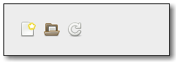
Example
Subclasses:
None
Methods
Inherited:
Gtk.Container (35), Gtk.Widget (278), GObject.Object (37), Gtk.Buildable (10), Gtk.Orientable (2), Gtk.ToolShell (9)
Structs:
Gtk.ContainerClass (5), Gtk.WidgetClass (12), GObject.ObjectClass (5)
| class | new () |
|---|---|
| get_drop_index (x, y) | |
| get_icon_size () | |
| get_item_index (item) | |
| get_n_items () | |
| get_nth_item (n) | |
| get_relief_style () | |
| get_show_arrow () | |
| get_style () | |
| insert (item, pos) | |
| set_drop_highlight_item (tool_item, index_) | |
| set_icon_size (icon_size) | |
| set_show_arrow (show_arrow) | |
| set_style (style) | |
| unset_icon_size () | |
| unset_style () |
Virtual Methods
Inherited:
Gtk.Container (10), Gtk.Widget (82), GObject.Object (7), Gtk.Buildable (10), Gtk.ToolShell (9)
| do_orientation_changed (orientation) |
|---|
| do_popup_context_menu (x, y, button_number) |
| do_style_changed (style) |
Properties
Inherited:
Gtk.Container (3), Gtk.Widget (39), Gtk.Orientable (1)
| Name | Type | Flags | Short Description |
|---|---|---|---|
| icon-size | Gtk.IconSize | r/w/en | Size of icons in this toolbar |
| icon-size-set | bool | r/w | Whether the icon-size property has been set |
| show-arrow | bool | r/w/en | If an arrow should be shown if the toolbar doesn’t fit |
| toolbar-style | Gtk.ToolbarStyle | r/w/en | How to draw the toolbar |
Child Properties
| Name | Type | Default | Flags | Short Description |
|---|---|---|---|---|
| expand | bool | False | r/w | Whether the item should receive extra space when the toolbar grows |
| homogeneous | bool | False | r/w | Whether the item should be the same size as other homogeneous items |
Style Properties
Inherited:
| Name | Type | Default | Flags | Short Description |
|---|---|---|---|---|
| button-relief | Gtk.ReliefStyle | Gtk.ReliefStyle.NONE | r | Type of bevel around toolbar buttons |
| internal-padding | int | 0 | d/r | Amount of border space between the toolbar shadow and the buttons deprecated |
| max-child-expand | int | 2147483647 | r | Maximum amount of space an expandable item will be given |
| shadow-type | Gtk.ShadowType | Gtk.ShadowType.OUT | d/r | Style of bevel around the toolbar deprecated |
| space-size | int | 12 | d/r | Size of spacers deprecated |
| space-style | Gtk.ToolbarSpaceStyle | Gtk.ToolbarSpaceStyle.LINE | d/r | Whether spacers are vertical lines or just blank deprecated |
Signals
Inherited:
Gtk.Container (4), Gtk.Widget (69), GObject.Object (1)
| Name | Short Description |
|---|---|
| focus-home-or-end | A keybinding signal used internally by GTK+. |
| orientation-changed | Emitted when the orientation of the toolbar changes. |
| popup-context-menu | Emitted when the user right-clicks the toolbar or uses the keybinding to display a popup menu. |
| style-changed | Emitted when the style of the toolbar changes. |
Fields
Inherited:
Gtk.Container (4), Gtk.Widget (69), GObject.Object (1)
| Name | Type | Access | Description |
|---|---|---|---|
| container | Gtk.Container | r |
Class Details
class Gtk.Toolbar(**kwargs)
Bases:
Gtk.Container, Gtk.Orientable, Gtk.ToolShell
Abstract:
No
Structure:
A toolbar is created with a call to Gtk.Toolbar.new().
A toolbar can contain instances of a subclass of Gtk.ToolItem. To add a Gtk.ToolItem to the a toolbar, use Gtk.Toolbar.insert(). To remove an item from the toolbar use Gtk.Container.remove(). To add a button to the toolbar, add an instance of Gtk.ToolButton.
Toolbar items can be visually grouped by adding instances ofGtk.SeparatorToolItem to the toolbar. If the Gtk.Toolbar child property “expand” is True and the property Gtk.SeparatorToolItem :draw is set toFalse, the effect is to force all following items to the end of the toolbar.
By default, a toolbar can be shrunk, upon which it will add an arrow button to show an overflow menu offering access to any Gtk.ToolItem child that has a proxy menu item. To disable this and request enough size for all children, call Gtk.Toolbar.set_show_arrow() to set Gtk.Toolbar :show-arrow to False.
Creating a context menu for the toolbar can be done by connecting to the Gtk.Toolbar ::popup-context-menu signal.
CSS nodes
Gtk.Toolbar has a single CSS node with name toolbar.
Returns:
the newly-created toolbar.
Return type:
Creates a new toolbar.
Parameters:
Returns:
The position corresponding to the point (x, y) on the toolbar.
Return type:
Returns the position corresponding to the indicated point onself. This is useful when dragging items to the toolbar: this function returns the position a new item should be inserted.
x and y are in self coordinates.
New in version 2.4.
Returns:
the current icon size for the icons on the toolbar.
Return type:
Retrieves the icon size for the toolbar. See Gtk.Toolbar.set_icon_size().
Parameters:
item (Gtk.ToolItem) – a Gtk.ToolItem that is a child of self
Returns:
the position of item on the toolbar.
Return type:
Returns the position of item on the toolbar, starting from 0. It is an error if item is not a child of the toolbar.
New in version 2.4.
Returns:
the number of items on the toolbar
Return type:
Returns the number of items on the toolbar.
New in version 2.4.
Parameters:
n (int) – A position on the toolbar
Returns:
The n'th Gtk.ToolItem on self, or None if there isn’t an n'th item.
Return type:
Gtk.ToolItem or None
Returns the n'th item on self, or None if the toolbar does not contain an n'th item.
New in version 2.4.
Returns:
The relief style of buttons on self.
Return type:
Returns the relief style of buttons on self. SeeGtk.Button.set_relief().
New in version 2.4.
Returns:
True if the toolbar has an overflow menu.
Return type:
Returns whether the toolbar has an overflow menu. See Gtk.Toolbar.set_show_arrow().
New in version 2.4.
Returns:
the current style of self
Return type:
Retrieves whether the toolbar has text, icons, or both . SeeGtk.Toolbar.set_style().
Parameters:
- item (Gtk.ToolItem) – a Gtk.ToolItem
- pos (int) – the position of the new item
Insert a Gtk.ToolItem into the toolbar at position pos. If pos is 0 the item is prepended to the start of the toolbar. If pos is negative, the item is appended to the end of the toolbar.
New in version 2.4.
set_drop_highlight_item(tool_item, index_)[source]
Parameters:
- tool_item (Gtk.ToolItem or None) – a Gtk.ToolItem, or None to turn of highlighting
- index (int) – a position on self
Highlights self to give an idea of what it would look like if item was added to self at the position indicated by index_. If item is None, highlighting is turned off. In that case index_is ignored.
The tool_item passed to this function must not be part of any widget hierarchy. When an item is set as drop highlight item it can not added to any widget hierarchy or used as highlight item for another toolbar.
New in version 2.4.
set_icon_size(icon_size)[source]
Parameters:
icon_size (Gtk.IconSize) – The Gtk.IconSize that stock icons in the toolbar shall have.
This function sets the size of stock icons in the toolbar. You can call it both before you add the icons and after they’ve been added. The size you set will override user preferences for the default icon size.
This should only be used for special-purpose toolbars, normal application toolbars should respect the user preferences for the size of icons.
set_show_arrow(show_arrow)[source]
Parameters:
show_arrow (bool) – Whether to show an overflow menu
Sets whether to show an overflow menu when self isn’t allocated enough size to show all of its items. If True, items which can’t fit in self, and which have a proxy menu item set by Gtk.ToolItem.set_proxy_menu_item() or Gtk.ToolItem ::create-menu-proxy, will be available in an overflow menu, which can be opened by an added arrow button. If False, self will request enough size to fit all of its child items without any overflow.
New in version 2.4.
Parameters:
style (Gtk.ToolbarStyle) – the new style for self.
Alters the view of self to display either icons only, text only, or both.
Unsets toolbar icon size set with Gtk.Toolbar.set_icon_size(), so that user preferences will be used to determine the icon size.
Unsets a toolbar style set with Gtk.Toolbar.set_style(), so that user preferences will be used to determine the toolbar style.
do_orientation_changed(orientation) virtual
Parameters:
orientation (Gtk.Orientation) –
Parameters:
Return type:
do_style_changed(style) virtual
Parameters:
style (Gtk.ToolbarStyle) –
Signal Details
Gtk.Toolbar.signals.focus_home_or_end(toolbar, focus_home)
Signal Name:
focus-home-or-end
Flags:
Parameters:
- toolbar (Gtk.Toolbar) – The object which received the signal
- focus_home (bool) – True if the first item should be focused
Returns:
True if the signal was handled, False if not
Return type:
A keybinding signal used internally by GTK+. This signal can’t be used in application code
Gtk.Toolbar.signals.orientation_changed(toolbar, orientation)
Signal Name:
orientation-changed
Flags:
Parameters:
- toolbar (Gtk.Toolbar) – The object which received the signal
- orientation (Gtk.Orientation) – the new Gtk.Orientation of the toolbar
Emitted when the orientation of the toolbar changes.
Signal Name:
popup-context-menu
Flags:
Parameters:
- toolbar (Gtk.Toolbar) – The object which received the signal
- x (int) – the x coordinate of the point where the menu should appear
- y (int) – the y coordinate of the point where the menu should appear
- button (int) – the mouse button the user pressed, or -1
Returns:
return True if the signal was handled, False if not
Return type:
Emitted when the user right-clicks the toolbar or uses the keybinding to display a popup menu.
Application developers should handle this signal if they want to display a context menu on the toolbar. The context-menu should appear at the coordinates given by x and y. The mouse button number is given by the button parameter. If the menu was popped up using the keybaord, button is -1.
Gtk.Toolbar.signals.style_changed(toolbar, style)
Signal Name:
style-changed
Flags:
Parameters:
- toolbar (Gtk.Toolbar) – The object which received the signal
- style (Gtk.ToolbarStyle) – the new Gtk.ToolbarStyle of the toolbar
Emitted when the style of the toolbar changes.
Property Details
Gtk.Toolbar.props.icon_size
Name:
icon-size
Type:
Default Value:
Flags:
READABLE, WRITABLE, EXPLICIT_NOTIFY
The size of the icons in a toolbar is normally determined by the toolbar-icon-size setting. When this property is set, it overrides the setting.
This should only be used for special-purpose toolbars, normal application toolbars should respect the user preferences for the size of icons.
New in version 2.10.
Gtk.Toolbar.props.icon_size_set
Name:
icon-size-set
Type:
Default Value:
Flags:
Is True if the icon-size property has been set.
New in version 2.10.
Gtk.Toolbar.props.show_arrow
Name:
show-arrow
Type:
Default Value:
Flags:
READABLE, WRITABLE, EXPLICIT_NOTIFY
If an arrow should be shown if the toolbar doesn’t fit
Gtk.Toolbar.props.toolbar_style
Name:
toolbar-style
Type:
Default Value:
Flags:
READABLE, WRITABLE, EXPLICIT_NOTIFY
How to draw the toolbar