pandas.DataFrame.plot.line — pandas 2.3.0 documentation (original) (raw)
DataFrame.plot.line(x=None, y=None, **kwargs)[source]#
Plot Series or DataFrame as lines.
This function is useful to plot lines using DataFrame’s values as coordinates.
Parameters:
xlabel or position, optional
Allows plotting of one column versus another. If not specified, the index of the DataFrame is used.
ylabel or position, optional
Allows plotting of one column versus another. If not specified, all numerical columns are used.
colorstr, array-like, or dict, optional
The color for each of the DataFrame’s columns. Possible values are:
- A single color string referred to by name, RGB or RGBA code,
for instance ‘red’ or ‘#a98d19’. - A sequence of color strings referred to by name, RGB or RGBA
code, which will be used for each column recursively. For instance [‘green’,’yellow’] each column’s line will be filled in green or yellow, alternatively. If there is only a single column to be plotted, then only the first color from the color list will be used. - A dict of the form {column namecolor}, so that each column will be
colored accordingly. For example, if your columns are called a andb, then passing {‘a’: ‘green’, ‘b’: ‘red’} will color lines for column a in green and lines for column b in red.
**kwargs
Additional keyword arguments are documented inDataFrame.plot().
Returns:
matplotlib.axes.Axes or np.ndarray of them
An ndarray is returned with one matplotlib.axes.Axesper column when subplots=True.
Examples
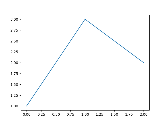
s = pd.Series([1, 3, 2]) s.plot.line()
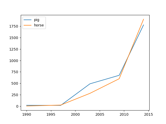
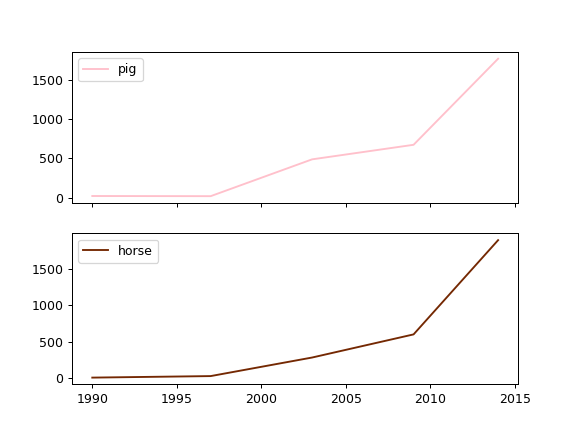
The following example shows the populations for some animals over the years.
df = pd.DataFrame({ ... 'pig': [20, 18, 489, 675, 1776], ... 'horse': [4, 25, 281, 600, 1900] ... }, index=[1990, 1997, 2003, 2009, 2014]) lines = df.plot.line()
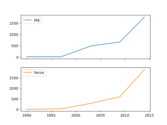
An example with subplots, so an array of axes is returned.
axes = df.plot.line(subplots=True) type(axes) <class 'numpy.ndarray'>
Let’s repeat the same example, but specifying colors for each column (in this case, for each animal).
axes = df.plot.line( ... subplots=True, color={"pig": "pink", "horse": "#742802"} ... )
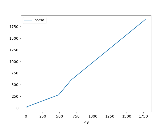
The following example shows the relationship between both populations.
lines = df.plot.line(x='pig', y='horse')