IsolationForest example (original) (raw)
Note
Go to the endto download the full example code. or to run this example in your browser via JupyterLite or Binder
An example using IsolationForest for anomaly detection.
The Isolation Forest is an ensemble of “Isolation Trees” that “isolate” observations by recursive random partitioning, which can be represented by a tree structure. The number of splittings required to isolate a sample is lower for outliers and higher for inliers.
In the present example we demo two ways to visualize the decision boundary of an Isolation Forest trained on a toy dataset.
Authors: The scikit-learn developers
SPDX-License-Identifier: BSD-3-Clause
Data generation#
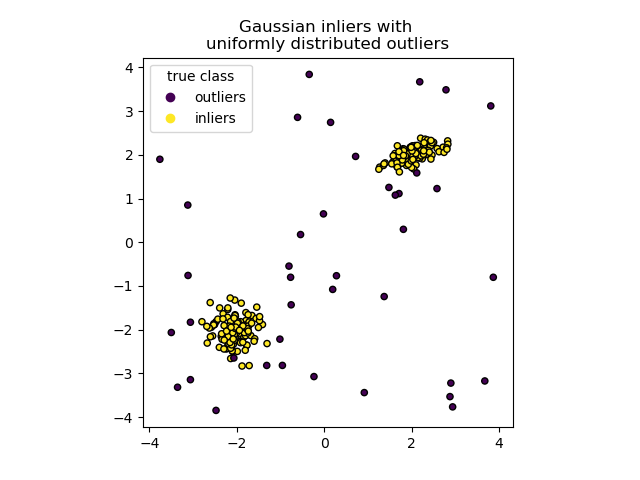
We generate two clusters (each one containing n_samples) by randomly sampling the standard normal distribution as returned bynumpy.random.randn. One of them is spherical and the other one is slightly deformed.
For consistency with the IsolationForest notation, the inliers (i.e. the gaussian clusters) are assigned a ground truth label 1whereas the outliers (created with numpy.random.uniform) are assigned the label -1.
import numpy as np
from sklearn.model_selection import train_test_split
n_samples, n_outliers = 120, 40 rng = np.random.RandomState(0) covariance = np.array([[0.5, -0.1], [0.7, 0.4]]) cluster_1 = 0.4 * rng.randn(n_samples, 2) @ covariance + np.array([2, 2]) # general cluster_2 = 0.3 * rng.randn(n_samples, 2) + np.array([-2, -2]) # spherical outliers = rng.uniform(low=-4, high=4, size=(n_outliers, 2))
X = np.concatenate([cluster_1, cluster_2, outliers]) y = np.concatenate( [np.ones((2 * n_samples), dtype=int), -np.ones((n_outliers), dtype=int)] )
X_train, X_test, y_train, y_test = train_test_split(X, y, stratify=y, random_state=42)
We can visualize the resulting clusters:
import matplotlib.pyplot as plt
scatter = plt.scatter(X[:, 0], X[:, 1], c=y, s=20, edgecolor="k") handles, labels = scatter.legend_elements() plt.axis("square") plt.legend(handles=handles, labels=["outliers", "inliers"], title="true class") plt.title("Gaussian inliers with \nuniformly distributed outliers") plt.show()
Training of the model#
IsolationForest(max_samples=100, random_state=0)
In a Jupyter environment, please rerun this cell to show the HTML representation or trust the notebook. On GitHub, the HTML representation is unable to render, please try loading this page with nbviewer.org.
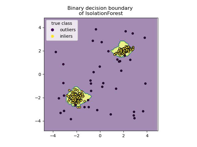
Plot discrete decision boundary#
We use the class DecisionBoundaryDisplay to visualize a discrete decision boundary. The background color represents whether a sample in that given area is predicted to be an outlier or not. The scatter plot displays the true labels.
import matplotlib.pyplot as plt
from sklearn.inspection import DecisionBoundaryDisplay
disp = DecisionBoundaryDisplay.from_estimator( clf, X, response_method="predict", alpha=0.5, ) disp.ax_.scatter(X[:, 0], X[:, 1], c=y, s=20, edgecolor="k") disp.ax_.set_title("Binary decision boundary \nof IsolationForest") plt.axis("square") plt.legend(handles=handles, labels=["outliers", "inliers"], title="true class") plt.show()
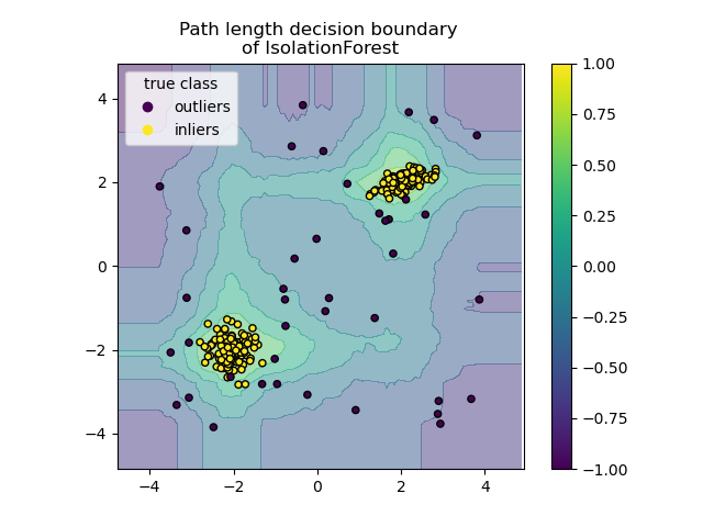
Plot path length decision boundary#
By setting the response_method="decision_function", the background of theDecisionBoundaryDisplay represents the measure of normality of an observation. Such score is given by the path length averaged over a forest of random trees, which itself is given by the depth of the leaf (or equivalently the number of splits) required to isolate a given sample.
When a forest of random trees collectively produce short path lengths for isolating some particular samples, they are highly likely to be anomalies and the measure of normality is close to 0. Similarly, large paths correspond to values close to 1 and are more likely to be inliers.
disp = DecisionBoundaryDisplay.from_estimator( clf, X, response_method="decision_function", alpha=0.5, ) disp.ax_.scatter(X[:, 0], X[:, 1], c=y, s=20, edgecolor="k") disp.ax_.set_title("Path length decision boundary \nof IsolationForest") plt.axis("square") plt.legend(handles=handles, labels=["outliers", "inliers"], title="true class") plt.colorbar(disp.ax_.collections[1]) plt.show()
Total running time of the script: (0 minutes 0.478 seconds)
Related examples