Step-by-step guide | Chart.js (original) (raw)
Follow this guide to get familiar with all major concepts of Chart.js: chart types and elements, datasets, customization, plugins, components, and tree-shaking. Don't hesitate to follow the links in the text.
We'll build a Chart.js data visualization with a couple of charts from scratch:
# Build a new application with Chart.js
In a new folder, create the package.json file with the following contents:
Modern front-end applications often use JavaScript module bundlers, so we’ve picked Parcel (opens new window) as a nice zero-configuration build tool. We’re also installing Chart.js v4 and a JavaScript client for Cube (opens new window), an open-source API for data apps we’ll use to fetch real-world data (more on that later).
Run npm install, yarn install, or pnpm install to install the dependencies, then create the src folder. Inside that folder, we’ll need a very simple index.html file:
As you can see, Chart.js requires minimal markup: a canvas tag with an id by which we’ll reference the chart later. By default, Chart.js charts are responsive and take the whole enclosing container. So, we set the width of the div to control chart width.
Lastly, let’s create the src/acquisitions.js file with the following contents:
Let’s walk through this code:
- We import
Chart, the main Chart.js class, from the specialchart.js/autopath. It loads all available Chart.js components (which is very convenient) but disallows tree-shaking. We’ll address that later. - We instantiate a new
Chartinstance and provide two arguments: the canvas element where the chart would be rendered and the options object. - We just need to provide a chart type (
bar) and providedatawhich consists oflabels(often, numeric or textual descriptions of data points) and an array ofdatasets(Chart.js supports multiple datasets for most chart types). Each dataset is designated with alabeland contains an array of data points. - For now, we only have a few entries of dummy data. So, we extract
yearandcountproperties to produce the arrays oflabelsand data points within the only dataset.
Time to run the example with npm run dev, yarn dev, or pnpm dev and navigate to localhost:1234 (opens new window) in your web browser:
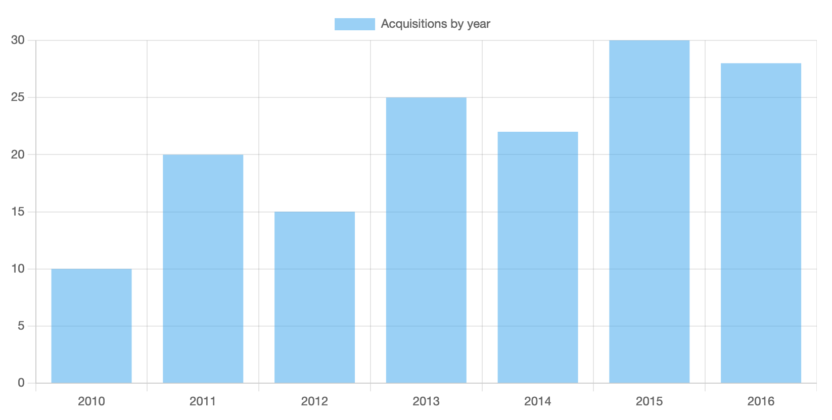
With just a few lines of code, we’ve got a chart with a lot of features: a legend, grid lines, ticks, and tooltips shown on hover. Refresh the web page a few times to see that the chart is also animated. Try clicking on the “Acquisitions by year” label to see that you’re also able to toggle datasets visibility (especially useful when you have multiple datasets).
# Simple customizations
Let’s see how Chart.js charts can be customized. First, let’s turn off the animations so the chart appears instantly. Second, let’s hide the legend and tooltips since we have only one dataset and pretty trivial data.
Replace the new Chart(...); invocation in src/acquisitions.js with the following snippet:
As you can see, we’ve added the options property to the second argument—that’s how you can specify all kinds of customization options for Chart.js. The animation is disabled with a boolean flag provided via animation. Most chart-wide options (e.g., responsiveness or device pixel ratio) are configured like this.
The legend and tooltips are hidden with boolean flags provided under the respective sections in plugins. Note that some of Chart.js features are extracted into plugins: self-contained, separate pieces of code. A few of them are available as a part of Chart.js distribution (opens new window), other plugins are maintained independently and can be located in the awesome list (opens new window) of plugins, framework integrations, and additional chart types.
You should be able to see the updated minimalistic chart in your browser.
# Real-world data
With hardcoded, limited-size, unrealistic data, it’s hard to show the full potential of Chart.js. Let’s quickly connect to a data API to make our example application closer to a production use case.
Let’s create the src/api.js file with the following contents:
Let’s see what’s happening there:
- We
importthe JavaScript client library for Cube (opens new window), an open-source API for data apps, configure it with the API URL (apiUrl) and the authentication token (cubeToken), and finally instantiate the client (cubeApi). - Cube API is hosted in Cube Cloud (opens new window) and connected to a database with a public dataset (opens new window) of ~140,000 records representing all of the artworks in the collection of the Museum of Modern Art (opens new window) in New York, USA. Certainly, a more real-world dataset than what we’ve got now.
- We define a couple of asynchronous functions to fetch data from the API:
getAquisitionsByYearandgetDimensions. The first one returns the number of artworks by the year of acquisition, the other returns the number of artworks for every width-height pair (we’ll need it for another chart). - Let’s take a look at
getAquisitionsByYear. First, we create a declarative, JSON-based query in theacquisitionsByYearQueryvariable. As you can see, we specify that for everyyearAcquiredwe’d like to get thecountof artworks;yearAcquiredhas to be set (i.e., not undefined); the result set would be sorted byyearAcquiredin the ascending order. - Second, we fetch the
resultSetby callingcubeApi.loadand map it to an array of objects with desiredyearandcountproperties.
Now, let’s deliver the real-world data to our chart. Please apply a couple of changes to src/acquisitions.js: add an import and replace the definition of the data variable.
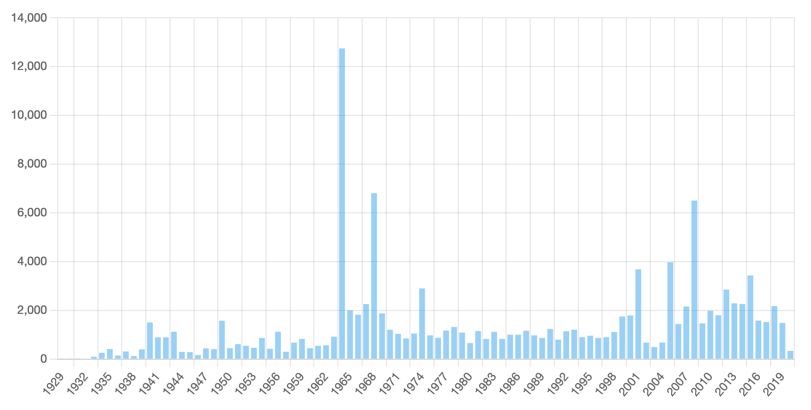
Done! Now, our chart with real-world data looks like this. Looks like something interesting happened in 1964, 1968, and 2008!
We’re done with the bar chart. Let’s try another Chart.js chart type.
# Further customizations
Chart.js supports many common chart types.
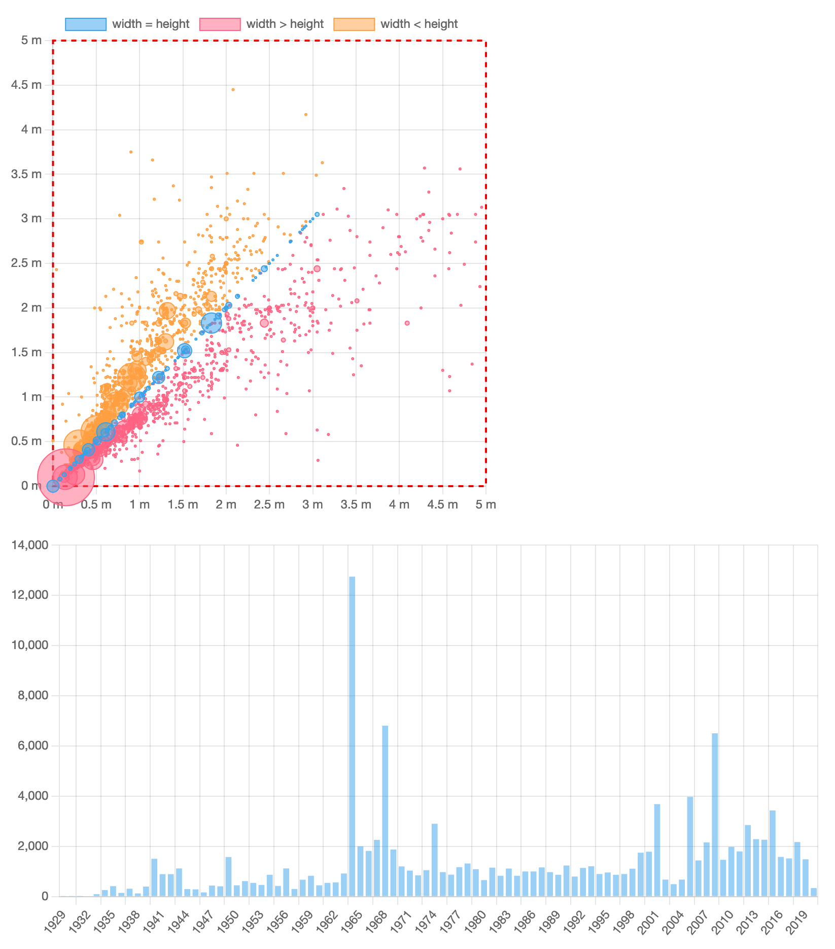
For instance, Bubble chart allows to display three dimensions of data at the same time: locations on x and y axes represent two dimensions, and the third dimension is represented by the size of the individual bubbles.
To create the chart, stop the already running application, then go to src/index.html, and uncomment the following two lines:
Then, create the src/dimensions.js file with the following contents:
Probably, everything is pretty straightforward there: we get data from the API and render a new chart with the bubble type, passing three dimensions of data as x, y, and r (radius) properties.
Now, reset caches with rm -rf .parcel-cache and start the application again with npm run dev, yarn dev, or pnpm dev. We can review the new chart now:
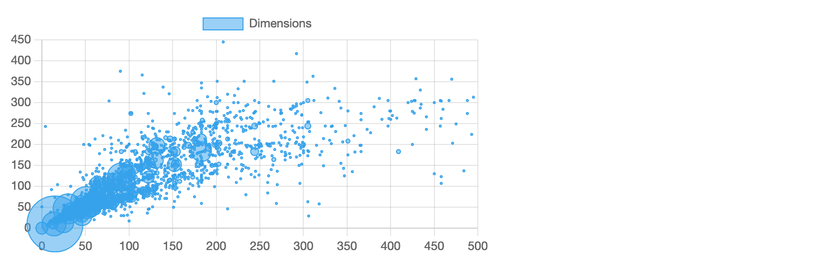
Well, it doesn’t look pretty.
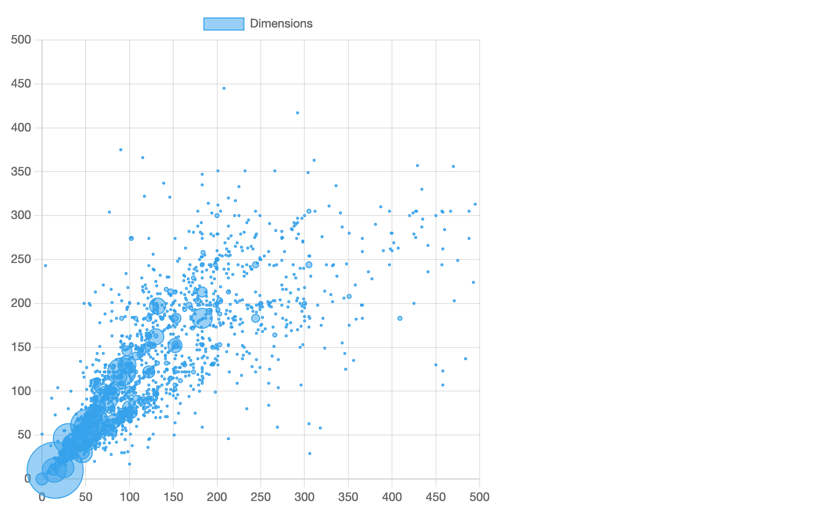
First of all, the chart is not square. Artworks’ width and height are equally important so we’d like to make the chart width equal to its height as well. By default, Chart.js charts have the aspect ratio of either 1 (for all radial charts, e.g., a doughnut chart) or 2 (for all the rest). Let’s modify the aspect ratio for our chart:
Looks much better now:
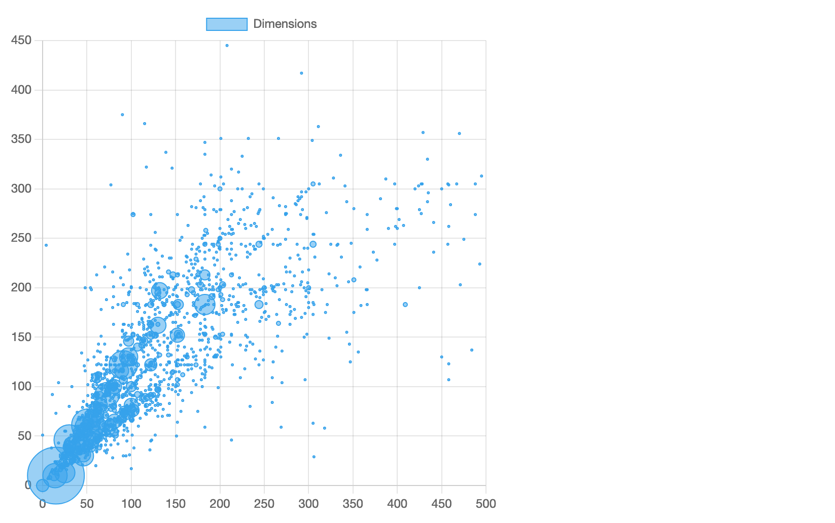
However, it’s still not ideal. The horizontal axis spans from 0 to 500 while the vertical axis spans from 0 to 450. By default, Chart.js automatically adjusts the range (minimum and maximum values) of the axes to the values provided in the dataset, so the chart “fits” your data. Apparently, MoMa collection doesn’t have artworks in the range of 450 to 500 cm in height. Let’s modify the axes configuration for our chart to account for that:
Great! Behold the updated chart:
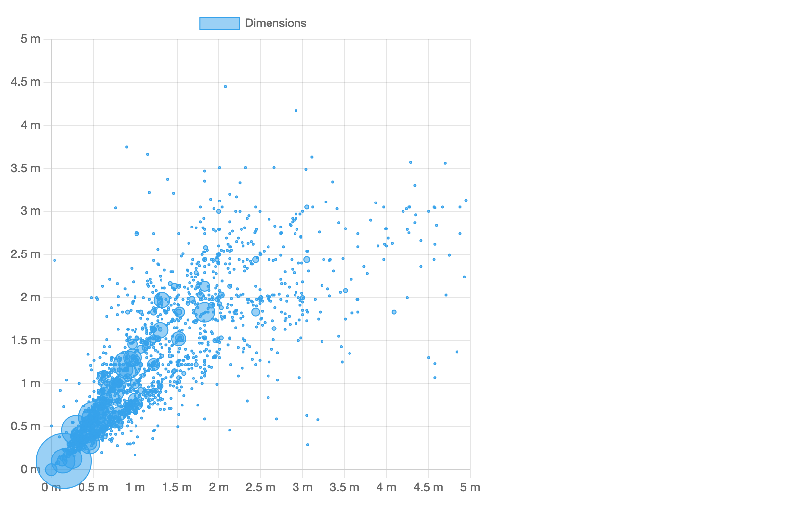
However, there’s one more nitpick: what are these numbers? It’s not very obvious that the units are centimetres. Let’s apply a custom tick format to both axes to make things clear. We’ll provide a callback function that would be called to format each tick value. Here’s the updated axes configuration:
Perfect, now we have proper units on both axes:
# Multiple datasets
Chart.js plots each dataset independently and allows to apply custom styles to them.
Take a look at the chart: there’s a visible “line” of bubbles with equal x and y coordinates representing square artworks. It would be cool to put these bubbles in their own dataset and paint them differently. Also, we can separate “taller” artworks from “wider” ones and paint them differently, too.
Here’s how we can do that. Replace the datasets with the following code:
As you can see, we define three datasets with different labels. Each dataset gets its own slice of data extracted with filter. Now they are visually distinct and, as you already know, you can toggle their visibility independently.
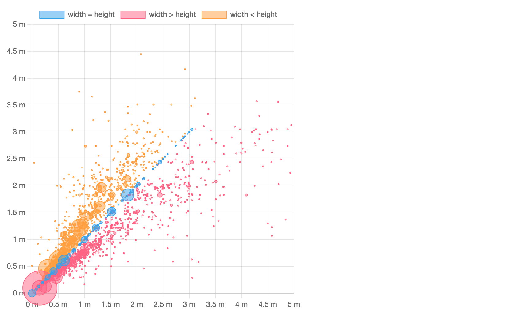
Here we rely on the default color palette. However, keep in mind every chart type supports a lot of dataset options that you can feel free to customize.
# Plugins
Another—and very powerful!—way to customize Chart.js charts is to use plugins. You can find some in the plugin directory (opens new window) or create your own, ad-hoc ones. In Chart.js ecosystem, it’s idiomatic and expected to fine tune charts with plugins. For example, you can customize canvas background or add a border to it with simple ad-hoc plugins. Let’s try the latter.
Plugins have an extensive API but, in a nutshell, a plugin is defined as an object with a name and one or more callback functions defined in the extension points. Insert the following snippet before and in place of the new Chart(...); invocation in src/dimensions.js:
As you can see, in this chartAreaBorder plugin, we acquire the canvas context, save its current state, apply styles, draw a rectangular shape around the chart area, and restore the canvas state. We’re also passing the plugin in plugins so it’s only applied to this particular chart. We also pass the plugin options in options.plugins.chartAreaBorder; we could surely hardcode them in the plugin source code but it’s much more reusable this way.
Our bubble chart looks fancier now:
# Tree-shaking
In production, we strive to ship as little code as possible, so the end users can load our data applications faster and have better experience. For that, we’ll need to apply tree-shaking (opens new window) which is fancy term for removing unused code from the JavaScript bundle.
Chart.js fully supports tree-shaking with its component design. You can register all Chart.js components at once (which is convenient when you’re prototyping) and get them bundled with your application. Or, you can register only necessary components and get a minimal bundle, much less in size.
Let’s inspect our example application. What’s the bundle size? You can stop the application and run npm run build, or yarn build, or pnpm build. In a few moments, you’ll get something like this:
We can see that Chart.js and other dependencies were bundled together in a single 265 KB file.
To reduce the bundle size, we’ll need to apply a couple of changes to src/acquisitions.js and src/dimensions.js. First, we’ll need to remove the following import statement from both files: import Chart from 'chart.js/auto'.
Instead, let’s load only necessary components and “register” them with Chart.js using Chart.register(...). Here’s what we need in src/acquisitions.js:
And here’s the snippet for src/dimensions.js:
You can see that, in addition to the Chart class, we’re also loading a controller for the chart type, scales, and other chart elements (e.g., bars or points). You can look all available components up in the documentation.
Alternatively, you can follow Chart.js advice in the console. For example, if you forget to import BarController for your bar chart, you’ll see the following message in the browser console:
Remember to carefully check for imports from chart.js/auto when preparing your application for production. It takes only one import like this to effectively disable tree-shaking.
Now, let’s inspect our application once again. Run yarn build and you’ll get something like this:
By importing and registering only select components, we’ve removed more than 56 KB of unnecessary code. Given that other dependencies take ~50 KB in the bundle, tree-shaking helps remove ~25% of Chart.js code from the bundle for our example application.
# Next steps
Now you’re familiar with all major concepts of Chart.js: chart types and elements, datasets, customization, plugins, components, and tree-shaking.
Feel free to review many examples of charts in the documentation and check the awesome list (opens new window) of Chart.js plugins and additional chart types as well as framework integrations (opens new window) (e.g., React, Vue, Svelte, etc.). Also, don’t hesitate to join Chart.js Discord (opens new window) and follow Chart.js on Twitter (opens new window).
Have fun and good luck building with Chart.js!