Plot Categorical Data - MATLAB & Simulink (original) (raw)
This example shows how to plot data from a categorical array.
Load Sample Data
Load sample data gathered from 100 patients. Display the data types and sizes of the arrays from the patients MAT-file.
Name Size Bytes Class Attributes
Age 100x1 800 double
Diastolic 100x1 800 double
Gender 100x1 13012 cell
Height 100x1 800 double
LastName 100x1 13216 cell
Location 100x1 15808 cell
SelfAssessedHealthStatus 100x1 13140 cell
Smoker 100x1 100 logical
Systolic 100x1 800 double
Weight 100x1 800 double
Create Categorical Arrays
The workspace variable, Location, lists three unique medical facilities where patients were observed.
To access and compare data more easily, convert Location to a categorical array.
Location = categorical(Location);
Summarize the categorical array. The summary displays the number of times each category appears in Location.
Location: 100x1 categorical
 County General Hospital       39
 St. Mary's Medical Center      24
 VA Hospital                   37
 <undefined>                    0
39 patients were observed at County General Hospital, 24 at St. Mary's Medical Center, and 37 at the VA Hospital.
The workspace variable, SelfAssessedHealthStatus, contains four unique values, Excellent, Fair, Good, and Poor.
Convert SelfAssessedHealthStatus to an ordinal categorical array, such that the categories have the mathematical ordering Poor < Fair < Good < Excellent.
SelfAssessedHealthStatus = categorical(SelfAssessedHealthStatus, ... ["Poor" "Fair" "Good" "Excellent"], ... Ordinal=true);
Summarize the categorical array, SelfAssessedHealthStatus.
summary(SelfAssessedHealthStatus)
SelfAssessedHealthStatus: 100x1 ordinal categorical
 Poor             11
 Fair             15
 Good             40
 Excellent        34
 <undefined>       0
Additional statistics:
Min         Poor
Median      Good
Max         Excellent
Plot Histogram
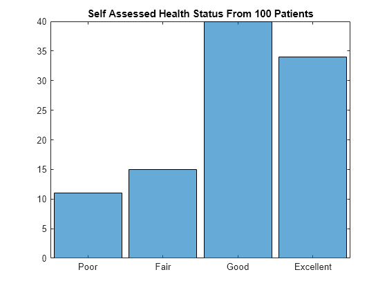
Create a histogram bar plot directly from SelfAssessedHealthStatus. This categorical array is an ordinal categorical array. The categories have the ordering Poor < Fair < Good < Excellent, which determines the order of the categories along the _x_-axis of the plot. The histogram function plots the category counts for each of the four categories.
figure histogram(SelfAssessedHealthStatus) title("Self Assessed Health Status From 100 Patients")
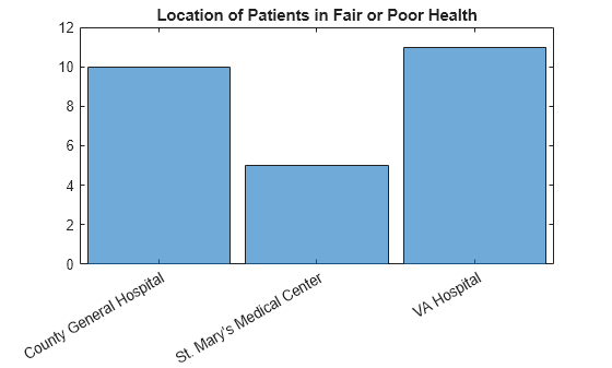
Create a histogram of the hospital location for only the patients who assessed their health as Fair or Poor.
figure histogram(Location(SelfAssessedHealthStatus <= "Fair")) title("Location of Patients in Fair or Poor Health")
Create Pie Chart
Create a pie chart directly from a categorical array.
figure pie(SelfAssessedHealthStatus); title("Self Assessed Health Status From 100 Patients")
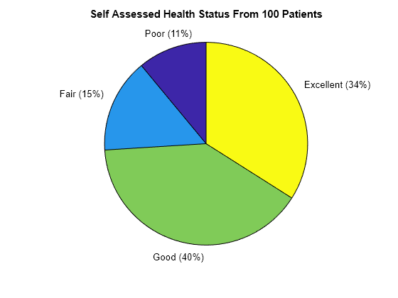
The function pie accepts the categorical array, SelfAssessedHealthStatus, and plots a pie chart of the four categories.
Create Pareto Chart
Create a Pareto chart from the category counts for each of the four categories of SelfAssessedHealthStatus.
figure A = countcats(SelfAssessedHealthStatus); C = categories(SelfAssessedHealthStatus); pareto(A,C); title("Self Assessed Health Status From 100 Patients")
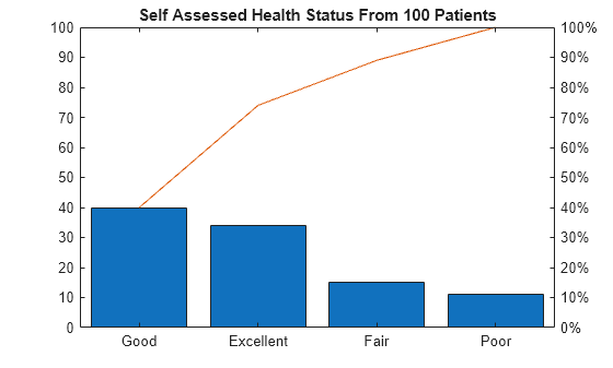
The first input argument to pareto must be a vector. If a categorical array is a matrix or multidimensional array, reshape it into a vector before calling countcats and pareto.
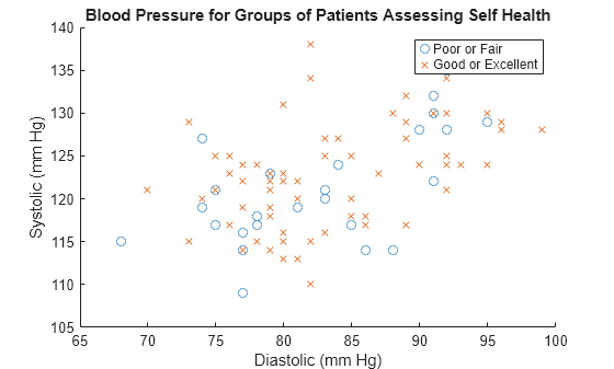
Create Scatter Plot
Determine if self-assessed health is related to blood pressure readings. Create a scatter plot of Diastolic and Systolic readings for two groups of patients.
First, create _x_- and _y_-arrays of blood pressure readings for two groups of patients. The first group of patients consists of those who assess their self-health as either Poor or Fair. The second group consists of those who assess their self-health as Good or Excellent.
You can use the categorical array, SelfAssessedHealthStatus, to create logical indices. Use the logical indices to extract values from Diastolic and Systolic into different arrays.
X1 = Diastolic(SelfAssessedHealthStatus <= "Fair"); Y1 = Systolic(SelfAssessedHealthStatus <= "Fair");
X2 = Diastolic(SelfAssessedHealthStatus >= "Good"); Y2 = Systolic(SelfAssessedHealthStatus >= "Good");
X1 and Y1 are 26-by-1 numeric arrays containing data for the patients with Poor or Fair health.
X2 and Y2 are 74-by-1 numeric arrays containing data for the patients with Good or Excellent health.
Create a scatter plot of blood pressure readings for the two groups of patients. The plot shows no suggestive differences between the two groups, possibly indicating that blood pressure does not affect how these patients assessed their own health.
figure h1 = scatter(X1,Y1,"o"); hold on h2 = scatter(X2,Y2,"x");
title("Blood Pressure for Groups of Patients Assessing Self Health"); xlabel("Diastolic (mm Hg)") ylabel("Systolic (mm Hg)") legend("Poor or Fair","Good or Excellent")
See Also
categorical | summary | countcats | histogram | pie | bar | rose | scatter