The fine scale genetic structure of the British population (original) (raw)
. Author manuscript; available in PMC: 2015 Nov 4.
Published in final edited form as: Nature. 2015 Mar 19;519(7543):309–314. doi: 10.1038/nature14230
Summary
Fine-scale genetic variation between human populations is interesting as a signature of historical demographic events and because of its potential for confounding disease studies. We use haplotype-based statistical methods to analyse genome-wide SNP data from a carefully chosen geographically diverse sample of 2,039 individuals from the United Kingdom (UK). This reveals a rich and detailed pattern of genetic differentiation with remarkable concordance between genetic clusters and geography. The regional genetic differentiation and differing patterns of shared ancestry with 6,209 individuals from across Europe carry clear signals of historical demographic events. We estimate the genetic contribution to SE England from Anglo-Saxon migrations to be under half, identify the regions not carrying genetic material from these migrations, suggest significant pre-Roman but post-Mesolithic movement into SE England from the Continent, and show that in non-Saxon parts of the UK there exist genetically differentiated subgroups rather than a general “Celtic” population.
Background
The genetic composition of human populations varies throughout the world, as a result of the interplay between population movement, admixture, natural selection, and genetic drift. Characterising such geographical population structure provides insights into demographic history and is critical to genetic studies of disease1–3.
Human population structure is reasonably well understood at broad scales, for example between and within continents4–10. Here we investigate structure over much finer scales, in Caucasians within the United Kingdom (UK) consisting of England, Scotland, Wales and Northern Ireland. We use “Britain” (technically “Great Britain”) to refer to the single island consisting of modern-day England, Scotland and Wales. UK population structure has been studied before, typically on relatively small samples using various single-locus systems, and recently genome-wide SNP data11,12. These earlier studies show some regional variation at particular loci, with a weak, roughly north-south, cline in allele frequencies genome-wide, suggesting that population structure in the UK is rather limited.
Samples and Analysis Methods
To investigate fine-scale population structure in the UK, and to provide well-characterised controls for disease studies, we assembled a sample, the People of the British Isles (PoBI) collection, as previously described13. Our analyses use 2,039 PoBI samples from rural areas within the UK, genotyped as part of WTCCC2, who had all four grandparents born within 80 kilometres of each other. We thus effectively sample DNA from the grandparents. The grandparents’ average year of birth is 1885 (s.d. 18 years). Since the DNA from each PoBI participant is a random sample of their grandparents’ DNA, our approach allows investigation of fine scale population structure in rural areas of the UK before the major population movements of the 20th century.
To provide context for the UK samples, we analysed 6,209 samples from 10 countries in continental Europe genotyped in the WTCCC2 study of multiple sclerosis14. To ensure compatibility between the PoBI and continental European samples we restricted attention to autosomal SNPs genotyped in both samples (~500K SNPs, see Methods).
Fine-scale UK population differentiation
Consistent with earlier studies of the UK, population structure within the PoBI collection is very limited. The average of the pairwise FST estimates between each of the 30 sample collection districts is 0.0007, with a maximum of 0.003 (Supplementary Table 1).
Against this background of very limited structure within the UK, we applied a recently developed method for detecting fine-scale population structure, fineSTRUCTURE15, to the PoBI samples, to look for more subtle effects. See Methods (also Extended Data Figs 1, 2) for an informal description, details, interpretation under both discrete and isolation-by-distance models, assessment of convergence, and enhancements to the algorithm as applied in this study. In contrast to commonly used approaches such as principal components or ADMIXTURE16, fineSTRUCTURE explicitly models the correlation between nearby SNPs, and uses extended multi-marker haplotypes throughout the genome. This substantially increases its power to detect subtle levels of genetic differentiation.
The fineSTRUCTURE algorithm can divide samples into genetic clusters hierarchically, from coarser to finer levels of structuring. We applied fineSTRUCTURE to the PoBI samples’ genetic data without reference to the known geographical locations. The genetic clustering can be assessed with respect to geography by plotting individuals on a map of the UK (at the centroid of their grandparents’ places of birth) and examining the inferred genetic clusters, for different levels of the hierarchical clustering.
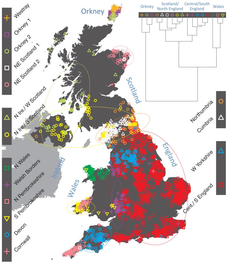
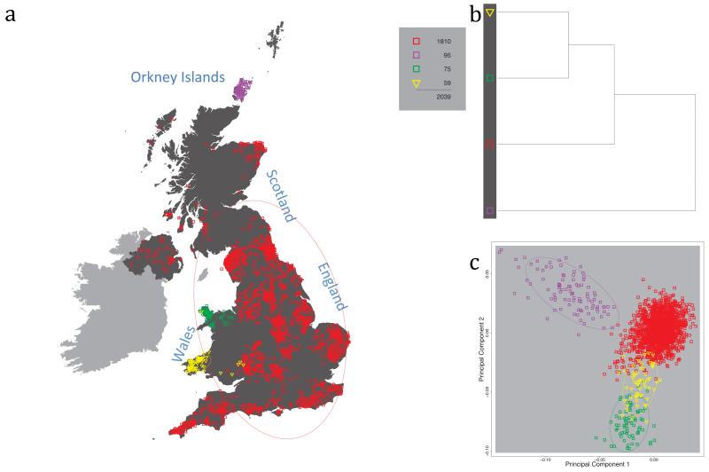
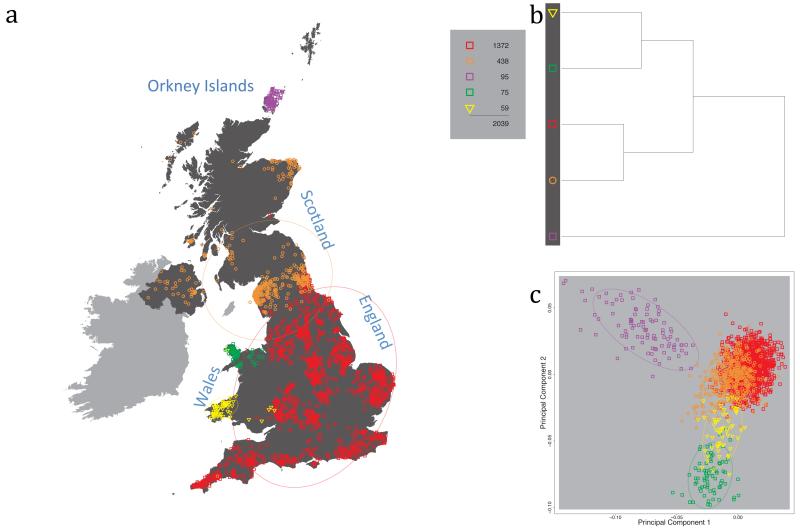
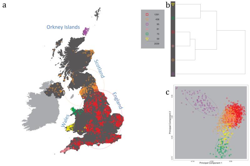
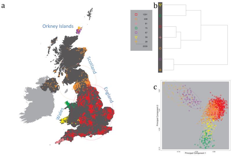
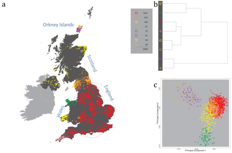
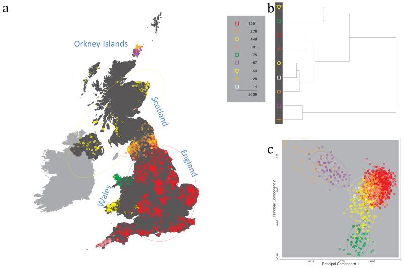
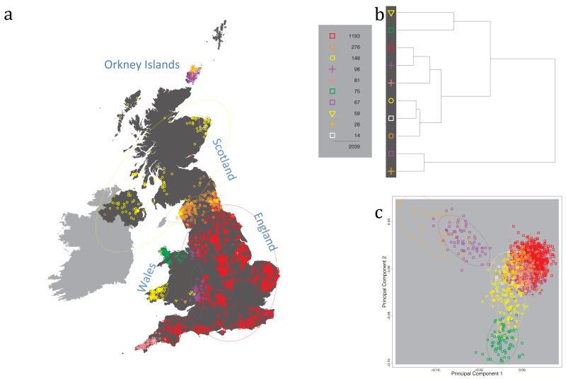
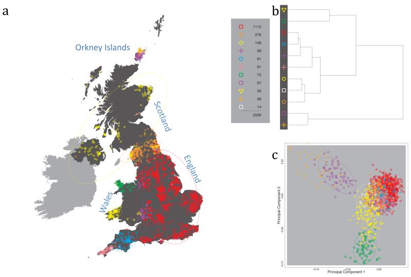
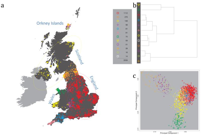
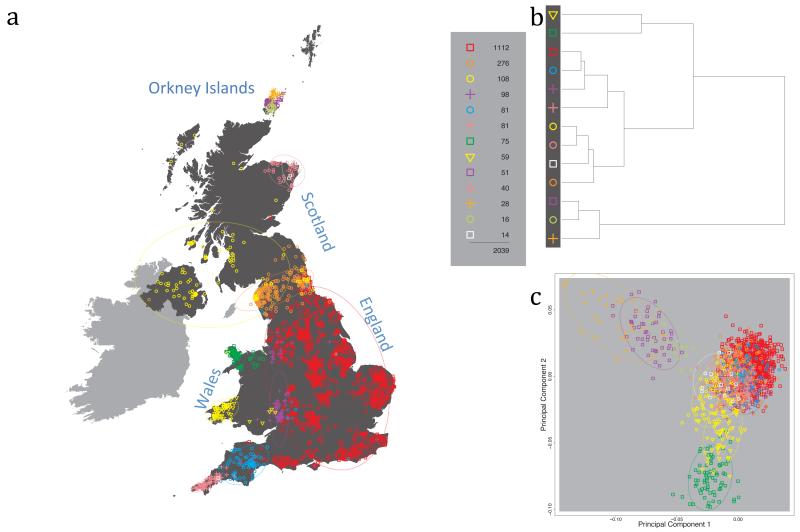
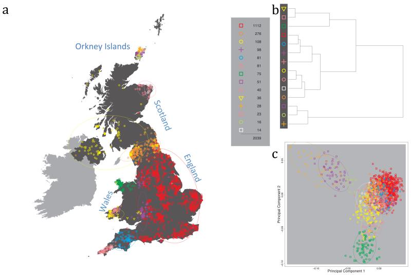
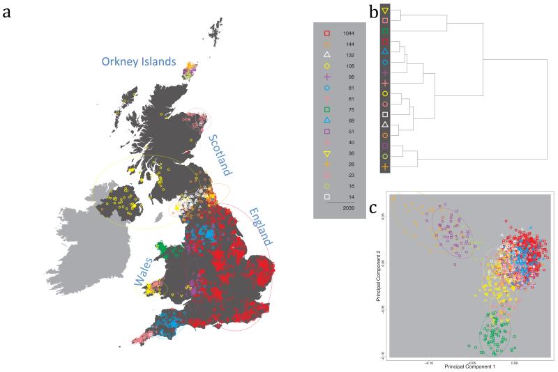
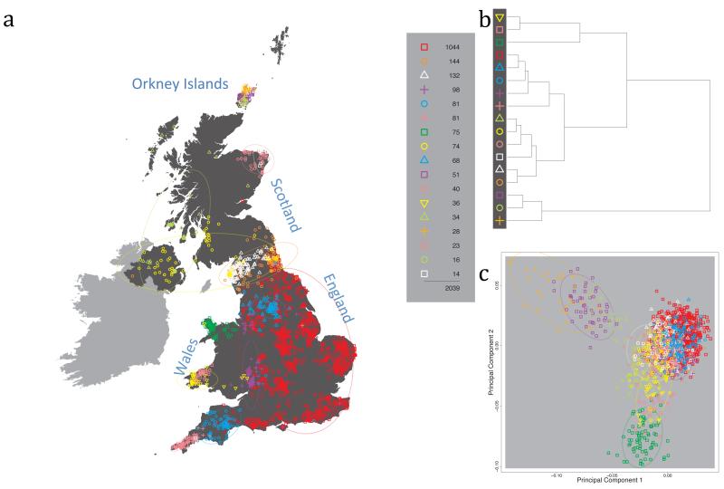
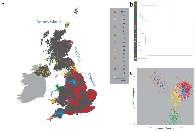
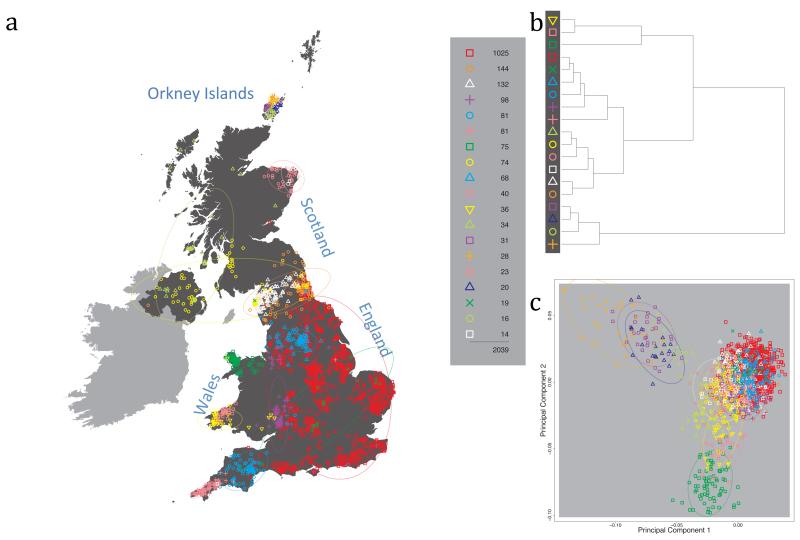
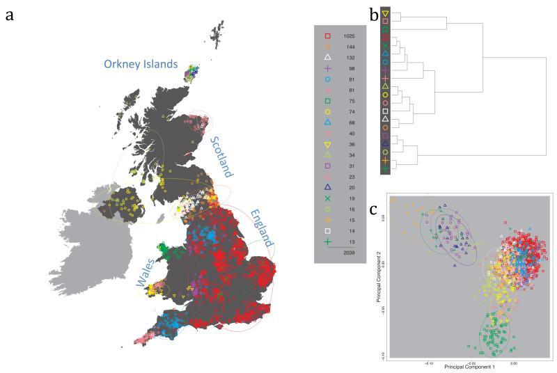
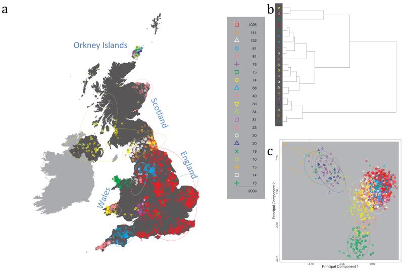
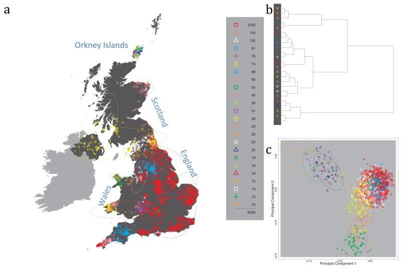
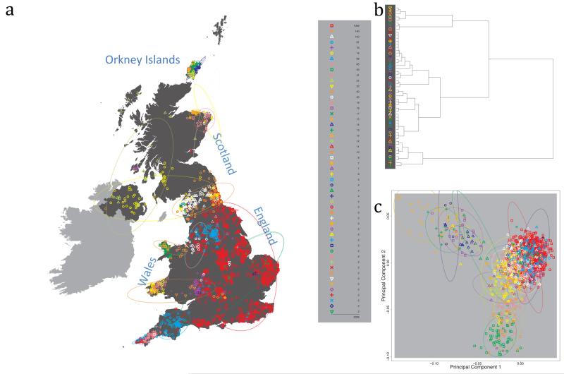
Fig. 1 shows this map for 17 clusters, together with the tree showing how these clusters are related at coarser levels of the hierarchy. (There is nothing special about this level of clustering, but it is convenient for describing some of the main features of our analysis. Extended Data Fig. 3 depicts maps showing other levels of the hierarchical clustering.) The correspondence between the genetic clusters and geography is striking: most of the genetic clusters are highly localised, with many occupying non-overlapping regions. Because the genetic clustering made no reference to the geographical location of the samples, the resulting correspondence between genetic clusters and geography reassures us that our approach is detecting real population differentiation at fine scales. Our approach can separate groups in close proximity, such as in Cornwall and Devon in southwest England, where the genetic clusters closely match the modern county boundaries, or in Orkney, off the north coast of Scotland.
Figure 1. Clustering of the 2,039 UK individuals into 17 clusters based only on genetic data.
For each individual, the coloured symbol representing the genetic cluster to which the individual is assigned is plotted at the centroid of their grandparents’ birthplace. Cluster names are in side-bars and ellipses give an informal sense of the range of each cluster (see Methods). No relationship between clusters is implied by the colours/symbols. The tree (top right) depicts the order of the hierarchical merging of clusters (see Methods for the interpretation of branch lengths).
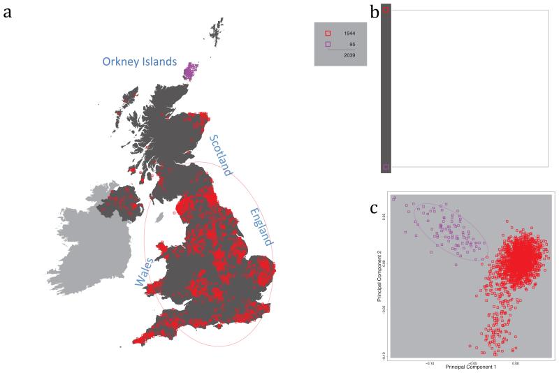
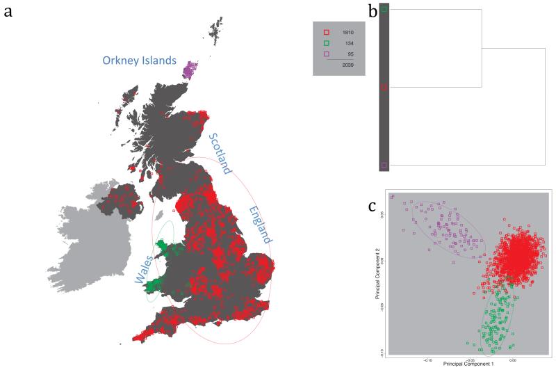
It is instructive to consider the tree that describes the hierarchical splitting of the 2,039 genotyped individuals into successively finer clusters (Fig. 1). The coarsest level of genetic differentiation (i.e. the assignment into two clusters) separates the samples in Orkney from all others. Next the Welsh samples separate from the other non-Orkney samples. Subsequent splits reveal more subtle differentiation (reflected in the shorter distances between branches), including separation of north and south Wales, then separation of the north of England, Scotland, and Northern Ireland from the rest of England, and separation of samples in Cornwall from the large English cluster. There is a single large cluster (red squares) that covers most of central and southern England and extends up the east coast. Strikingly, even at the finest level of differentiation returned by fineSTRUCTURE (53 clusters), this cluster remains largely intact, and contains almost half the individuals (1,006) in our study.
Although larger than between the sampling locations, estimated FST values between the clusters represented in Fig 1 are small (average 0.002, maximum 0.007, Supplementary Table 2), confirming that differentiation is subtle. On the other hand, all comparisons between pairs of clusters of their patterns of ancestry as estimated by fineSTRUCTURE show highly significant differences (Supplementary Table 3).
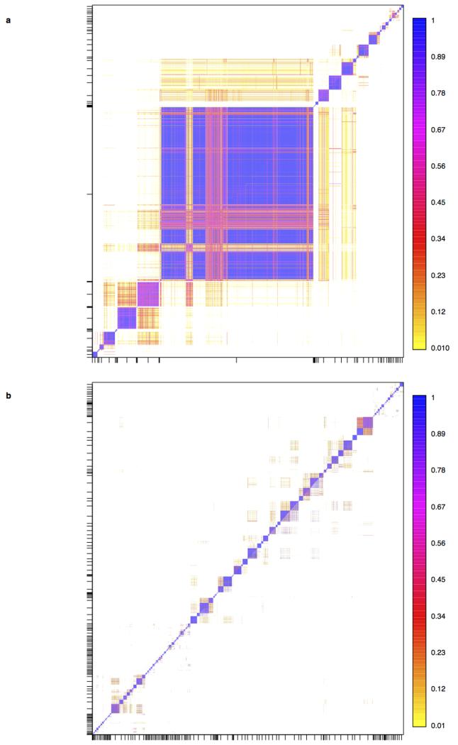
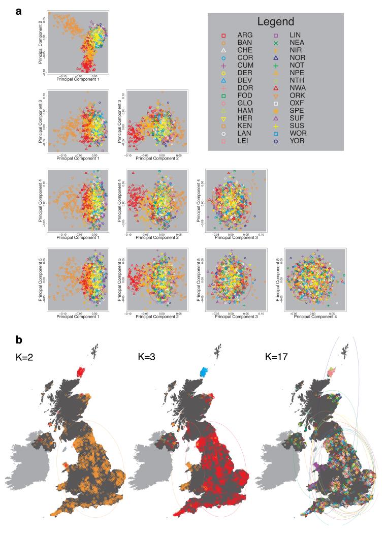
We compared our approach to two widely used analysis tools, namely principal components17 and ADMIXTURE16 (Extended Data Figure 4). Both approaches broadly separate samples from Wales and from Orkney, but are not able to distinguish many of the other clusters found by fineSTRUCTURE. We also performed analyses to show that the clustering is not an artefact of our sampling scheme preferentially selecting related individuals (see Methods, Extended Data Fig. 5 and Supplementary Note).
UK clusters in relation to Europe
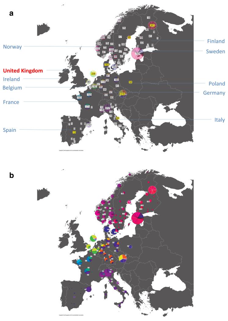
Genetic differences between UK clusters might in part reflect their relative isolation from each other, and in part differing patterns of migration and admixture from populations outside the UK. To gain further insight into this second aspect, we first applied similar fineSTRUCTURE analyses to 6,209 samples from continental Europe (henceforth “Europe”, see Extended Data Fig. 6a for the distribution of the samples by region), and then characterised the genetic composition of the UK clusters with respect to the genetic groups we found in Europe. A fuller analysis of the clustering within Europe, and its interpretation, will be described elsewhere.
To avoid confusion below, we will refer to each of the 17 sets of individuals defined by our fineSTRUCTURE analyses in the UK as a “cluster”, and to each of the sets of individuals defined in our analyses of Europe as a “group”. We focus in these analyses on the division of the European samples into 51 such groups (Extended Data Fig. 6b). We italicise names of UK clusters, to distinguish them from the geographic region (e.g. the pink cross cluster Cornwall, and the county Cornwall). European groups are each given a unique identifying number (these are consecutive at the finest level of clustering, but not at the level we consider). In the text, groups are identified by this number and, for clarity, a three-letter label identifying the country (or countries) where the group is mainly represented (e.g. GER6 for the group labelled “6”, which is mostly found in Germany).
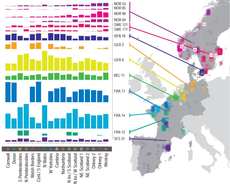
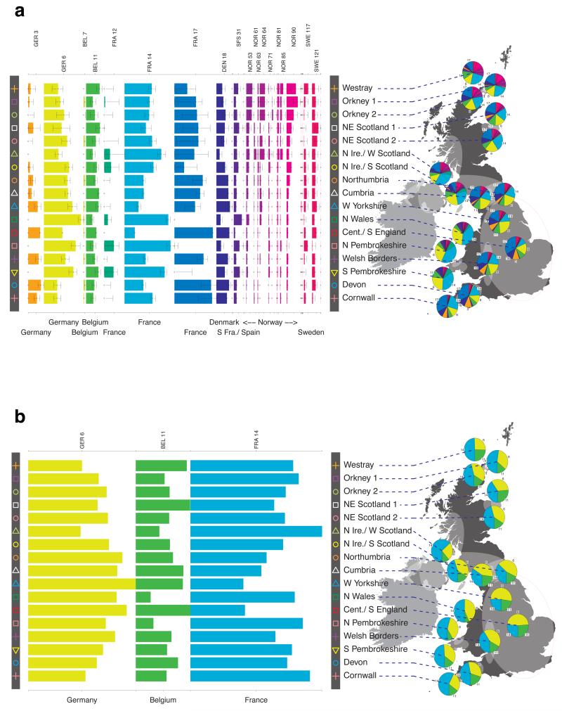
For each UK cluster we estimated an “ancestry profile” which characterises the ancestry of the cluster as a mixture of the ancestry of the 51 European groups. (see Methods for details, also Supplementary Table 4). As for the fineSTRUCTURE clustering, these analyses use no geographical information. The estimated “ancestry profiles” are illustrated in Fig. 2 which also depicts the sampling locations in Europe of the groups contributing to the ancestry profiles (see also Extended Data Fig 7a). Note that it is possible for distinct clusters within the UK to have very similar ancestry profiles: e.g. two UK regions could receive similar contributions from a set of European groups (thus similar ancestry profiles) but then evolve separately (leading to different patterns of shared ancestry within and between the regions, and thus to distinct clusters in fineSTRUCTURE).
Figure 2. European ancestry profiles for the 17 UK clusters.
Each row represents a European group (labels at right). Each column represents a UK cluster. Coloured bars have heights representing the proportion of the UK cluster’s ancestry best represented by that of the European group labelled with that colour. The map shows the location (when known at regional level) of the samples assigned to each European group (some sample locations are jittered and/or moved for clarity, see Methods). Lines join group labels to the centroid of the group, or collection of groups (Norway, Sweden, with individual group centroids marked by group number).
The bar charts in Fig. 2 show that some European groups feature substantially in the ancestry profiles of all UK clusters. These are: GER6 (yellow green) found predominantly in western Germany; BEL11 (green), in the northern, Flemish part of Belgium; FRA14 (light blue), in north-west France; DEN18 (dark blue), in Denmark; SFS31 (blue/purple) in southern France and Spain. In contrast, some European groups feature substantially in the ancestry profiles of some UK clusters but are absent from those of other UK clusters: GER3 (orange), in northern Germany; FRA12 (dark green), in France; and FRA17 (blue), also in France. Two Swedish groups (SWE117 and SWE121) feature in the ancestry profiles of the UK clusters, with Norwegian groups (shades of purple) featuring substantially in the ancestry profiles of the Orkney clusters, and to a lesser extent the clusters involving Scotland and Northern Ireland.
Discussion
The application of powerful haplotype based analysis methods to genome-wide SNP data from a large, carefully-collected, UK sample reveals a rich pattern of subtle fine-scale genetic differentiation within the UK which shows a striking concordance with geography. Few of these details have been captured previously.
The clustering (Fig. 1 and Extended Data Fig. 3) is striking both for its exquisite differentiation over small distances and the stability of some clusters over very large distances. Genetic differentiation within the UK is not related in a simple way to geographical distance. Examples of fine-scale differentiation include the separation of: islands within Orkney; Devon from Cornwall; and the Welsh/English borders from surrounding areas. The edges between clusters follow natural geographical boundaries in some instances, e.g. between Devon and Cornwall (boundaries the Tamar Estuary and Bodmin Moor), and Orkney is separated by sea from Scotland. However, in many instances clusters span geographic boundaries; e.g. the clusters in Northern Ireland span the sea to Scotland.
Although branch lengths on the hierarchical clustering tree in Fig. 1 are not easy to interpret directly, they are indicative of the relative differentiation between UK clusters, so that for example, the differences between Orkney, Wales, and the remainder of the UK, are substantial, compared to some of the finer differences (splits closer to the tips of the tree). North and south Wales are about as distinct genetically from each other as are central and southern England from northern England and Scotland, and the genetic differences between Cornwall and Devon are comparable to or greater than those between northern English and Scottish samples, and to those between islands in Orkney.
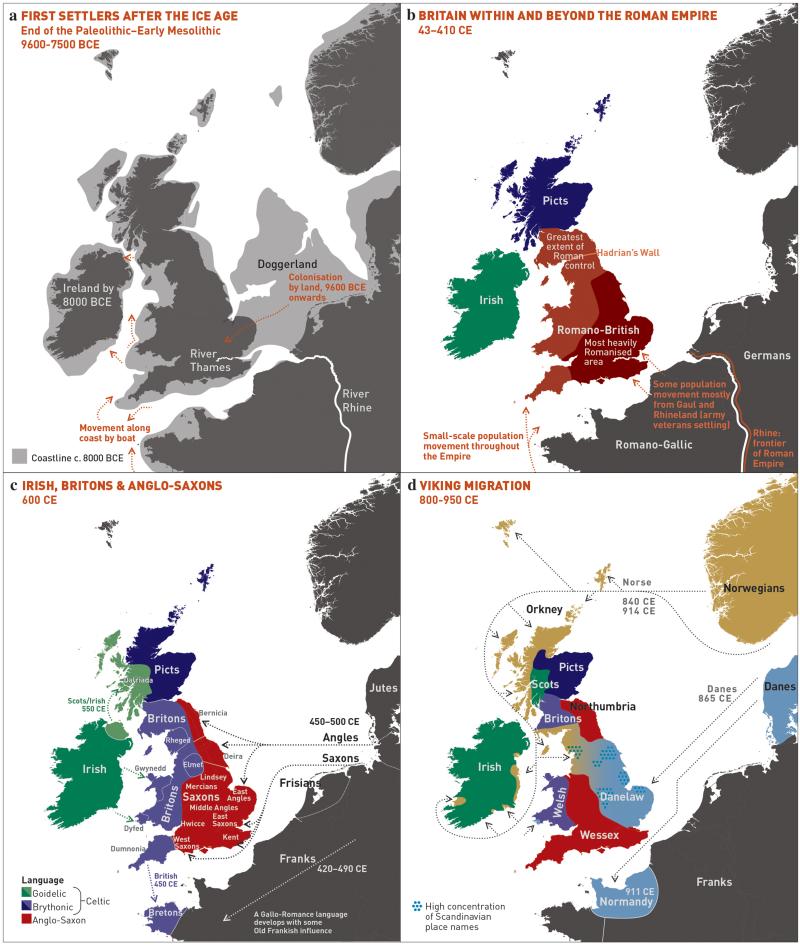
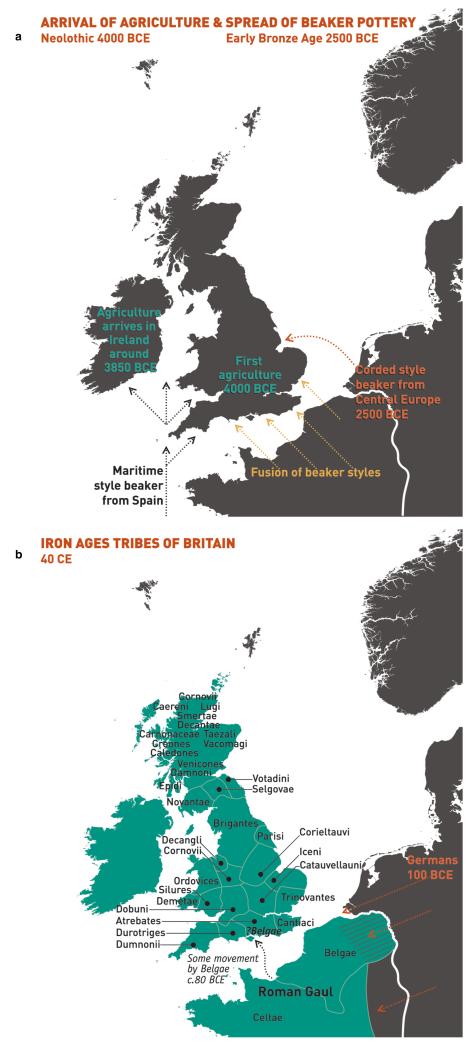
To facilitate further discussion, Figure 3 and Extended Data Figure 8 give an overview of the major population groups and movements of people within and into the UK at different times, based on archaeological, historical and linguistic evidence. For more detail see the Supplementary Note.
Figure 3. Major events in the peopling of the British Isles.
See Supplementary Note for further details. a, The routes taken by the first settlers after the last ice age. b, Britain during the period of Roman rule. c, The regions of ancient British, Irish and Saxon control. d, The migrations of Norse and Danish Vikings. The main regions of Norse Viking (light brown) and Danish Viking (light blue) settlement are shown.
Our observation that samples in Orkney differ genetically from those in the rest of the UK has been noted before18–21 and is consistent with the historical settlement, and long-term control, of Orkney by Norse Vikings (Orkney was a part of Norway from 875 to 1472). Further, the estimated ancestry profiles of the Orkney clusters show substantial contributions from groups in Norway (Fig. 2). This consistency with history and archaeology provides external validation of our approach.
Our approach is clearly powered to detect quite subtle levels of population structure. Not finding such structure in central and southern England is thus informative. While some structure may exist within this region, there must have been sufficient movement of people, and hence of their DNA, since the last major invasions of the UK to make it relatively homogeneous genetically. This does not require large-scale population movements; it could be achieved by relatively local migration over many generations. This region of Britain lacks major geographical and (for the most part since the Roman occupation) geo-political barriers to human movement.
Other UK clusters may well reflect historical events. For example, several genetic clusters in Fig. 1 match the geo-political boundaries in Fig. 3c, and may represent remnants of communities/kingdoms present after the Saxon migrations, while the cluster spanning Northern Ireland and Southern Scotland may reflect the ‘Ulster Plantations’. The Supplementary Note contains further observations relating to the genetic clustering.
Relative isolation has clearly been a major determinant of fine-scale population structure within the UK. To assess the role of a different possible cause, namely differential migration into different parts of the UK, we estimated European “ancestry profiles” for each of the UK genetic clusters (Fig. 2). Here we must use modern-day groupings, in Europe and the UK, as surrogates for the sources and results of major migration events. Population movements between these events and the present, involving either the source populations or recipient groups, will attenuate signals of the original migration. For this and other reasons, it is hard to provide definitive explanations for our observations. Nonetheless, genetic differences persist through many generations and where we can check our conclusions against historical evidence, there is good concordance. In what follows we focus on the most likely explanations for various observations. See Supplementary Note for a fuller discussion. For definiteness, we focus on the clustering in Fig. 1 and Extended Data Fig. 6b, although other levels are informative. Analysis of additional UK and European samples, particularly in regions where our data is sparse (e.g. central Wales and Scotland, Spain, the Netherlands) would improve our ability to infer historical events.
The observation (Fig. 2, Supplementary Table 4) that particular European groups (e.g. GER3, FRA12, FRA17) contribute substantially to the ancestry profiles of some, but not all, UK clusters strongly suggests that at least some of the structure we observe in the UK results from differential input of DNA to different parts of the UK: the absence in particular UK clusters of ancestry from specific European groups is best explained by the DNA from those European groups never reaching those UK clusters. A critical observation which follows is that groups which contribute significantly to the ancestry profiles of all UK clusters most probably represent, at least in part, migration events into the UK that are relatively old, since their DNA had time to spread throughout the UK. Conversely, groups that contribute to the ancestry profiles of only some UK groups most probably represent more recent migration events, with the resulting DNA not yet spread throughout the UK by internal migration. “Old” and “recent” here are relative terms – we can infer the order of some events in this way but not their absolute times. Although we refer to “migration events” we cannot distinguish between movements of reasonable numbers of people over a short time or on-going movements of smaller numbers over longer periods.
Applying this approach suggests a relative ordering of the peopling of the British Isles. For a full discussion, and caveats, see Supplementary Note. Briefly, the earliest migrations whose descendants survive to make a substantial contribution to the present population are best captured by three groups in our European analyses, GER6 (western Germany), BEL11 (Belgium), and FRA14 (north-western France). These groups still contribute to current patterns of population differentiation (Fig 2, see also Extended Data Fig 7). Other European groups may reflect early migrations into the UK, but with smaller contribution, including SFS31 (southern France/Spain), at least part of DEN18 (Denmark), and possibly parts of Norway and Sweden. A subsequent migration, best captured by FRA17 (France), contributed a substantial amount of ancestry to the UK outside Wales. Although we cannot formally exclude this being part of the Saxon migration, this seems unlikely (see Methods) and instead it might represent movement of people taking place between the early migrations and those known from historical records. Migrations represented by FRA12 essentially only affect Wales and Northern Ireland and/or Scotland. We also see clear signals of some of the known historical migrations and settlements, including the Saxons (GER3, northern Germany, and probably much of DEN18, Denmark) and the Norse Vikings (NOR53-NOR90).
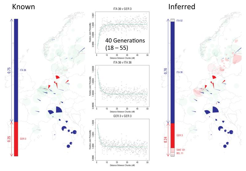
To further shed light on two major migration events, in Orkney and in central and southern England respectively, we applied a distinct analytical tool, GLOBETROTTER22 (Extended Data Figs 9 and 10). Informally, GLOBETROTTER exploits information in the rate of decay of shared haplotype segments to test for the presence of recent admixture, to identify groups contributing, and then date the admixture.
GLOBETROTTER detected strong evidence (p<0.01) that the largest Orkney cluster (Orkney 1) was influenced by a recent admixture event with an overall contribution of ~25% of the DNA from groups in Norway, confirming that the Norwegian contribution in the ancestry profile for this cluster reflects recent admixture (Extended Data Fig. 10). The approach assumed the simplest model (a single pulse of admixture), and estimated this to have occurred 29 generations ago (95% CI: 18-39 generations), corresponding to year 1100 (95% CI: 830-1418), assuming a 28 year generation time22; no clear evidence was found of multiple admixture dates. We expect less precise estimates for the other two Orkney clusters (due to their smaller sample size), but these were consistent with those for Orkney 1. For Cent./ S England the method also detected an admixture event, with a contribution of ~35% of DNA from GER3, the group in north-western Germany, and an estimated date of 38 generations (95% CI: 36-40 generations), corresponding to year 858 (95% CI: 802-914) (Extended Data Fig. 10). The GLOBETROTTER analyses detect likely source populations for the known historical migrations (Norse Vikings and Saxons respectively) with the estimated proportion contributed by these sources close to that estimated in the ancestry profiles. Note that a migration event is likely to precede any subsequent population admixture, possibly substantially so, if the migrants mate largely within the migrant group for some time after their migration. Further, admixture is likely to be a gradual process, so that using a model of a single pulse of admixture in GLOBETROTTER is likely to estimate a time after the commencement of admixture. For these reasons, the admixture dates estimated by GLOBETROTTER should provide upper bounds on the dates of the migrations22, as for both examples here, where the estimated dates are 200 or more years after the known dates of the migrations, suggesting that the mixing was indeed a gradual process.
After the Saxon migrations, the language, place names, cereal crops, and pottery styles all changed from that of the existing (Romano-British) population to those of the Saxon migrants. There has been ongoing historical and archaeological controversy about the extent to which the Saxons replaced the existing Romano-British populations. Earlier genetic analyses, based on limited samples and specific loci, gave conflicting results. With genome-wide data we can resolve this debate. Two separate analyses (ancestry profiles and GLOBETROTTER) show clear evidence in modern England of the Saxon migration, but each limits the proportion of Saxon ancestry, clearly excluding the possibility of long-term Saxon replacement. We estimate the proportion of Saxon ancestry in C./S England as very likely to be under 50%, and most likely in the range 10%-40%.
A more general conclusion of our analyses is that while many of the historical migration events leave signals in our data, they have had a smaller effect on the genetic composition of UK populations than has sometimes been argued. In particular, we see no clear genetic evidence of the Danish Viking occupation and control of a large part of England, either in separate UK clusters in that region (cf. Orkney), or in estimated ancestry profiles, suggesting a relatively limited input of DNA from the Danish Vikings and subsequent mixing with nearby regions, and clear evidence for only a minority Norse contribution (about 25%) to the current Orkney population.
We saw no evidence of a general “Celtic” population in non-Saxon parts of the UK. Instead there were many distinct genetic clusters in these regions, some amongst the most different in our analyses. Further, the ancestry profile of Cornwall (perhaps expected to resemble other “Celtic” clusters) is quite different from that of the Welsh clusters, and much closer to that of Devon, and Cent./ S England. Nevertheless, the data suggest that the Welsh clusters represent populations that are more similar to the early post-ice-age settlers of Britain than those from elsewhere in the UK.
In summary, we have presented the first fine-scale dissection of subtle levels of genetic differentiation within a country, by utilising careful sampling, genomic data, and powerful statistical methods. The resulting genetic clusters, and the characterisation of their ancestry in terms of European groups, provide important and novel insights into the peopling of the British Isles.
Genetic information can augment archaeological, linguistic, and historical approaches to understanding population history. It also complements them, in providing evidence related to the bulk of ordinary people rather than the successful elite. We hope that our study will act as a proof-of-principle for the power of such detailed genetic analyses.
METHODS
Samples, Genotyping, and QC
The sampling scheme and general information about the UK sample is described elsewhere13. Briefly, the aim was to collect samples from rural regions of the UK, for whom all four grandparents were born close to each other. In total 4,371 samples were collected as part of the PoBI project. Of these 2,886 were genotyped on the Illumina Human 1.2M-Duo genotyping chip as part of the Wellcome Trust Case Control Consortium 2 (WTCCC2) studies, with 2,510 passing the WTCCC2 genotype quality control (QC) procedures23. We then applied a geographic filter, which imposed a maximum pairwise distance between each sample’s grandparents’ places of birth of 80km, leaving 2,039 samples available for analysis. In what follows we refer to these samples as the ‘UK sample(s)’. We give a detailed description of the choice of SNPs used for our analyses below.
For the European ancestry profile analysis we used 6,209 samples from the WTCCC2 multiple sclerosis study14, of which 5,682 were cases and 527 were controls. We excluded all samples from the UK and Ireland (see ‘Treatment of Eire’ below). Extended Data Fig. 6a shows a breakdown of sample numbers by region. In the following text we refer to these continental European samples as the ‘European sample(s)’. The European samples were genotyped on the Illumina Human 660-Quad chip as previously described14. These samples had already passed through the WTCCC2 SNP and sample quality control procedures14.
For all analyses we used intersections of the autosomal SNPs available for the UK and European data sets, constructed in the following manner: we excluded SNPs in the HLA region, and, for analyses involving the European samples, SNPs in major multiple sclerosis associated regions (although any effect of the use of disease samples should be small in analyses of genome-wide data). More specifically, we first took the full intersection of the UK and European data SNP sets. We removed a 15Mb region surrounding the HLA region on chromosome 6 because the European samples were comprised of multiple sclerosis case samples, a disease with strong HLA associations. This left 575,236 SNPs that were transferred to the haplotype inference (phasing) step (see next section). Within the phasing software (IMPUTE2) further SNPs were excluded based on WTCCC2 quality control procedures, which – in addition to IMPUTE2’s internal removal of SNPs due to strand issues or lack of overlap between the SNP array and the reference panel haplotypes – removed 15,211 of these SNPs prior to phasing. After phasing, SNPs with IMPUTE2 info-threshold ≤ 0.975 and SNPs that were singletons among all phased data were removed (these data include all POBI and European samples). This left 524,699 SNPs. For the analyses using only the UK data (the clustering analysis labelled ‘Analysis A’ in the next section) 522,862 SNPS were used in the CHROMOPAINTER/fineSTRUCTURE analyses (see next section), as the rest were monomorphic in the UK set of 2,039 individuals. For further analyses, using the European data (labelled ‘Analysis B’ and ‘Analysis C’ in the next section), multiple sclerosis associated SNPs (regions defined by linkage disequilibrium around major loci of suggestive association with multiple sclerosis) were removed, as well as some other SNPs for technical reasons. In total this removed SNPs from 56.8Mb of the genome. This resulted in 515,981 SNPs remaining for the analyses involving European samples. After removing monomorphic SNPs, this SNP count is reduced to 515,779. These 515,779 SNPs were used to run CHROMOPAINTER for Analyses B and C described below. In summary, there were 522,862 SNPs available for the UK clustering analyses, and 515,779 SNPs available for the analyses involving European samples. A complete list of rsIDs is available at http:/www.well.ox.ac.uk/POBI.
Inference of Population Structure
To aid in understanding we give an informal description of the approach we applied for inferring fine-scale population structure. This is followed by a more detailed elaboration of our analysis. A critical feature of the algorithm, unlike other common approaches to detecting population structure such as principal components, ADMIXTURE16 or STRUCTURE24, is that it explicitly models the correlation structure amongst nearby SNPs due to linkage disequilibrium, making use of the information in extended multi-marker haplotypes throughout the genome. This adds substantially to fineSTRUCTURE’s power to detect subtle levels of genetic differentiation. It has been known since the early HLA studies that methods that account for linkage disequilibrium are more informative for studies of human population structure than approaches which treat each locus marginally25.
Very informally, in the fineSTRUCTURE approach, haplotype phase was first inferred in each sample, after which each resulting haploid genome is broken into pieces, in such a way that for each piece the method identifies the homologous piece in another individual to which it is most similar. This can be thought of as identifying the other individual in the collection with the most similar ancestry for that part of the genome (the average size of these pieces varies across individuals, but has median 0.51cM with IQR 0.44-0.63cM). For each individual, one can tally up the number of pieces over which its genome is closest to each other PoBI individual. These individual vectors of similarity counts are then used to cluster together individuals with similar ancestries, using a model-based statistical algorithm (fineSTRUCTURE) fitted by Markov chain Monte Carlo. The choice as to the number of clusters, and the assignment of individuals to clusters, is made so as to maximise the posterior probability under the probability model used for clustering in fineSTRUCTURE. In the PoBI analysis, this yields 53 clusters of individuals. Similar clusters are then merged hierarchically to give a tree which can be used to describe population structure at different levels of granularity, as we describe below.
More formally, haplotypes were inferred (phased) jointly for all individuals used in the study (i.e. the UK and European samples) with IMPUTE226, using the default values (see http://mathgen.stats.ox.ac.uk/impute/impute_v2.html#mcmc_options). The reference data used are available from the IMPUTE2 website (http://mathgen.stats.ox.ac.uk/impute/impute_v2.html#reference).
Next, we used the algorithm implemented in the CHROMOPAINTER program15 to represent the DNA of individuals as mosaics of the DNA from other individuals.
We performed three separate CHROMOPAINTER analyses:
- Form each haplotype of a UK individual as a mosaic of all UK haplotypes excluding those of that individual.
- Form each UK haplotype as a mosaic of all European haplotypes.
- Form each haplotype of a European individual as a mosaic of all European haplotypes excluding those of that individual.
For each analysis, A-C, we ran the algorithm implemented in CHROMOPAINTER as recommended by the authors, except for a minor change to the value of a single parameter for analysis A, implemented for technical reasons. Specifically, we initially applied CHROMOPAINTER to a subset of individuals and chromosomes (chosen as described below) using 10 iterations of its Expectation-Maximization (EM) algorithm to infer the genome-wide average “switch” and global “emission” rates in CHROMOPAINTER's Hidden Markov Model. We averaged the inferred values of each across the chromosomes and individuals used, weighting chromosomes by their relative size, and fixed these final “switch” and “global” emission rates in a final run of CHROMOPAINTER on all individuals and chromosomes. This final CHROMOPAINTER run gave the final “counts” and “lengths” values used in all subsequent analyses. For analysis A, we inferred “switch” and global “emission” rates averaging across chromosomes 4, 10, 15, 22 (using weights of 187, 131, 81 and 34, respectively) and 20 individuals from each of 30 United Kingdom sample regions (counties or districts from which the PoBI samples were collected, from across the whole UK), starting with an initial “switch” rate of 400,000/(2_NUK_), where NUK is the number of samples used for the UK analyses, and a default emission rate. For analyses B and C, we inferred “switch” and global “emission” rates averaging across chromosomes 1, 8, 15, 22 (using weights of 219, 142, 81 and 34, respectively), 20 individuals from each of 30 United Kingdom regions, and 20 individuals out of every 200 in a combined file of all European subjects, starting with an initial “switch” rate of 400,000/(2_NE_), where NE is the number of samples used for the European analyses, and a default emission rate. Previous work with CHROMOPAINTER has shown that deviations of the “switch” rate (even up to a factor of 10) have little effect on CHROMOPAINTER's inference (data not shown). Finally, for analysis C, we set the expected number of haplotypic segments to define a “region” (i.e. the '-k' switch) to CHROMOPAINTER's default value of 100 in order to estimate a normalization parameter (denoted by “_c_”) subsequently used by the clustering program fineSTRUCTURE15. In contrast, we set this value to 50 (i.e. using '-k 50') for analysis A. This slight deviation from CHROMOPAINTER's default value was implemented for analysis A because some UK individuals shared relatively long haplotype segments with other UK haplotypes, such that they did not always have 100 total such segments across the entirety of some of the smaller chromosomes. We used the June 2008 build 36 genetic map from the HapMap webpage (http://hapmap.ncbi.nlm.nih.gov/downloads/recombination/2008-03_rel22_B36/rates/).
CHROMOPAINTER provides estimates of the counts of haplotype segments and total length of DNA (in cM) for which an individual shares most recent common ancestry with a set of other individuals. When summed across all 22 autosomes we refer to the vector of these counts as the ‘copying profile’ for that individual. For example, in analysis B, CHROMOPAINTER gives the counts of haplotype segments and total length of DNA for which each UK individual shares most recent common ancestry with each European individual. These values are given for chromosome 1-22 of each UK individual, and are also summed to give a genome-wide total across the autosomes (in the case of the counts data, the copying profile). Furthermore, within a UK individual, these values can be summed across any grouping of European individuals (for example those sampled from the same geographic region or assigned to the same European group - see below) providing an estimate of the counts of haplotype segments and/or total length of DNA for which each UK individual shares most recent common ancestry with any European group (a group copying profile). It is natural to average these values across UK individuals assigned to the same cluster (see below) to get average values for all UK individuals from a particular cluster; a ‘copying vector’ for the cluster as a whole.
For analyses A and C, described above, we used the algorithm implemented in the program fineSTRUCTURE15 to group the UK and European individuals respectively into genetically relatively homogeneous clusters. The fineSTRUCTURE program takes as its input the counts of haplotype segments for which each individual shares recent common ancestry with every other as inferred by CHROMOPAINTER (summed across all chromosomes, the copying profile). The choice to use counts in this analysis is motivated by the underlying “painting” model used by CHROMOPAINTER, in which segments are shared with individuals chosen independently from one another, and there is a constant switch rate between segments. Under this model, each segment provides an equal amount of independent information, while segment lengths are uninformative, so the segment counts provide a natural basis for inference, and this is why they are used. However, we note that in practice fineSTRUCTURE attempts to allow for departures from this modelling assumption (which is expected to only be an approximation) through a scaling parameter on the (log-) likelihood. Moreover we believe there is often useful information provided in, for example, the fact that segments shared between genuinely closely related groups tend to be longer on average, akin to the idea of long segments shared “identical by descent” with respect to some founder population. Exploring and using this “length” information may provide an interesting topic for future work.
We initially put all of our individuals into a single cluster at iteration 0, but otherwise used default values when running fineSTRUCTURE (see 15 for details). Each Markov Chain Monte Carlo (MCMC) iteration of fineSTRUCTURE provides the number of clusters and the cluster membership of each individual, sampled according to their posterior probabilities under the fineSTRUCTURE model. We sampled values every 10,000 iterations for 1 million MCMC iterations following either 1 million (analysis A) or 3 million (analysis C) “burn-in” iterations. Starting from the MCMC sample with the highest posterior probability among all samples, fineSTRUCTURE performed 100,000 additional hill-climbing moves to reach its final inferred state.
Next we undertook an additional step to improve fineSTRUCTURE’s inference for cluster membership. This is an addition to the fineSTRUCTURE algorithm15. While fineSTRUCTURE's final inferred state has been shown to give sensible results in practice15, it relies heavily on a single MCMC sample observation. Although this single sample is the one with maximum posterior probability among all MCMC samples, the probability has been calculated assuming fixed (sampled) values for a large number of parameters that include the total number of clusters, each individual's final inferred cluster assignment, and other modelling parameters. Therefore, a concern is that the posterior distribution will be relatively flat across such an extensive state space, such that fairly divergent parameter values may result in similar posterior probabilities. In contrast, the marginal posterior distribution of each individual's cluster assignment across all MCMC runs should be substantially more informative, improving the assignment of individuals to clusters. Informally, by chance alone any given individual may not be in its own optimal (highest probability) cluster in the final inferred state, despite the overall posterior probability being at its maximum. We thus seek to reassign any such individuals to their most probable cluster. We therefore leverage the marginal information of each individual's cluster assignment from the values of the MCMC samples recorded every 10,000 iterations (see above) in order to re-assign individuals to clusters. Specifically, assuming we have N total individuals and M MCMC samples, and starting from the K clusters in fineSTRUCTURE's “final inferred state”, we perform the following procedure:
- We find the number xi(m) of individuals that cluster with individual i (including individual i itself) in MCMC sample m, for i = 1,…,N and m = 1,…,M.
- We furthermore find the number yik(m) ≤ xi(m) of individuals that both cluster with individual i in MCMC sample m and that are in cluster k of the “final inferred state”, for k = 1,…,K.
- We re-assign each individual i to the cluster k with the maximum value of ∑m=i,…M [yik(m) / xi(m)] across all k in 1,…,K. These re-assignments give a new “final inferred state”; note these re-assignments can reduce the total number of clusters K.
- We repeat steps 1-3 for 50 iterations.
This procedure gives the final cluster assignments for each individual.
One feature of this additional procedure used for reassigning individuals to clusters is that we obtain measurements of the confidence in the assignment of each individual i to each cluster k. For each individual i, the values of ∑m=i,…M [yik(m) / xi(m)] from the final iteration can be normalised across k to sum to one, and stored in the _K_-vector PK,i. These quantities have a natural interpretation as a measure of the confidence associated with the assignment of individual i to each cluster k. Note that we assign individual i to the cluster k for which the value of the measurement is maximal. Call this maximal value Pk_max,i. It is possible to apply a threshold t, 0 < t < 1_, to the assignment of individuals to clusters so that an individual is only assigned to a cluster if _Pk_max,i > t. If not, then the individual may be removed from subsequent analyses. We investigated the effect of setting such a threshold t. The main observation is that applying a threshold has very little effect on the make-up and distribution of clusters across the UK, nor on downstream analyses (data not shown). For further discussion see Supplementary Note.
One possible consequence of this extra procedure is to reduce the final number of clusters inferred from that of the so-called “final inferred state”. For analysis A, the final number of UK clusters inferred, after the extra procedure, is 53 (the initial “final inferred state” had 55). For analysis C the final number of European groups inferred is 145 (no change to the initial “final inferred state”).
We assessed convergence of the fineSTRUCTURE MCMC runs in various ways. This included running independent chains, and comparing aspects of the assignments of individuals to clusters, and the results of downstream analyses, between the two chains. Reassuringly, given the size of the state space being explored, these diagnostics confirmed mixing of the MCMC chains (Extended Data Fig. 2).
Using the final assignments, we used fineSTRUCTURE to construct a “tree” in the default manner described in 15 by successively merging pairs of clusters. Starting at the final cluster assignments, fineSTRUCTURE merged the pair of clusters whose merging gave the smallest decrease to the posterior probability among all possible pairwise merges. This gives the next level up in the tree (with one fewer cluster). We repeat this merging process at the new level and continue until just two clusters remain. Fig. 1 shows the assignment of individuals to clusters for the level of the tree when 17 clusters remain. The final cluster assignments and the assignments of individuals to clusters at all levels of the tree are provided in Extended Data Figs. 3.1- 3.24 for the UK clustering analyses (A). The tree so obtained is a hierarchical clustering tree and should not be interpreted as a phylogeny. Nonetheless there is information about the strength of the differentiation between clusters in these trees.
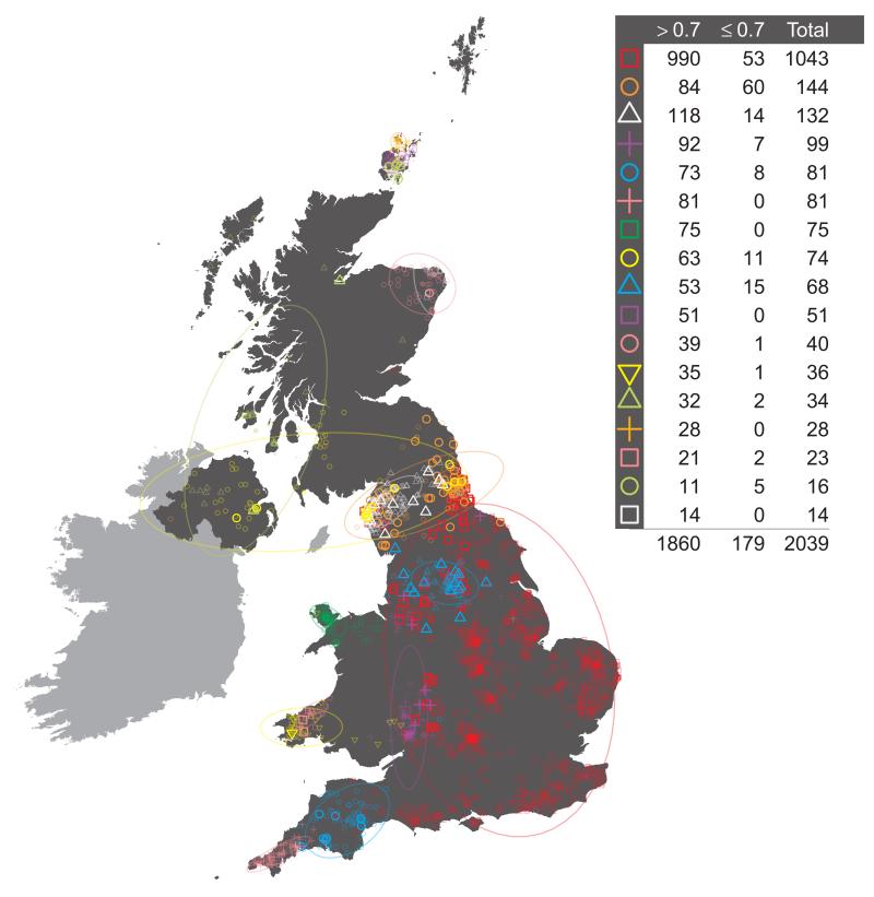
It is possible to use the vectors of measures PK,i defined above, of the confidence associated with the assignment of individual i to each cluster k in the final inferred state, to reassign individuals to clusters at any level of the tree. Consider the following. Define the lowest or finest level of the tree, the level relating to the final cluster assignments, to be LK, where K is the number of clusters in the final inferred state. Then define each level of the tree to be LJ, where J in (2, 3, …, K) is the number of clusters at the level of interest. For a given level of the tree LJ, each cluster CJ,j, j in (1, …, J), is made up of one or more clusters at the lowest level of the tree, merged into a single cluster. For example, the large UK cluster in central and southern England at the level containing 17 clusters (depicted in Fig. 1, red squares) is the union of eleven smaller clusters from the final inferred state. For each individual i it is possible to define a new _J_-vector of measures PJ,i, for level LJ, where for each cluster CJ,j we sum the values in PK,i for all clusters that are merged to form CJ,j, and store the result in component j of PJ,i. Thus, for our previous example of the large cluster in central and southern England at the level containing 17 clusters, for each individual i we sum the values relating to the eleven constituent clusters at the final inferred state that make up this larger cluster, and use this as the measure of confidence that the individual i is assigned to the larger cluster. We can use the vector of measures PJ,i so-defined to reassign individuals to the cluster for which PJ,i is maximal. This will potentially result in some individuals being reassigned to a different cluster from the one to which they were assigned by the standard tree building method. For example, we see this has occurred for exactly one individual in Extended Data Fig. 1, resulting in the different total numbers assigned to the red square and purple cross clusters in Extended Data Fig. 1 when compared to Extended Data Fig. 3.16 (both depicting 17 clusters). One advantage of this process is that we can interpret PJ,i as a measure of the confidence of the assignment of an individual i to each cluster at the given level LJ. We can also set a threshold t and examine which individuals have lower confidence assignments to their cluster, where by ‘lower confidence’ we mean that the maximum value in the vector PJ,i is less than t. We depict this for the UK clustering at the level of 17 clusters in Extended Data Fig. 1, when we set t = 0.7.
Other Methods for Detecting Population Structure
We implemented principal components analysis (PCA) using the package MMM17. We applied PCA to the intersection of the SNPs used for PCA in the WTCCC2 project23 and the SNPs passing quality control filters in UK sample in this paper. This resulted in 188,329 SNPs with minor allele frequency >0.05 in the UK population. These SNPs are distributed approximately evenly with respect to the genetic distance across the 22 autosomes. We excluded all SNPs in regions with unusually high loadings based on visual inspection of the first 20 axes of PCA applied to the UK control samples of WTCCC2. The results are shown in Extended Data Fig. 4a.
We also applied the program ADMIXTURE16 to these same data, using default settings as recommended by the authors. As with PCA, the ADMIXTURE model effectively assumes independence of the markers used across the genome. We ran ADMIXTURE three times, corresponding to three different choices for the number of clusters to be used for classification (K). To understand the method in the simplest cases we set K=2 and K=3, and for comparison to the results presented in our main analyses we set K=17. The results are shown in Extended Data Fig. 4b.
Continuous or discrete frameworks for modelling and inferring population structure
There is a general issue when modelling genetic variation from spatially structured populations as to whether to use models which characterise the population as comprised of distinct subpopulations, or at the other extreme to model the population in continuous space, without distinct subgroups, where isolation by distance is the primary factor in giving rise to geographical substructure16,24,27,28. Both are obviously oversimplifications for natural populations, and in particular for humans, and are more naturally thought of as caricatures and as endpoints of a spectrum, with debate as to which might be closer to capturing the important features of historical human demography. One potential criticism of the fineSTRUCTURE approach is that it is embedded in a framework of discrete subgroups. There is an obvious sense in which fineSTRUCTURE is closer to this framework: it explicitly estimates a set of subgroups in the population, on the basis of patterns of shared ancestry. Although this is a description of the population, rather than a model of it, it might well be more natural or useful if there is, in reality, some underlying discreteness. On the other hand, the hierarchical tree estimated by fineSTRUCTURE allows viewing of the population at multiple levels of clustering. This does not stipulate a fixed number of subgroups, and instead provides a complex description of the underlying structure – in effect zooming in from the coarsest partition of the population as two subgroups to examine finer and finer partitions. Taken together, we argue that this approach is better suited to capturing the complexities of real populations than had it only described a single set of discrete subgroups. Our approach, of probabilistically classifying individuals into groups at a particular level, rather than forcing them to belong to exactly one cluster, also allows some flexibility in a world where there is smoother variation with geography.
Clearly some, but not all, aspects of human demography will be influenced by the dynamics of isolation by distance. Conversely, cultural, linguistic, and geographical barriers will all tend to encourage boundaries, and hence discreteness of subgroups. We are encouraged by the fact that the multi-level descriptive framework of fineSTRUCTURE, as applied to the subtle levels of population structure within the UK, is clearly capturing real effects, as evidenced for example by the concordance with geography, largely non-overlapping clusters (cf ADMIXTURE), confident assignment of individuals to clusters in most cases (typically except where clusters overlap geographically), and its ability to detect groups which reflect known historical events.
Estimating Ancestry Profiles
In order to understand the genetic make-up of different genetic clusters in the UK with respect to potential ancestral populations we performed the following analyses. For analysis B (above) the CHROMOPAINTER algorithm provides estimates of the proportion of each UK individual's DNA that is most closely related ancestrally to each European individual, among all the sample members. These proportions can then be summed across groups. These proportions approximate the fraction of an individual’s DNA that coalesces, back in time, most recently with each particular sampled individual15. Because in humans these coalescence events can be far back in time relative to population separation times, we expect them to often predate population splits (i.e., we expect incomplete lineage sorting). This leads to differences in the amount of DNA copied from different European groups being subtle, in a sense adding “noise”. The amount of noise depends on the number of individuals sampled – and thus potentially sharing DNA – in the different groups, with larger sample sizes likely to reduce noise. In addition, we rely on informative variation patterns to identify individuals from whom DNA is copied, adding additional noise, which may systematically vary across the genome. To account for this “noise” we follow 22, so that at each level of the hierarchical clustering tree of the UK samples, and for a fixed level (see main text) of the European samples’ hierarchical clustering tree, we perform multiple linear regression as follows. For each level of the hierarchical clustering tree of the UK samples, and for the set of G (= 51) groups inferred for Europe we perform the following linear regression. Let YP be a _G_-vector describing the average proportion of DNA genome-wide that a cluster P of UK individuals copies from each of G groups of European individuals, as inferred by CHROMOPAINTER. That is, element g of YP consists of CHROMOPAINTER's total genome-wide length (in cM) of all haplotype segments inferred to be most closely related ancestrally to any individual of European group g, normalized to sum to unity across all g in 1,…,G within a UK individual and then averaged across all individuals in the UK cluster P. We use copying lengths, rather than counts (used in the clustering itself), for this analysis because all individuals have the same total genetic length, but this length may be broken into differing numbers of copying segments in different individuals. Thus it is straightforward to interpret coefficients in the below linear regression, in terms of the fraction of the genome contributed by different components in the mixture, using copying lengths, but interpretation would be more difficult using counts of shared DNA segments. Analogously, let Xg be a _G_-vector describing the average proportion of DNA that the European individuals of group g copy from each of the G European groups as inferred by CHROMOPAINTER, including their own group (though note individuals are not allowed to copy from their own haplotypes in CHROMOPAINTER). We assume
and solve simultaneously for the βg under the restriction that each βg ≥ 0 and ∑g=1Gβg=1, using a slight adaptation of the non-negative-least-squares (nnls) function in the statistical software package R (see 29).
We interpret the inferred value for βg as the average proportion of genome-wide DNA of a UK individual from cluster P that is most closely related ancestrally to European group g. We refer to these vectors as ‘ancestry profiles’.
To assess statistical uncertainty in our estimates of the βg for each UK cluster P, we perform a bootstrap procedure where we re-sample the chromosomes of the NP UK individuals in this group (constructing pseudo-individuals by sampling pairs of chromosomes for each of the autosomes). In particular, for each bootstrap iteration, we randomly sample the _G_-vector of CHROMOPAINTER output across these UK individuals NP times with replacement for each chromosome 1-22. We then generate each of NP “pseudo-individuals” by randomly summing 22 pairs of these samples (without replacement), one pair per chromosome, and then summing across the first, respectively the second, member of each pair before rescaling the resulting _G_-vectors to sum to unity. Averaging each element of the _G_-vectors across these NP “pseudo-individuals” gives us a new re-sampled value of YP, which we then substitute into (1) above to generate new inferred values of the βg. We repeat this procedure 1,000 times, reporting the inner 95% quantiles of the sampling distribution for a given European group g across these 1,000 bootstrap re-samples.
Assessing the Strength and Robustness of the Inferred Population Structure – FST, identity by descent (IBD), and total variation distance (TVD)
Using the same set of SNPs that were used for the PCA analyses (see above) we analysed pairwise FST both between the sample collection districts, and between the 17 inferred clusters from our main analysis using the method implemented in the program Eigensoft30). The complete matrices of pairwise FST values are given in Supplementary Tables 1 and 2.
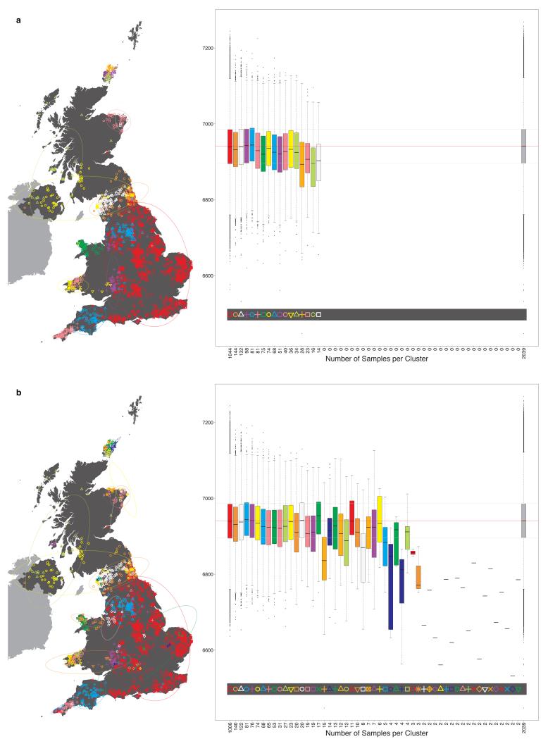
To investigate the effect that recent shared ancestry may have on our analyses we calculated a measure of pairwise identity by descent (IBD) and compared its distribution within clusters to its distribution across the whole sample. This measure uses a hidden Markov model (HMM) to estimate IBD across the genome14. The measure is likely to be useful when the shared relatedness is just a few generations in the past, allowing the identification of pairs of individuals in our UK sample that are reasonably closely related. The results are plotted in Extended Data Fig. 5. Reassuringly, these confirm that levels of relatedness within clusters are typically similar to those between clusters, and hence that our observed clusters are not an artefact of a sampling scheme which preferentially selected closely related individuals from regional localities.
To quantify the strength of differences between the inferred clusters we perform the following analyses. As noted above we can summarise the copying profiles of all the samples in a given cluster X to produce a characteristic “copying vector” x = (_x_1, _x_2, …, xn); the average (across individuals in cluster X) proportion of each individual in cluster _X_’s closest ancestry that is attributed to individuals from each of the clusters, Y = (_Y_1, _Y_2, …, Yn), where n is the number of inferred clusters. In fact, this copying vector can be calculated for any group of samples (i.e. not only the inferred clusters). One can use these vectors to test if the clusters inferred by fineSTRUCTURE are capturing significant differences in ancestry, and to give a sense of the strength of the differences observed. Given a pair of inferred clusters (A and B) and their copying vectors (a and b respectively) one can calculate the total variation distance (TVDCV) between the pair:
TVDCV(A,B)=0.5×∑i=1n(∣ai−bi∣).
TVDCV can be interpreted as a measure of the difference between the two clusters. (As the copying vectors are discrete probability distributions over the set of clusters, total variation distance is a natural metric for quantifying the difference between them.)
Furthermore, given a pair of clusters (A and B) one can randomly reassign the individuals in the clusters, maintaining the cluster sizes, to obtain a new pair of clusters (_A_’ and _B_’, of the same size as A and B respectively). One can then calculate the copying vectors (_a_’ and _b_’) for the new clusters _A_’ and _B_’, and the total variation distance between them. Repeating this process _m_-times one can obtain a p-value from a permutation test of the null hypothesis that, given the cluster sizes, the individuals in the two clusters are assigned randomly to each cluster. Here the p-value is the proportion of the m permutations where TVDCV(A', B') ≥ TVDCV(A, B). Supplementary Table 3 shows the value of the TVDCV statistic for all pairs of the 17 clusters used in our main analyses.
Similarly, rather than using the copying vectors for a pair of clusters (A and B), one can use the ancestry profiles of the clusters (α and β) to calculate the total variation distance between the ancestry profiles of a pair of clusters (TVDAP):
TVDAP(A,B)=0.5×∑i=1n(∣αi−βi∣).
TVDAP can be interpreted as a measure of the difference between the ancestry profiles of the two clusters. (Again, as ancestry profiles are discrete probability distributions, total variation distance is a natural metric for quantifying the difference between them.)
As above, one can permute the individuals that are assigned to each cluster, maintaining the cluster sizes, and calculate the ancestry profiles of the resulting clusters (_A_’ and _B_’) and the total variation distance between them. As before, repeating this process _m_-times one can obtain a p-value from a permutation test of the null hypothesis that, given the cluster sizes, the individuals in the two clusters are assigned randomly to each cluster with respect to their ancestry profile. Here the p-value is the proportion of the m permutations where TVDAP(A', B') ≥ TVDAP(A, B). Supplementary Table 5 gives TVDAP for all pairs of ancestry profiles for the 17 UK clusters used in our main analyses, and gives the associated p-values based on 1,000 permutations.
Assessing the Accuracy and Robustness of the Ancestry Profiles
We undertook a number of simulation studies, generating data with similar properties to the actual data, to assess the accuracy of the estimated ancestry profiles. These suggested good accuracy of the major components of our estimated ancestry profiles.
A major challenge for this kind of simulation study is in simulating data which has similar properties to the real data. The subtle similarities and differences within and between our various UK clusters and European groups are generated by their complicated shared and distinct demographic histories. This true demographic history is unknown and might not be well approximated by simple models that can be simulated from, and so it is not possible to simulate realistic data from the appropriate model31. Instead, we used subsamples of the real data for our simulation studies. This has the advantage that it replicates patterns in the real data, but the disadvantage that simulation studies must be based on smaller sample sizes than the actual study. (Since some of the data is needed to simulate the scenario of interest, and the rest of the data to analyse that scenario, so neither the simulated data set, nor the data used for analysis, can be as large as the actual data set.)
For each simulation scenario described below, we generated N simulated individuals as mixtures of two populations A and B intermixing λ generations ago in proportions α, β(= 1 – α) respectively, closely following established approaches22,32,33. Informally, to simulate an admixed haploid chromosome we did the following: a genetic distance x (in centimorgans) was sampled from an exponential distribution with rate λ/100. The first x cM of the simulated chromosome was composed of the first x cM of a real data chromosome selected randomly from either population A or B according to the proportions of admixture α and β (the specific values used are given below). Then a new genetic distance was sampled from the same exponential distribution (rate= λ/100), and the process repeated until an entire simulated chromosome was generated. This was repeated for all 22 autosomes, resulting in a single (haploid) set of chromosomes for one individual. We did this 2_N_ times, generating 2_N_ full sets of haploid autosomes. (To limit the chance of multiple simulated individuals copying from the same real data individual at any location in the genome, wherever possible the new piece of chromosome sampled was selected from the pool of chromosomes in the selected population (A or B) for which no other previously simulated chromosome had copied at the same location. When this was not possible, a chromosome was selected at random from the selected population (A or B). See 22.). Diploid individuals were constructed by aggregating two full sets of haploid chromosomes, making N simulated individuals in total.
We considered three scenarios of two populations admixing, and for each of these scenarios we considered three proportions of admixture for the second group (β = 0.1, 0.25 and 0.5). This yielded the following nine sets of simulations:
- (1)
‘Italy and Northern Germany’: N = 25, λ = 40, β = 0.1, 0.25 and 0.5, derived by mixing 30 randomly sampled individuals from the Italian Group ITA36 (which contains 284 individuals) with 10 randomly sampled individuals from GER3 (58 individuals). - (2)
‘North Wales and Norway’: N = 40, λ = 29, β = 0.1, 0.25 and 0.5, derived by mixing 75 individuals from the N Wales cluster with 10 randomly sampled individuals from NOR72 (116 individuals) and 10 from NOR71 (148 individuals). - (3)
‘North Wales and Denmark’: N = 25, λ = 40, β = 0.1, 0.25 and 0.5, derived by mixing 75 individuals from the N Wales cluster with 20 randomly sampled individuals from DEN18 (319 individuals).
These simulations were chosen both to test our model’s ability to infer sources of admixture and their proportions from distinct European groups (simulation 1); as well as to mimic admixture events we infer in our main analyses, i.e. relating to the Norwegian Viking (simulation 2) and Anglo-Saxon (simulation 3) migrations into the UK. Simulations (2) and (3) use samples from the N Wales cluster, which we infer has little evidence of DNA influx from the Norwegian Vikings and Anglo-Saxons, and mixes them with groups containing primarily individuals sampled from Norway (2) or from Denmark (3). These simulations are used to model admixture between the ‘ancient’ British population (i.e. genetically constituted as it was prior to the Saxon invasion) and Norwegian Viking or Anglo-Saxon settlers, respectively. Simulation (2) further assesses our model's ability to distinguish two distinct Norwegian sources of admixture from among 12 different groups primarily containing samples from Norway.
For each simulated data set we estimated ancestry profiles as follows. We used CHROMOPAINTER (see above) to represent each of the 2_N_ simulated haplotypes as a mosaic of all the European haplotypes except those used for the relevant simulations. Specifically, the 40 samples from ITA36 and GER3 used for the simulations in the ‘Italy and Northern Germany’ scenario (1) were removed from the CHROMOPAINTER analysis for scenario (1). Similarly the European samples used for the simulations in (2) and (3) were removed in their respective CHROMOPAINTER analyses. This ensures that the actual admixing individuals are not sampled when forming the mosaics. We used the estimated switch and emission rates from the main analysis, described in ‘Inference of Population Structure’ above.
Recall the ancestry profiles are determined by fitting a linear mixture model that utilizes both the CHROMOPAINTER copying profiles derived from making up the ‘target group’ (here the simulated samples, in our main analysis the UK samples within a cluster) haplotypes from the ‘source groups’ (here the European samples except those used in the simulations, in our main analysis all the European samples) haplotypes, as well as the CHROMOPAINTER copying profiles used for the clustering of the ‘source groups’. To obtain the latter we adapted the results from the existing CHROMOPAINTER analysis C (see ‘Inference of Population Structure’ above) as follows. (It would be computationally prohibitive to rerun the full CHROMOPAINTER analysis for each of the nine simulated datasets.) For each European individual’s copying profile the elements associated with the European samples used in the simulations were removed. Then, for each of the 51 European groups, we averaged these adjusted copying profiles across all individuals assigned to the given group (excluding any individuals used in the relevant simulations) as described in ‘Inference of Population Structure’, and used the adjusted copying profiles for the 51 EU groups as covariates in our linear mixture model as described in ‘Estimating Ancestry Profiles’.
This post-hoc adjustment of the copying profiles for each of the 51 European groups assumes that if we had repeated the CHROMOPAINTER analysis for the relevant reduced set of European samples, the copying profile of the parts of the chromosomes previously associated with the removed samples is redistributed evenly across all the other European individuals. This is inherently conservative as it is more likely that by excluding, for example, 10 of the 58 GER3 samples from the ‘new’ GER3 group would have resulted in an increase of copying from the other 48 GER3 samples, relative to the increase in copying from individuals from other European groups. Thus the performance of our approach for determining ancestry profiles in our simulation study is likely to be an underrepresentation of the performance of our approach in the main data analyses.
Furthermore, we only used a relatively small number of individuals from each of ITA36, GER3, NOR71, NOR72 and DEN18 in the simulations, to ensure a sufficient number of remaining individuals from each to use for inferring the ancestry profiles. As a consequence, the number of simulated individuals we generated is rather small, consisting of only 25 or 40 individuals per simulation, compared to our main analysis (using the real data) where many of the clusters were significantly larger. We expect the increased sample size for the majority of clusters used in our main analyses to improve our inference of ancestry profiles relative to the simulations, substantially so in some cases such as Cent./ S England which contains 1,044 individuals.
We also adopted an alternative simulation approach for the scenarios represented by (1) - (3) above using a forwards-in-time simulation method, initialised from real data, as previously described22. In each case, we combined a subset of the same randomly sampled individuals from populations A and B above (e.g. for (1), the 30 individuals from ITA36 and the 10 individuals from GER3) into a single “pool” population, which we then simulated forwards in time for the same λ generations as used above. To imitate the three simulations for scenario (1) above this pool population contained respectively (20, 60, 60) haplotypes from ITA36 and (20, 20, 7) haplotypes from GER3 to approximate admixture contributions of (0.5, 0.25, 0.1) from GER3. Similarly for scenario (2) the pool population contained (40, 120, 150) haplotypes from N Wales and (40, 40, 18) haplotypes from NOR72/NOR71 (half from each); and for scenario (3) (50, 150, 150) haplotypes from N Wales and (50, 50, 18) haplotypes from DEN18.
To create the next generation of haplotypes following this “admixture event” we randomly sampled two distinct parental haplotypes (each comprising a full set of 22 single chromosomes from one individual) from the pool. We compose a new set of haplotypes for an individual in the next generation as a mosaic of chunks from these two parent sets, with switches in the mosaic based on the HapMap Phase 2 genetic map (June 2008, build 36 genetic map, as above). More specifically, we determined the number of recombination breakpoints on each chromosome by summing a random sample from a Bernoulli distribution with probability 0.5 (which models the expected obligate crossover per generation per chromosome) and a random sample from a Poisson distribution with rate equal to the total genetic length of the chromosome in Morgans minus 0.5 (which models the remaining crossovers). We then sampled the physical location of each of the breakpoints independently according to their relative genetic map value, copying segments on either side of a breakpoint without mutation from the chromosomes two different parents. In the first generation after the admixture, we repeated this process to generate 500 full (i.e. chromosomes 1 - 22) sets of haplotypes. For the remaining λ – 1 generations, 500 new full sets of haplotypes were each simulated in the same manner as a mosaic of chunks from two distinct full sets of haplotypes randomly sampled with replacement from the previous generation. After λ generations, we randomly sampled distinct haplotypes (i.e. without replacement) to form N individuals for subsequent analysis, where N is the same as in the relevant scenario of (1) – (3) above. We then inferred ancestry proportions in these N simulated individuals in the same manner described above.
The resulting ancestry profiles from all 18 simulation studies (2 simulation methods times 3 scenarios times 3 admixture proportions (β)) are given in Supplementary Table 6.
Dating Admixture Events in Orkney and South East England
We ran GLOBETROTTER22 to estimate the time of the major admixture events contributing to the make up of the Cent./ S England cluster and the three clusters in Orkney (Westray, Orkney 1 and Orkney 2) using the 51 European groups as surrogates for the putative admixing ‘source groups’ (i.e. using analysis B from ‘Inference of Population Structure’ above) and assuming a single “pulse” of admixture when analysing each UK cluster. We closely follow the application of GLOBETROTTER as described by the authors. In short, CHROMOPAINTER identifies the segments of DNA within each UK individual's genome that are most closely related ancestrally to each European group, as described in ‘Inference of Population Structure’. GLOBETROTTER measures the decay of association versus genetic distance between the segments copied from a given pair of European groups. Assuming a single “pulse” of admixture between two or more distinct admixing source groups, theoretical considerations predict that this decay will be exponentially distributed with rate equal to the time (in generations ago) that this admixture occurred34. GLOBETROTTER jointly fits an exponential distribution to the decay curves for all pairwise combinations of European groups and determines the single best fitting rate, hence determining the most likely single admixture event and estimating the date it occurred. Instead of requiring specific genetic surrogates to represent each admixing source group involved in the admixture, as in other dating approaches such as ROLLOFF35, GLOBETROTTER aims to infer the haplotype composition of each source group for the admixture as a linear combination of those carried by sampled groups (i.e. a linear combination of the 51 European groups). This results in the admixed group themselves automatically being represented in the same form – as a mixture of mixtures - consistent with the linear estimation procedure we applied for each UK group, prior to estimating admixture dates for each group.
The following provides more details on our approach for dating and estimating admixture proportions within a single UK cluster; full details of the GLOBETROTTER method are provided in 22. For each haploid set of chromosomes of each individual from a given UK cluster, we consider the genome-wide mosaic inferred by CHROMOPAINTER in the UK on Europe analysis (analysis B from ‘Inference of Population Structure’ above). In this manner each UK sample’s haploid genome is pieced together as a series of “chunks”, with each chunk a contiguous segment of DNA best matching a European sample inferred to be most closely related ancestrally to that segment. We note that CHROMOPAINTER infers these mosaics for each individual many times in a probabilistic manner, so we can sample from the set of mosaics for a given individual. We sampled 10 such mosaics for each haploid genome of each UK individual in the cluster we are focussing on, giving 20 total mosaics for each UK individual.
Consider two of these 20 mosaics (these two could be the same sampled mosaic). We compare each chunk on mosaic 1 to each chunk on mosaic 2. For each pair of chunks, we record the two European groups (perhaps the same) copied at each chunk (or more precisely, the group of the European individual inferred to be closest to the UK individual’s chunk) in the pair and the genetic distance between the two chunks’ midpoints. We remove any chunk pairs where this genetic distance is less than 1cM (to avoid the effects of within population linkage disequilibrium confounding signals of admixture) or greater than 50cM (as linkage disequilibrium attributable to admixture will have decayed to zero by this distance). Otherwise we round this genetic distance to the nearest 0.1cM and assign the chunk pair a score SCP equal to the product of the two chunks’ sizes in centimorgans, with chunk sizes larger than 1cM fixed to 1cM. This scoring protocol weights chunks' contributions by their relative size, so that larger chunks contribute more to the score, but caps the contribution of any chunk to prevent inference from being dominated by a small number of chunks. We repeat this for all chunk pairs across all 20C2 = 190 combinations of mosaics. After doing so, for each pair of European groups, say A and B, and for each 0.1cM bin d in [1, 1.1, …, 50cM] we sum the SCP values across all chunk pairs where (i) the genetic distance between the two chunks’ midpoints is in d and (ii) one chunk in the pair copies A and the other copies B. We refer to this as the “coancestry vector” for pair (A, B), which contains one element for each d.
We repeat this tabulation for all pairs (A, B) of the 51 European groups, giving 51×51 such coancestry vectors. After a re-scaling and then a re-weighting of these coancestry vectors using the inferred ancestry profiles from ‘Estimating Ancestry Profiles’ above (i.e. the βg), this gives a set of reweighted coancestry vectors (referred to as “observed coancestry curves” in 22), that efficiently capture the decay of linkage disequilibrium attributable to admixture (see 22 for details). In the course of this re-weighting, we remove European groups whose inferred ancestry contribution (βg) to the given UK cluster is less than 0.1%, thus reducing the number of European groups remaining for consideration in our analysis. For each pair of European groups (M, N), now a subset of the 51×51 total pairwise combinations, we label the reweighted coancestry vector vMN. We fit a “coancestry curve”, ΨMN (d), to the values in vMN as follows: for each fixed pair (M, N) of European groups we fit the parametric model
where ϵ ≥ 0 is an error term and
Here λ is interpreted as the date of admixture in generations from present. GLOBETROTTER jointly estimates the values of τMN, δMN and λ that minimize the sum of the mean squared error across the curves, i.e. that minimize
∑(M,N)∑d(vMN(d)−ΨMN(d))2.
The values of δMN carry information about which European group best represents each admixing source group (if any) – e.g. positive values of δMN suggest that groups M and N often carry haplotypes representing the same true, unsampled admixing source, while negative values of δMN suggest that M and N represent different admixing sources. We use principal components and linear modelling to jointly analyze all δMN, both describing the haplotypes carried by each admixing source group as a linear combination of those carried by each of the 51 European groups, and inferring the proportion of admixture contributed from each source (see 22 for details). The inferred mixing coefficients from this linear modelling, along with the inferred admixture proportions for each source, allows a new estimate of the ancestry proportions describing the given UK cluster (i.e. analogous to those described in ‘Estimating Ancestry Profiles’). We can therefore re-scale our coancestry vectors using these new ancestry proportions, giving new values of ΨMN (d), from which we can re-infer the date(s) of admixture, offering improved accuracy of estimation provided the fitting procedure results in improvements in characterising the true source groups. When analysing each UK cluster, we repeated this iterative process of ancestry proportion and date inference five times. Once these five iterations were completed, we then fixed the inferred ancestry proportions, and within each UK cluster performed 100 bootstrap re-samples of individuals' chromosomes to infer 95% confidence intervals for the actual admixture date.
Estimating the proportion of Saxon ancestry in central and southern England
It is of interest to estimate the proportion of Saxon ancestry in our Cent./ S England cluster. We have undertaken two separate analyses which bear on this, namely our estimated ancestry profiles and the GLOBETROTTER analysis. One challenge is that various distinct modern European groups may carry DNA which descends from the Saxons (or their ancestors), and hence be informative about the contribution of Saxon DNA to the UK.
The pattern of contributions to UK clusters from GER3, and its location in Europe in northern Germany, make it very likely to capture ancestry brought to the UK by Saxon migrants (see Discussion). As noted in the discussion in the Supplementary Note, some of the ancestry shared with the group DEN18 from modern Denmark could also reflect ancestry brought to the UK by the Saxon migrants. Ancestry shared with DEN18 could also have reached the UK in early migrations by land or sea, or in later migrations of the Danish Vikings. The fact that this group contributes some ancestry to all UK clusters is evidence that some of this ancestry sharing may indeed result from early migrations. The increased contribution of this group to the ancestry profiles of all the English clusters further suggests that some part also came to the UK with the Saxons.
The contribution to the ancestry of the UK clusters from FRA17, now spread throughout France, is also correlated with the contribution of GER3 and DEN18. One possible explanation for this pattern is that FRA17 also captures Saxon ancestry. Another explanation is that it represents ancestry that spread into the UK at a different time, but into many of the same parts of the UK as the DNA from the later Saxon migrations. The Saxon migrations did not directly involve people from what is now France. There were movements of Germanic peoples, notably the Franks, into France around the time of the Saxon migration into England. The Germanic ancestry these migrations brought to what is now France would have been Frankish rather than Saxon, and it would have been diluted through mixing with the already substantial local populations. It thus seems unlikely that ancestry in the UK arising from the Saxon migrations would be better captured by FRA17 than by people now living near the homeland of the Saxons (represented by GER3) – the contribution of FRA17 is about threefold that of GER3. Further, the geographic pattern of FRA17 contributions differs from that of GER3 (which we see as very likely Saxon), in being relatively much higher in the Scottish and Orkney clusters. This is difficult to reconcile with ancestry from both groups arriving as part of the same migration event, and the substantial contribution of FRA17 in Scotland and Orkney, relative to GER3, is more likely to reflect an earlier influx into the UK, and increased time to spread geographically. Also, FRA17 did not figure as one of the source populations for the admixture event in Cent./ S England estimated by the GLOBETROTTER analysis. We thus conclude that the contribution to the UK clusters from FRA17 is unlikely to reflect the Saxon migrations.
In the ancestry profile approach, we thus argue that the proportion of DNA in modern Cent./ S England inherited from the Saxons is best captured by GER3 and some of DEN18, which would suggest a range of ~10% (assuming only GER3 reflected the Saxon migrations) to ~20% (assuming GER3 and all of DEN18 reflected the Saxon migrations). If we were wrong in concluding that the FRA17 contribution does not result from DNA which arrived with the Saxon migrations, so that some or all of it did reflect Saxon DNA, then the proportion of Saxon ancestry could be substantially higher (up to ~50%).
The GLOBETROTTER analysis of Cent./ S England detected an admixture event, with a contribution of ~35% of DNA from GER3, with estimated dates for admixture somewhat after, but consistent with (see Discussion above), the known historical dates of the Saxon migrations (Extended Data Fig. 10).
There are inevitable uncertainties in both analyses due to the nature of the data – we are trying to estimate admixture proportions for events ~1,200-1,500 years ago on the basis of DNA from modern populations. Nonetheless we feel it is safe to conclude from our analyses that the proportion of Saxon ancestry in Cent./ S England is very likely to be under 50%, and most likely in the range 10%-40%.
Treatment of Eire
We explicitly excluded samples from Eire (the Republic of Ireland) from our European analyses, and as possible contributors to the ancestry profiles of the UK clusters, principally to allow assessment of the major migrations from continental Europe into the UK. Detailed early analyses, which included samples from Eire with the other European samples, provided evidence of shared Irish ancestry with our UK samples, presumably reflecting in part migrations from Great Britain into Eire and vice versa. Eire thus acts as a source and a sink for ancestry from the UK, which severely complicates interpretation of estimated ancestry profiles, since sharing of ancestry with Eire could reflect British migration into Eire rather than the converse. Also, the UK and Eire could share ancestry because both descend from some similar ancestral populations.
While there is historical evidence of migration after the collapse of Roman rule from Devon and Cornwall into what is now Brittany in north-west France, this does not leave a signal in, and hence does not confound, our ancestry analyses, either because we do not have appropriate samples from Brittany or because the amount of DNA transferred from Britain to France via this route is relatively small. (Had this been an effect we would have expected to see either or both of our Devon and Cornwall clusters sharing substantially more ancestry from one of the groups in France, but this was not the case.)
Maps and Visualization
For the UK map boundaries we used a map of the UK sourced from the Office for National Statistics (England and Wales); National Records of Scotland; and the Northern Ireland Statistics and Research Agency. The European maps were sourced from Eurostat. For context we added the boundaries of the Republic of Ireland and the Isle of Man to the UK maps, taken from the European maps. Map boundaries were obtained in digitised form36–39 and were drawn using various packages in the statistical software language R.
The latitude and longitude for each UK sample’s grandparents’ birthplaces was assigned (geocoded) automatically13 using a place name gazetteer from Edina (www.edina.ac.uk). All locations were checked for consistency between project records and the automatic geocoding, and any discrepancy resolved in favour of the project records. For the UK cluster analyses shown in Fig. 1, each sample was assigned, and plotted at, the average of the latitudes and longitudes of its grandparents’ birthplaces. For clarity of display a small, random, amount of noise was added to point's latitude and longitude to avoid over-plotting. Independently across points, a random value was drawn from a uniform distribution on (−20a, 20a), where a is the smallest non-zero difference in latitude observed between the locations of any pair of points, and the resulting value was then added to the latitude of the point. An analogous procedure was then performed, independently, for the longitude of each point.
For the tree depicting the order of the hierarchical merging of clusters in Fig. 1, the lengths of the branches relate to changes in the likelihood of the fineSTRUCTURE model. They do not relate directly to time or other measures of genetic distance so caution is needed in their interpretation. Some additional length was added to the tips of the tree for clarity.
The ellipses displayed in Fig. 1, and Extended Data Figs. 1, 3 and 4 were obtained by fitting a two dimensional t-distribution with five degrees of freedom to the plotted spatial locations associated with each cluster. Each ellipse depicts the 90% probability region of the fitted distribution.
Only limited geographic information was known about the European samples: often this was just the city or region from which the samples were taken, but sometimes only a country was known. To visualize the spatial patterns of the European genetic groups obtained from the fineSTRUCTURE analyses we plotted the European samples on a map of Europe, with colours reflecting the groups assigned by fineSTRUCTURE. We did this in two ways, plotting individual points for Fig. 2 (depicting the ancestry profiles) and using pie charts in Extended Data Fig. 6b (our initial assessment of fine-scale population structure in Europe).
For Fig. 2 we restricted ourselves to plotting only those European samples that have some fine-scale location information (i.e. more precise than just country of sampling), as these samples will be informative for assessing regional fine structure (although all samples in the group are used for generating the ancestry profile). As all the samples from a given region/city have exactly the same location assigned to them, we added some random noise to each sample’s assigned latitude and longitude to enable visualization on a map. To do this for each sample we drew two samples from a uniform distribution on (−0.5, 0.5), in units degrees of latitude and longitude, and added the results to the sample’s latitude and longitude respectively. We plot each sample as a point on the map, coloured to indicate the European group to which they are assigned. Fig. 2 shows the locations of the samples assigned to each European group that contribute at least 2.5% to at least one of the UK clusters. As several inferred European groups are represented in the French sampling locations, and would thus be difficult to discern, the points for groups FRA12, FRA14 and FRA17 have been shifted by one degree of both latitude and longitude (for FRA12, −1 degree of longitude and −1 degree of latitude; FRA14, +1 and +1; FRA17, −1 and +1). In Fig. 2 the lines to each group (or set of groups) end at the centre of mass of the groups. This was calculated before any samples had their locations shifted (as for the French groups, and/or by adding random noise). For the Norwegian groups and the Swedish groups the line ends at the average position of the centres of mass of the constituent groups. For the groups GER3 and GER6 the centre of mass is calculated using only those samples from Germany. This is because several samples from these groups are assigned to Stockholm, Copenhagen and Oslo, all of which are major cities. We assume these samples are migrants from Germany, and thus including them would skew the centre of mass position that we interpret as the approximate historical locus for the group. This potential problem caused less of an issue for the other groups depicted in Fig. 2.
For Extended Data Fig. 6b, the spatial patterns of the European genetic groups obtained from the fineSTRUCTURE analyses are displayed in pie charts. All of the samples from the same location are displayed together in a single pie chart, with the sectors of the pie chart coloured to reflect the proportion of samples from that location that are assigned by fineSTRUCTURE to a given group. The pie charts are centred at suitable locations on the map of Europe, depending on the geographic information known (see relevant figure captions). The size of the pie chart indicates the number of samples represented by the chart. The number of samples represented by a chart is proportional to the area of the chart. For the larger sampling locations, if a European group accounts for at least 20% of a location’s samples then the European group number is also displayed on the edge of the appropriate sector of the associated pie chart.
For the ancestry profile analyses we also display pie charts, this time on a map of the UK (Extended Data Fig. 6b). Here each pie chart relates to one of the inferred UK clusters and is displayed at the centre of the cluster’s associated ellipse (as described above). Each sector of the pie chart is coloured (and sometimes numbered) by the relevant colour (and number) of the European group it relates to. The subtended angle of each sector represents the proportion of the UK cluster’s DNA that is most similar to that of samples from the relevant European group as described in the ‘Estimating Ancestry Profiles’ section above.
Consent and Study Protocol
Informed consent was obtained from all subjects. For the UK subjects, ethics approval was granted by the NRES Committee, Yorkshire and the Humber – Leeds West, UK (Reference 05/Q1205/35) in March 2005. For the European subjects, informed consent and ethics approval was obtained as part of the WTCCC2 multiple sclerosis study14.
Code Availability
The software CHROMOPAINTER, fineSTRUCTURE and GLOBETROTTER are available for download at http://www.paintmychromosomes.com/.
Extended Data
Extended Data Figure 1. The effect of setting a threshold on the confidence of cluster assignment for the genetic clusters in the UK inferred by the fineSTRUCTURE analysis.
The UK map depicts the clustering of the 2,039 UK individuals into 17 clusters on the basis of genetics alone. See Figure 1 for further details. Here a threshold is set on the measurement of confidence used for assigning individuals to clusters (see Methods). This measure is defined on the interval [0, 1], where the value 1 is interpreted as meaning complete certainty of cluster assignment and 0 as being complete lack of certainty. The plot illustrates the effect of setting a threshold of 0.7 so that a UK individual is only assigned to a cluster if the measure of assignment for that individual is greater than 0.7. All of the samples that have small, faded symbols are assigned to their clusters with confidence greater than 0.7. Those samples for which the assignment is less confident (i.e. the measure is less than or equal to 0.7) are plotted with large, bold symbols. The table shows the number of individuals with confidence measure above and below the 0.7 threshold together with the total for each UK cluster. The slight discrepancy between the totals in this figure and Extended Data Fig. 3.16 is due to differences in the method for assigning individuals to clusters (see Methods). The threshold of 0.7 was chosen for illustrative purposes only. Similar patterns relate to other thresholds.
Extended Data Figure 2. Convergence of the algorithm implemented in fineSTRUCTURE.
The fineSTRUCTURE clustering algorithm was run twice on the UK samples (a) and twice on the European samples (b) to assess convergence. The displayed heatmap depicts the proportion of sampled MCMC iterations for which each pair of UK individuals is assigned to the same cluster. The values above and below the diagonal represent two different runs of fineSTRUCTURE. Individuals are ordered along each axis according to the inferred tree from the fineSTRUCTURE run above the diagonal, with tick-marks on the axes at the middle of each cluster. Comparison between runs is made by comparing the plot above the diagonal (run two) with that below the diagonal (run one). The high degree of symmetry in the plot confirms the similarity between the runs and hence that each MCMC run has converged to very similar clusters.
Extended Data Figures 3.1 - 3.24. Genetic clusters in the UK inferred by the fineSTRUCTURE analysis at all levels of the hierarchical clustering.
Each of the plots 3.1 – 3.23 shows exactly the same information, but for different numbers of clusters, from 2 to 24 in order, determined by the hierarchical clustering analysis. At the level of 24 clusters every cluster has at least 10 members. This is not the case for finer levels of clustering and for brevity these levels are omitted. The final figure, 3.24 shows the final clustering by fineSTRUCTURE, with 53 clusters. a, The UK map depicts the clustering of the 2,039 UK individuals into clusters on the basis of genetics alone. Each symbol corresponds to one of the sampled individuals and is plotted at the centroid of their grandparents’ birthplace. Each genetic cluster is represented by a unique combination of colour and plotting symbol, with individuals depicted with the symbol of the cluster to which they are assigned. The ellipses centred on each cluster give a sense of the extent of the cluster by showing the 90% probability region of the two-dimensional t-distribution (5 degrees of freedom) which best fits the locations of the individuals in the cluster. No relationship between clusters is implied by the colours/symbols. In addition there is a table at each level that displays the number of samples in each of the inferred clusters. b, A tree depicting the order of the merging of the clusters in the hierarchical clustering. The cluster symbols are the same as shown in a. The lengths of the branches relate to changes in the likelihood of the statistical model underlying fineSTRUCTURE. They do not relate directly to time or other measures of genetic distance so caution is needed in their interpretation. Some additional length is added to the tips of the tree for clarity. c, The UK samples plotted against the first two principal components as determined in the genome-wide principal components analysis. For comparison, each individual is depicted by the same symbol as in the fineSTRUCTURE analysis depicted in a. The ellipses are drawn as in a.
Extended Data Figure 4. Application of standard methods for detecting population structure to the UK data.
a, Genome-wide principal component analysis of the UK samples. The UK samples plotted against all pairs of principal component axes, for the first five axes, as determined in the genome-wide principal components analysis. Each individual is depicted by a symbol representing the district from which it was collected. The labels of the sample collection districts are interpreted as follows: CUM = Cumbria; LIN = Lincolnshire; NEA = North East England; OXF = Oxfordshire; YOR = Yorkshire; CHE = Cheshire; NTH = Northamptonshire; NOT = Nottinghamshire; DOR = Dorset; SUS = Sussex; NOR = Norfolk; WOR = Worcestershire; DEV = Devon; SPE = South Pembrokeshire; COR = Cornwall; NWA = North Wales; ARG = Argyle and Bute; NPE = North Pembrokeshire; BAN = Banff and Buchan; NIR = Northern Ireland; ORK = Orkney; SUF = Suffolk; LEI = Leicestershire; FOD = Forest of Dean; HER = Herefordshire; HAM = Hampshire; DER = Derbyshire; LAN = Lancashire; KEN = Kent; GLO = Gloucestershire. b, Clustering the UK samples using the program ADMIXTURE. ADMIXTURE was applied in three scenarios, corresponding to different preset values for K, the number of clusters into which the UK samples are divided. Here K = 2, 3 and 17 (see Methods). A map is shown for each value of K. Each symbol on the map corresponds to one of the sampled individuals and is plotted at the centroid of their grandparents’ birthplace. Each cluster is represented by a unique combination of colour and plotting symbol, with individuals depicted with the symbol of the cluster to which they are assigned. The ellipses centred on each cluster give a sense of the extent of the cluster by showing the 90% probability region of the two-dimensional t-distribution (5 degrees of freedom) which best fits the locations of the individuals in the cluster.
Extended Data Figure 5. Potential recent shared ancestry in the genetic clusters in the UK inferred by the fineSTRUCTURE analysis.
a, The UK map to the left depicts the clustering of the 2,039 UK individuals into 17 clusters on the basis of genetics alone. See Fig. 1 for further details. Pairwise identity by descent (IBD) within clusters and across the whole UK sample for all of the 2,039 UK individuals is shown to the right. For each of the inferred UK clusters a box and whisker plot shows the distribution of the pairwise IBD statistic (see Methods). Each box is filled by the colour of the cluster to which it relates, and the outlier points have the same shape as the cluster to which they relate. For comparison the distribution of the pairwise IBD statistic across the whole UK sample is shown on the far right, with the box coloured grey. The light grey horizontal lines indicate the upper and lower quartiles of the IBD statistic’s distribution for the whole UK sample. Along the x-axis the number of samples in the associated cluster is shown. The y-axis gives the value of the pairwise IBD statistic. Note that only clusters of size 4 or less depart substantially from the average relatedness. b, The same information as a but with 53 clusters of UK individuals.
Extended Data Figure 6. Population Structure in the European Samples.
a, Number of samples derived from each European sampling region. The 6,209 European samples used for the analyses were sampled from ten countries and various locations within each country. Each sample has a specific sampling location (often a city, but in some cases only a whole country). The numbers shown give the number of samples derived from a particular location. Some numbers are depicted out of position for clarity. In these cases a yellow line leads from the number to the actual location. Where the sample locations are well-localized (e.g. the city of sampling is known) the box surrounding the number is white. When only information about the country of sampling is known the box is coloured yellow. The numbers are overlain on a faded version of the pie charts from Extended Data Fig. 6b for easy reference. b, European ancestry profiles of the UK clusters. The 6,209 European samples divided into 51 genetic groups (represented by colours and labelled with a subset of the numbers between 1 and 145) using our fineSTRUCTURE analyses. For clarity the colour space has been skewed to emphasize the differences between groups 1 to 18 as these groups are the major contributors to the ancestry profiles of the UK clusters. Each sample has a specific sampling location (often a city, but in some cases only a country, see Extended Data Fig 6a). The pie charts are located at these sampling locations, and depict the proportion of the samples from that location assigned to each of the 51 genetic groups. Each genetic group also has a label number, which is displayed for the larger sectors of each of the pie charts. The area of the pie chart is proportional to the number of samples from that location. Pie charts with black borders correspond to well-localized samples. In contrast, for samples where only the country of sampling is known, they are combined in a single pie chart for the country, which is shown with white borders. Some pie charts are depicted out of position for clarity; in these cases a yellow line leads from the chart to the actual location.
Extended Data Figure 7. European ancestry profiles of the UK clusters.
a, The map of the UK shown relates to the map with 17 UK clusters shown in Fig. 1. Ellipses indicate the extent of the UK clusters as in Fig. 1. The pie charts represent the ancestry profile of the UK clusters from Fig. 1. Each pie chart is plotted at the centroid of the corresponding cluster, although some pie charts have been moved for clarity; in the cases where the relocation is substantial a red line leads from the pie chart to the centroid. The sectors of the pie charts are coloured with the colours of the European genetic groups (for the larger sectors the number of the European group is also given). They indicate the ancestry profiles of each UK cluster, namely the proportion of the cluster ancestry that is best represented by each of the European groups. The magnitude of the angle of a sector is proportional to the contribution of that European group to the ancestry profile of the associated UK cluster. The symbols in the grey bar to the left of the map represent the UK clusters as in Fig. 1. The bar chart in the left part of the plot depicts the same ancestry profiles of the UK clusters in a different way. Each row represents a UK cluster (arranged roughly north to south) with the symbols for the clusters from Fig. 1 indicated at each end of the row. Each column represents a European group, with group numbers listed with a three letter prefix that, for clarity, relates to the country or countries where the cluster is most represented. The colour of each bar also indicates the European group to which the bar relates. Confidence intervals (95%) obtained from 1,000 bootstraps of the ancestry profile analysis (see Methods) are indicated on each bar. b, Renormalized ancestry profiles of the UK clusters illustrating possible early European contributions to the UK population. A representation of the relative contributions to the UK clusters from the three European groups (GER6-W. Germany, BEL11- Belgium, and FRA14-NW France) hypothesized to be the major contributors to the earliest migrations into the UK after the last ice age from which DNA survives to the present in substantial proportions (see Supplementary Note). Interpretation of the map, pie charts and bar chart is as for a. In this case, however, the proportions were renormalized to sum to 1 for the contributions from GER6, BEL11 and FRA14.
Extended Data Figure 8. More major events in the peopling of the British Isles.
See Supplementary Note for further details. a, The arrival of agriculture and subsequent migrations from 4000 – 2500 BCE. b, The major Iron Age tribes of Britain around the year 40.
Extended Data Figure 9. Application of GLOBETROTTER to infer simulation of ancestry 40 generations ago between groups from Northern Germany (GER 3, 2 5%) and Italy (ITA 36, 75%).
Twenty-five admixed individuals were simulated, and the individuals used to construct these simulated individuals were then removed from the list of potential donors (see Methods). Left barplot, and map: The barplot shows the true population and proportion contributed for each of the two admixing groups. The map shows, for each of the European sampling locations, the true proportion of individuals sampled from that location assigned to each of the admixing groups, coloured according to the barplot. Central three plots: example curves constructed by GLOBETROTTER to infer admixture times, and infer details of admixing groups (see Methods and Supplementary Note). For each pair of populations A and B (A can be the same as or different from B) the points show the empirical probability, relative to under independence, as a function of genetic distance x, that two positions separated by distance x correspond to ancestry donated by population A, and by population B, respectively. The green line shows GLOBETROTTER fitted exponential decay curves for the underlying (i.e. expected) value of this relative probability estimate. Under a model of a single admixture event occurring g generations ago, this probability decays at a rate g according to theory, providing an estimate of the admixture time (and 95% CI) shown overlaying curves ITA 36 v GER 3 and ITA 36 v ITA 36. If ancestries A and B associate with the same admixing group - e.g. whenever A=B - the fitted curve will have negative slope, as seen for the GER 3 v GER 3 plot. If a positive slope is seen, as for the ITA 36 v GER 3 plot, this implies these populations contribute to the two different respective admixing groups. Right barplot, and map: GLOBETROTTER produces an inference of the genetic composition of (haplotypes carried by) the two admixing groups, as a mixture of (haplotypes carried by) populations actually sampled. This mixture inference jointly uses curves for pairs of sampled populations, and the overall haplotypic makeup of different sampled populations, including the admixed group. The barpot shows the inferred mixture representation (dominated in each case by the true admixing groups) and estimated admixture proportion (24%, close to the truth of 25%), with more red/blue populations respectively giving a larger contribution. The map shows populations inferred as contributing to the first (pink/red shades) or second (blue shades) admixing group, respectively, as for the left map, with populations coloured according to the barplot. This shows populations falsely inferred as contributing material to the admixing groups were still sampled, mainly, from locations close to those of the true admixing groups. We caution that in this setting of admixture between genetically similar European groups, estimation of admixture fraction is very uncertain (see Methods) (e.g. contributing populations are often impossible to definitively assign to a “side” of the event). For further details of the analysis, e.g. tests for admixture presence in this simulation, see Methods and Supplementary Note.
Extended Data Figure 10. Application of GLOBETROTTER to infer details of admixture in the UK clusters.
a, Inferring admixture in a population of 1,044 UK individuals from central and southern England. Left hand plot: the bold red squares show mean grandparental birthplace for each individual in this population. Central three plots: example curves constructed by GLOBETROTTER to infer admixture times, and infer details of admixing groups (see Methods and Supplementary Note). For each pair of populations A and B (A can be the same as or different from B) the points show the empirical probability, relative to under independence, as a function of genetic distance x, that two positions separated by distance x correspond to ancestry donated by population A, and by population B, respectively. The green line shows GLOBETROTTER fitted exponential decay curves for the underlying (i.e. expected) value of this relative probability estimate. Under a model of a single admixture event occurring g generations ago, this probability decays at a rate g according to theory, providing an estimate of the admixture time (and 95% CI) shown overlaying curves SFS 31 v GER 3 and SFS 31 v SFS 31. If ancestries A and B associate with the same admixing group - e.g. whenever A=B - the fitted curve will have negative slope, as seen for the GER 3 v GER 3 plot. If a positive slope is seen, as for the SFS 31 v GER 3 plot, this implies these populations contribute to the two different respective admixing groups. Right barplot, and map: GLOBETROTTER inference shows one possibility for the genetic composition of (haplotypes carried by) the two unsampled historical admixing groups, as a mixture of (haplotypes carried by) populations actually sampled. This mixture inference jointly uses curves for pairs of sampled populations, and the overall haplotypic makeup of different sampled populations, including the admixed group. The barpot shows the inferred mixture representation (with largest contributions in each case by GER3/DEN18, sampled most frequently from northern Germany and Denmark, and SFS31/ITA52, sampled mainly from southern France and Spain and northern Italy) and estimated admixture proportion (34%), with more intense red/blue populations respectively implying a larger contribution. The map shows populations inferred as contributing to the first (pink/red shades) or second (blue shades) admixing group respectively, with populations coloured according to the barplot. We caution that in this setting of admixture between genetically similar European groups, estimation of admixture fraction is very uncertain (see Methods and Supplementary Note) (e.g. contributing populations are often impossible to definitively assign to a “side” of the event), so that other closely related scenarios, e.g. a somewhat lower admixture fraction from a more completely “GER 3” like group than that inferred, are likely consistent with the GLOBETROTTER results seen. b, Inferring admixture in a population of 51 UK individuals from Orkney. Left hand plot: the bold purple squares show mean grandparental birthplace for each individual in this population. Central three plots: example curves constructed by GLOBETROTTER to infer admixture times, and infer details of admixing groups (see Methods and Supplementary Note). For each pair of populations A and B (A can be the same as or different from B) the points show the empirical probability, relative to under independence, as a function of genetic distance x, that two positions separated by distance x correspond to ancestry donated by population A, and by population B, respectively. The green line shows GLOBETROTTER fitted exponential decay curves for the underlying (i.e. expected) value of this relative probability estimate. Under a model of a single admixture event occurring g generations ago, this probability decays at a rate g according to theory, providing an estimate of the admixture time (and 95% CI) shown overlaying curves NOR 90 v FRA 12 and NOR 90 v NOR 90. If ancestries A and B associate with the same admixing group - e.g. whenever A=B - the fitted curve will have negative slope, as seen for the NOR 90 v NOR 90 plot. If a positive slope is seen, as for the NOR 90 v FRA 12 plot, this implies these populations contribute to the two different respective admixing groups. Right barplot, and map: GLOBETROTTER inference shows one possibility for the genetic composition of (haplotypes carried by) the two unsampled historical admixing groups, as a mixture of (haplotypes carried by) populations actually sampled. This mixture inference jointly uses curves for pairs of sampled populations, and the overall haplotypic makeup of different sampled populations, including the admixed group. The barpot shows the inferred mixture representation (with largest contribution in each case by GER3/NOR90, sampled most frequently from northern Germany and Norway, and FRA12/FRAC14, both sampled mainly from France) and estimated admixture proportion (42%), with more intense red/blue populations respectively implying a larger contribution. The map shows populations inferred as contributing to the first (pink/red shades) or second (blue shades) admixing group respectively, with populations coloured according to the barplot. We caution that in this setting of admixture between genetically similar European groups, estimation of admixture fraction is very uncertain (see Methods and Supplementary Note) (e.g. contributing populations are often impossible to definitively assign to a “side” of the event). In particular, inspection of curves involving GER 3 does not yield a clear “side” of the event for this population, unlike the NOR 90 v FRA 12 case that implies French-like and Norwegian-like haplotype presence must occur mainly in distinct admixing groups. Therefore the GER 3 component might in fact capture haplotypes for either (or both) the French-like or Norwegian-like admixing groups, and the inferred scenario shows only one possibility.
Supplementary Material
supplementary note
supplementary table 1
Supplementary Table 1 ∣ Pairwise FST values for the UK sample collection districts. For each of the 30 UK sample collection districts the table gives the pairwise Fst value. The standard errors on these estimates (not shown for clarity of exposition) have a mean of 0.0001 and a maximum of 0.0003. The labels of the sample collection districts are interpreted as follows: CUM = Cumbria; LIN = Lincolnshire; NEA = North East England; OXF = Oxfordshire; YOR = Yorkshire; CHE = Cheshire; NTH = Northamptonshire; NOT = Nottinghamshire; DOR = Dorset; SUS = Sussex; NOR = Norfolk; WOR = Worcestershire; DEV = Devon; SPE = South Pembrokeshire; COR = Cornwall; NWA = North Wales; ARG = Argyle and Bute; NPE = North Pembrokeshire; BAN = Banff and Buchan; NIR = Northern Ireland; ORK = Orkney; SUF = Suffolk; LEI = Leicestershire; FOD = Forest of Dean; HER = Herefordshire; HAM = Hampshire; DER = Derbyshire; LAN = Lancashire; KEN = Kent; GLO = Gloucestershire.
supplementary table 2
Supplementary Table 2 ∣ Pairwise FST values for the UK clusters. For each of the 17 UK clusters used in the main analysis (labelled from north to south as per Fig. 2) the table gives the pairwise FST value. The standard errors on these estimates (not shown for clarity of exposition) have a mean of 0.0001 and a maximum of 0.0003.
supplementary table 3
Supplementary Table 3 ∣ Robustness of the inferred UK clusters. For each pair of the 17 UK clusters used in the main analysis the table gives the total variation distance between the copying vectors (TVDCV) associated with the pair (See Methods for details). The TVDCV statistic is interpreted as a measure of the differentiation of the pair of clusters, based on genetic ancestry. Using the TVDCV statistic, one can calculate the p-value from a permutation test of the null hypothesis that, given the cluster sizes, the individuals in the two clusters are assigned randomly to each cluster. Based on 1,000 permutations for each pair, all the pairwise comparisons of clusters give p-values below 0.001, confirming that the actual clusters are capturing real ancestry differences.
supplementary table 4
Supplementary Table 4 ∣ European ancestry profiles of the UK clusters. For each of the 17 UK clusters used in the main analysis (rows, labelled from north to south as per Fig. 2) the table gives the ancestry profile point estimates (with 95% confidence intervals derived by bootstrapping shown in brackets) for the 20 of the 51 groups obtained in the European clustering analysis (columns, labelled by European group number): those that contribute at least 1% to the ancestry profile of at least one UK cluster are shown.
supplementary table 5
Supplementary Table 5 ∣ Differences between the ancestry profiles of the UK clusters. For each pair of the 17 UK clusters used in the main analysis (labelled from north to south as per Fig. 2b) the table gives the total variation distance between the ancestry profiles (TVDAP) associated with the pair (See Methods for details). The TVDAP statistic is interpreted as a measure of the differentiation of the pair of clusters, based on genetic ancestry. Using the TVDAP statistic, one can calculate the p-value from a permutation test of the null hypothesis that, given the cluster sizes, the individuals in the two clusters are assigned randomly to each cluster. The calculated p-values, based on 1,000 permutations for each pair, are shown in brackets.
supplementary table 6
Supplementary Table 6 ∣ Robustness of the ancestry profiles. The table gives the inferred ancestry profiles for 18 clusters, simulated under various demographic scenarios and using two different simulation approaches (here labelled ‘Real Data’ and ‘Forwards’, see Methods for details). Each simulation assumes the cluster is the result of a single admixture of two populations (samples from which are derived from the clusters we used in our main analyses), in the proportions given (50:50; 25:75; 10:90; labelled 50, 25, 10 respectively). For each of the simulated clusters the table gives the ancestry profile point estimates (with 95% confidence intervals derived by bootstrapping shown in brackets) for the 51 groups obtained in the European clustering analysis (columns, labelled by European group number). See Methods and Supplementary Note for more details.
supplementary table 7
Supplementary Table 7 ∣ Correlations between European groups’ contributions to the UK ancestry profiles. Displayed are pairwise correlations (Pearson’s r) of each European group’s contributions to the ancestry profiles of each of the 17 UK clusters used in our main analysis. Here only values for European groups that contribute at least 1% to the ancestry profile of at least one UK cluster are shown. a, Ordered by European group numbers. b, Grouped into clusters according to similar patterns of correlation coefficients. Note that there are various scenarios which can give rise to these correlations, so that strong correlations between contributions from two European groups do not necessarily imply that the two groups contributed ancestry through the same migration event(s) (see Methods and Supplementary Note for examples of this).
Acknowledgements
We thank James Cheshire for his advice. We thank the UK Office for National Statistics, the National Records of Scotland, and the Northern Ireland Statistics and Research Agency for providing the boundaries used for the UK maps. We note that census output is Crown copyright and is reproduced with the permission of the Controller of HMSO and the Queen's Printer for Scotland. We further acknowledge the provision of maps from Eurostat, which are copyright Eurographics for the administrative boundaries. We acknowledge support from the Wellcome Trust (072974/Z/03/Z, 088262/Z/09/Z, 075491/Z/04/Z, 075491/Z/04/A, 075491/Z/04/B, 090532/Z/09/Z, 084818/Z/08/Z, 095552/Z/11/Z, 085475/z/08/z, 098387/z/12/z, 098386/Z/12/Z), the Academy of Finland (257654) and the Australian National Health and Medical Research Council (APP1053756). PD was supported in part by a Wolfson-Royal Society Merit Award.
Author Contributions
W.B. conceived and directed the PoBI project. P.D. directed the analysis and sample genotyping. B.W., A.B., T.D., K.H., E.R. and W.B. collected the UK (PoBI) samples and extracted DNA. IMSGC provided the European samples' genotypes and geographical information. Sample genotyping and quality control was performed by WTCCC2 for both the UK and European genotype data. S.L., G.H., S.M. and P.D. performed the major analyses with contributions from B.W., D.D., D.L., D.F., C.F., M.R., M.P., and W.B.. M.R. and B.C. provided historical and archaeological information and context. G.H. made Extended Data Fig.2. S.L. produced all the other figures. P.D., S.L., B.W., G.H., S.M., M.R., and W.B. wrote the manuscript. All authors reviewed the manuscript.
Footnotes
Author Information Genotype data, as well as location information at county level (or aggregated across counties where there are small numbers of samples associated with a particular county), will be made available by the WTCCC access process, via the European Genotype Archive (https://www.ebi.ac.uk/ega/).
The authors declare no competing financial interests.
REFERENCES
- 1.Cardon LR, Bell JI. Association study designs for complex diseases. Nat. Rev. Genet. 2001;2:91–99. doi: 10.1038/35052543. [DOI] [PubMed] [Google Scholar]
- 2.Marchini J, Cardon LR, Phillips MS, Donnelly P. The effects of human population structure on large genetic association studies. Nat. Genet. 2004;36:512–517. doi: 10.1038/ng1337. [DOI] [PubMed] [Google Scholar]
- 3.Bodmer W, Bonilla C. Common and rare variants in multifactorial susceptibility to common diseases. Nat. Genet. 2008;40:695–701. doi: 10.1038/ng.f.136. [DOI] [PMC free article] [PubMed] [Google Scholar]
- 4.Cavalli-Sforza LL, Menozzi P, Piazza A. The History and Geography of Human Genes. Princeton University Press; 1994. [Google Scholar]
- 5.Quintana-Murci L, et al. Genetic evidence of an early exit of Homo sapiens sapiens from Africa through eastern Africa. Nat. Genet. 1999;23:437–441. doi: 10.1038/70550. [DOI] [PubMed] [Google Scholar]
- 6.Conrad DF, et al. A worldwide survey of haplotype variation and linkage disequilibrium in the human genome. Nat. Genet. 2006;38:1251–1260. doi: 10.1038/ng1911. [DOI] [PubMed] [Google Scholar]
- 7.The 1000 Genomes Project Consortium An integrated map of genetic variation from 1,092 human genomes. Nature. 2012;491:56–65. doi: 10.1038/nature11632. [DOI] [PMC free article] [PubMed] [Google Scholar]
- 8.Botigué LR, et al. Gene flow from North Africa contributes to differential human genetic diversity in southern Europe. Proc. Natl. Acad. Sci. U. S. A. 2013;110:11791–11796. doi: 10.1073/pnas.1306223110. [DOI] [PMC free article] [PubMed] [Google Scholar]
- 9.Ralph P, Coop G. The geography of recent genetic ancestry across Europe. PLoS Biol. 2013;11:e1001555. doi: 10.1371/journal.pbio.1001555. [DOI] [PMC free article] [PubMed] [Google Scholar]
- 10.Hellenthal G, Auton A, Falush D. Inferring human colonization history using a copying model. PLoS Genet. 2008;4:e1000078. doi: 10.1371/journal.pgen.1000078. [DOI] [PMC free article] [PubMed] [Google Scholar]
- 11.The Wellcome Trust Case Control Consortium Genome-wide association study of 14,000 cases of seven common diseases and 3,000 shared controls. Nature. 2007;447:661–668. doi: 10.1038/nature05911. [DOI] [PMC free article] [PubMed] [Google Scholar]
- 12.O’Dushlaine CT, et al. Population structure and genome-wide patterns of variation in Ireland and Britain. Eur. J. Hum. Genet. 2010;18:1248–1254. doi: 10.1038/ejhg.2010.87. [DOI] [PMC free article] [PubMed] [Google Scholar]
- 13.Winney B, et al. People of the British Isles: preliminary analysis of genotypes and surnames in a UK-control population. Eur. J. Hum. Genet. 2012;20:203–210. doi: 10.1038/ejhg.2011.127. [DOI] [PMC free article] [PubMed] [Google Scholar]
- 14.The International Multiple Sclerosis Genetics Consortium. The Wellcome Trust Case Control Consortium 2 Genetic risk and a primary role for cell-mediated immune mechanisms in multiple sclerosis. Nature. 2011;476:214–219. doi: 10.1038/nature10251. [DOI] [PMC free article] [PubMed] [Google Scholar]
- 15.Lawson DJ, Hellenthal G, Myers S, Falush D. Inference of population structure using dense haplotype data. PLoS Genet. 2012;8:e1002453. doi: 10.1371/journal.pgen.1002453. [DOI] [PMC free article] [PubMed] [Google Scholar]
- 16.Alexander DH, Novembre J, Lange K. Fast model-based estimation of ancestry in unrelated individuals. Genome Res. 2009;19:1655–1664. doi: 10.1101/gr.094052.109. [DOI] [PMC free article] [PubMed] [Google Scholar]
- 17.Pirinen M, Donnelly P, Spencer CCA. Efficient computation with a linear mixed model on large-scale data sets with applications to genetic studies. Ann. Appl. Stat. 2013;7:369–390. [Google Scholar]
- 18.Wilson JF, et al. Genetic evidence for different male and female roles during cultural transitions in the British Isles. Proc. Natl. Acad. Sci. U. S. A. 2001;98:5078–5083. doi: 10.1073/pnas.071036898. [DOI] [PMC free article] [PubMed] [Google Scholar]
- 19.Capelli C, et al. A Y chromosome census of the British Isles. Curr. Biol. 2003;13:979–984. doi: 10.1016/s0960-9822(03)00373-7. [DOI] [PubMed] [Google Scholar]
- 20.Goodacre S, et al. Genetic evidence for a family-based Scandinavian settlement of Shetland and Orkney during the Viking periods. Heredity (Edinb) 2005;95:129–135. doi: 10.1038/sj.hdy.6800661. [DOI] [PubMed] [Google Scholar]
- 21.Wells RS, et al. The Eurasian heartland: a continental perspective on Y-chromosome diversity. Proc. Natl. Acad. Sci. U. S. A. 2001;98:10244–10249. doi: 10.1073/pnas.171305098. [DOI] [PMC free article] [PubMed] [Google Scholar]
- 22.Hellenthal G, et al. A genetic atlas of human admixture history. Science. 2014;343:747–751. doi: 10.1126/science.1243518. [DOI] [PMC free article] [PubMed] [Google Scholar]
ADDITIONAL REFERENCES FOR METHODS
- 23.Genetic Analysis of Psoriasis Consortium. the Wellcome Trust Case Control Consortium 2 A genome-wide association study identifies new psoriasis susceptibility loci and an interaction between HLA-C and ERAP1. Nat. Genet. 2010;42:985–990. doi: 10.1038/ng.694. [DOI] [PMC free article] [PubMed] [Google Scholar]
- 24.Pritchard JK, Stephens M, Donnelly P. Inference of Population Structure Using Multilocus Genotype Data. Genetics. 2000;155:945–959. doi: 10.1093/genetics/155.2.945. [DOI] [PMC free article] [PubMed] [Google Scholar]
- 25.Bodmer JG, Eriksson AW, Forsius H, Nevanlinna HR, Workman PL, Norio RK. Popul. Struct. Genet. Disord. Academic Press; 1980. pp. 211–238. [Google Scholar]
- 26.Howie BN, Donnelly P, Marchini J. A flexible and accurate genotype imputation method for the next generation of genome-wide association studies. PLoS Genet. 2009;5:e1000529. doi: 10.1371/journal.pgen.1000529. [DOI] [PMC free article] [PubMed] [Google Scholar]
- 27.Wright S. Isolation by Distance. Genetics. 1943;28:114–138. doi: 10.1093/genetics/28.2.114. [DOI] [PMC free article] [PubMed] [Google Scholar]
- 28.Rousset F. Genetic Structure and Selection in Subdivided Populations. Princeton University Press; 2004. [Google Scholar]
- 29.Lawson CL, Hanson RJ. Solving Least Squares Problems. 1995 Reprinted by the Society for Industrial and Applied Mathematics. [Google Scholar]
- 30.Bhatia G, Patterson N, Sankararaman S, Price AL. Estimating and interpreting FST: the impact of rare variants. Genome Res. 2013;23:1514–1521. doi: 10.1101/gr.154831.113. [DOI] [PMC free article] [PubMed] [Google Scholar]
- 31.Pritchard JK, Przeworski M. Linkage disequilibrium in humans: models and data. Am. J. Hum. Genet. 2001;69:1–14. doi: 10.1086/321275. [DOI] [PMC free article] [PubMed] [Google Scholar]
- 32.Price AL, et al. Discerning the ancestry of European Americans in genetic association studies. PLoS Genet. 2008;4:e236. doi: 10.1371/journal.pgen.0030236. [DOI] [PMC free article] [PubMed] [Google Scholar]
- 33.Moorjani P, et al. The history of African gene flow into Southern Europeans, Levantines, and Jews. PLoS Genet. 2011;7:e1001373. doi: 10.1371/journal.pgen.1001373. [DOI] [PMC free article] [PubMed] [Google Scholar]
- 34.Falush D, Stephens M, Pritchard JK. Inference of population structure using multilocus genotype data: linked loci and correlated allele frequencies. Genetics. 2003;164:1567–1587. doi: 10.1093/genetics/164.4.1567. [DOI] [PMC free article] [PubMed] [Google Scholar]
- 35.Patterson N, et al. Ancient admixture in human history. Genetics. 2012;192:1065–1093. doi: 10.1534/genetics.112.145037. [DOI] [PMC free article] [PubMed] [Google Scholar]
- 36.National Records of Scotland Census: Digitised Boundary Data (Scotland) 2011 [computer file] at < http://edina.ac.uk/census>.
- 37.Northern Ireland Statistics and Research Agency Census: Digitised Boundary Data (Northern Ireland) 2011 [computer file] at < http://edina.ac.uk/census>.
- 38.Office for National Statistics Census: Digitised Boundary Data (England and Wales) 2011 [computer file] at < http://edina.ac.uk/census>.
- 39.European maps’ digital boundaries sourced from Eurostat, copyright Eurographics. at < http://epp.eurostat.ec.europa.eu/portal/page/portal/gisco_Geographical_information_maps/popups/references/administrative_units_statistical_units_1>.
Associated Data
This section collects any data citations, data availability statements, or supplementary materials included in this article.
Supplementary Materials
supplementary note
supplementary table 1
Supplementary Table 1 ∣ Pairwise FST values for the UK sample collection districts. For each of the 30 UK sample collection districts the table gives the pairwise Fst value. The standard errors on these estimates (not shown for clarity of exposition) have a mean of 0.0001 and a maximum of 0.0003. The labels of the sample collection districts are interpreted as follows: CUM = Cumbria; LIN = Lincolnshire; NEA = North East England; OXF = Oxfordshire; YOR = Yorkshire; CHE = Cheshire; NTH = Northamptonshire; NOT = Nottinghamshire; DOR = Dorset; SUS = Sussex; NOR = Norfolk; WOR = Worcestershire; DEV = Devon; SPE = South Pembrokeshire; COR = Cornwall; NWA = North Wales; ARG = Argyle and Bute; NPE = North Pembrokeshire; BAN = Banff and Buchan; NIR = Northern Ireland; ORK = Orkney; SUF = Suffolk; LEI = Leicestershire; FOD = Forest of Dean; HER = Herefordshire; HAM = Hampshire; DER = Derbyshire; LAN = Lancashire; KEN = Kent; GLO = Gloucestershire.
supplementary table 2
Supplementary Table 2 ∣ Pairwise FST values for the UK clusters. For each of the 17 UK clusters used in the main analysis (labelled from north to south as per Fig. 2) the table gives the pairwise FST value. The standard errors on these estimates (not shown for clarity of exposition) have a mean of 0.0001 and a maximum of 0.0003.
supplementary table 3
Supplementary Table 3 ∣ Robustness of the inferred UK clusters. For each pair of the 17 UK clusters used in the main analysis the table gives the total variation distance between the copying vectors (TVDCV) associated with the pair (See Methods for details). The TVDCV statistic is interpreted as a measure of the differentiation of the pair of clusters, based on genetic ancestry. Using the TVDCV statistic, one can calculate the p-value from a permutation test of the null hypothesis that, given the cluster sizes, the individuals in the two clusters are assigned randomly to each cluster. Based on 1,000 permutations for each pair, all the pairwise comparisons of clusters give p-values below 0.001, confirming that the actual clusters are capturing real ancestry differences.
supplementary table 4
Supplementary Table 4 ∣ European ancestry profiles of the UK clusters. For each of the 17 UK clusters used in the main analysis (rows, labelled from north to south as per Fig. 2) the table gives the ancestry profile point estimates (with 95% confidence intervals derived by bootstrapping shown in brackets) for the 20 of the 51 groups obtained in the European clustering analysis (columns, labelled by European group number): those that contribute at least 1% to the ancestry profile of at least one UK cluster are shown.
supplementary table 5
Supplementary Table 5 ∣ Differences between the ancestry profiles of the UK clusters. For each pair of the 17 UK clusters used in the main analysis (labelled from north to south as per Fig. 2b) the table gives the total variation distance between the ancestry profiles (TVDAP) associated with the pair (See Methods for details). The TVDAP statistic is interpreted as a measure of the differentiation of the pair of clusters, based on genetic ancestry. Using the TVDAP statistic, one can calculate the p-value from a permutation test of the null hypothesis that, given the cluster sizes, the individuals in the two clusters are assigned randomly to each cluster. The calculated p-values, based on 1,000 permutations for each pair, are shown in brackets.
supplementary table 6
Supplementary Table 6 ∣ Robustness of the ancestry profiles. The table gives the inferred ancestry profiles for 18 clusters, simulated under various demographic scenarios and using two different simulation approaches (here labelled ‘Real Data’ and ‘Forwards’, see Methods for details). Each simulation assumes the cluster is the result of a single admixture of two populations (samples from which are derived from the clusters we used in our main analyses), in the proportions given (50:50; 25:75; 10:90; labelled 50, 25, 10 respectively). For each of the simulated clusters the table gives the ancestry profile point estimates (with 95% confidence intervals derived by bootstrapping shown in brackets) for the 51 groups obtained in the European clustering analysis (columns, labelled by European group number). See Methods and Supplementary Note for more details.
supplementary table 7
Supplementary Table 7 ∣ Correlations between European groups’ contributions to the UK ancestry profiles. Displayed are pairwise correlations (Pearson’s r) of each European group’s contributions to the ancestry profiles of each of the 17 UK clusters used in our main analysis. Here only values for European groups that contribute at least 1% to the ancestry profile of at least one UK cluster are shown. a, Ordered by European group numbers. b, Grouped into clusters according to similar patterns of correlation coefficients. Note that there are various scenarios which can give rise to these correlations, so that strong correlations between contributions from two European groups do not necessarily imply that the two groups contributed ancestry through the same migration event(s) (see Methods and Supplementary Note for examples of this).
