stackedplot - Stacked plot of several variables with common x-axis - MATLAB (original) (raw)
Stacked plot of several variables with common x-axis

Syntax
Description
Table and Timetable Data
stackedplot([tbl](#mw%5F7d9c15aa-ec9b-42d1-87c2-f401b15c80b0)) plots the variables of a table or timetable in a stacked plot, up to a maximum of 25 variables. The function plots the variables in separate _y_-axes, stacked vertically. The variables share a common _x_-axis.
- If
tblis a table, thenstackedplotplots the variables against row numbers. - If
tblis a timetable, thenstackedplotplots the variables against row times. - If
tblis a timetable with an attached event table, thenstackedplotalso plots events as vertical lines or shaded regions. (since R2023b)
The stackedplot function plots all the numeric, logical, categorical, datetime, and duration variables of tbl, and ignores table variables having any other data type.
stackedplot([tbl](#mw%5F7d9c15aa-ec9b-42d1-87c2-f401b15c80b0)1,...,[tbl](#mw%5F7d9c15aa-ec9b-42d1-87c2-f401b15c80b0)N) plots the variables of multiple tables or timetables. The inputs must be either all tables or all timetables. (since R2022b)
stackedplot({[tbl](#mw%5F7d9c15aa-ec9b-42d1-87c2-f401b15c80b0)1,...,[tbl](#mw%5F7d9c15aa-ec9b-42d1-87c2-f401b15c80b0)N}) specifies the input as a cell array whose elements are either all tables or all timetables. This syntax is equivalent to the previous syntax.
stackedplot(___,[vars](#mw%5F94bd29a7-adc0-4b62-9e14-651bb06dd1d1)) plots only the table or timetable variables specified by vars.
Vector and Matrix Data
stackedplot([X](#mw%5Fd78c3296-f143-4a6a-a6bc-b6c51d66c9d3),[Y](#mw%5F9cccd2e5-1a1c-43fe-86fc-da51ce66ee30)) plots the columns of Y versus the vector X up to a maximum of 25 columns.
stackedplot([Y](#mw%5F9cccd2e5-1a1c-43fe-86fc-da51ce66ee30)) plots the columns ofY versus their row number. The _x_-axis scale ranges from 1 to the number of rows in Y.
Additional Options
stackedplot(___,[LineSpec](#mw%5F2be87f38-793e-448b-a600-717e2d49e4d1%5Fsep%5Fmw%5F3a76f056-2882-44d7-8e73-c695c0c54ca8)) sets the line style, marker symbol, and color. You can use this syntax with the input arguments of any of the previous syntaxes.
stackedplot(___,"XVariable",[xvar](#mw%5Fd7080e99-757f-472f-8c0d-3d013a91deee)) specifies table variables that provide the _x_-values for the stacked plot.
This syntax is supported only when the inputs are tables.
stackedplot(___,"CombineMatchingNames",false) plots variables from different inputs but with the same names in different_y_-axes. The default behavior when you do not specify theCombineMatchingNames name-value argument is to plot them in the same_y_-axis.
This syntax is supported only when the inputs are multiple tables or multiple timetables.
stackedplot(___,[Name,Value](#namevaluepairarguments)) sets properties for the stacked plot using one or more name-value arguments. For a list of the properties, see StackedLineChart Properties. Name-value argument settings apply to all the plots in the stacked plot.
stackedplot([parent](#mw%5F2be87f38-793e-448b-a600-717e2d49e4d1%5Fsep%5Fmw%5F58c53d12-c3c1-4fe8-b606-f6a109982a64),___) creates the stacked plot in the figure, panel, or tab specified by parent. The option parent can precede any of the input argument combinations in the previous syntaxes.
Examples
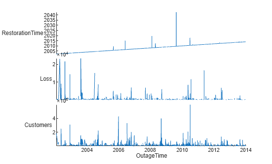
Read data from a spreadsheet to a timetable. (Read any text data it contains into string arrays). The first variable that contains dates and times, OutageTime, provides the row times for the timetable. Display the first five rows.
tbl = readtimetable("outages.csv","TextType","string"); head(tbl,5)
   OutageTime         Region        Loss     Customers     RestorationTime           Cause
________________    ___________    ______    __________    ________________    _________________

2002-02-01 12:18    "SouthWest"    458.98    1.8202e+06    2002-02-07 16:50    "winter storm"
2003-01-23 00:49    "SouthEast"    530.14    2.1204e+05                 NaT    "winter storm"
2003-02-07 21:15    "SouthEast"     289.4    1.4294e+05    2003-02-17 08:14    "winter storm"
2004-04-06 05:44    "West"         434.81    3.4037e+05    2004-04-06 06:10    "equipment fault"
2002-03-16 06:18    "MidWest"      186.44    2.1275e+05    2002-03-18 23:23    "severe storm"
Sort the timetable so that its row times are in order. The row times of a timetable do not need to be in order. However, if you use the row times as the _x_-axis of a plot, then it is better to ensure the timetable is sorted by its row times.
tbl = sortrows(tbl); head(tbl,5)
OutageTime Region Loss Customers RestorationTime Cause
________________ ___________ ______ __________ ________________ ______________
2002-02-01 12:18 "SouthWest" 458.98 1.8202e+06 2002-02-07 16:50 "winter storm"
2002-03-05 17:53 "MidWest" 96.563 2.8666e+05 2002-03-10 14:41 "wind"
2002-03-16 06:18 "MidWest" 186.44 2.1275e+05 2002-03-18 23:23 "severe storm"
2002-03-26 01:59 "MidWest" 388.04 5.6422e+05 2002-03-28 19:55 "winter storm"
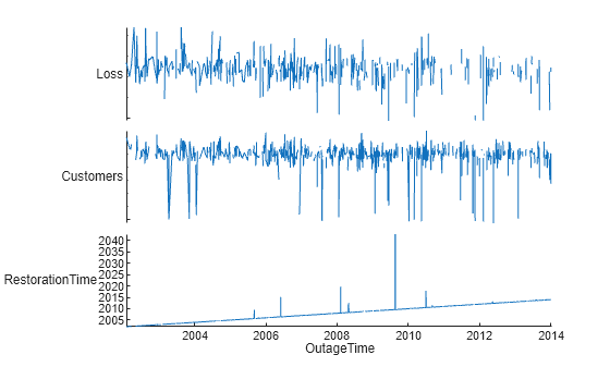
2002-04-20 16:46 "MidWest" 23141 NaN NaT "unknown" Create a stacked plot of data from tbl. The row times, OutageTime, provide the values along the _x_-axis. The stackedplot function plots the values from the Loss, Customers, and RestorationTime variables, with each variable plotted along its own y-axis. However, the plot does not include the Region and Cause variables because they contain data that cannot be plotted.

Since R2023b
Plot events from an event table that is attached to a timetable. The result is a stacked plot of the timetable variables with events plotted as vertical lines or shaded regions. For more information about event tables, see eventtable.
First, import a timetable and an event table from a sample MAT-file. Display the timetable, which has a list of weather conditions over a span of two weeks in November 2022.
load weatherEvents.mat weatherData
weatherData=15×2 timetable Time Temperature Humidity ___________ ___________ ________
01-Nov-2022        36            45
02-Nov-2022        31            76
03-Nov-2022        37            43
04-Nov-2022        36            46
05-Nov-2022        38            72
06-Nov-2022        32            54
07-Nov-2022        35            50
08-Nov-2022        34            45
09-Nov-2022        32            72
10-Nov-2022        30            58
11-Nov-2022        39            54
12-Nov-2022        34            58
13-Nov-2022        31            73
14-Nov-2022        40            78
15-Nov-2022        34            66
Next, display the event table. It has a list of storms that occurred in November 2022 and their durations.
weatherEvents = 4×3 eventtable Event Labels Variable: EventType Event Lengths Variable: EventLength
   Time        EventType    EventLength    Precipitation (mm)
___________    _________    ___________    __________________

03-Nov-2022      Hail         1.2 hr              12.7
05-Nov-2022      Rain          36 hr             114.3
10-Nov-2022      Snow          18 hr              25.4
14-Nov-2022      Rain          20 hr             177.8
Then, attach the event table to the timetable. The event table becomes a property of the timetable. When you display the timetable, you can also see the event labels.
weatherData.Properties.Events = weatherEvents
weatherData=15×2 timetable with 4 events Time Temperature Humidity ___________ ___________ ________
        01-Nov-2022        36            45
        02-Nov-2022        31            76
Hail    03-Nov-2022        37            43
        04-Nov-2022        36            46
Rain    05-Nov-2022        38            72
Rain    06-Nov-2022        32            54
        07-Nov-2022        35            50
        08-Nov-2022        34            45
        09-Nov-2022        32            72
Snow    10-Nov-2022        30            58
        11-Nov-2022        39            54
        12-Nov-2022        34            58
        13-Nov-2022        31            73
Rain    14-Nov-2022        40            78
        15-Nov-2022        34            66
Create a stacked plot. The shaded regions indicate when the storms listed in the attached event table occurred.
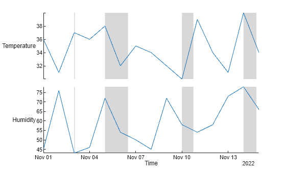
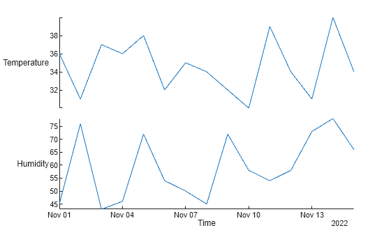
To hide the events, use the EventsVisible name-value argument.
stackedplot(weatherData,EventsVisible="off")
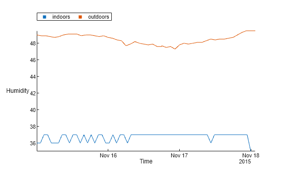
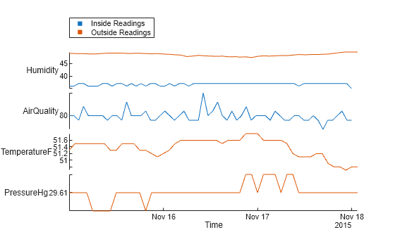
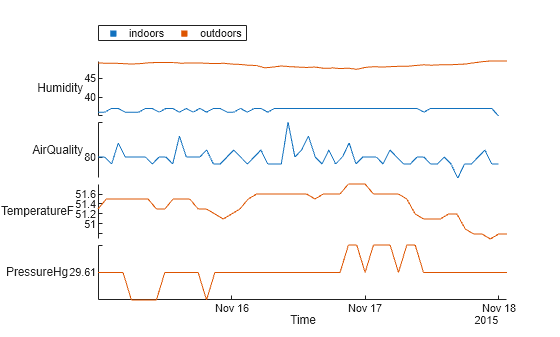
Load two timetables from the sample MAT-files, indoors and outdoors. Then display the first three rows of each timetable.
load indoors.mat load outdoors.mat head(indoors,3)
Time Humidity AirQuality
___________________ ________ __________
2015-11-15 00:00:24 36 80
2015-11-15 01:13:35 36 80
2015-11-15 02:26:47 37 79
Time Humidity TemperatureF PressureHg
___________________ ________ ____________ __________
2015-11-15 00:00:24 49 51.3 29.61
2015-11-15 01:30:24 48.9 51.5 29.61
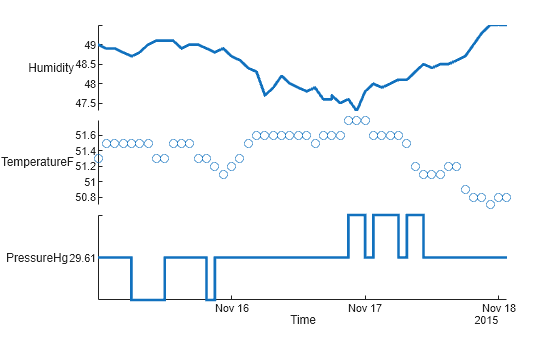
2015-11-15 03:00:24 48.9 51.5 29.61 Create a stacked plot of the data in indoors and outdoors. When you create a stacked plot from multiple tables or timetables:
- The legend displays the color associated with each table or timetable.
- Variables that have the same names but that come from different tables or timetables are plotted in the same _y_-axis. For example, this call to
stackedplotplots theHumidityvariables fromindoorsandoutdoorsin the same _y_-axis.
stackedplot(indoors,outdoors)

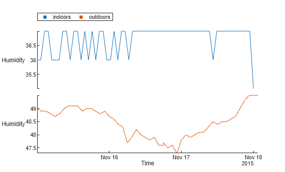
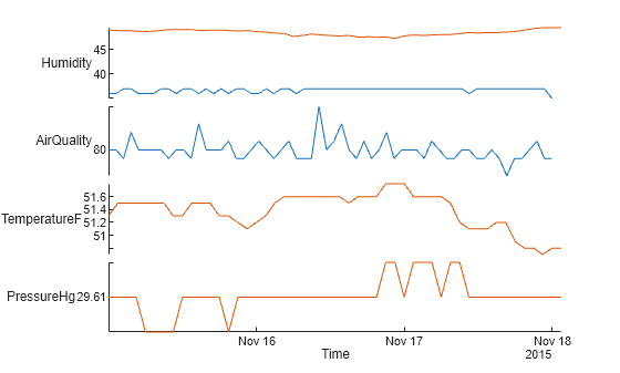
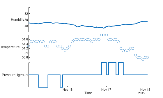
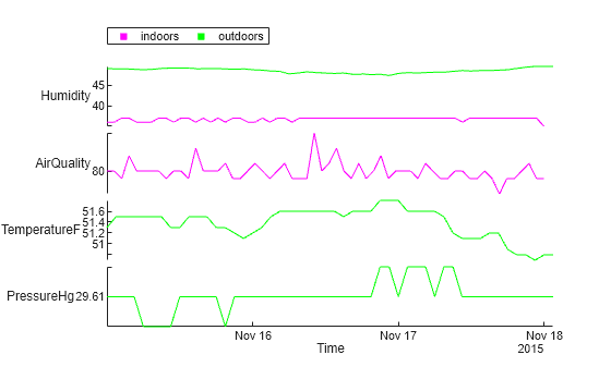
Load two timetables from the sample MAT-files, indoors and outdoors. Both timetables have a variable named Humidity. Make a stacked plot from the two Humidity variables. The colors in the legend show which variables come from which timetable.
load indoors.mat load outdoors.mat head(indoors,5)
       Time            Humidity    AirQuality
___________________    ________    __________

2015-11-15 00:00:24       36           80
2015-11-15 01:13:35       36           80
2015-11-15 02:26:47       37           79
2015-11-15 03:39:59       37           82
2015-11-15 04:53:11       36           80

       Time            Humidity    TemperatureF    PressureHg
___________________    ________    ____________    __________

2015-11-15 00:00:24        49          51.3          29.61
2015-11-15 01:30:24      48.9          51.5          29.61
2015-11-15 03:00:24      48.9          51.5          29.61
2015-11-15 04:30:24      48.8          51.5          29.61
2015-11-15 06:00:24      48.7          51.5           29.6
stackedplot(indoors,outdoors,"Humidity")
The syntax stackedplot(indoors,outdoors,"Humidity") is equivalent to the syntax stackedplot(indoors,outdoors,"Humidity","CombineMatchingNames",true). By default, variables that have matching names but come from different inputs are plotted in the same _y_-axis.
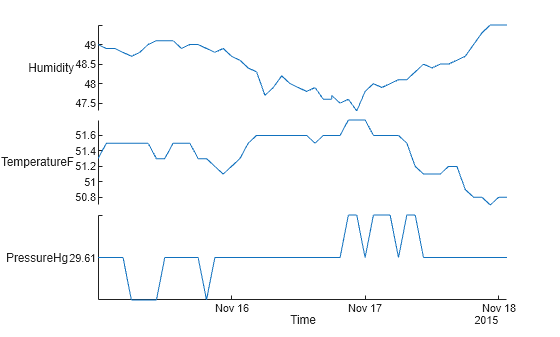
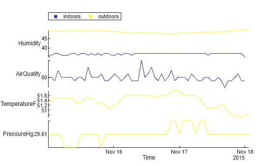
To plot the two Humidity variables in different _y_-axes, specify the "CombineMatchingNames",false name-value argument.
stackedplot(indoors,outdoors,"Humidity","CombineMatchingNames",false)
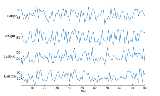
Create a table from patient data. Display the first three rows.
tbl = readtable("patients.xls","TextType","string"); head(tbl,3)
 LastName      Gender     Age             Location              Height    Weight    Smoker    Systolic    Diastolic    SelfAssessedHealthStatus
__________    ________    ___    ___________________________    ______    ______    ______    ________    _________    ________________________

"Smith"       "Male"      38     "County General Hospital"        71       176      true        124          93              "Excellent"
"Johnson"     "Male"      43     "VA Hospital"                    69       163      false       109          77              "Fair"
"Williams"    "Female"    38     "St. Mary's Medical Center"      64       131      false       125          83              "Good"
Plot only four of the variables from the table.
stackedplot(tbl,["Height","Weight","Systolic","Diastolic"])
Read a timetable from file and display its first three rows.
tbl = readtimetable("outages.csv","TextType","string"); tbl = sortrows(tbl); head(tbl,3)
   OutageTime         Region        Loss     Customers     RestorationTime         Cause
________________    ___________    ______    __________    ________________    ______________

2002-02-01 12:18    "SouthWest"    458.98    1.8202e+06    2002-02-07 16:50    "winter storm"
2002-03-05 17:53    "MidWest"      96.563    2.8666e+05    2002-03-10 14:41    "wind"
2002-03-16 06:18    "MidWest"      186.44    2.1275e+05    2002-03-18 23:23    "severe storm"
Reorder the variables by specifying them in an order that differs from their order in the table. For example, RestorationTime is the last variable in the timetable that can be plotted. By default, stackedplot places it at the bottom of the plot. But you can reorder the variables to put RestorationTime at the top.
stackedplot(tbl,["RestorationTime","Loss","Customers"])
There are also other ways to reorder the variables.
- Specify them by their numeric order in the table:
stackedplot(tbl,[4 2 3]);
- Return a
StackedLineChartobject and reorder the values in itsDisplayVariablesproperty:
s = stackedplot(tbl); s.DisplayVariables = ["RestorationTime","Loss","Customers"]
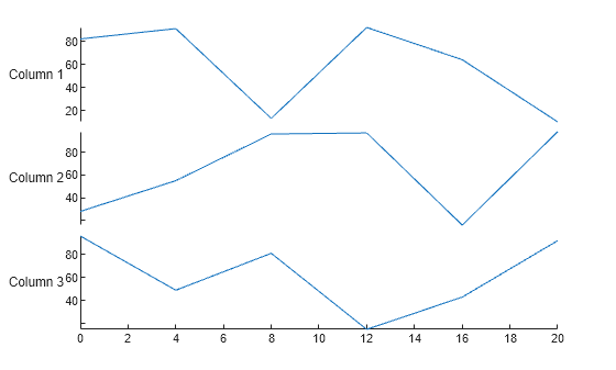
Create a numeric matrix and a numeric vector.
Y = 6×3
82    28    96
91    55    49
13    96    81
92    97    15
64    16    43
10    98    92
Create a stacked plot using X and Y.
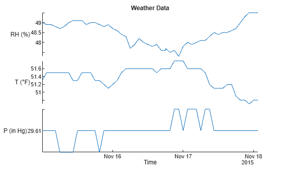
Load a timetable that has a set of weather measurements. Display its first three rows.
load outdoors outdoors(1:3,:)
ans=3×3 timetable Time Humidity TemperatureF PressureHg ___________________ ________ ____________ __________
2015-11-15 00:00:24        49          51.3          29.61
2015-11-15 01:30:24      48.9          51.5          29.61
2015-11-15 03:00:24      48.9          51.5          29.61
Create a stacked plot. Specify the title and labels for the _y_-axes using name-value arguments. You can use name-value arguments to change any properties from their defaults values. (Also note that you can specify the degree symbol using char(176).)
degreeSymbol = char(176); newYlabels = ["RH (%)","T (" + degreeSymbol + "F)","P (in Hg)"]; stackedplot(outdoors,"Title","Weather Data","DisplayLabels",newYlabels)
Load two timetables from the sample MAT-files, indoors and outdoors.
load indoors.mat load outdoors.mat head(indoors,3)
       Time            Humidity    AirQuality
___________________    ________    __________

2015-11-15 00:00:24       36           80
2015-11-15 01:13:35       36           80
2015-11-15 02:26:47       37           79

       Time            Humidity    TemperatureF    PressureHg
___________________    ________    ____________    __________

2015-11-15 00:00:24        49          51.3          29.61
2015-11-15 01:30:24      48.9          51.5          29.61
2015-11-15 03:00:24      48.9          51.5          29.61
When you create a stacked plot with multiple tables or timetables, it includes a legend. By default, the legend uses the names of the inputs as labels. But you can specify the labels and the orientation of the labels in the legend.
stackedplot(indoors,outdoors,"LegendLabels",["Inside Readings","Outside Readings"],... "LegendOrientation","vertical")
Also, you can hide the legend.
stackedplot(indoors,outdoors,"LegendVisible","off")
The stackedplot function returns a StackedLineChart object. You can use it to set the same line and axis properties for all plots, or to set different property values for individual plots. In this example, first change the line widths for all plots in a stacked plot. Then, use the PlotType property of individual plots, so that the stacked plot has a line plot, scatter plot, and stair plot.
Load a timetable that has a set of weather measurements.
load outdoors outdoors(1:3,:)
ans=3×3 timetable Time Humidity TemperatureF PressureHg ___________________ ________ ____________ __________
2015-11-15 00:00:24        49          51.3          29.61
2015-11-15 01:30:24      48.9          51.5          29.61
2015-11-15 03:00:24      48.9          51.5          29.61
Create a stacked plot and return a StackedLineChart object.
s = stackedplot(outdoors)
s = StackedLineChart with properties:
     SourceTable: [51×3 timetable]
DisplayVariables: {'Humidity'  'TemperatureF'  'PressureHg'}
           Color: [0.0660 0.4430 0.7450]
       LineStyle: '-'
       LineWidth: 0.5000
          Marker: 'none'
      MarkerSize: 6
   EventsVisible: on
Show all properties
The object provides access to many properties that apply to all the plots. For example, you can use s.LineWidth to make the lines wider.
The object also provides access to arrays of objects that you can use to modify the lines and _y_-axes for individual plots. To access properties of individual lines, use s.LineProperties. For each plot, you can specify a different line style, marker, plot type, and so on.
ans=3×1 StackedLineProperties array with properties: Color MarkerFaceColor MarkerEdgeColor LineStyle LineWidth Marker MarkerSize PlotType
Change the second plot to a scatter plot, and the third plot to a stair plot, using the PlotType property.
s.LineProperties(2).PlotType = "scatter"; s.LineProperties(3).PlotType = "stairs";
You also can access individual _y_-axes through the s.AxesProperties property.
ans=3×1 StackedAxesProperties array with properties: YLimits YScale LegendLabels LegendLocation LegendVisible CollapseLegend
For example, change the _y_-limits of the first plot.
s.AxesProperties(1).YLimits = [46 54];
Create a table from a subset of patient data, using the Weight, Systolic, and Diastolic variables.
load patients tbl = table(Weight,Systolic,Diastolic); head(tbl,3)
Weight    Systolic    Diastolic
______    ________    _________

 176        124          93
 163        109          77
 131        125          83
Create a stacked plot, with Systolic and Diastolic plotted using the same _y_-axis, and Weight using its own _y_-axis. First, specify vars as a cell array with two elements. The first element groups "Systolic" and "Diastolic" together in a string array. They are plotted together on a common _y_-axis. The second element of the cell array is "Weight". It is plotted on its own _y_-axis. Also, return a StackedLineChart object that has the properties of the stacked plot.
vars = {["Systolic","Diastolic"],"Weight"}
vars=1×2 cell array {["Systolic" "Diastolic"]} {["Weight"]}
s = stackedplot(tbl,vars)
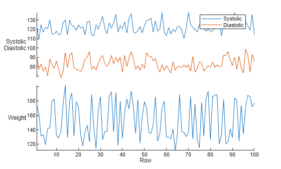
s = StackedLineChart with properties:
     SourceTable: [100×3 table]
DisplayVariables: {{1×2 cell}  'Weight'}
       XVariable: []
           Color: [0.0660 0.4430 0.7450]
       LineStyle: '-'
       LineWidth: 0.5000
          Marker: 'none'
      MarkerSize: 6
Show all properties
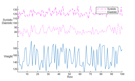
When you plot multiple variables in one _y_-axis, you can assign different styles to the lines within that _y_-axis by assigning an array that specifies the styles.
For example, to specify the same color for both lines in the first _y_-axis, assign it to s.LineProperties(1).Color. To specify different line styles for the two lines, assign a string array that specifies two different styles to s.LineProperties(1).LineStyle.
s.LineProperties(1).Color = "magenta"; s.LineProperties(1).LineStyle = ["--",":"];
Load two timetables from the sample MAT-files, indoors and outdoors.
load indoors.mat load outdoors.mat
Create a stacked plot.
s = stackedplot(indoors,outdoors);
Change the color order used to indicate which variables come from which timetable. If you have a few timetables, it can be practical to choose colors by name.
colororder(s,["magenta","green"])
If you plot variables from a larger number of input tables or timetables, it might be more practical to set the color order by using a colormap. Specify that the colormap has n colors, where n is the number of tables or timetables you specified when you created the stacked plot.
For example, set the color order using the parula function to return the parula colormap. Specify the number of colors as being equal to the number of timetables. If you do not know how many tables or timetables are shown in the stacked plot, use the SourceTable property of the StackedLineChart object returned by stackedplot.
numTimetables = numel(s.SourceTable); colororder(s,parula(numTimetables))
Import data into a timetable. Then make a stacked plot. By default, all plots have linear scales on both their _x_- and _y_-axes.
tbl = readtimetable("outages.csv"); tbl = sortrows(tbl); s = stackedplot(tbl)
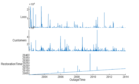
s = StackedLineChart with properties:
     SourceTable: [1468×5 timetable]
DisplayVariables: {'Loss'  'Customers'  'RestorationTime'}
           Color: [0.0660 0.4430 0.7450]
       LineStyle: '-'
       LineWidth: 0.5000
          Marker: 'none'
      MarkerSize: 6
   EventsVisible: on
Show all properties
You can access properties of individual _y_-axes, such as their scales, through the s.AxesProperties property.
ans=3×1 StackedAxesProperties array with properties: YLimits YScale LegendLabels LegendLocation LegendVisible CollapseLegend
To turn the first and second plots into semilog plots, with log scales on their _y_-axes, set their YScale properties to 'log'.
s.AxesProperties(1).YScale = 'log'; s.AxesProperties(2).YScale = 'log';
Input Arguments
Input table or timetable. The stackedplot function plots all the numeric, logical, categorical, datetime, andduration variables, and ignores table variables of any other data type. If tbl has more than 25 variables,stackedplot plots the first 25.
To specify multiple input tables or timetables, use a comma-separated list or a cell array of tables or timetables. When specifying multiple inputs, you cannot mix tables and timetables in one call to stackedplot.
Variables in the input tables or timetables, specified using one of the indexing schemes from the table.
Note: If you create a stacked plot from multiple tables or timetables, then vars can be only a string array, a cell array of character vectors, or a cell array whose elements are string arrays or cell arrays of character vectors.
| Indexing Scheme | Examples |
|---|---|
| Variable names: A string array or a cell array of character vectors. | "A" — A variable called A["A","B"] or {'A','B'} — Two variables called A and B |
| Variable index (for single table or timetable only): An index number that refers to the location of a variable in the table.A vector of numbers.A logical vector. Typically, this vector is the same length as the number of variables, but you can omit trailing 0 or false values. | 3 — The third variable from the table[2 3] — The second and third variables from the table[false false true] — The third variable |
| Variable type (for single table or timetable only): A vartype subscript that selects variables of a specified type. | vartype("categorical") — All the variables containing categorical values |
| Variables specified in nested cell array: A cell array that contains numeric arrays (for single table or timetable only).A cell array that contains string arrays.A cell array that contains cell arrays of character vectors. | {[1 2] 3} — The first and second variables plotted in one _y_-axis, and the third variable plotted in a second _y_-axis{["A","B"],"C"} — Variables A and B plotted in one _y_-axis, and variable C plotted in a second _y_-axis{{'A','B'},'C'} — Variables A and B plotted in one _y_-axis, and variable C plotted in a second _y_-axis |
Example: stackedplot(tbl,[1 3 4]) specifies the first, third, and fourth variables.
Example: stackedplot(tbl,{["Temp1","Temp2"],"Pressure"}) uses a nested cell array to specify that Temp1 and Temp2 are plotted in the same _y_-axis.
Example: stackedplot(tbl,{{1,2},5}) specifies variables by number and plots the first and second variables in the same_y_-axis.
_x_-values, specified as a numeric, datetime, duration, or logical vector. The length of X must equal the number of rows ofY.
_y_-values, specified as a numeric, datetime, duration, categorical, or logical array. The stackedplot function plots each column in a separate _y_-axis.
Line style, marker, and color, specified as a string scalar or character vector containing symbols. The symbols can appear in any order. You do not need to specify all three characteristics (line style, marker, and color). For example, if you omit the line style and specify the marker, then the plot shows only the marker and no line.
Example: "--or" is a red dashed line with circle markers.
| Line Style | Description | Resulting Line |
|---|---|---|
| "-" | Solid line |  |
| "--" | Dashed line |  |
| ":" | Dotted line |  |
| "-." | Dash-dotted line |  |
| Marker | Description | Resulting Marker |
|---|---|---|
| "o" | Circle |  |
| "+" | Plus sign |  |
| "*" | Asterisk |  |
| "." | Point |  |
| "x" | Cross |  |
| "_" | Horizontal line |  |
| "|" | Vertical line |  |
| "square" | Square |  |
| "diamond" | Diamond |  |
| "^" | Upward-pointing triangle |  |
| "v" | Downward-pointing triangle |  |
| ">" | Right-pointing triangle |  |
| "<" | Left-pointing triangle |  |
| "pentagram" | Pentagram |  |
| "hexagram" | Hexagram |  |
| Color Name | Short Name | RGB Triplet | Appearance |
|---|---|---|---|
| "red" | "r" | [1 0 0] |  |
| "green" | "g" | [0 1 0] |  |
| "blue" | "b" | [0 0 1] |  |
| "cyan" | "c" | [0 1 1] |  |
| "magenta" | "m" | [1 0 1] |  |
| "yellow" | "y" | [1 1 0] |  |
| "black" | "k" | [0 0 0] |  |
| "white" | "w" | [1 1 1] |  |
Table variables that contain _x_-values, specified as a string array, character vector, cell array of character vectors, integer array, or logical array.
You can specify xvar only when the input argumentstbl or tbl1,...,tblN are tables, not timetables, vectors, or matrices.
- If the input is one table, then
xvarspecifies one variable in the table. - If the inputs are multiple tables, then
xvarcan specify either one variable that is present in all tables or a different variable in each table.
For example, if the inputs aretbl1,tbl2,tbl3, thenxvarcan be"X"if each table has a variable namedXthat provides _x_-values. However, iftbl1has a variable namedX1,tbl2a variable namedX2, andtbl3a variable namedX3, then specifyxvaras["X1","X2","X3"].
Parent container, specified as a Figure, Panel,Tab, TiledChartLayout, or GridLayout object.
Name-Value Arguments
Specify optional pairs of arguments asName1=Value1,...,NameN=ValueN, where Name is the argument name and Value is the corresponding value. Name-value arguments must appear after other arguments, but the order of the pairs does not matter.
Example: stackedplot(tbl,Marker="o",MarkerSize=10)
Before R2021a, use commas to separate each name and value, and enclose Name in quotes.
Example: stackedplot(tbl,"Marker","o","MarkerSize",10)
The stacked chart line properties listed here are only a subset common to all stacked plots, whether the data source is a table or array. For a complete list, see StackedLineChart Properties.
Line color, specified as an RGB triplet, a hexadecimal color code, or one of the color options listed in the first table.
For a custom color, specify an RGB triplet or a hexadecimal color code.
- An RGB triplet is a three-element row vector whose elements specify the intensities of the red, green, and blue components of the color. The intensities must be in the range
[0,1], for example,[0.4 0.6 0.7]. - A hexadecimal color code is a string scalar or character vector that starts with a hash symbol (
#) followed by three or six hexadecimal digits, which can range from0toF. The values are not case sensitive. Therefore, the color codes"#FF8800","#ff8800","#F80", and"#f80"are equivalent.
Alternatively, you can specify some common colors by name. This table lists the named color options, the equivalent RGB triplets, and the hexadecimal color codes.
| Color Name | Short Name | RGB Triplet | Hexadecimal Color Code | Appearance |
|---|---|---|---|---|
| "red" | "r" | [1 0 0] | "#FF0000" | |
| "green" | "g" | [0 1 0] | "#00FF00" | |
| "blue" | "b" | [0 0 1] | "#0000FF" | |
| "cyan" | "c" | [0 1 1] | "#00FFFF" | |
| "magenta" | "m" | [1 0 1] | "#FF00FF" | |
| "yellow" | "y" | [1 1 0] | "#FFFF00" | |
| "black" | "k" | [0 0 0] | "#000000" | |
| "white" | "w" | [1 1 1] | "#FFFFFF" | |
| "none" | Not applicable | Not applicable | Not applicable | No color |
This table lists the default color palettes for plots in the light and dark themes.
| Palette | Palette Colors |
|---|---|
| "gem" — Light theme default_Before R2025a: Most plots use these colors by default._ |  |
| "glow" — Dark theme default |  |
You can get the RGB triplets and hexadecimal color codes for these palettes using the orderedcolors and rgb2hex functions. For example, get the RGB triplets for the "gem" palette and convert them to hexadecimal color codes.
RGB = orderedcolors("gem"); H = rgb2hex(RGB);
Before R2023b: Get the RGB triplets using RGB = get(groot,"FactoryAxesColorOrder").
Before R2024a: Get the hexadecimal color codes using H = compose("#%02X%02X%02X",round(RGB*255)).
Example: "blue"
Example: [0 0 1]
Example: "#0000FF"
Marker size, specified as a positive value in points, where 1 point = 1/72 of an inch.
More About
A standalone visualization is a chart designed for a special purpose that works independently from other charts. Unlike other charts such as plot and surf, a standalone visualization has a preconfigured axes object built into it, and some customizations are not available. A standalone visualization also has these characteristics:
- It cannot be combined with other graphics elements, such as lines, patches, or surfaces. Thus, the
holdcommand is not supported. - The
gcafunction can return the chart object as the current axes. - You can pass the chart object to many MATLAB® functions that accept an axes object as an input argument. For example, you can pass the chart object to the
titlefunction.
Tips
- To interactively explore the data in your stacked plot, use these features.
- Zoom — Use the scroll wheel to zoom.
- Pan — Click and drag the stacked plot to pan across the_x_-values.
- Data cursor — Hover over a location to display _y_-values for each plot.
Version History
Introduced in R2018b
The stackedplot function can plot events as lines or shaded regions on stacked plots created from timetables. To plot events associated with a timetable, you must attach an event table to it before you call stackedplot. For more information on event tables, see eventtable.
To support events, stackedplot has a newEventsVisible name-value argument:
- If
EventsVisibleis"on", thenstackedplotplots events as lines or shaded regions. - If
EventsVisibleis"off", thenstackedplothides events.
You can now plot variables from multiple input tables or timetables. In previous releases, you can plot variables only from a single table or timetable.
Also, these name-value arguments are added in R2022b. The correspondingStackedLineChart properties are also added in R2022b.
CombineMatchingNamesLegendLabelsLegendVisibleLegendOrientation
You can display the same table or timetable variable multiple times in a stacked plot. In previous releases, specifying a variable more than once results in an error.
For example, create a timetable from the outages.csv file. Then plot the RestorationTime variable under each of the other variables you specify.
tbl = readtimetable("outages.csv"); tbl = sortrows(tbl); stackedplot(tbl,["Loss","RestorationTime","Customers","RestorationTime"])