Summarize or Pivot Data in Tables Using Groups - MATLAB & Simulink (original) (raw)
Main Content
When working with data in tables, you can often organize the data into groups. You can group tabular data to summarize and interpret the data based on common characteristics. For example, if your data consists of events over a large time period, you can group the data by year to identify trends over time. The table variables that define the grouping criteria are considered the grouping variables, and the table variables that contain the values associated with each group are considered the data variables. This example shows how to create a grouped summary table or a pivoted table to inspect and compare groups of data using either the groupsummary or pivot function, respectively. This example also shows how to create a grouped summary table or a pivoted table using the Compute by Group or Pivot Table tasks in the Live Editor.
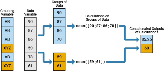
In this image, values in a data variable are grouped according to a grouping variable and then summarized using the mean.
Import Data as Table
Import the sample data set outages.csv. The file contains data for utility power outages in the United States, such as the affected region, the outage cause, and the number of affected customers. You can organize this data into groups using a single variable or using multiple variables.
T = readtable("outages.csv","TextType","string")
T=1468×6 table
Region OutageTime Loss Customers RestorationTime Cause
___________ ________________ ______ __________ ________________ _________________
"SouthWest"    2002-02-01 12:18    458.98    1.8202e+06    2002-02-07 16:50    "winter storm"
"SouthEast"    2003-01-23 00:49    530.14    2.1204e+05                 NaT    "winter storm"
"SouthEast"    2003-02-07 21:15     289.4    1.4294e+05    2003-02-17 08:14    "winter storm"
"West"         2004-04-06 05:44    434.81    3.4037e+05    2004-04-06 06:10    "equipment fault"
"MidWest"      2002-03-16 06:18    186.44    2.1275e+05    2002-03-18 23:23    "severe storm"
"West"         2003-06-18 02:49         0             0    2003-06-18 10:54    "attack"
"West"         2004-06-20 14:39    231.29           NaN    2004-06-20 19:16    "equipment fault"
"West"         2002-06-06 19:28    311.86           NaN    2002-06-07 00:51    "equipment fault"
"NorthEast"    2003-07-16 16:23    239.93         49434    2003-07-17 01:12    "fire"
"MidWest"      2004-09-27 11:09    286.72         66104    2004-09-27 16:37    "equipment fault"
"SouthEast"    2004-09-05 17:48    73.387         36073    2004-09-05 20:46    "equipment fault"
"West"         2004-05-21 21:45    159.99           NaN    2004-05-22 04:23    "equipment fault"
"SouthEast"    2002-09-01 18:22    95.917         36759    2002-09-01 19:12    "severe storm"
"SouthEast"    2003-09-27 07:32       NaN    3.5517e+05    2003-10-04 07:02    "severe storm"
"West"         2003-11-12 06:12    254.09    9.2429e+05    2003-11-17 02:04    "winter storm"
"NorthEast"    2004-09-18 05:54         0             0                 NaT    "equipment fault"
  ⋮
Summarize Data Using One Grouping Variable
When you have one grouping variable, you can create a grouped summary table with rows that correspond to each unique group using the groupsummary function. The variables in the grouped summary table represent the statistics computed per group for the data variables. This type of summary is particularly useful for identifying patterns in the data and making comparisons between different groups.
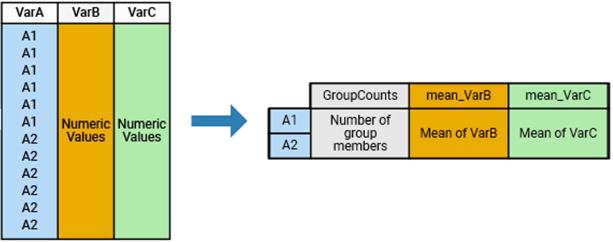
In this image, a table with one grouping variable and two data variables is summarized, and the grouped summary table shows the group counts and the mean of each group within each data variable.
Apply One Grouping Criterion
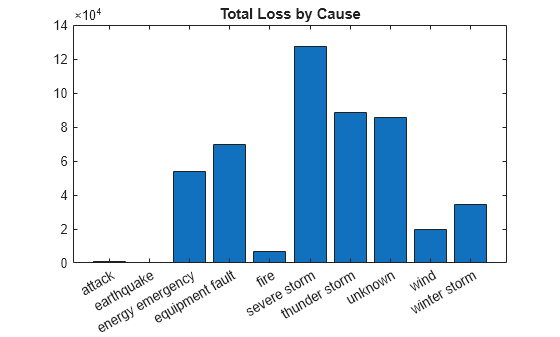
Compute the total power loss for each outage cause. Specify the grouping variable as Cause and the data variable as Loss.
G1 = groupsummary(T,"Cause","sum","Loss")
G1=10×3 table Cause GroupCount sum_Loss __________________ __________ __________
"attack"                 294            1057.7
"earthquake"               2            258.18
"energy emergency"       188             53983
"equipment fault"        156             69428
"fire"                    25            6709.6
"severe storm"           338        1.2763e+05
"thunder storm"          201             88754
"unknown"                 24             85366
"wind"                    95             19524
"winter storm"           145             34492
Visualize the grouped summary table using a bar chart.
bar(G1.Cause,G1.sum_Loss) title("Total Loss by Cause")
Compute Multiple Statistics per Group
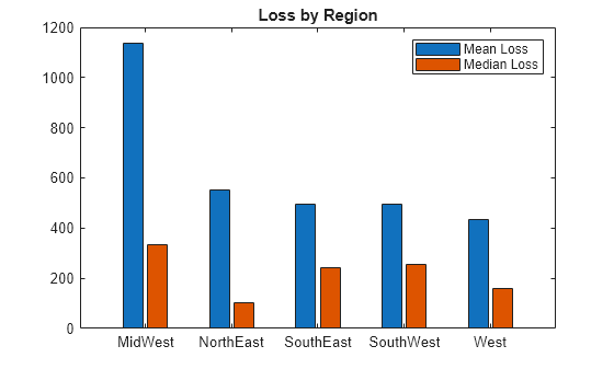
Compute the mean and median power loss for each region.
G2 = groupsummary(T,"Region",["mean" "median"],"Loss")
G2=5×4 table Region GroupCount mean_Loss median_Loss ___________ __________ _________ ___________
"MidWest"         142         1137.7        334.51
"NorthEast"       557         551.65        101.73
"SouthEast"       389         495.35        242.44
"SouthWest"        26         493.88        256.74
"West"            354         433.37         158.9
Visualize the grouped summary table using a bar chart. Each bar in a group of bars represents a different statistic. The statistics share a common scale because they represent the same data variable.
bar(G2.Region,[G2.mean_Loss G2.median_Loss]) legend("Mean Loss","Median Loss") title("Loss by Region")
Compute Statistic for Multiple Data Variables
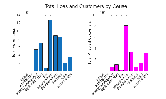
Compute the total power loss and total affected customers for each outage cause.
G3 = groupsummary(T,"Cause","sum",["Loss" "Customers"])
G3=10×4 table Cause GroupCount sum_Loss sum_Customers __________________ __________ __________ _____________
"attack"                 294            1057.7          25598
"earthquake"               2            258.18     1.3996e+05
"energy emergency"       188             53983     7.0441e+06
"equipment fault"        156             69428     1.1546e+07
"fire"                    25            6709.6     1.6527e+06
"severe storm"           338        1.2763e+05     8.1392e+07
"thunder storm"          201             88754     3.3516e+07
"unknown"                 24             85366     7.5306e+06
"wind"                    95             19524     1.4724e+07
"winter storm"           145             34492      3.273e+07
Visualize the grouped summary table using two bar charts. The statistics do not share a common scale because they represent different data variables.
ax = tiledlayout(1,2); title(ax,"Total Loss and Customers by Cause") nexttile bar(G3.Cause,G3.sum_Loss) ylabel("Total Power Loss") nexttile bar(G3.Cause,G3.sum_Customers,"magenta") ylabel("Total Affected Customers")
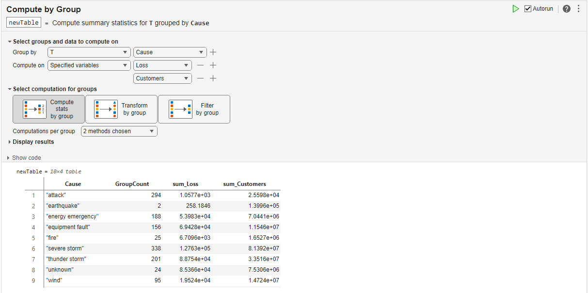
Alternatively, to interactively summarize tabular data in a grouped summary table, use the Compute by Group Live Editor task. Live Editor Tasks are apps that you can embed in a live script to interactively explore parameters and options, immediately see the results, automatically generate the corresponding code.
Pivot and Summarize Data Using Multiple Grouping Variables
When you have more than one grouping variable, you can create a pivoted table with columns and rows that correspond to unique combinations of the values in the grouping variables using the pivot function. The data values in the pivoted table represent one statistic computed per group for one data variable. A pivoted table has more configuration options than a grouped summary table that you can create using groupsummary, and a pivoted table is useful for identifying relationships between groups. Alternatively, you can use the groupsummary function to apply more than one computation method or operate on more than one data variable.
In this image, a table with three grouping variables and one data variable is pivoted, and the pivoted table shows the sum of data values in each unique combination of groups.

Apply Two Grouping Criteria
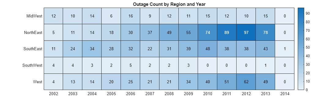
Compute the number of outages for each region per year. In this case, the two grouping variables are Region and OutageTime. One grouping variable designates the variables of the pivoted table, and one grouping variable designates the rows of the pivoted table. By default, the data values in the pivoted table are the group counts.
P1 = pivot(T,Rows="Region",Columns="OutageTime",ColumnsBinMethod="year",RowLabelPlacement="rownames")
P1=5×13 table 2002 2003 2004 2005 2006 2007 2008 2009 2010 2011 2012 2013 2014 ____ ____ ____ ____ ____ ____ ____ ____ ____ ____ ____ ____ ____
MidWest       12      10      14       6      16       9      12      11      15      12      10      15      0
NorthEast      5      11      14      18      30      37      49      55      74      89      97      78      0
SouthEast     11      24      34      28      32      22      31      39      48      38      38      43      1
SouthWest      4       4       3       2       5       2       2       3       0       0       0       1      0
West           4      13      14      20      25      21      21      34      40      51      62      49      0
Visualize the pivoted table using a heatmap.
xvar = P1.Properties.VariableNames; yvar = P1.Properties.RowNames; cvar = P1.Variables;
figure heatmap(xvar,yvar,cvar) title("Outage Count by Region and Year") fig = gcf; fig.Position(3) = fig.Position(3) * 2;
Alternatively, you can apply two grouping criteria using the groupsummary function, where groups are defined as unique combinations of the values in the Region and OutageTime grouping variables.
G4 = groupsummary(T,["Region" "OutageTime"],{"none" "year"},"sum",["Loss" "Customers"])
G4=58×5 table Region year_OutageTime GroupCount sum_Loss sum_Customers ___________ _______________ __________ ________ _____________
"MidWest"           2002              12          41994      5.0288e+06
"MidWest"           2003              10         8822.4      1.6592e+06
"MidWest"           2004              14          18207      1.6618e+06
"MidWest"           2005               6         1505.8      4.0282e+05
"MidWest"           2006              16         5419.4       5.893e+06
"MidWest"           2007               9         8778.9      1.2878e+06
"MidWest"           2008              12         8262.7      5.8309e+06
"MidWest"           2009              11         1117.5      1.7014e+06
"MidWest"           2010              15         5551.1       1.276e+06
"MidWest"           2011              12         364.24      2.6649e+06
"MidWest"           2012              10         117.18      1.3579e+06
"MidWest"           2013              15         2251.9      5.3376e+05
"NorthEast"         2002               5          32734      3.3639e+06
"NorthEast"         2003              11          30555      2.2939e+06
"NorthEast"         2004              14         6174.4      8.8251e+05
"NorthEast"         2005              18         8601.7      2.1882e+06
  ⋮
Apply Three Grouping Criteria
Compute the number of outages for each cause per region per number of customers. In this case, the three grouping variables are Cause, Region, and Customers. Define two bins for the Customers variable by specifying the ColumnsBinMethod name-value argument. Because multiple grouping variables designate the columns of the pivoted table, the pivoted table contains nested tables.
P2 = pivot(T,Rows="Cause",Columns=["Region" "Customers"],ColumnsBinMethod={"none",[0 100 Inf]},IncludeMissingGroups=false)
P2=10×6 table
Cause MidWest NorthEast SouthEast SouthWest West
__________________ ______________________ ______________________ ______________________ ______________________ ______________________
                      [0, 100)    [100, Inf]    [0, 100)    [100, Inf]    [0, 100)    [100, Inf]    [0, 100)    [100, Inf]    [0, 100)    [100, Inf]
                      ________    __________    ________    __________    ________    __________    ________    __________    ________    __________

"attack"                 5             0           83            1            6            1           0            0            43            5
"earthquake"             0             0            1            0            0            0           0            0             0            1
"energy emergency"       7             4            5            7           17           24           1            5             7           15
"equipment fault"        2             4            6            9            1           31           0            1            10           40
"fire"                   0             0            0            4            0            2           0            0             1           10
"severe storm"           0            31            1          141            5          127           0            5             0           21
"thunder storm"          0            32            2          100            0           53           0            6             0            4
"unknown"                0             4            0            6            1            1           0            0             1            2
"wind"                   0            16            0           41            0           13           0            3             1           20
"winter storm"           0            17            1           69            3           34           0            1             0           19
Compute Marginal Totals
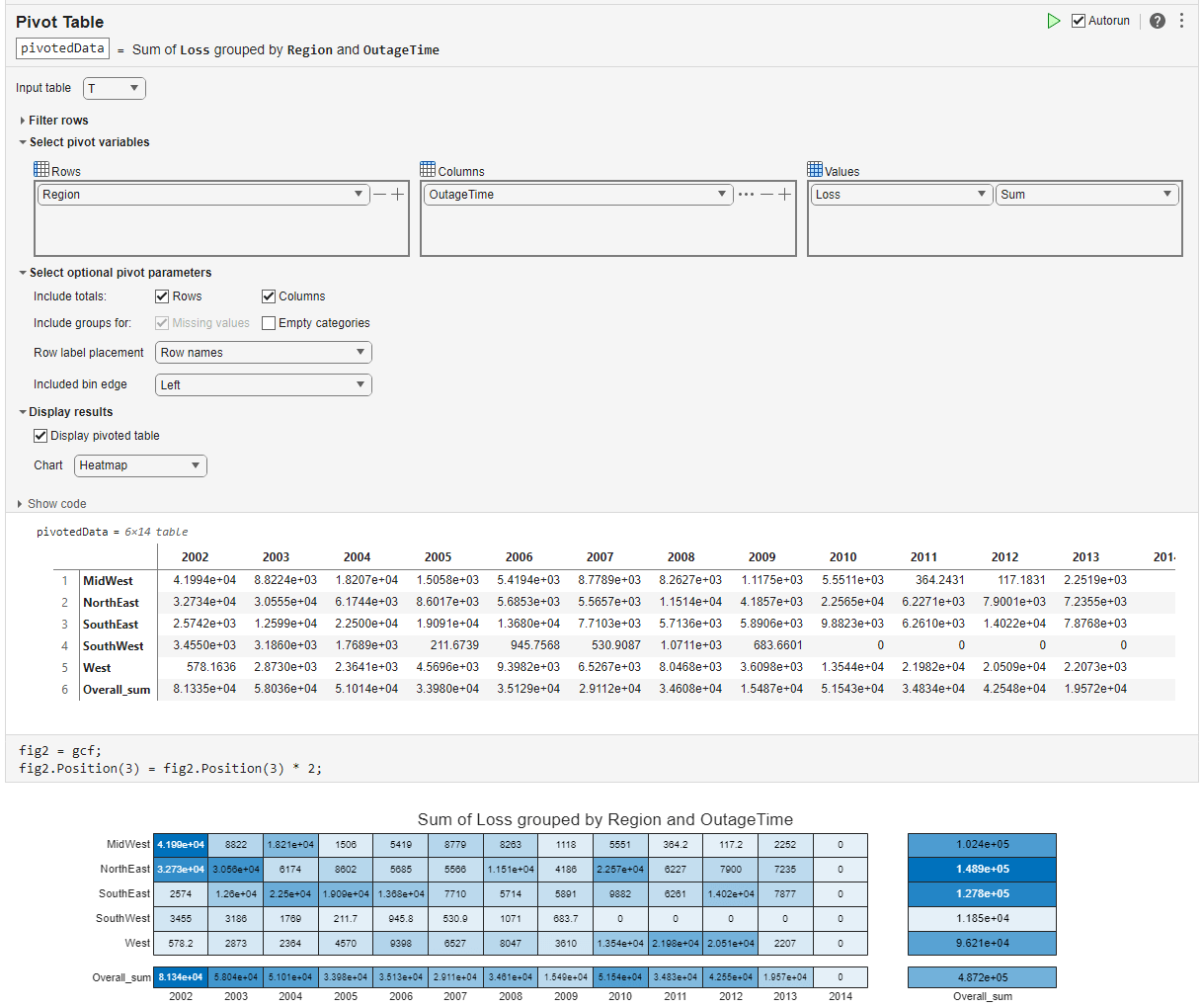
You can display row-wise and column-wise statistics in a pivoted table using the IncludeTotals name-value argument. Compute the total power loss for each region per year, and include the marginal totals in the pivoted table. The last row of the pivoted table represents the total power loss for each year. The last variable of the pivoted table represents the total power loss for each region.
P3 = pivot(T,Rows="Region",Columns="OutageTime",ColumnsBinMethod="year",DataVariable="Loss",RowLabelPlacement="rownames",IncludeTotals=true)
P3=6×14 table 2002 2003 2004 2005 2006 2007 2008 2009 2010 2011 2012 2013 2014 Overall_sum ______ ______ ______ ______ ______ ______ ______ ______ ______ ______ ______ ______ ____ ___________
MidWest         41994    8822.4     18207    1505.8    5419.4    8778.9    8262.7    1117.5    5551.1    364.24    117.18    2251.9     0      1.0239e+05
NorthEast       32734     30555    6174.4    8601.7    5685.3    5565.7     11514    4185.7     22565    6227.1    7900.1    7235.5     0      1.4894e+05
SouthEast      2574.2     12599     22500     19091     13680    7710.3    5713.6    5890.6    9882.3      6261     14022    7876.8     0       1.278e+05
SouthWest        3455      3186    1768.9    211.67    945.76    530.91    1071.1    683.66         0         0         0         0     0           11853
West           578.16      2873    2364.1    4569.6    9398.2    6526.7    8046.8    3609.8     13544     21982     20509    2207.3     0           96208
Overall_sum     81335     58036     51014     33980     35129     29112     34608     15487     51543     34834     42548     19572     0       4.872e+05
Alternatively, to interactively summarize tabular data in a pivoted table and visualize the pivoted table in a different types of charts, use the Pivot Table Live Editor task.
Other Functions for Grouped Calculations
In most cases, groupsummary is the recommended function for identifying patterns in the data and making comparisons between one or more grouping variables. pivot is the recommended function for identifying relationships between multiple grouping variables or when you need additional configuration options.
To explore additional functions for grouped calculations, see the tips and recommendations in Perform Calculations by Group in Table.
See Also
Functions
- groupsummary | pivot | bar | heatmap