Dash in 20 Minutes Tutorial | Dash for Python Documentation (original) (raw)
By the end of this tutorial, you will understand the basic building blocks of Dash and you will know how to build this app:
View app
# Import packages
from dash import Dash, html, dash_table, dcc, callback, Output, Input
import pandas as pd
import plotly.express as px

# Incorporate data
df = pd.read_csv('https://raw.githubusercontent.com/plotly/datasets/master/gapminder2007.csv')

# Initialize the app
app = Dash()

# App layout
app.layout = [
    html.Div(children='My First App with Data, Graph, and Controls'),
    html.Hr(),
    dcc.RadioItems(options=['pop', 'lifeExp', 'gdpPercap'], value='lifeExp', id='my-final-radio-item-example'),
    dash_table.DataTable(data=df.to_dict('records'), page_size=6),
    dcc.Graph(figure={}, id='my-final-graph-example')
]

# Add controls to build the interaction
@callback(
    Output(component_id='my-final-graph-example', component_property='figure'),
    Input(component_id='my-final-radio-item-example', component_property='value')
)
def update_graph(col_chosen):
    fig = px.histogram(df, x='continent', y=col_chosen, histfunc='avg')
    return fig

# Run the app
if __name__ == '__main__':
    app.run(debug=True)
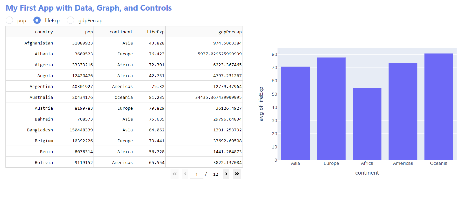
My First App with Data, Graph, and Controls
Hello World
Building and launching an app with Dash can be done with just 5 lines of code.
Open a Python IDE on your computer, create an app.py file with the code below and install Dash if you haven’t done so already.
To launch the app, type into your terminal the command python app.py. Then, go to the http link.
Alternatively, with Dash 2.11 or later, you can run this app and other examples from this documentation in a Jupyter Notebook.
The code below creates a very small “Hello World” Dash app.
from dash import Dash, html

app = Dash()

# Requires Dash 2.17.0 or later
app.layout = [html.Div(children='Hello World')]

if __name__ == '__main__':
    app.run(debug=True)
Follow this example gif (using VS Code) if you are not sure how to set up the app:
Hello World: Code Breakdown
# Import packages
from dash import Dash, html
- When creating Dash apps, you will almost always use the import statement above. As you create more advanced Dash apps, you will import more packages.
# Initialize the app
app = Dash()
- This line is known as the Dash constructor and is responsible for initializing your app. It is almost always the same for any Dash app you create.
# App layout
app.layout = [html.Div(children='Hello World')]
- The app layout represents the app components that will be displayed in the web browser and here is provided as a
list, though it could also be a Dash component.
In this example, a single component was added to the list: anhtml.Div.
The Div has a few properties, such aschildren, which we use to add text content to the page: “Hello World”.
# Run the app
if __name__ == '__main__':
    app.run(debug=True)
- These lines are for running your app, and they are almost always the same for any Dash app you create.
Connecting to Data
There are many ways to add data to an app: APIs, external databases, local .txt files, JSON files, and more.
In this example, we will highlight one of the most common ways of incorporating data from a CSV sheet.
Replace the app.py code from the previous section with the code below. Then, install pandas (pip install pandas) and launch the app.
# Import packages
from dash import Dash, html, dash_table
import pandas as pd

# Incorporate data
df = pd.read_csv('https://raw.githubusercontent.com/plotly/datasets/master/gapminder2007.csv')

# Initialize the app
app = Dash()

# App layout
app.layout = [
    html.Div(children='My First App with Data'),
    dash_table.DataTable(data=df.to_dict('records'), page_size=10)
]

# Run the app
if __name__ == '__main__':
    app.run(debug=True)
Connect to Data: Code Breakdown
# Import packages
from dash import Dash, html, dash_table
import pandas as pd
- We import the
dash_tablemodule to display the data inside a Dash DataTable. We also import the pandas library to read the CSV sheet data.
# Incorporate data
df = pd.read_csv('https://raw.githubusercontent.com/plotly/datasets/master/gapminder2007.csv')
- Here we read the CSV sheet into a pandas dataframe. This will make it easier to slice, filter, and inspect the data.
- If you prefer to use a CSV sheet that is on your computer (and not online), make sure to save it in the same folder that contains the
app.pyfile.
Then, update the line of code to:df = pd.read_csv('NameOfYourFile.csv') - If you’re using an Excel sheet, make sure to
pip install openpyxl. Then, update the line of code to:df = pd.read_excel('NameOfYourFile.xlsx', sheet_name='Sheet1')
Tip: You can read the pandas docs on reading data if your data is in a different format, or consider using another Python library if you are connecting to a specific database type or file format.
For example, if you’re considering using Databricks as a backend for your Dash app, you may review their Python documentation for recommendations on how to connect.
# App layout
app.layout = [
    html.Div(children='My First App with Data'),
    dash_table.DataTable(data=df.to_dict('records'), page_size=10)
]
- In addition to the app title, we add the DataTable component and read the pandas dataframe into the table.
Visualizing Data
The Plotly graphing library has more than 50 chart types to choose from.
In this example, we will make use of the histogram chart.
Replace the app.py code from the previous section with the code below.
# Import packages
from dash import Dash, html, dash_table, dcc
import pandas as pd
import plotly.express as px

# Incorporate data
df = pd.read_csv('https://raw.githubusercontent.com/plotly/datasets/master/gapminder2007.csv')

# Initialize the app
app = Dash()

# App layout
app.layout = [
    html.Div(children='My First App with Data and a Graph'),
    dash_table.DataTable(data=df.to_dict('records'), page_size=10),
    dcc.Graph(figure=px.histogram(df, x='continent', y='lifeExp', histfunc='avg'))
]

# Run the app
if __name__ == '__main__':
    app.run(debug=True)
My First App with Data and a Graph
Visualize Data: Code Breakdown
# Import packages
from dash import Dash, html, dash_table, dcc
import pandas as pd
import plotly.express as px
- We import the
dccmodule (DCC stands for Dash Core Components). This module includes a Graph component calleddcc.Graph, which is used to render interactive graphs. - We also import the
plotly.expresslibrary to build the interactive graphs.
# App layout
app.layout = [
    html.Div(children='My First App with Data and a Graph'),
    dash_table.DataTable(data=df.to_dict('records'), page_size=10),
    dcc.Graph(figure=px.histogram(df, x='continent', y='lifeExp', histfunc='avg'))
]
- Using the
plotly.expresslibrary, we build the histogram chart and assign it to thefigureproperty of thedcc.Graph. This displays the histogram in our app.
Controls and Callbacks
So far you have built a static app that displays tabular data and a graph.
However, as you develop more sophisticated Dash apps, you will likely want to give the app user more freedom to interact with the app and explore the data in greater depth.
To achieve that, you will need to add controls to the app by using the callback function.
In this example we will add radio buttons to the app layout. Then, we will build the callback to create the interaction between the radio buttons and the histogram chart.
# Import packages
from dash import Dash, html, dash_table, dcc, callback, Output, Input
import pandas as pd
import plotly.express as px

# Incorporate data
df = pd.read_csv('https://raw.githubusercontent.com/plotly/datasets/master/gapminder2007.csv')

# Initialize the app
app = Dash()

# App layout
app.layout = [
    html.Div(children='My First App with Data, Graph, and Controls'),
    html.Hr(),
    dcc.RadioItems(options=['pop', 'lifeExp', 'gdpPercap'], value='lifeExp', id='controls-and-radio-item'),
    dash_table.DataTable(data=df.to_dict('records'), page_size=6),
    dcc.Graph(figure={}, id='controls-and-graph')
]

# Add controls to build the interaction
@callback(
    Output(component_id='controls-and-graph', component_property='figure'),
    Input(component_id='controls-and-radio-item', component_property='value')
)
def update_graph(col_chosen):
    fig = px.histogram(df, x='continent', y=col_chosen, histfunc='avg')
    return fig

# Run the app
if __name__ == '__main__':
    app.run(debug=True)
My First App with Data, Graph, and Controls
Controls: Code Breakdown
# Import packages
from dash import Dash, html, dash_table, dcc, callback, Output, Input
- We import
dcclike we did in the previous section to usedcc.Graph. In this example, we needdccfordcc.Graphas well as the radio buttons component,dcc.RadioItems. - To work with the callback in a Dash app, we import the
callbackmodule and the two arguments commonly used within the callback:OutputandInput.
# App layout
app.layout = [
    html.Div(children='My First App with Data, Graph, and Controls'),
    html.Hr(),
    dcc.RadioItems(options=['pop', 'lifeExp', 'gdpPercap'], value='lifeExp', id='controls-and-radio-item'),
    dash_table.DataTable(data=df.to_dict('records'), page_size=6),
    dcc.Graph(figure={}, id='controls-and-graph')
]
- Notice that we add that
RadioItemscomponent to the layout, directly above the DataTable.
There are three options, one for every radio button. ThelifeExpoption is assigned to thevalueproperty, making it the currently selected value. - Both the
RadioItemsand theGraphcomponents were givenidnames: these will be used by the callback to identify the components.
# Add controls to build the interaction
@callback(
    Output(component_id='controls-and-graph', component_property='figure'),
    Input(component_id='controls-and-radio-item', component_property='value')
)
def update_graph(col_chosen):
    fig = px.histogram(df, x='continent', y=col_chosen, histfunc='avg')
    return fig
- The inputs and outputs of our app are the properties of a particular component.
In this example, our input is thevalueproperty of the component that has the ID “controls-and-radio-item”. If you look back at the layout, you will see that this is currentlylifeExp.
Our output is thefigureproperty of the component with the ID “controls-and-graph”, which is currently an empty dictionary (empty graph). - The callback function’s argument
col_chosenrefers to the component property of the inputlifeExp.
We build the histogram chart inside the callback function, assigning the chosen radio item to the y-axis attribute of the histogram.
This means that every time the user selects a new radio item, the figure is rebuilt and the y-axis of the figure is updated. - Finally, we return the histogram at the end of the function. This assigns the histogram to the
figureproperty of thedcc.Graph, thus displaying the figure in the app.
Styling Your App
The examples in the previous section used Dash HTML Components to build a simple app layout, but you can style your app to look more professional.
This section will give a brief overview of the multiple tools that you can use to enhance the layout style of a Dash app:
- HTML and CSS
- Dash Design Kit (DDK)
- Dash Bootstrap Components
- Dash Mantine Components
HTML and CSS
HTML and CSS are the lowest level of interface for rendering content on the web.
The HTML is a set of components, and CSS is a set of styles applied to those components.
CSS styles can be applied within components via the style property, or they can be defined as a separate CSS file in reference with the className property, as in the example below.
# Import packages
from dash import Dash, html, dash_table, dcc, callback, Output, Input
import pandas as pd
import plotly.express as px

# Incorporate data
df = pd.read_csv('https://raw.githubusercontent.com/plotly/datasets/master/gapminder2007.csv')

# Initialize the app - incorporate css
external_stylesheets = ['https://codepen.io/chriddyp/pen/bWLwgP.css']
app = Dash(external_stylesheets=external_stylesheets)

# App layout
app.layout = [
    html.Div(className='row', children='My First App with Data, Graph, and Controls',
             style={'textAlign': 'center', 'color': 'blue', 'fontSize': 30}),

    html.Div(className='row', children=[
        dcc.RadioItems(options=['pop', 'lifeExp', 'gdpPercap'],
                       value='lifeExp',
                       inline=True,
                       id='my-radio-buttons-final')
    ]),

    html.Div(className='row', children=[
        html.Div(className='six columns', children=[
            dash_table.DataTable(data=df.to_dict('records'), page_size=11, style_table={'overflowX': 'auto'})
        ]),
        html.Div(className='six columns', children=[
            dcc.Graph(figure={}, id='histo-chart-final')
        ])
    ])
]

# Add controls to build the interaction
@callback(
    Output(component_id='histo-chart-final', component_property='figure'),
    Input(component_id='my-radio-buttons-final', component_property='value')
)
def update_graph(col_chosen):
    fig = px.histogram(df, x='continent', y=col_chosen, histfunc='avg')
    return fig

# Run the app
if __name__ == '__main__':
    app.run(debug=True)
My First App with Data, Graph, and Controls
Dash Design Kit (DDK)
Dash Design Kit is our high level UI framework that is purpose-built for Dash.
With Dash Design Kit, you don’t need to use HTML or CSS. Apps are mobile responsive by default and everything is themeable.
Dash Design Kit is licensed as part of Dash Enterprise and officially supported by Plotly.
Here’s an example of what you can do with Dash Design Kit (note that you won’t be able to run this example without a Dash Enterprise license).
# Import packages
from dash import Dash, html, dash_table, dcc, callback, Output, Input
import pandas as pd
import plotly.express as px
import dash_design_kit as ddk

# Incorporate data
df = pd.read_csv('https://raw.githubusercontent.com/plotly/datasets/master/gapminder2007.csv')

# Initialize the app
app = Dash()

# App layout
app.layout = ddk.App([
    ddk.Header(ddk.Title('My First App with Data, Graph, and Controls')),
    dcc.RadioItems(options=['pop', 'lifeExp', 'gdpPercap'],
                    value='lifeExp',
                    inline=True,
                    id='my-ddk-radio-items-final'),
    ddk.Row([
        ddk.Card([
            dash_table.DataTable(data=df.to_dict('records'), page_size=12, style_table={'overflowX': 'auto'})
        ], width=50),
        ddk.Card([
            ddk.Graph(figure={}, id='graph-placeholder-ddk-final')
        ], width=50),
    ]),

])

# Add controls to build the interaction
@callback(
    Output(component_id='graph-placeholder-ddk-final', component_property='figure'),
    Input(component_id='my-ddk-radio-items-final', component_property='value')
)
def update_graph(col_chosen):
    fig = px.histogram(df, x='continent', y=col_chosen, histfunc='avg')
    return fig

# Run the app
if __name__ == '__main__':
    app.run(debug=True)
Dash Bootstrap Components
Dash Bootstrap is a community-maintained library built off of the bootstrap component system.
Although it is not officially maintained or supported by Plotly, Dash Bootstrap is a powerful way of building elegant app layouts.
Notice that we first define a row and then the width of columns inside the row, using the dbc.Row and dbc.Col components.
For the app below to run successfully, make sure to install the Dash Bootstrap Components library: pip install dash-bootstrap-components
Read more about the Dash Bootstrap Components in the third-party documentation.
# Import packages
from dash import Dash, html, dash_table, dcc, callback, Output, Input
import pandas as pd
import plotly.express as px
import dash_bootstrap_components as dbc

# Incorporate data
df = pd.read_csv('https://raw.githubusercontent.com/plotly/datasets/master/gapminder2007.csv')

# Initialize the app - incorporate a Dash Bootstrap theme
external_stylesheets = [dbc.themes.CERULEAN]
app = Dash(__name__, external_stylesheets=external_stylesheets)

# App layout
app.layout = dbc.Container([
    dbc.Row([
        html.Div('My First App with Data, Graph, and Controls', className="text-primary text-center fs-3")
    ]),

    dbc.Row([
        dbc.RadioItems(options=[{"label": x, "value": x} for x in ['pop', 'lifeExp', 'gdpPercap']],
                       value='lifeExp',
                       inline=True,
                       id='radio-buttons-final')
    ]),

    dbc.Row([
        dbc.Col([
            dash_table.DataTable(data=df.to_dict('records'), page_size=12, style_table={'overflowX': 'auto'})
        ], width=6),

        dbc.Col([
            dcc.Graph(figure={}, id='my-first-graph-final')
        ], width=6),
    ]),

], fluid=True)

# Add controls to build the interaction
@callback(
    Output(component_id='my-first-graph-final', component_property='figure'),
    Input(component_id='radio-buttons-final', component_property='value')
)
def update_graph(col_chosen):
    fig = px.histogram(df, x='continent', y=col_chosen, histfunc='avg')
    return fig

# Run the app
if __name__ == '__main__':
    app.run(debug=True)
Dash Mantine Components
Dash Mantine is a community-maintained library built off of the Mantine component system.
Although it is not officially maintained or supported by the Plotly team, Dash Mantine is another powerful way of customizing app layouts.
The Dash Mantine Components uses the Grid module to structure the layout.
Instead of defining a row, we define a dmc.Grid, within which we insert dmc.Cols and define their width by assigning a number to the span property.
For the app below to run successfully, make sure to install the Dash Mantine Components library: pip install dash-mantine-components==0.12.1
Read more about the Dash Mantine Components in the third-party documentation.
from dash import Dash, dash_table, dcc, callback, Output, Input
import pandas as pd
import plotly.express as px
import dash_mantine_components as dmc

df = pd.read_csv('https://raw.githubusercontent.com/plotly/datasets/master/gapminder2007.csv')

app = Dash()

app.layout = dmc.Container([
    dmc.Title('My First App with Data, Graph, and Controls', color="blue", size="h3"),
    dmc.RadioGroup(
            [dmc.Radio(i, value=i) for i in  ['pop', 'lifeExp', 'gdpPercap']],
            id='my-dmc-radio-item',
            value='lifeExp',
            size="sm"
        ),
    dmc.Grid([
        dmc.Col([
            dash_table.DataTable(data=df.to_dict('records'), page_size=12, style_table={'overflowX': 'auto'})
        ], span=6),
        dmc.Col([
            dcc.Graph(figure={}, id='graph-placeholder')
        ], span=6),
    ]),

], fluid=True)

@callback(
    Output(component_id='graph-placeholder', component_property='figure'),
    Input(component_id='my-dmc-radio-item', component_property='value')
)
def update_graph(col_chosen):
    fig = px.histogram(df, x='continent', y=col_chosen, histfunc='avg')
    return fig

if __name__ == '__main__':
    app.run(debug=True)
Next Steps
Congratulations! You have learned to build and style your first Dash app.
This is the first step of an exciting Dash learning path that will give you the skills and tools to build sophisticated Python analytics apps.
To continue your learning journey, we recommend you check out the following resources:
- 100 simple examples of Dash components interacting with Plotly graphs
- Dash Core Components