Myron Goldsmith, Quiet Poet of American Architecture (original) (raw)
[April 9, 2007] Some followers of Mies strove to be different, others competed to be the most orthodox. Myron Goldsmith chose simply to be good. Of all the architects who studied with and 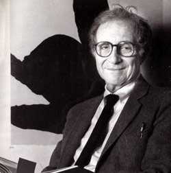 worked under Mies, Goldsmith may be the most successful in faithfully absorbing Mies' basic principles and unyielding standards into a body of work that also remains completely individual.
A small exhibition with a handful of large pictures, many of them iconic Ezra Stoller photographs, runs at the Arts Club, 201 East Chestnut Street, only through this Friday, April 13th, from 11:00 A.M. to 6:00 P.M. daily.
Like Augie March, "an American. Chicago born" (in 1918), Goldsmith's pedigree was international, drawing on two masters, not only Mies, but the great maestro of concrete construction, Pier Luigi Nervi. Those twin strains were masterfully synthesized by Goldsmith in such stunning concepts as a design for a Garibaldi Bridge over the Tiber, where slender ribbons of arched concrete supported the thin, sculpted concrete of the roadway above.
Goldsmith studied with Mies and later work in Mies' firm. Afterwards, he landed for what would be a long career at Skidmore, Owings and Merrill. Several 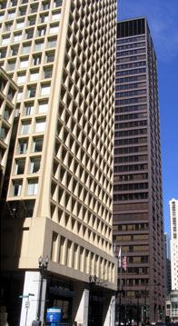 years before both the Hancock Center and Sears Tower, Goldsmith collaborated at SOM with legendary engineer Fazlur Kahn to use the tube technique that would famously be associated with those later structures in the 1966 Brunswick (now Cook County Administration) Building, at 37 stories the city's tallest concrete structure at the time of its construction. The Brunswick is a tube within a tube, beginning with a central interior tube for elevators and services. Like John Wellborn Root's incomparable Monadnock Building of 1891, the Brunswick is a skyscraper with load bearing walls. The second, outer tube is made up of columns that grow thinner as they rise, reflecting their lighter load. The interior is left entirely column-free. At the second floor level, massive transfer girders take on the weight of the over sixty perimeter columns above, transferring the load it to just ten, massive columns below. In a gesture to Root's masterpiece, just as at the Monadnock's base, that of the Brunswick curves outward at the level of the transfer beam.
Simple, yet deceptively sophisticated, just like Goldsmith's design for the Kitt Peak National Observatory in Arizona, which supports a 50 ton heliostat 100 feet in the 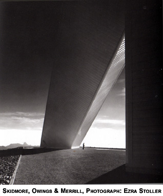 air with a two-legged structure - one straight, one a 500 foot long diagonal - designed to eliminate possible distortions in the readings due to wind or sun. Again, simple, but not simplistic. Rather than the cliched dome or spiraled tower, Goldsmith uses angular geometry to create a poetry of aspiration.
In Chicago, Goldsmith also designed the transit stations for the CTA's new lines in the median of the Kennedy and Dan Ryan expressways. Time, in the person of the CTA's chronic neglect of maintenance for its facilities, had not been kind to Goldsmith's stations. Faded paint, rust and corrosion, and the clouding of the acrylic domes of the canopies had left the stations looking like an exhausted refutation of modernism. Now, recent renovations at stations like Sox-35th on the Red Line have returned 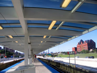 them to their original condition of simple, pure lines, clean white steel and light flooding through the broad canopies perched like the wings of a butterfly on a widely space row of small central columns.
The Arts Club exhibition also features Goldsmith's role as a teacher, with an entire wall of small photos of the works of his students, diverse and individual. "Sometimes I let a student do something that interests him that I wouldn't quite go about in that way because I am interested to see what will happen . . . I think every teacher learns from what students do."
Perhaps Goldsmith's most astonishing concept was the unrealized 1978 design for the Ruck-a-Chucky Bridge in Auburn, California. The small, elegant catalogue for 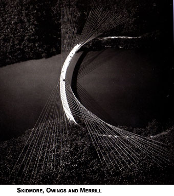 the exhibition, edited by Gillian Power, with a biographical essay by the Pritzker Prize's Martha Thorne, includes this perfect description of Ruck-a-Chucky from San Francisco's storied architecture critic Allan Temko, which serves both as a cogent description and as an encapsulation of the ethos of Goldsmith's work.
"What appears to be effortless poetry - the elegant span lightly flung in a curved trajectory across the forested valley - is actually rigorous structural logic. The pattern of the cables is a 'saddle-shaped' double curvature, but etherealized - an almost immaterial depiction of structural forces, lightly sketched against the rugged background of the hills. It is a Platonic essence of a bridge, an ideal structure which - even if it is never built - should remain in the hearts and minds of people who realize that art and science, technology and humanism, are united in civilized life."
Like Baryshnikov or Astaire, the art of Goldsmith was to do the impossible and, as Temko notes, make it seem effortless: alloying program and matter, technique and conserved energy, into an expression of the sublime.
Read Myron Goldsmith's oral history at the Art Institute of Chicago website
Join a discussion on this story.
© Copyright 2007 Lynn Becker All rights reserved.

