forui - Dart API docs (original) (raw)


📚 Documentation •🖼️ Widgets •🤓 API Reference •🗺️ Road Map
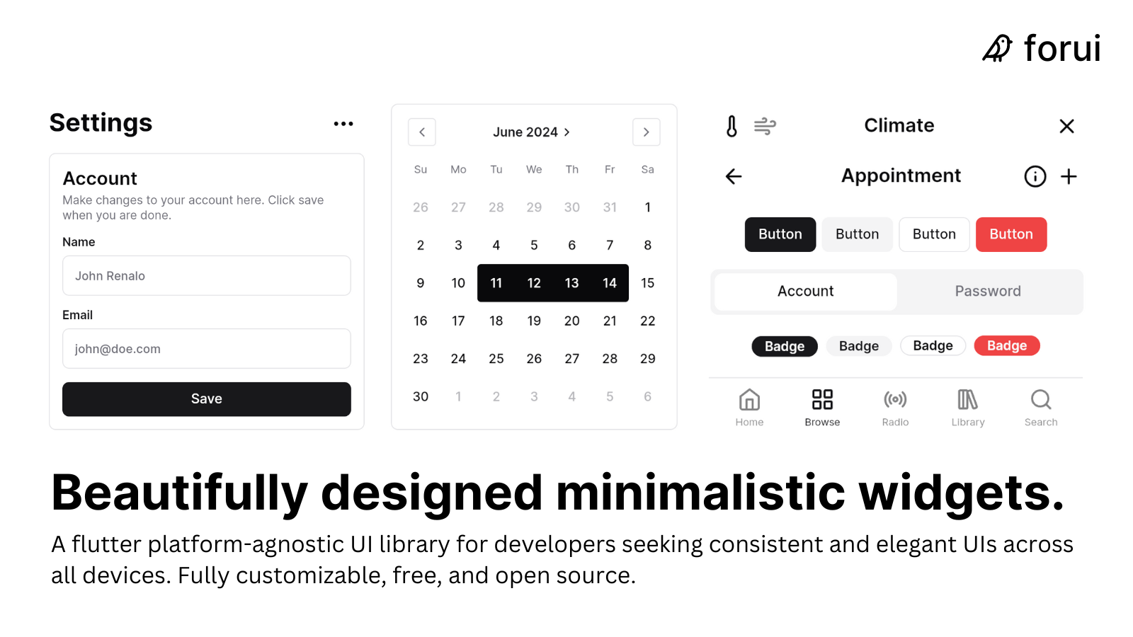
Forui is a Flutter UI library that provides a set of beautifully designed, minimalistic widgets.
Documentation
Visit forui.dev/docs to view the documentation.
Contributing
Please read the contributing guide.
License
Licensed under the MIT License and Open Font License.
Libraries
The bundled assets in forui_assets, exported for convenience.
A Flutter package for building beautiful user interfaces.
Low-level utilities and services.
Localizations for Forui widgets. Forui supports all 115 languages supported by Material.
Classes and functions for configuring the Forui widgets' theme. A theme configures the colors and typographic choices of Forui widgets.
Widgets
widgets/accordion Widgets
A vertically stacked set of interactive headings that each reveal a section of content.
widgets/alert Widgets
Displays a callout for user attention.
widgets/avatar Widgets
An image element with a fallback for representing the user.
widgets/badge Widgets
A badge. Badges are typically used to draw attention to specific information, such as labels and counts.
widgets/bottom_navigation_bar Widgets
A bottom navigation bar.
widgets/breadcrumb Widgets
A breadcrumb.
widgets/button Widgets
A button.
widgets/calendar Widgets
A calendar.
widgets/card Widgets
A card.
widgets/checkbox Widgets
A checkbox control that allows the user to toggle between checked and not checked.
widgets/date_field Widgets
A date field allows a date to be selected from a calendar or input field.
widgets/dialog Widgets
A modal dialog.
widgets/divider Widgets
A divider.
A header.
widgets/label Widgets
A label that describes a form field with a label, description, and error message (if any).
widgets/line_calendar Widgets
A line calendar displays dates in a single horizontal, scrollable line.
A pagination enables the user to select a specific page from a range of pages.
widgets/picker Widgets
A generic picker that allows an item to be selected. It is composed of one or more wheels, optionally, with separators between those wheels.
widgets/popover Widgets
A popover displays rich content in a portal that is aligned to a target.
A popover menu displays a menu in a portal aligned to a child.
widgets/progress Widgets
A progress indicator.
widgets/radio Widgets
A radio button that typically allows the user to choose only one of a predefined set of options.
widgets/resizable Widgets
A resizable which children can be resized along either the horizontal or vertical main axis.
widgets/scaffold Widgets
A scaffold.
widgets/select Widgets
Displays a list of options for the user to pick from.
widgets/select_group Widgets
A group of form fields that allow users to make a selection from a set of options.
A tile that, when triggered, displays a list of options for the user to pick from.
widgets/select_tile_group Widgets
A group of tiles that allow users to make a selection from a set of options.
widgets/sheet Widgets
A sheet is a panel that slides in from the edge of a screen.
widgets/slider Widgets
An input where the user selects a value from within a given range.
widgets/switch Widgets
A control that allows the user to toggle between checked and unchecked.
widgets/tabs Widgets
Allows switching between widgets through tabs.
widgets/text_field Widgets
A text field.
widgets/tile Widgets
A tile is typically used to group related information together.
widgets/time_field Widgets
A time field allows a time to be selected from a picker or input field.
widgets/time_picker Widgets
A time picker that allows a time to be selected. It is composed of multiple wheels.
widgets/tooltip Widgets
A tooltip displays information related to an widget when focused, hovered over on desktop, and long pressed on Android and iOS.