Material Design EditText in Android with Example (original) (raw)
Last Updated : 23 Jul, 2025
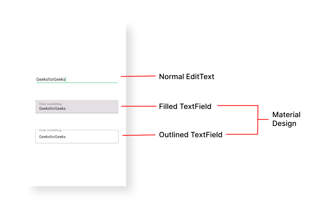
**EditText is one of the important UI elements. **Edittext refers to the widget that displays an empty text field in which a user can enter the required text and this text is further used inside the application. In this article it has been discussed to implement the special type of text fields, those are called **Material Design EditText. Have a look at the normal edit text in Android and the Material design Text fields in Android. The design and the easy-to-use implementation make them different from normal EditText fields.
Step by Step Implementation
In this example, we are going to demonstrate two important types of Material Design EditText:
- **Filled EditText
- **Outlined EditText
**Step 1: Create a New Project
To create a new project in Android Studio please refer to **How to Create/Start a New Project in Android Studio.
**Step 2: Add Required Dependency
Include google material design components dependency in the **build.gradle.ktsfile****.** After adding the dependencies don't forget to click on the "**Sync Now" button present at the top right corner.
implementation ("com.google.android.material:material:1.12.0")
**Note: While syncing your project you need to be **connected to the **network and make sure that you are adding the dependency to the Module-levelGradlefile as shown below.
**Step 3: Change the Base application theme
Go to **app > src > main > res > values > themes.xml and change the base application theme. The MaterialComponents contains various action bar theme styles, one may invoke any of the **MaterialComponents action bar theme styles, except **AppCompat styles.
**Why the theme needs to be changed:
Let's discuss why we need to change the action bar theme to the material theme of the app to invoke all the Google MDC widgets in our android application:
- Because all the Google material design components are built and packaged inside the MaterialTheme for Android.
- If you are invoking the AppCompat action bar theme you will not end up with the error, but the application crashes immediately after launching it. Below is the code for the **themes.xml file.
**themes.xml:
XML `
<style name="Theme.Demo" parent="Base.Theme.Demo" />`
**Step 4: Change the colors of the application
One can change the color combination of the application and it's an optional step. Go to **app > src > main > res > **colors.xml file and choose your color combination.
**colors.xml:
XML `
#0f9d58 #006d2d #55cf86`
**Step 5: Working with the activity_main.xml file
Now in this file, we are going to design the material text fields as the user requirements. Note that for each of the EditText styles the ****"style"** attribute is different.
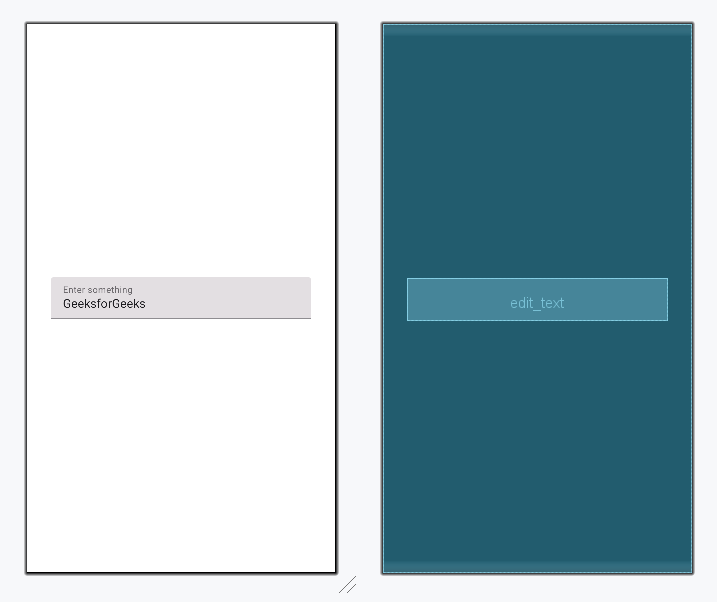
**Style 1 - Filled EditText
In the below code the "**com.google.android.material.textfield.TextInputLayout" makes the filled box for the EditText field. And "**com.google.android.material.textfield.TextInputEditText" which is the actual edit text which takes input from the user. Add the following code in the parent layout of activity_main.xml file.
activity_main.xml `
<com.google.android.material.textfield.TextInputLayout android:id="@+id/filledTextField" android:layout_width="match_parent" android:layout_height="wrap_content" style="@style/Widget.MaterialComponents.TextInputLayout.FilledBox" android:layout_margin="32dp" android:hint="Enter something">
<!--this is the actual edit text which takes the input-->
<com.google.android.material.textfield.TextInputEditText
    android:id="@+id/edit_text"
    android:layout_width="match_parent"
    android:layout_height="wrap_content" />
</com.google.android.material.textfield.TextInputLayout>
`
**Design UI (Filled EditText):
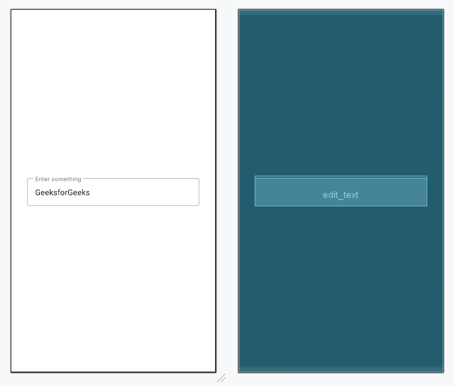
**Style 1 - Outlined EditText
Only difference is the style attribute in the ****"com.google.android.material.textfield.TextInputLayout"** to be invoked.
activity_main.xml `
<com.google.android.material.textfield.TextInputLayout android:id="@+id/outlinedTextField" android:layout_width="match_parent" android:layout_height="wrap_content" style="@style/Widget.MaterialComponents.TextInputLayout.OutlinedBox" android:layout_margin="32dp" android:hint="Enter something">
<!--this is the actual edit text which takes the input-->
<com.google.android.material.textfield.TextInputEditText
    android:id="@+id/edit_text"
    android:layout_width="match_parent"
    android:layout_height="wrap_content"/>
</com.google.android.material.textfield.TextInputLayout>
`
**Design UI (Outlined EditText):
**Output: