Container class in Flutter (original) (raw)
Last Updated : 26 Feb, 2025
**Container class in flutter is a convenience widget that combines common painting, positioning, and sizing of widgets. A Container class can be used to store one or more widgets and position them on the screen according to our convenience. Basically, a container is like a box to store contents. A basic container element that stores a widget has a **margin, which separates the present container from other contents. The total container can be given a **border of different shapes, for example, rounded rectangles, etc. A container surrounds its child with **padding and then applies additional constraints to the padded extent (incorporating the width and height as constraints, if either is non-null).

Check out this post to understand the scaffold widget which we will be using in our examples.
**Constructor of Container Class
**Syntax:
Container({Key key,
AlignmentGeometry alignment,
EdgeInsetsGeometry padding,
Color color,
Decoration decoration,
Decoration foregroundDecoration,
double width,
double height,
BoxConstraints constraints,
EdgeInsetsGeometry margin,
Matrix4 transform,
Widget child,
Clip clipBehavior: Clip.none});
**Properties of Container Class
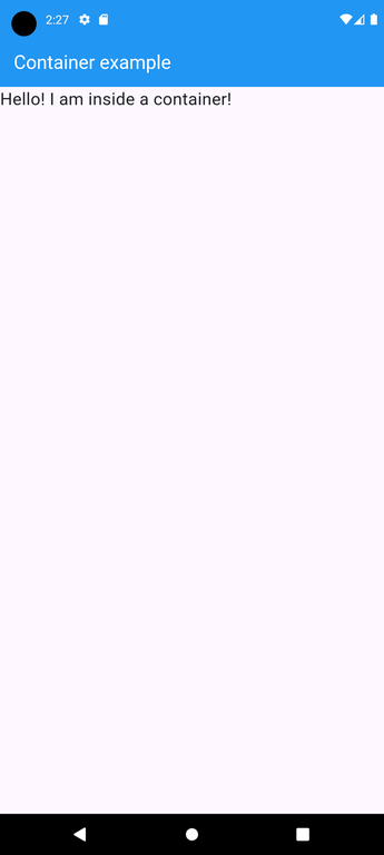
**1. child : Container widget has a property 'child:' which stores its child. The child class can be any widget. Let us take an example, taking a text widget as a child.
**Example:
Dart `
import 'package:flutter/material.dart';
// Entry point of the application void main() => runApp(const MyApp());
// Main application widget class MyApp extends StatelessWidget { const MyApp({Key? key}) : super(key: key);
@override Widget build(BuildContext context) { return MaterialApp(
  // Disable the debug banner
  debugShowCheckedModeBanner: false,
  home: Scaffold(

    // App bar with a title
    appBar: AppBar(
      backgroundColor: Colors.blue,
      title: const Text(
        "Container example",
        style: TextStyle(color: Colors.white),
      ),
    ),

    // Body of the scaffold with a container
    body: Container(
      child: const Text(
        "Hello! I am inside a container!",
        style: TextStyle(fontSize: 20),
      ),
    ),
  ),
);
} }
`
**Output:
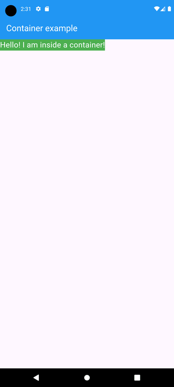
**2. **color : The color property sets the background color of the entire container. Now we can visualize the position of the container using a background color.
**Example:
Dart `
import 'package:flutter/material.dart';
// Entry point of the application void main() => runApp(const MyApp());
// Main application widget class MyApp extends StatelessWidget { const MyApp({Key? key}) : super(key: key);
@override Widget build(BuildContext context) { return MaterialApp(
  // Disable the debug banner
  debugShowCheckedModeBanner: false,
  home: Scaffold(

    // App bar with a title
    appBar: AppBar(
      backgroundColor: Colors.blue,
      title: const Text(
        "Container example",
        style: TextStyle(color: Colors.white),
      ),
    ),

    // Body of the scaffold with a container
    body: Container(

      // Background Color of the Container
      color: Colors.green,
      child: const Text(
        "Hello! I am inside a container!",
        style: TextStyle(fontSize: 20,
        color: Colors.white
        ),
      ),
    ),
  ),
);
} }
`
**Output:
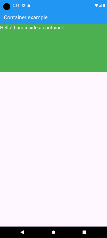
**3. **height and width : By default, a container class takes the space that is required by the child. We can also specify the height and width of the container based on our requirements.
**Example:
Dart `
import 'package:flutter/material.dart';
// Entry point of the application void main() => runApp(const MyApp());
// Main application widget class MyApp extends StatelessWidget { const MyApp({Key? key}) : super(key: key);
@override Widget build(BuildContext context) { return MaterialApp(
  // Disable the debug banner
  debugShowCheckedModeBanner: false,
  home: Scaffold(

    // App bar with a title
    appBar: AppBar(
      backgroundColor: Colors.blue,
      title: const Text(
        "Container example",
        style: TextStyle(color: Colors.white),
      ),
    ),

    // Body of the scaffold with a container
    body: Container(
      // Height of the container
      height: 200,

      // Width of the container
      width: double.infinity,
      color: Colors.green,
      child: const Text(
        "Hello! I am inside a container!",
        style: TextStyle(fontSize: 20,
        color: Colors.white
        ),
      ),
    ),
  ),
);
} }
`
**Output:
**4. **margin : The margin is used to create an empty space around the container. Observe the white space around the container. Here EdgeInsets.geometry is used to set the margin .all() indicates that the margin is present in all four directions equally.
**Example:
Dart `
import 'package:flutter/material.dart';
// Entry point of the application void main() => runApp(const MyApp());
// Main application widget class MyApp extends StatelessWidget { const MyApp({Key? key}) : super(key: key);
@override Widget build(BuildContext context) { return MaterialApp(
  // Disable the debug banner
  debugShowCheckedModeBanner: false,
  home: Scaffold(

    // App bar with a title
    appBar: AppBar(
      backgroundColor: Colors.blue,
      title: const Text(
        "Container example",
        style: TextStyle(color: Colors.white),
      ),
    ),

    // Body of the scaffold with a container
    body: Container(
      height: 200, // Height of the container
      width: double.infinity, // Width of the container
      margin: const EdgeInsets.all(20), // Margin of the container
      color: Colors.green,
      child: const Text(
        "Hello! I am inside a container!",
        style: TextStyle(fontSize: 20,
        color: Colors.white
        ),
      ),
    ),
  ),
);
} }
`
**Output:

**5. padding: The padding is used to give space from the border of the container from its children. Observe the space between the border and the text.
**Example:
Dart `
import 'package:flutter/material.dart';
// Entry point of the application void main() => runApp(const MyApp());
// Main application widget class MyApp extends StatelessWidget { const MyApp({Key? key}) : super(key: key);
@override Widget build(BuildContext context) { return MaterialApp(
  // Disable the debug banner
  debugShowCheckedModeBanner: false,
  home: Scaffold(

    // App bar with a title
    appBar: AppBar(
      backgroundColor: Colors.blue,
      title: const Text(
        "Container example",
        style: TextStyle(color: Colors.white),
      ),
    ),

    // Body of the scaffold with a container
    body: Container(
      // Height of the container
      height: 200,

      // Width of the container
      width: double.infinity,

      // Margin of the container
      margin: const EdgeInsets.all(20),

      // Padding of the container
      padding: const EdgeInsets.all(30),
      color: Colors.green,
      child: const Text(
        "Hello! I am inside a container!",
        style: TextStyle(fontSize: 20,
        color: Colors.white
        ),
      ),
    ),
  ),
);
} }
`
**Output:

**6. **alignment: The alignment is used to position the child within the container. We can align in different ways: bottom, bottom center, left, right, etc. here the child is aligned to the bottom center.
**Example:
Dart `
import 'package:flutter/material.dart';
// Entry point of the application void main() => runApp(const MyApp());
// Main application widget class MyApp extends StatelessWidget { const MyApp({Key? key}) : super(key: key);
@override Widget build(BuildContext context) { return MaterialApp(
  // Disable the debug banner
  debugShowCheckedModeBanner: false,
  home: Scaffold(

    // App bar with a title
    appBar: AppBar(
      backgroundColor: Colors.blue,
      title: const Text(
        "Container example",
        style: TextStyle(color: Colors.white),
      ),
    ),

    // Body of the scaffold with a container
    body: Container(

      // Height of the container
      height: 200,

      // Width of the container
      width: double.infinity,

      // Alignment of the container
      alignment: Alignment.bottomCenter,

      // Margin of the container
      margin: const EdgeInsets.all(20),

      // Padding of the container
      padding: const EdgeInsets.all(30),
      color: Colors.green,
      child: const Text(
        "Hello! I am inside a container!",
        style: TextStyle(fontSize: 20,
        color: Colors.white
        ),
      ),
    ),
  ),
);
} }
`
**Output:

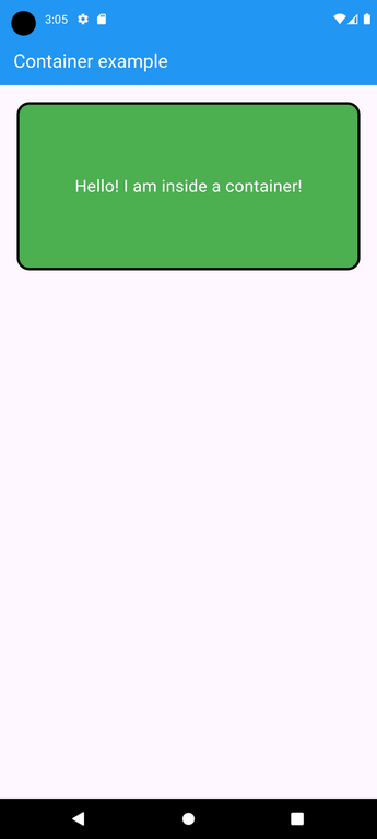
**7. **Decoration : The decoration property is used to decorate the box(e.g. give a border). This paints behind the child. Whereas foreground Decoration paints in front of a child. Let us give a border to the container. But, both color and border color cannot be given. if you use the color outside the decoration property.
**Example:
Dart `
import 'package:flutter/material.dart';
// Entry point of the application void main() => runApp(const MyApp());
// Main application widget class MyApp extends StatelessWidget { const MyApp({Key? key}) : super(key: key);
@override Widget build(BuildContext context) { return MaterialApp(
  // Disable the debug banner
  debugShowCheckedModeBanner: false,
  home: Scaffold(

    // App bar with a title
    appBar: AppBar(
      backgroundColor: Colors.blue,
      title: const Text(
        "Container example",
        style: TextStyle(color: Colors.white),
      ),
    ),

    // Body of the scaffold with a container
    body: Container(

      // Height of the container
      height: 200,

      // Width of the container
      width: double.infinity,

      // Alignment of the container
      alignment: Alignment.center,

      // Margin of the container
      margin: const EdgeInsets.all(20),

      // Padding of the container
      padding: const EdgeInsets.all(30),

      // Removed the color property from here to avoid assertion error
      // color: Colors.green,
      decoration: BoxDecoration(

        // Use color here when using the decoration property
        color: Colors.green,

        // Add rounded corners
        borderRadius: BorderRadius.circular(15),
        border: Border.all(color: Colors.black, width: 3),
      ),
      child: const Text(
        "Hello! I am inside a container!",
        style: TextStyle(fontSize: 20,
        color: Colors.white
        ),
      ),
    ),
  ),
);
} }
`
**Note: if you are using color and decoration property in a container, you must use color inside the decoration otherwise it cause Assertion Error.
**Output:
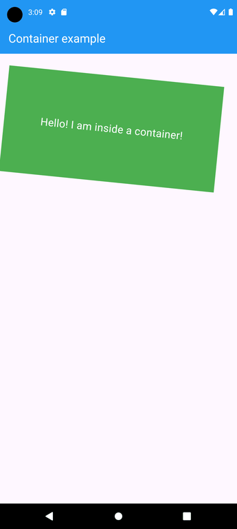
**8. **Transform: This property of the container helps us to rotate the container. We can rotate the container in any axis, here we are rotating in the z-axis.
**Example:
Dart `
import 'package:flutter/material.dart';
// Entry point of the application void main() => runApp(const MyApp());
// Main application widget class MyApp extends StatelessWidget { const MyApp({Key? key}) : super(key: key);
@override Widget build(BuildContext context) { return MaterialApp(
  // Disable the debug banner
  debugShowCheckedModeBanner: false,
  home: Scaffold(

    // App bar with a title
    appBar: AppBar(
      backgroundColor: Colors.blue,
      title: const Text(
        "Container example",
        style: TextStyle(color: Colors.white),
      ),
    ),
    // Body of the scaffold with a container
    body: Container(
      // Height of the container
      height: 200,

      // Width of the container
      width: double.infinity,

      // Alignment of the container
      alignment: Alignment.center,

      // Margin of the container
      margin: const EdgeInsets.all(20),

      // Padding of the container
      padding: const EdgeInsets.all(30),

      // Removed the color property from here to avoid assertion error
      color: Colors.green,

      // Rotation of the container
      transform: Matrix4.rotationZ(0.1),
      child: const Text(
        "Hello! I am inside a container!",
        style: TextStyle(fontSize: 20,
        color: Colors.white
        ),
      ),
    ),
  ),
);
} }
`
**Output:
**9. **Constraints: When we want to give additional constraints to the child, we can use this property.
**10. ClipBehaviour: This property takes in _Clip Enum as the object. This decides whether the content inside the container will be clipped or not.
**11. Foreground Decoration: This parameter holds _Decoration class as the object. It controls the decoration in front of the Container widget.
**Note: There can be many more operations that can be performed to container class. Moreover, the container class is used often while developing flutter applications. This is just basics to get started with. Find more properties and attributes in the given link which is the official flutter documentation.