Types of Graphs in Statistics (original) (raw)
Last Updated : 23 Jul, 2025
Graphs in statistics serve as powerful tools for visually representing data, making it easier to interpret, compare, and analyze trends. These graphical representations help in identifying patterns, relationships, and distributions within datasets. Below, we explore some of the most commonly used types of graphs and charts in statistics.
Here is a simple example of a statistical graph (bar graph) showing the number of store visitors throughout the week. The x-axis represents the days of the week, while the y-axis shows the number of visitors. This graph helps visualize visitor trends across the week.

From the graph, we can see that the store sees the most visitors on Saturday and Sunday, with the highest point reaching around 120 visitors. In contrast, Monday has the fewest visitors, with numbers dropping below 60. After Monday, the number of visitors gradually increases, peaking again on Friday.
The Types Of Graphs
The most commonly used types of graphs in statistics include:
- Statistical Graphs (e.g., bar graph, pie chart, line graph, etc.)
- Exponential Graphs
- Logarithmic Graphs
- Trigonometric Graphs
- Frequency Distribution Graphs
Each type of graph serves a unique purpose in representing different data sets. Below, we explore each of these graph types in detail to understand their applications and advantages.
**Statistical Graphs
A statistical graph or chart is a pictorial representation of statistical data in a graphical format. These graphs help in understanding data trends, patterns, and distributions effectively. Some of the most common types of statistical graphs include:
**Types of Statistical Graphs
**Bar Graph
A bar graph is a visual representation of grouped data using rectangular bars. The length of each bar is proportional to the value it represents. The horizontal axis represents categorical data, while the vertical axis represents numerical data. Bar graphs are commonly used for comparing different categories within a dataset.
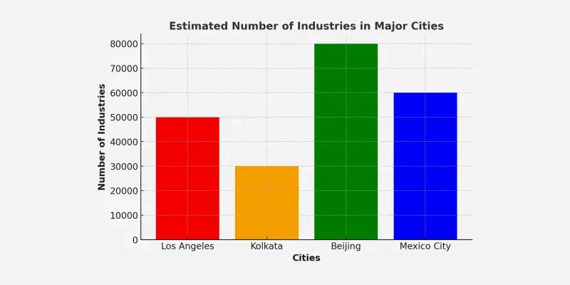
For example Below is a bar graph which shows Estimated number of industries in major cities
Bar Graph Uses:
- When you want to display data that are grouped into nominal or ordinal categories.
- To compare data among different categories.
- Bar graphs can also show large data changes over time.
- Bar graphs are ideal for visualizing the distribution of data when we have more than three categories.
**Line Graph
A line graph is a chart that uses points connected by lines to show changes over time. It is useful for tracking trends and comparing data over continuous intervals. The horizontal axis represents the independent variable (e.g., time), while the vertical axis represents the dependent variable (e.g., sales or temperature).
All data value is represented in points and later they connected by line from one to other i.e. in “dot-to-dot” fashion.
Here is a simple example of a line graph showing the monthly average temperatures in a city. The x-axis represents the months, while the y-axis shows the average temperature. This graph helps visualize temperature trends throughout the week.
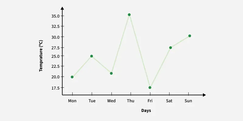
So, from the from we can see the temperature fluctuates throughout the week, peaking at 35°C on Thursday and dropping to 18°C on Friday, the lowest point. After Friday, it gradually increases, reaching 30°C on Sunday.
Uses of line graphs:
- When you want to show trends. For example, how house prices have increased over time.
- When you want to make predictions based on a data history over time.
- When comparing two or more different variables, situations, and information over a given period of time
Pie Chart
A pie chart is a circular graph divided into sectors, where each sector represents a proportion of the whole dataset. Pie charts are useful for showing percentage distributions and comparing relative sizes of categories within a dataset.
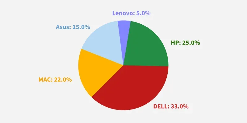
For example The pie chart below is used to represent people’s choice of Laptop’s brands. The circle as a whole here is represented by all the people who took part in the survey. Since it is a whole, the sum of all percentages represented in a pie graph must add up to 100%
Pie Chart Uses:
- When you want to create and represent the composition of something.
- It is very useful for displaying nominal or ordinal categories of data.
- To show percentage or proportional data.
- When comparing areas of growth within a business such as profit.
- Pie charts work best for displaying data for 3 to 7 categories.
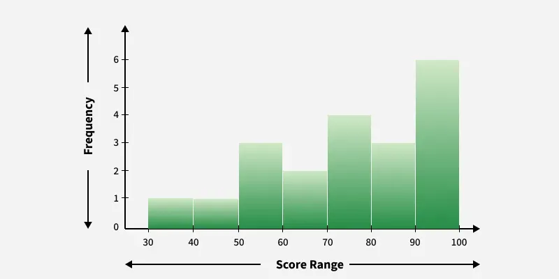
Histogram
A histogram is a type of bar graph that represents the frequency of numerical data within specific intervals. Unlike a standard bar graph, the bars in a histogram are adjacent, representing continuous data distribution. It is commonly used for showing distributions such as test scores, heights, or population data.
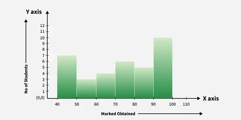
For example: Consider the case of the data given below in the table that shows the data obtained in a class test of 35 students as:
| Marks obtained | 40-50 | 50-60 | 60-70 | 70-80 | 80-90 | 90-100 |
|---|---|---|---|---|---|---|
| Number of Students | 7 | 3 | 4 | 6 | 5 | 10 |
The histogram drawn for this case is drawn as:
Histogram Uses:
- When the data is continuous.
- When you want to represent the shape of the data’s distribution.
- When you want to see whether the outputs of two or more processes are different.
- To summarize large data sets graphically.
- To communicate the data distribution quickly to others.
**Exponential Graphs
Exponential graphs are used to represent exponential functions.
Exponential functions are of the form
f(x) = kax
where,
- **x is Independent Variable
- **k is Some Constant
- **a is Base of Exponential Graph
These graphs can be either increasing or decreasing, depending on the nature of the function. For example, the graph of y = 3x is an increasing exponential graph, while the graph of y = 3(-x) is a decreasing exponential graph.
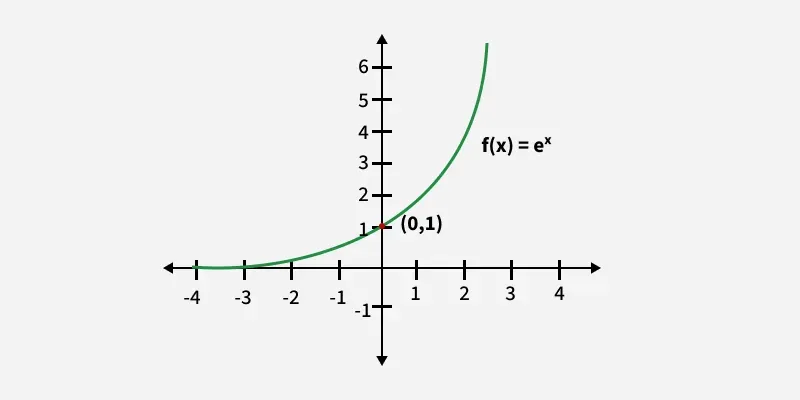
**Example of Exponentially Increasing Graph: **2 x , 3 x , e x etc. The graph of ex is added below,
**Exponential Graph Uses:
- When modeling rapid growth or decay, such as population increase or radioactive decay.
- To represent compound interest, showing how investments grow over time.
- When analyzing virus spread in epidemiology and predicting outbreaks.
- To describe capacitor charging/discharging in electrical circuits.
**Logarithmic Graphs
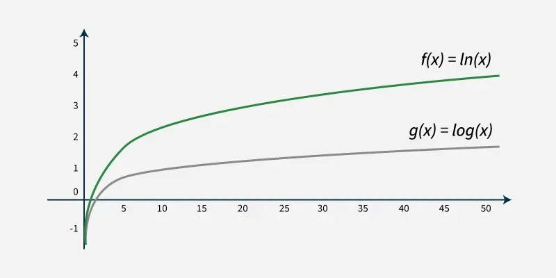
Logarithmic graphs are the inverse of exponential graphs. They are plotted similarly using a table of values and reflect a slow increase as the input variable grows. For example, the inverse of **y = 3 x is **y = log 3 (x), which represents a logarithmic graph.
A logarithmic graph is plotted based on the domain and range of the logarithmic function. The x-intercept is determined by setting the function equal to zero, while the y-intercept is undefined. The logarithmic function grows slowly for large values of x and never crosses the y-axis.
Graph of exponential function is added below:
**Logarithmic Graph Uses:
- When representing data with large ranges, such as earthquake magnitudes or sound intensity.
- To analyze exponential decay processes, like radioactive decay and cooling rates.
- When modeling financial trends, such as stock market fluctuations and economic growth.
- To measure pH levels in chemistry, where small changes represent significant shifts in acidity or alkalinity.
**Trigonometric Graphs
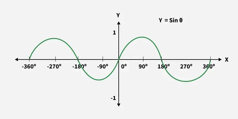
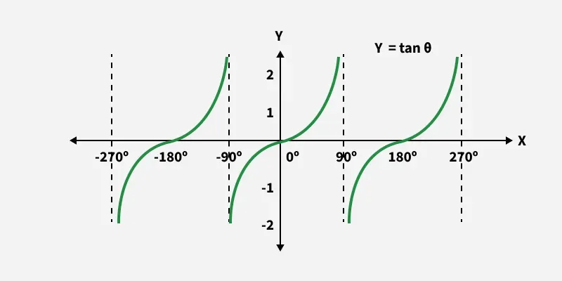
Trigonometric graphs represent the functions of sine, cosine, tangent, cotangent, secant, and cosecant. these graphs are periodic, meaning they repeat their values at regular intervals, making them essential for understanding cyclic patterns. The shape and behavior of each graph depend on the amplitude, frequency, and phase shift of the trigonometric function.
This is the trigonometric graph of sine:
This is the trigonometric graph of tangent:
**Trigonometric Graph Uses:
- When analyzing wave motion, such as sound waves and water waves.
- To model oscillations in physics, like pendulum motion and vibrating strings.
- When studying alternating current (AC) circuits in electrical engineering.
- To represent periodic phenomena, such as tides, seasonal changes, and planetary motion.
Frequency Distribution Graphs
A frequency distribution graph shows the number of occurrences of different outcomes in a dataset. Typically, frequency distributions are represented using bar graphs or histograms. This type of graph is commonly used in statistical analysis to understand data spread and frequency patterns.
A frequency distribution illustrates how often each value of a variable occurs within a dataset. It organizes data into categories or intervals, displaying the number of occurrences for each, making it easier to analyze patterns and trends.
**Frequency Distribution Uses:
- When analyzing data patterns to understand how values are distributed.
- To summarize large datasets into a structured and readable format.
- When identifying trends, such as the most or least frequent occurrences.
- To compare different data sets effectively in research and statistics.
Read more about graph from Types of Graphs with Examples