Pearson Correlation in Data Science (original) (raw)
Last Updated : 30 Jan, 2026
Correlation measures the strength and direction of the relationship between two numerical variables. Pearson Correlation is a statistical measure that quantifies the strength and direction of a linear relationship between two continuous numeric variables.
- Used to select features with strong linear relationships for predictive modeling.
- Helps identify which variables increase or decrease together.
- Detects redundancy between highly correlated variables to avoid multicollinearity.
- Sensitive to outliers which can significantly affect the correlation value.
How Pearson Correlation Works
Pearson correlation is a number that tells us how strongly two values are linearly related. It gives a result between -1 and +1:
- +1: Perfect positive relationship (both increase together)
- -1: Perfect negative relationship (one increases the other decreases)
- 0: No linear relationship
Pearson Correlation Formula
r = \frac{\sum (x - m_x)(y - m_y)}{\sqrt{\sum (x - m_x)^2 \sum (y - m_y)^2}}
where
- x, y: Two numeric vectors of the same length n
- mₓ, mᵧ: Mean values of x and y respectively
Types of Correlation Methods
There are two main types of correlation methods:
1. Parametric Correlation
- Measures linear relationships between continuous variables
- Assumes normal distribution and is sensitive to outliers
- Pearson Correlation is the most commonly used method
2. Non-Parametric Correlation
- Used for non-normal or ordinal data and non-linear (monotonic) relationships
- Based on ranked data, making it more robust to outliers
- Common methods include Spearman’s Rho and Kendall’s Tau
Implementing Pearson Correlation in Python
Python has a built-in method pearsonr() from the scipy.stats module to find the Pearson correlation.
**Syntax:
from scipy.stats import pearsonr
pearsonr(x, y)
- **Parameters: x, yare the numeric lists or series.
- **Return Type: A tuple (correlation coefficient, p-value)
Pearson Correlation with Car Data
Here we find the correlation between car weight and miles per gallon (mpg).
You can download dataset from here
Python `
import pandas as pd from scipy.stats import pearsonr
df = pd.read_csv("path_to_Auto.csv")
Convert dataframe into series
l1 = df['weight'] l2 = df['mpg']
Apply the pearsonr()
corr, _ = pearsonr(l1, l2) print('Pearsons correlation: %.3f' % corr)
`
**Output:
Pearson correlation is: -0.878
Understanding Correlation Using Anscombe Quartet
Anscombe Quartet shows that correlation numbers can be misleading. The four small datasets have almost the same Pearson correlation but display very different patterns when plotted the same correlation, different patterns emphasizing the importance of visualizing data.
- Load the four datasets from a CSV file.
- Calculate the Pearson correlation for each dataset.
- Plot all datasets to see how they differ visually.
You can download dataset from here
Python `
import pandas as pd import matplotlib.pyplot as plt from scipy.stats import pearsonr
Load your CSV file
df = pd.read_csv("path of dataset")
Store dataset names for looping
datasets = { "I": ("x1", "y1"), "II": ("x2", "y2"), "III": ("x3", "y3"), "IV": ("x4", "y4") }
Loop through each dataset and calculate Pearson correlation
for name, (x_col, y_col) in datasets.items(): x = df[x_col] y = df[y_col] corr, _ = pearsonr(x, y) print(f"Dataset {name}: Pearson correlation = {corr:.3f}")
Plot each dataset in a grid
fig, axs = plt.subplots(2, 2, figsize=(10, 8)) fig.suptitle('Anscombe-like Quartet Plots', fontsize=16)
for i, (name, (x_col, y_col)) in enumerate(datasets.items()): row = i // 2 col = i % 2 axs[row, col].scatter(df[x_col], df[y_col]) axs[row, col].set_title(f"Dataset {name}") axs[row, col].set_xlabel(x_col) axs[row, col].set_ylabel(y_col)
plt.tight_layout(rect=[0, 0.03, 1, 0.95]) plt.show()
`
**Output:
Dataset I: Pearson correlation = 0.816
Dataset II: Pearson correlation = 0.816
Dataset III: Pearson correlation = 0.816
Dataset IV: Pearson correlation = 0.817
Here we can see that the correlation is same for all the datasets but let's take a look at their correlation graphs:
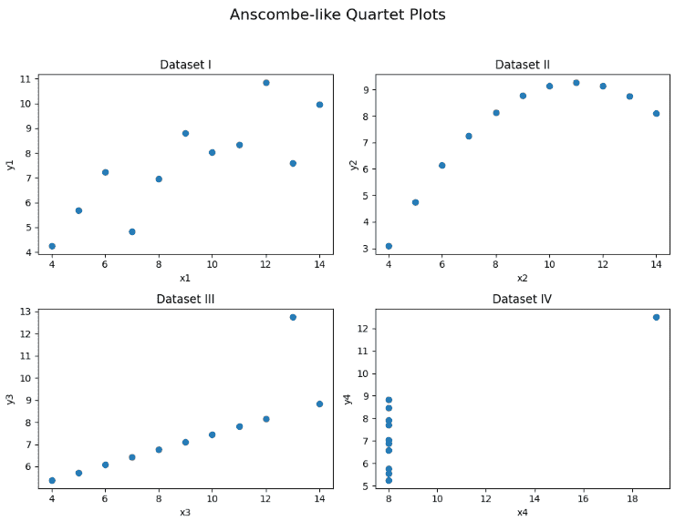
Plots
We can clearly see that the visual representation of them is very different this shows why it's important to look at your data visually, not just rely on correlation values.