How to select Colors for Data Visualizations? (original) (raw)
Last Updated : 23 Jul, 2025
Choosing the right colors in data visualization is essential for making charts clear, engaging and easy to understand. Good color choices highlight key insights, group related data and guide the viewer’s attention. Whether it's a simple bar chart or a complex heatmap, using right color palette can greatly improve readability and impact. It's not just about aesthetics, it's about communication.
Understanding Color Palette
A color palette is a set of colors chosen to create a consistent and appealing look in design, art or branding. It includes:
- **Primary colors: Basic colors like red, blue and yellow.
- **Secondary colors: Made by mixing primary colors (e.g., blue + yellow = green).
- **Tertiary colors: Mix of primary and secondary colors (e.g., red-orange).
- **Neutral colors: Black, white, grey, brown and beige used to balance bold colors.
Components and Properties of Colors
Colors have different features that affect how they look and work together. Knowing these features helps create better color palettes and designs. Let's understand it better.
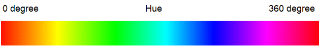
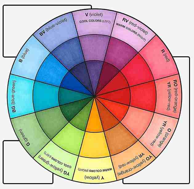
1. Hue:
Hue is a property of color based on its position on the color wheel. There's no color hierarchy just different characteristics. For example, using red and orange hues can create a warm, energetic feel, while blue hues bring a cool, calm vibe. Choosing the right hues adds visual interest and helps set the mood in design and data visualization.
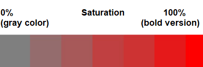
2. Saturation:
Saturation defines the intensity or purity of a color. On color wheel, it lies along radius. A saturation of 0% makes color look gray and dull, while 100% gives a bold, vibrant look. High saturation is often used to add energy and highlight key data.
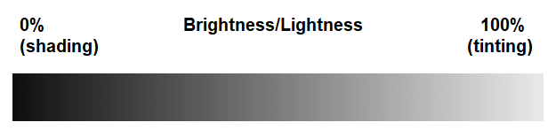
3. Brightness/Lightness:
Brightness refers to how much light a color reflects. Adding white increases brightness (tinting), while adding black decreases it (shading). On color wheel, brightness ranges from 0% (dark) to 100% (light). It's useful for making visuals clearer, especially for younger or visually-aware users.
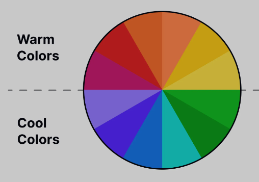
Colors are often linked to temperature based on how they make us feel. They're usually grouped as:
**Warm Colors:
- Like Red, orange, yellow
- Feel energetic, exciting and cozy. Often used to grab attention or show urgency.
**Cool Colors:
- Like Blue, green, purple
- Feel calm, relaxing and peaceful. Often used in quiet or restful spaces.
Color Temperatures
**How to select color temperature for better visualization?
When both warm and cool colors are used, warm color naturally draws more attention. If colors are close on color wheel, it's better to use either all warm or all cool tones. If the colors are far apart, using a mix of warm and cool tones creates stronger contrast and improves visual clarity.
Types of Color Palettes
There are three different types of color palette and it all depends upon the role of colors.
1. Qualitative Color Palette
- Qualitative palettes are used for unordered, categorical data.
- They use different hues to show separate categories, often in scatter plots or pie charts.
- It's best to limit them to about 10 distinct colors with moderate hue and saturation.
- **Example: In project tasks yellow for in-progress, green for completed, red for overdue.

2. Sequential Color Palette
- Sequential palettes are used for continuous or ordered data.
- They use light-to-dark shades of a single color (one hue) to show value ranges.
- Light shades represent low values, dark shades represent high values.
- Commonly used in heatmaps and gradients.
- **Example: Light green for young grass, dark green for older or denser grass.

3. Diverging Color Pallette
- Diverging palettes are used to compare data around a central value.
- They use two contrasting colors one for values above and one for values below midpoint.
- Often used to highlight differences or trends.
- **Example: Red shades for warmer temps, blue for cooler and white/gray for average.
**Popular Color Palettes
Some of the popular color palettes which are widely used by analysts for their visualization are:
**1. Virdis: It is a range of color which consists of deep blue to vibrant yellow for continuous data.

**2. Spectral: It comes under diverging color palette where we can easily flow from one color to another over the range of mid tone shades.

Selecting Primary Color
After building a palette, a key color is chosen to highlight important data and grab attention. This color could be a brand color or one used in past presentations.
Colors have three properties: hue, saturation and brightness. To create variations in palette:
- For categorical/discrete data – change the hue
- For continuous data – adjust saturation or brightness
This keeps the palette clear and focused.
Color Palettes for Comparing Objects
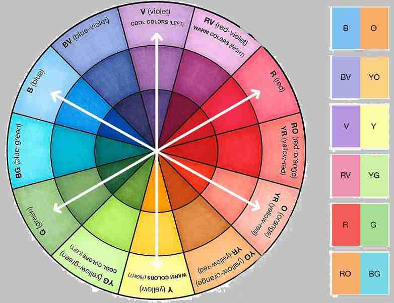
1. Pallettes Used to Compare Two Objects
When comparing two items, use the key color for the more important one and gray for the lesser. If both are distinct but equal, use two different colors based on color harmony, which includes three main types.
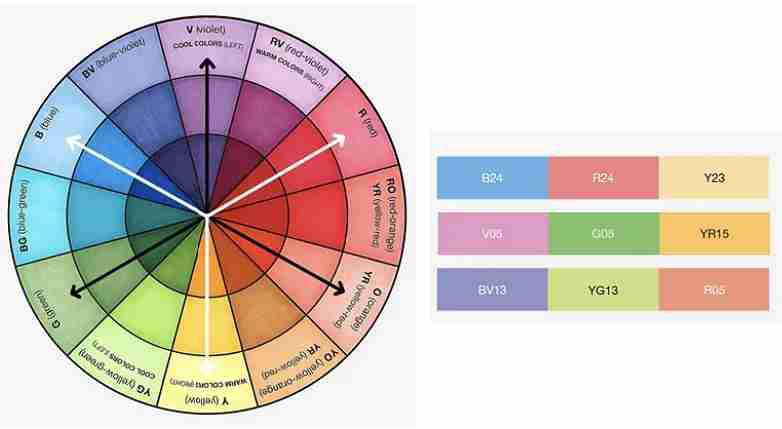
**1.1. Analogous Harmony
It is generally used for comparing two series without an evaluation of value. This process consists of selecting our key color and then searching for its one-step neighbor colors on the color wheel.
Analogous Harmony
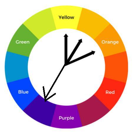
**1.2 Complementary Harmony
Complementary harmony uses colors that are opposite each other on the color wheel, creating strong contrast. The key color is shown as positive, and its opposite is used as a negative. Avoid using your brand color as negative, even if it's common.
Complementary Harmony
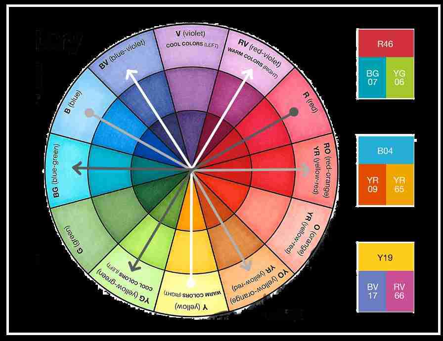
**1.3 Near Complementary
Near complementary is used to compare two items with one as the main focus. Instead of using exact opposites on the color wheel, it uses colors slightly off from the direct opposite (about 33% apart).
If the key color is warm, near complementary is usually cool. If not, reduce saturation or brightness of the second color for better balance.
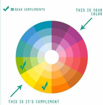
Near Complementary Harmony
2. Palettes Used to Compare Three Objects
As we have seen comparison of two objects goes smoothly but the comparison of three objects is a little tough. But we can do it with the help of two types of color harmony which support tricolor representation:
**2.1 Analogous or Triadic
This method compares three items without judging their value. It picks a key color, then two others spaced evenly around color wheel. To keep balance, use one as the main color and the other two as supporting accents.
Triadic consists of three equidistant colors on the wheel.
**2.2 Split Complementary
Split complementary uses a key color and two others placed near its opposite on the color wheel (one step away from the exact complement). It shows that two items are related but different from the one linked to the key color.
Choose any color with two colors on the either side of its complementary color.
3. Palettes Used to Compare Four Objects
Using four different colors in a comparison is rare, as it can be hard for audience to follow. However, when needed, certain color harmony techniques can help keep the visuals clear and easy to understand, such as:
**3.1. Analogous Complementary
This palette is used to compare one main item with three related components. It includes the key color, its direct complement and split complement colors for balance. The standout (pop-out) color is usually the average, while key color highlights most important item.
Analogous Complementary Color Harmony
**3.2. Double Complementary
Double complementary is used to compare four items by grouping them into two related pairs. Start with a key color, add its two analogs and then include their direct complements. To keep balance, key group (analogs) should be either warm or cool and complements should be opposite.
Double Complementary Color Harmony
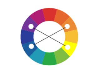
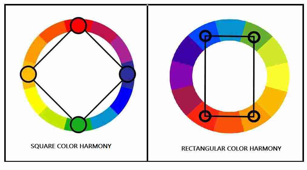
**3.3 Square or Rectangular
This is used to compare four equally important items.
- **Square: Pick a key color and then every third color around the wheel.
- **Rectangular: Choose a key color, a near analog (2 steps away) and their complements.
Square treats all colors equally, while rectangular forms two related pairs.
Color Palettes for Quantitative Data
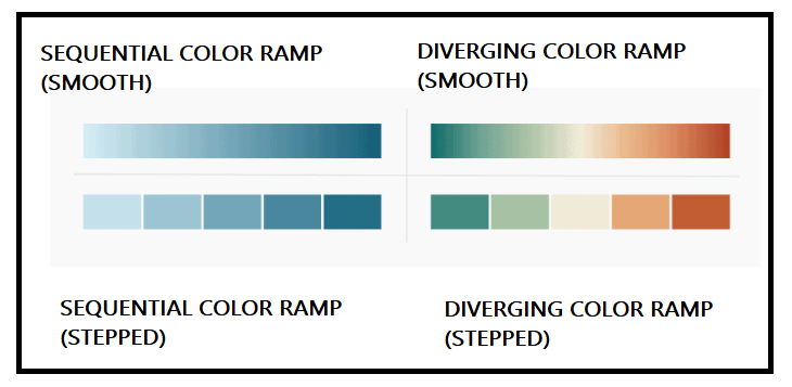
To show quantitative data clearly, colors should vary in saturation or lightness. Two common palette types are:
- **Sequential Color Ramp: Uses one color (monochrome) to show values from low to high. Light shades show low values, bold shades show high values. Can be smooth or stepped for better focus.
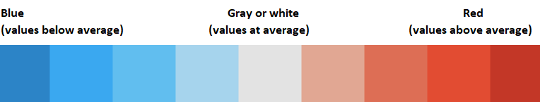
- **Diverging Color Ramp: Uses two colors (dichrome) with a neutral midpoint. One color shows positive values, opposite shows negative and gray shows midpoint.
Color Palettes for quantitative Data
Advantages of Color Theory - Selecting Right Color for Visualization
- **Conveys Emotions: Colors express feelings, red and orange show urgency or negativity, while yellow and light blue show happiness or calm.
- **Accessible to All: Color theory can be used by anyone to make visuals better and connect with audiences globally.
- **Improves Clarity: Using clear, well-chosen colors makes data easy to read and understand, especially in charts and slides.
- **Ensures Consistency: Consistent colors build brand recognition, trust and a professional look in presentations and reports.
Importance of Background Colors
- Choosing the right background color helps maintain contrast and readability.
- Colors like light blue can create calmness, while dark gray adds a sense of sophistication.
- It also supports brand identity and sets the mood for the data.
- White offers strong contrast, while gray or beige gives a softer look.
- Always pick a background that makes the content clear and easy to read.
Best Practices for Selecting Right Color
- **Limit Color Use: Use 2–3 colors max. Keep charts neutral (like gray) and highlight key data with bold colors to avoid confusion.
- **Match Color to Data Type: Choose the palette based on your data use sequential for ordered data, categorical for groups, and diverging for comparisons.
- **Follow Color Conventions: Colors have different meanings in different cultures. For example, red may mean danger or love depending on the context.
- **Consider Color Blindness: Use color combinations that are readable for color-blind users (e.g., avoid red-green pairs).
- **Test in Black & White: Always check your design in black and white first useful as a fallback when time is short or color choices don’t work.
**Related Articles: