How to Create a Pie of Pie Chart in Excel: Visualize Data with Two Data Sets (original) (raw)
Last Updated : 20 Mar, 2026
A Pie of Pie Chart in Excel is a special type of pie chart that improves data visualization by separating smaller values into a secondary pie chart. This makes it easier to view and compare categories that would otherwise appear too small in a regular pie chart. It is especially useful when working with datasets that contain many small segments, helping present the data more clearly and effectively
Types of Pie Charts in Excel
Excel offers various types of pie charts to better display your data. These include:
- **Pie: The basic pie chart displaying a single pie.
- **Exploded Pie: A pie chart where one slice is separated from the rest of the pie.
- **Pie of Pie: Two connected pie charts, one displaying detailed data.
- **Bar of Pie: A pie chart connected to a bar chart.
- **Pie in 3-D: A three-dimensional pie chart.
- **Exploded Pie in 3-D: A 3D pie chart with one slice exploded.
**How to Create a Pie of Pie Chart in Excel?
Here are the steps given below for your reference to create a Pie of Pie charts in Excel. create a pie of pie chart with two data sets in Excel:
Step 1: Open MS Excel in your device
Open an existing workbook in MS Excel or create a new one.
.webp)
Open MS Excel
Step 2: In Excel, Click on the **Insert tab
Click on the insert tab in in Excel
.webp)
Click on the Insert Tab
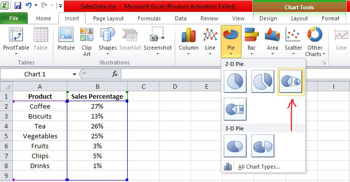
Step 3: Click on the Pie Chart option from lists of Charts
Click on the drop-down menu of the pie chart from the list of charts.
.webp)
Click on the Pie Chart option from lists of Charts
Step 4: Now, select **Pie of Pie from that list
Select the pie of pie chart from the charts option in Insert toolbar.
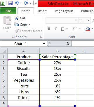
Below are the Sales Data that were taken as a reference for creating Pie of Pie Chart:
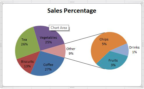
The Pie Chart obtained for the above Sales Data is as shown below:
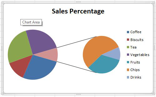
The pie of pie chart is displayed with connector lines, the first pie is the main chart, and to the right chart is the secondary chart. The above chart does not display labels, i.e., the percentage of each product. Hence, let's design and customize the pie of pie chart.
**Design the Pie of Pie Chart in Excel
Follow the below steps to design a pie of pie chart,
- The design tab will be available by right-clicking on the chart.
- Click on the **Design tab to create labels and style the chart with different colors. We can choose any chart layout and style from the drop-down list of designs in Excel as shown in the figure below.
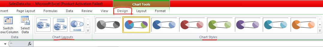
Here, we have chosen the first layout for our pie of pie chart as shown below:
**How to Change the Data in the Secondary Pie?
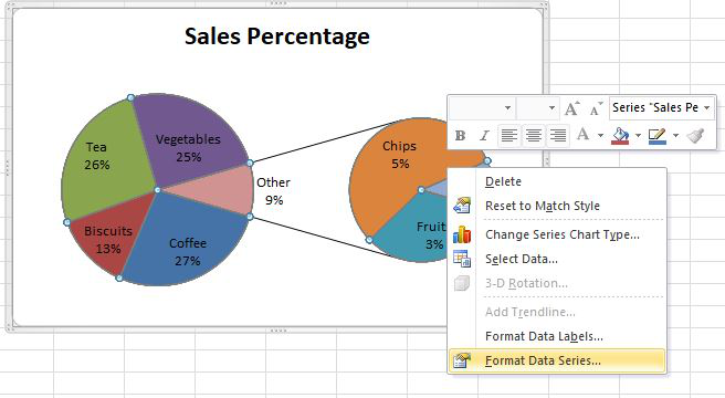
We can change the data that needs to be displayed in the secondary pie. To add data to the secondary pie from the first pie, right-click on the second pie and choose **Format Data Series.
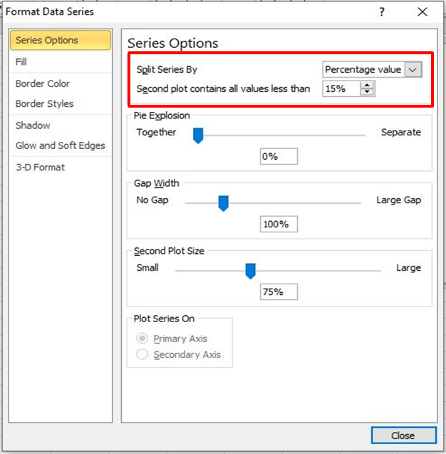
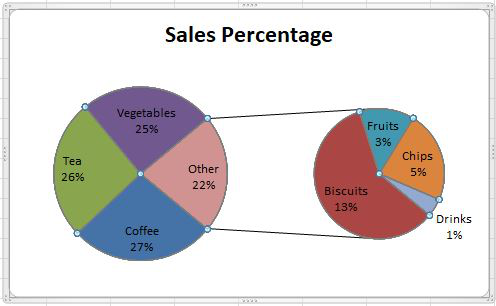
Here, the data series is split by percentage value, and also customized the second plot by having values less than 15%. In this way, a pie of pie chart can be customized in different ways. Now the pie of pie chart is formatted as follows:
Why Use Pie of Pie Charts in Excel?
A Pie of Pie chart in Excel is especially useful for displaying small values in a dataset that might not be as visible in a regular pie chart. Here are some reasons why you should consider using it:
- **Better Clarity: Breaks down complex data into two pies, making it easier to understand smaller values.
- **Professional Reports: Useful for financial reports, sales data, or any business analysis requiring detailed breakdowns.
- **Customizable: You can split the data by percentage, position, or value, depending on what makes the most sense for your analysis.
How to Customize the Secondary Pie Chart?
You can control what data is displayed in the secondary pie chart. Here’s how:
- Right-click on the Secondary Pie and select Format Data Series.
- You can adjust the percentage cutoff or select specific values to be displayed in the smaller pie.
- You can also change the colors and data labels to make the chart more visually appealing.
Additional Customization Options for Pie of Pie Charts
Apart from splitting data, Excel also allows you to further design your chart. You can:
Step 1: Change Chart Colors
Customize the colors of the pies to match your presentation style.
Step 2: Add a Chart Title
Provide a clear title that explains the data being displayed.
Step 3: Explode Slices
You can explode slices in both pies to emphasize particular data points.
How to Use Pie of Pie Charts for Data Analysis?
Using a Pie of Pie chart is an excellent way to simplify complex datasets, particularly when analyzing data with many small values. It allows you to:
- **Showcase Smaller Categories: Highlight smaller categories or subcategories of your data.
- **Clearer Data Presentation: Avoid clutter in your charts by splitting the pie into two.
- **Better Reporting: Ideal for use in financial reports, marketing data, sales data, and other presentations.