Loan Eligibility Prediction using Machine Learning Models in Python (original) (raw)
Last Updated : 23 Jul, 2025
Have you ever thought about the apps that can predict whether you will get your loan approved or not? In this article, we are going to develop one such model that can predict whether a person will get his/her loan approved or not by using some of the background information of the applicant like the applicant's gender, marital status, income, etc.
Step 1: Importing Libraries
In this step, we will be importing libraries like NumPy, Pandas, Matplotlib, etc.
Python `
import numpy as np import pandas as pd import matplotlib.pyplot as plt import seaborn as sb from sklearn.model_selection import train_test_split from sklearn.preprocessing import LabelEncoder, StandardScaler from sklearn import metrics from sklearn.svm import SVC from imblearn.over_sampling import RandomOverSampler
import warnings warnings.filterwarnings('ignore')
`
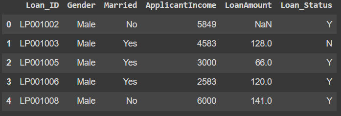
Step 2: Loading Dataset
Python `
df = pd.read_csv('loan_data.csv') df.head()
`
**Output:
head
To see the shape of the dataset, we can use **shape method.
Python `
df.shape
`
**Output:
(598, 6)
To print the information of the dataset, we can use **info() method
Python `
df.info()
`
**Output:
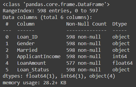
info
To get values like the mean, count and min of the column we can use describe() method.
Python `
df.describe()
`
**Output:
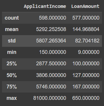
describe
Step 3: Exploratory Data Analysis
EDA refers to the detailed analysis of the dataset which uses plots like distplot, barplots, etc.
Let's start by plotting the piechart for LoanStatus column.
Python `
temp = df['Loan_Status'].value_counts() plt.pie(temp.values, labels=temp.index, autopct='%1.1f%%') plt.show()
`
**Output:
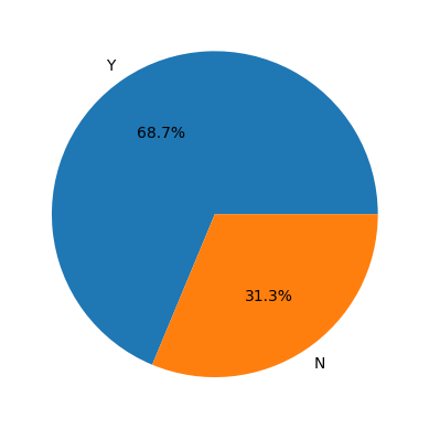
Piechart for LoanStatus
Here we have an imbalanced dataset. We will have to balance it before training any model on this data.
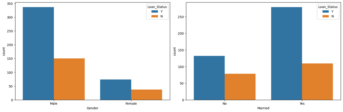
We specify the DataFrame df as the data source for the sb.countplot() function. The x parameter is set to the column name from which the count plot is to be created, and hue is set to 'Loan_Status' to create count bars based on the 'Loan_Status' categories.
Python `
plt.subplots(figsize=(15, 5)) for i, col in enumerate(['Gender', 'Married']): plt.subplot(1, 2, i+1) sb.countplot(data=df, x=col, hue='Loan_Status') plt.tight_layout() plt.show()
`
**Output:
countplot
One of the main observations we can draw here is that the chances of getting a loan approved for married people are quite low compared to those who are not married.
Python `
plt.subplots(figsize=(15, 5)) for i, col in enumerate(['ApplicantIncome', 'LoanAmount']): plt.subplot(1, 2, i+1) sb.distplot(df[col]) plt.tight_layout() plt.show()
`
**Output:
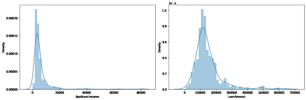
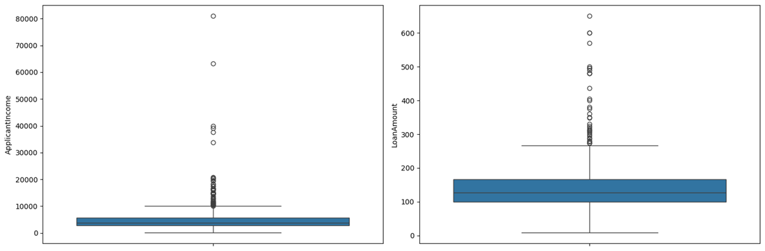
To find out the outliers in the columns, we can use boxplot.
Python `
plt.subplots(figsize=(15, 5)) for i, col in enumerate(['ApplicantIncome', 'LoanAmount']): plt.subplot(1, 2, i+1) sb.boxplot(df[col]) plt.tight_layout() plt.show()
`
**Output:
Boxplot
There are some extreme outlier's in the data we need to remove them.
Python `
df = df[df['ApplicantIncome'] < 25000] df = df[df['LoanAmount'] < 400000]
`
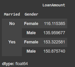
Let's see the mean amount of the loan granted to males as well as females. For that, we will use **groupyby() method.
Python `
df.groupby('Gender').mean(numeric_only=True)['LoanAmount']
`
**Output:
**Gender LoanAmount
**Female 126.697248
**Male 146.872294
**dtype: float64
The loan amount requested by males is higher than what is requested by females.
Python `
df.groupby(['Married', 'Gender']).mean(numeric_only=True)['LoanAmount']
`
**Output:
Mean Loan Amount
Here is one more interesting observation in addition to the previous one that the married people requested loan amount is generally higher than that of the unmarried. This may be one of the reason's that we observe earlier that the chances of getting loan approval for a married person are lower than that compared to an unmarried person.
Python `
Function to apply label encoding
def encode_labels(data): for col in data.columns: if data[col].dtype == 'object': le = LabelEncoder() data[col] = le.fit_transform(data[col])
return dataApplying function in whole column
df = encode_labels(df)
Generating Heatmap
sb.heatmap(df.corr() > 0.8, annot=True, cbar=False) plt.show()
`
**Output:
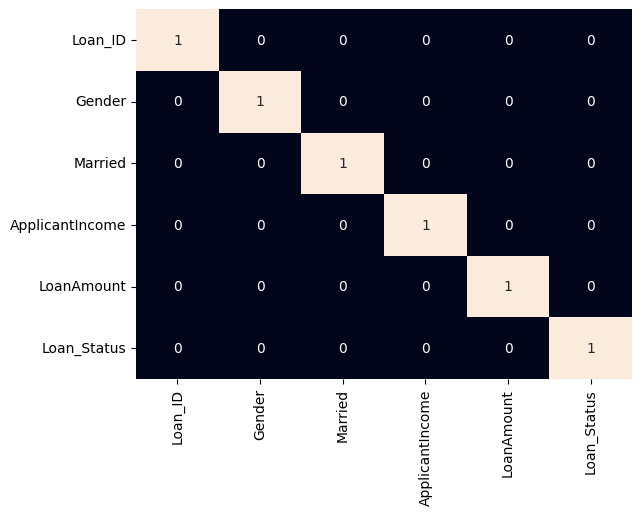
heatmap
Step 4: Data Preprocessing
In this step, we will split the data for training and testing. After that, we will preprocess the training data.
Python `
features = df.drop('Loan_Status', axis=1) target = df['Loan_Status'].values
X_train, X_val, Y_train, Y_val = train_test_split(features, target, test_size=0.2, random_state=10)
As the data was highly imbalanced we will balance
it by adding repetitive rows of minority class.
ros = RandomOverSampler(sampling_strategy='minority', random_state=0) X, Y = ros.fit_resample(X_train, Y_train)
X_train.shape, X.shape
`
**Output:
((456, 5), (638, 5))
We will now use Standard scaling for normalizing the data. To know more about StandardScaler refer this link.
Python `
Normalizing the features for stable and fast training.
scaler = StandardScaler() X = scaler.fit_transform(X) X_val = scaler.transform(X_val)
`
Step 5: Model Development
We will use Support Vector Classifier for training the model.
Python `
from sklearn.metrics import roc_auc_score model = SVC(kernel='rbf') model.fit(X, Y)
print('Training Accuracy : ', metrics.roc_auc_score(Y, model.predict(X))) print('Validation Accuracy : ', metrics.roc_auc_score(Y_val, model.predict(X_val))) print()
`
**Output:
Training Accuracy : 0.6300940438871474
Validation Accuracy : 0.48198198198198194
Step 6: Model Evaluation
Model Evaluation can be done using confusion matrix.
we first train the SVC model using the training data X and Y. Then, we calculate the ROC AUC scores for both the training and validation datasets. The confusion matrix is built for the validation data by using the confusion_matrix function from sklearn.metrics. Finally, we plot the confusion matrix using the plot_confusion_matrix function from the sklearn.metrics.plot_confusion_matrix submodule.
Python `
from sklearn.svm import SVC from sklearn.metrics import confusion_matrix training_roc_auc = roc_auc_score(Y, model.predict(X)) validation_roc_auc = roc_auc_score(Y_val, model.predict(X_val)) print('Training ROC AUC Score:', training_roc_auc) print('Validation ROC AUC Score:', validation_roc_auc) print() cm = confusion_matrix(Y_val, model.predict(X_val))
`
**Output:
Training ROC AUC Score: 0.6300940438871474
Validation ROC AUC Score: 0.48198198198198194
Python `
plt.figure(figsize=(6, 6)) sb.heatmap(cm, annot=True, fmt='d', cmap='Blues', cbar=False) plt.title('Confusion Matrix') plt.xlabel('Predicted Label') plt.ylabel('True Label') plt.show()
`
**Output:
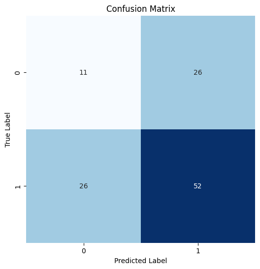
Confusion Matrix
Python `
from sklearn.metrics import classification_report print(classification_report(Y_val, model.predict(X_val)))
`
**Output:
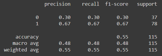
classification report
As this dataset contains fewer features the performance of the model is not up to the mark maybe if we will use a better and big dataset we will be able to achieve better accuracy.
You can download the dataset and source code from here:
- **Dataset: Load Eligibility Dataset
- **Source Code:Loan Eligibility Prediction using Machine Learning