Logistic Regression using Python (original) (raw)
Last Updated : 10 Feb, 2026
Logistic Regression is a widely used supervised machine learning algorithm used for classification tasks. In Python, it helps model the relationship between input features and a categorical outcome by estimating class probabilities, making it simple, efficient and easy to interpret.
- Used for binary and multiclass classification
- Predicts probabilities using the logistic (sigmoid) function
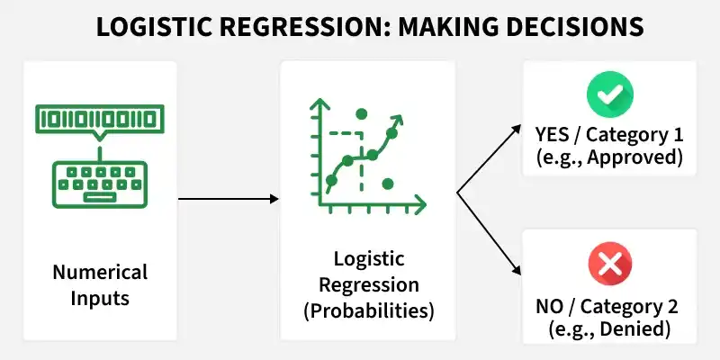
Logistic Regression
We will build a classifier that predicts whether a tumour is malignant or benign, based on medical measurements using Python.
**Step 1: Import Required Libraries
- **numpy: Handles numerical computations and arrays
- **pandas: Used for data handling and tabular structures
- **matplotlib.pyplot****:** Helps visualize data and results
- **Scikit Learn****:** Used for model building Python `
import numpy as np import pandas as pd import matplotlib.pyplot as plt
from sklearn.datasets import load_breast_cancer from sklearn.model_selection import train_test_split from sklearn.preprocessing import StandardScaler from sklearn.linear_model import LogisticRegression from sklearn.metrics import accuracy_score, confusion_matrix,precision_score, recall_score,f1_score,roc_curve, roc_auc_score
`
**Step 2: Load the Dataset
This step loads the Breast Cancer dataset from scikit learn. The dataset is provided as a structured object that bundles everything needed for a classification task. It contains:
- **Feature matrix: Numerical measurements used as input to the model
- **Target labels: The class to predict
- **Feature names: Descriptions of each input feature
- **Metadata: Additional information about the dataset
This structure makes the dataset easy to explore, preprocess and use directly for model training.
Python `
data = load_breast_cancer()
`
**Step 3: Convert Data to a Pandas DataFrame
The raw dataset is converted into pandas structures for easier handling and analysis. Using a DataFrame improves readability, supports exploratory data analysis and aligns with real world data workflows commonly used in production.
- **X represents the input features
- **y represents the target variable Python `
X = pd.DataFrame(data.data, columns=data.feature_names) y = pd.Series(data.target)
`
**Step 4: Train and Test Split
This step splits the data into training and testing sets. Here we will use 25% of data for testing and rest for training.
Python `
X_train, X_test, y_train, y_test = train_test_split( X, y, test_size=0.25, random_state=29 )
`
**Step 5: Feature Scaling
This step standardizes feature values so they are on a similar scale. Logistic Regression uses gradient based optimization which is sensitive to feature magnitudes, so scaling helps the model train correctly. The scaler is fit only on training data and then applied to test data to avoid data leakage.
Python `
scaler = StandardScaler()
X_train = scaler.fit_transform(X_train) X_test = scaler.transform(X_test)
`
**Step 6: Train the Logistic Regression Model
This step trains the Logistic Regression model on the scaled training data. Here:
- The model learns feature weights that separate the classes,
- Applies the sigmoid function to compute probabilities.
- Assigns a class based on those probabilities. Python `
model = LogisticRegression(max_iter=1000) model.fit(X_train, y_train)
`
**Step 7: Make Predictions
At this stage, the trained model is used to make predictions on unseen test data. It computes probabilities for each class and applies a threshold (default = 0.5) to convert them into class labels.
- **1: Predicted as benign
- **0: Predicted as malignant Python `
y_pred = model.predict(X_test) y_pred
`
**Output:
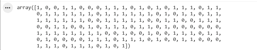
Predicted Labels
**Step 8: Model Evaluation
At this stage, predictions are available. We now evaluate how well the model performs using multiple metrics, since each metric highlights a different aspect of performance.
**Accuracy Score
Accuracy measures how often the model makes correct predictions overall.
- Gives a quick idea of overall correctness
- Works well when classes are balanced
- Can be misleading for imbalanced datasets Python `
accuracy = accuracy_score(y_test, y_pred) print(f"accuracy: {round(accuracy,2)}")
`
**Output:
accuracy: 0.98
**Confusion Matrix
A confusion matrix shows where the model is right and where it makes mistakes by comparing predicted labels with actual labels.
- Shows exact error types, not just a score
- Helps understand false positives vs false negatives
- Critical in domains like healthcare, where mistakes have different costs Python `
cm = confusion_matrix(y_test, y_pred) cm
`
**Output:

Confusion Matrix
**Precision Score
Precision shows how many predicted positives are actually correct.
- Focuses on reducing false positives
- Important when wrong positives are costly
- Commonly used in spam and fraud detection Python `
precision = precision_score(y_test, y_pred) f"Precision: {round(precision,2)}"
`
**Output:
Precision: 0.99
**Recall Score
Recall measures how many actual positives the model correctly identifies.
- Focuses on reducing false negatives
- Important when missing positives is risky
- Used in healthcare and safety systems Python `
recall = recall_score(y_test, y_pred) f"Recall: {round(recall,2)}"
`
**Output:
Recall: 0.98
**F1 Score
F1 score balances precision and recall into a single metric.
- Useful when data is imbalanced
- Penalizes extreme precision or recall values
- Preferred when both false positives and false negatives matter Python `
f1 = f1_score(y_test, y_pred) f"f1 score: {round(f1,2)}"
`
**Output:
f1 score: 0.98
**ROC-AUC Score
ROC-AUC shows how well the model separates classes across thresholds.
- Measures ranking ability, not exact predictions
- Higher value means better class separation
- Works well for comparing classification models Python `
y_prob = model.predict_proba(X_test)[:, 1]
fpr, tpr, thresholds = roc_curve(y_test, y_prob)
roc_auc = roc_auc_score(y_test, y_prob)
plt.figure() plt.plot(fpr, tpr, label=f"ROC Curve (AUC = {roc_auc:.2f})") plt.plot([0, 1], [0, 1], linestyle="--") plt.xlabel("False Positive Rate") plt.ylabel("True Positive Rate") plt.title("ROC Curve") plt.legend() plt.show()
`
**Output:
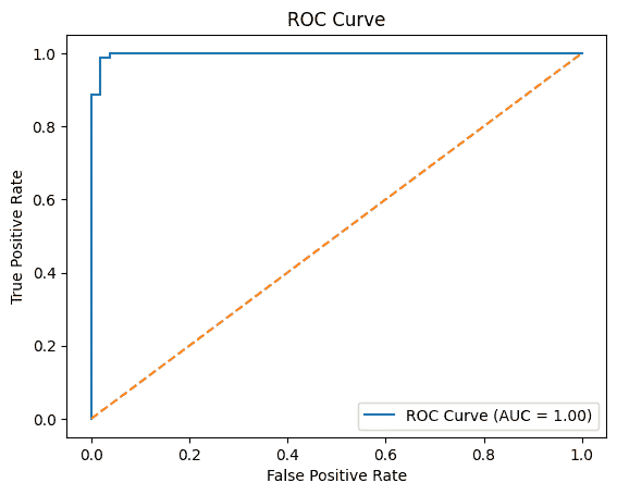
ROC-AUC Curve
You can download the python notebook from here