Plotting graph using Seaborn | Python (original) (raw)
Last Updated : 24 Feb, 2026
Seaborn is a Python data visualization library built on top of Matplotlib. It provides a high-level interface for drawing attractive, informative statistical graphics. Unlike Matplotlib, Seaborn works seamlessly with Pandas DataFrames, making it a preferred tool for quick exploratory data analysis and advanced statistical plotting.
- Comes with built-in datasets like iris, tips, etc.
- Provides statistical plots such as boxplots, violin plots, swarm plots, etc.
- Handles categorical data visualization better than Matplotlib.
- Supports aesthetic customization (themes, color palettes, styles).
- Simplifies working with DataFrames by auto-labeling axes.
Different Plots in Seaborn
Let's see the various types of plots in seaborn,
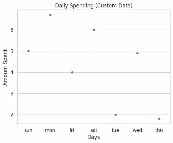
1. Strip Plot
A strip plot is a categorical scatter plot where data points are plotted along one categorical axis. It is useful for visualizing the distribution of values but may suffer from overlapping points.
**Applications
- Used when we want to visualize raw distribution of numerical data across categories.
- Helpful for detecting clusters or general spread of values.
**Advantages
- Simple and easy to interpret.
- Shows individual data points clearly.
**Limitations
- Overlapping points may cause loss of clarity in dense datasets. Python `
import matplotlib.pyplot as plt import seaborn as sns
x = ['sun', 'mon', 'fri', 'sat', 'tue', 'wed', 'thu'] y = [5, 6.7, 4, 6, 2, 4.9, 1.8]
ax = sns.stripplot(x=x, y=y) ax.set(xlabel='Days', ylabel='Amount Spent') plt.title('Daily Spending (Custom Data)') plt.show()
`
**Output:
Simple Plot
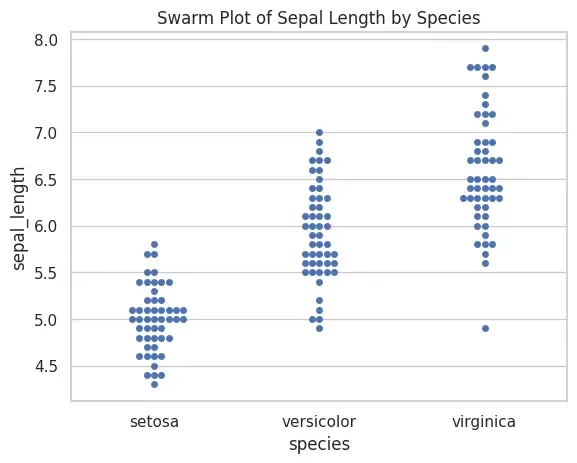
2. Swarm Plot
A swarm plot is similar to a strip plot, but points are arranged to avoid overlap. This ensures all data points are visible, making it more informative.
**Applications
- Useful when dataset is small/medium and we want to show all observations.
- Comparing sub-groups clearly without stacking.
**Advantages
- Prevents overlap of data points.
- Provides clearer visual insight than strip plot.
**Limitations
- Can be slow for large datasets.
- May look cluttered when categories have thousands of points. Python `
sns.set(style="whitegrid") iris = sns.load_dataset("iris") sns.swarmplot(x="species", y="sepal_length", data=iris) plt.title("Swarm Plot of Sepal Length by Species") plt.show()
`
**Output:
Swarm Plot
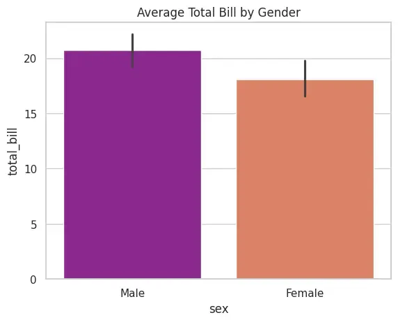
3. Bar Plot
A bar plot shows the average (by default mean) of a numerical variable across categories. It can use different estimators (mean, median, std, etc.) for aggregation.
**Applications
- Comparing average values across categories.
- Displaying results of group-by operations visually.
**Advantages
- Easy to interpret and widely used.
- Flexible can use different statistical functions.
**Limitations
- Does not show individual data distribution.
- Can hide variability when using only mean. Python `
tips = sns.load_dataset("tips") sns.barplot(x="sex", y="total_bill", data=tips, palette="plasma") plt.title("Average Total Bill by Gender") plt.show()
`
**Output:
Bar Plot
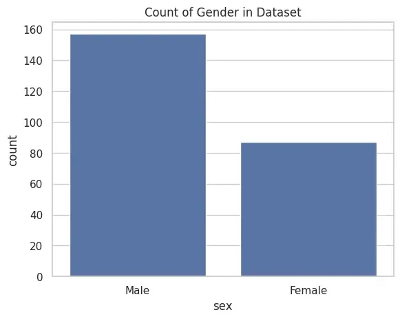
4. Count Plot
A count plot simply counts the occurrences of each category. It is like a histogram for categorical variables.
**Applications
- Checking frequency distribution of categorical values.
- Understanding class imbalance in data.
**Advantages
- Very simple and quick to interpret.
- No need for numerical data, only categorical required.
**Limitations
- Cannot display numerical spread inside categories. Python `
tips = sns.load_dataset("tips") sns.countplot(x="sex", data=tips) plt.title("Count of Gender in Dataset") plt.show()
`
**Output:
Count Plot
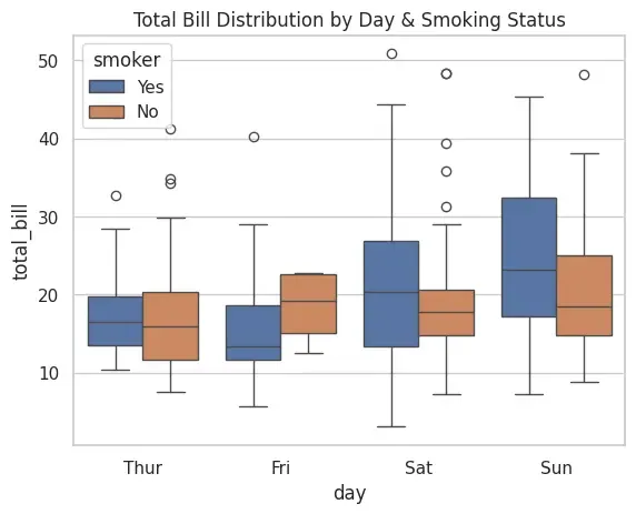
5. Box Plot
A box plot (or whisker plot) summarizes numerical data using quartiles, median and outliers. It helps in detecting variability and spread.
**Applications
- Detecting outliers.
- Comparing spread of distributions across categories.
**Advantages
- Highlights summary statistics effectively.
- Useful for large datasets.
**Limitations
- Does not show exact data distribution shape. Python `
tips = sns.load_dataset("tips") sns.boxplot(x="day", y="total_bill", data=tips, hue="smoker") plt.title("Total Bill Distribution by Day & Smoking Status") plt.show()
`
**Output:
Box Plot
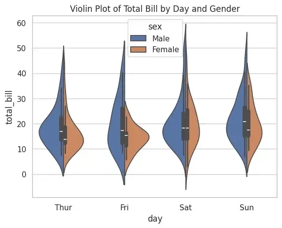
6. Violin Plot
A violin plot combines a box plot with a density plot, showing both summary stats and distribution shape.
**Applications
- Comparing distributions more deeply than boxplot.
- Helpful for detecting multimodal distributions.
**Advantages
- Shows both summary statistics and data distribution.
- Easier to see differences in distribution shapes.
**Limitations
- Can be harder to interpret for beginners.
- May be misleading if sample size is small. Python `
tips = sns.load_dataset("tips") sns.violinplot(x="day", y="total_bill", data=tips, hue="sex", split=True) plt.title("Violin Plot of Total Bill by Day and Gender") plt.show()
`
**Output:
Violin Plot
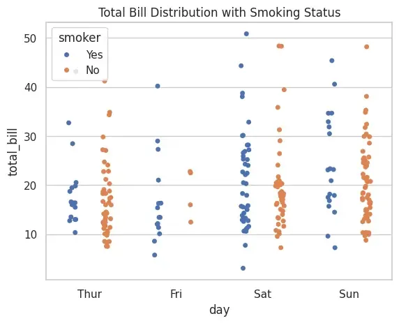
7. Strip Plot with Hue
This is an enhanced strip plot where categories are further divided using hue. It allows comparing multiple sub-groups within a category.
**Applications
- Comparing subgroups inside categories.
- Visualizing interaction between two categorical variables.
**Advantages
- Adds extra dimension to strip plot.
- Useful for multivariate visualization.
**Limitations
- Overlap issue exists. Python `
tips = sns.load_dataset("tips") sns.stripplot(x="day", y="total_bill", data=tips, jitter=True, hue="smoker", dodge=True) plt.title("Total Bill Distribution with Smoking Status") plt.show()
`
**Output:
Strip Plot with Hue
Applications
- **Exploratory Data Analysis (EDA): Identifying trends, outliers and patterns.
- **Feature Analysis: Comparing numerical features across categories.
- **Data Presentation: Creating professional, publication-ready plots.
- **Model Preparation: Checking class imbalance or spread before training models.