3D Plotting sample Data from MongoDB Atlas Using Python (original) (raw)
Last Updated : 12 Jul, 2025
MongoDB, the most popular NoSQL database, is an open-source document-oriented database. The term ‘NoSQL’ means ‘non-relational’. It means that MongoDB isn’t based on the table-like relational database structure but provides an altogether different mechanism for storage and retrieval of data. This format of storage is called BSON ( similar to JSON format).
Plotting sample data from MongoDB Atlas
Before Starting to plot the sample data make sure you have created an account on the MongoDB Cloud Atlas. If you have not created follow the below steps.
Approach:
- Import PyMongo and Axes3d and Matplotlib.
- Go to MongoDB Atlas Cloud by signing in.
- Paste the "course_cluster_uri" following the above steps.
- Get the client using "pymongo.MongoClient(course_url)" .
- Now set the query to filtering conditions and criteria by removing outliers that are clearly bad data.
- Convert cursor into a list.
- Now set the plot as "scatter/bar/hist" and also set Title, X-axis label, Y-axis label and legends.
- Don't forget to type plt.show().
Below is the implementation.
Python3 `
Using PyMongo to create plots
import pymongo from mpl_toolkits.mplot3d import Axes3D import matplotlib.pyplot as plt
course_cluster_uri = 'your_connection_string' course_client = pymongo.MongoClient(course_cluster_uri)
sample dataset
db = course_client['sample_weatherdata']
sample collection
weather_data = db['data']
remove outliers that are clearly bad data
query = { 'pressure.value': { '$lt': 9999 }, 'airTemperature.value': { '$lt': 9999 }, 'wind.speed.rate': { '$lt': 500 }, }
convert our cursor into a list
l = list(weather_data.find(query).limit(1000))
pull out the 3 variables we care
about into their own respective lists
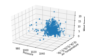
pressures = [x['pressure']['value'] for x in l] air_temps = [x['airTemperature']['value'] for x in l] wind_speeds = [x['wind']['speed']['rate'] for x in l]
here you'll write the code to plot pressures,
air_temps, and wind_speeds in a 3D plot
plt.clf() fig = plt.figure()
ax = fig.add_subplot(111, projection = '3d') ax.scatter(pressures, air_temps, wind_speeds)
ax.set_xlabel("Pressure") ax.set_ylabel("Air Temperature") ax.set_zlabel("Wind Speed")
plt.show()
`