How to create a correlation heatmap in Python? (original) (raw)
Last Updated : 23 Jul, 2025
Seaborn is a powerful Python library based on Matplotlib, designed for data visualization. It provides an intuitive way to represent data using statistical graphics. One such visualization is a heatmap, which is used to display data variation through a color palette. In this article, we focus on correlation heatmaps, and how Seaborn, in combination with Pandas and Matplotlib, can be used to generate one for a DataFrame.
Installation
To use Seaborn, you need to install it along with Pandas and Matplotlib. If you haven't installed Seaborn yet, you can do so using the following commands:
pip install seaborn
Alternatively, if you are using Anaconda:
conda install seaborn
Seaborn is typically included in Anaconda distributions and should work just by importing if your IDE is configured with Anaconda.
What is correlation heatmap?
A correlation heatmap is a 2D graphical representation of a correlation matrix between multiple variables. It uses colored cells to indicate correlation values, making patterns and relationships within data visually interpretable. The color intensity of each cell represents the strength of the correlation:
- 1 (or close to 1): Strong positive correlation (dark colors)
- 0: No correlation (neutral colors)
- -1 (or close to -1): Strong negative correlation (light colors)
Steps to create a correlation heatmap
The following steps show how a correlation heatmap can be produced:
- Import all required modules.
- Load the dataset.
- Compute the correlation matrix.
- Plot the heatmap using Seaborn.
- Display the heatmap using Matplotlib.
For plotting a heatmap, we use the heatmap() function from the Seaborn module.
**Example 1: Correlation Heatmap for Bestseller Novels Dataset
This example uses a dataset downloaded from Kaggle containing information about bestselling novels on Amazon.
Python `
Import necessary modules
import matplotlib.pyplot as plt import pandas as pd import seaborn as sns
Load dataset
data = pd.read_csv("C:\Users\Vanshi\Desktop\bestsellers.csv")
Compute correlation matrix
co_mtx = data.corr(numeric_only=True)
Print correlation matrix
print(co_mtx)
Plot correlation heatmap
sns.heatmap(co_mtx, cmap="YlGnBu", annot=True)
Display heatmap
plt.show()
`
**Output
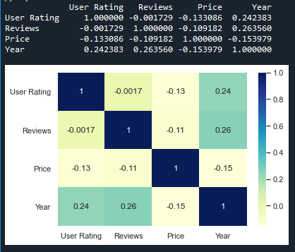
**Explanation:
- **Importing Libraries: We import Matplotlib for visualization, **Pandas for handling data and **Seaborn for plotting.
- **Loading Dataset: We use **pd.read_csv() to load the dataset.
- **Computing Correlation Matrix: The ****.corr() method** calculates the correlation between numerical columns.
- **Plotting the Heatmap: sns.heatmap() creates the visualization with color coding.
- **Displaying the Heatmap: plt.show() renders the heatmap.
**Example 2: Correlation Heatmap for NASA Exoplanet Dataset
This example uses an exoplanet space research dataset compiled by NASA.
Python `
Import necessary modules
import matplotlib.pyplot as mp import pandas as pd import seaborn as sb
Load dataset
data = pd.read_csv("C:\Users\Vanshi\Desktop\cumulative.csv")
Plotting correlation heatmap
dataplot = sb.heatmap(data.corr(numeric_only=True))
Displaying heatmap
mp.show()
`
**Output
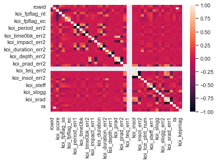
**Explanation:
- **Loading Dataset: The dataset is loaded using **pd.read_csv().
- **Computing Correlation Matrix: ****.corr() function** is applied to identify relationships between numerical variables.
- **Plotting with Seaborn: heatmap() function is used to visualize the correlation, with cmap="coolwarm" to adjust the color scheme.
- **Displaying the Heatmap: mp.show() function displays the plotted heatmap.