Plot a Pie Chart in Python using Matplotlib (original) (raw)
A Pie Chart is a circular statistical plot that can display only one series of data. The area of the chart is the total percentage of the given data. **Pie charts in Python are widely used in business presentations, reports, and dashboards due to their simplicity and effectiveness in displaying data distributions. In this article, we will explore how to create a **pie chart in Python using the **Matplotlib library, one of the most widely used libraries for data visualization in Python.
Table of Content
- Why Use Pie Charts?
- Basic Structure of a Pie Chart
- Plotting a Pie Chart in Matplotlib
- Customizing Pie Charts
- Creating a Nested Pie Chart in Python
- Creating 3D Pie Charts
Why Use Pie Charts?
**Pie charts provide a visual representation of data that makes it easy to compare parts of a whole. They are particularly useful when:
- Displaying relative proportions or percentages.
- Summarizing categorical data.
- Highlighting significant differences between categories.
However, while pie charts are useful, they also have limitations. They can become cluttered with too many categories or lead to misinterpretation if not designed thoughtfully. Despite this, a well-crafted **pie chart using Matplotlib can significantly enhance the presentation of your data.
Basic Structure of a Pie Chart
A pie chart consists of slices that represent different categories. The size of each slice is proportional to the quantity it represents. The following components are essential when creating a **pie chart in Matplotlib:
- **Data: The values or counts for each category.
- **Labels: The names of each category, which will be displayed alongside the slices.
- **Colors: Optional, but colors can be used to differentiate between slices effectively.
**Matplotlib API has pie() function in its pyplot module which create a pie chart representing the data in an array. let's create pie chart in python.
**Syntax: matplotlib.pyplot.pie(data, explode=None, labels=None, colors=None, autopct=None, shadow=False)
**Parameters:
- **data represents the array of data values to be plotted, the fractional area of each slice is represented by **data/sum(data)
- **labels is a list of sequence of strings which sets the label of each wedge.
- **color attribute is used to provide color to the wedges.
- **autopct is a string used to label the wedge with their numerical value.
- **shadow is used to create shadow of wedge.
Plotting a Pie Chart in Matplotlib
Let's create a simple pie chart using the pie() function in Matplotlib. This function is a powerful and easy way to visualize the distribution of categorical data.
Python `
Import libraries
from matplotlib import pyplot as plt import numpy as np
Creating dataset
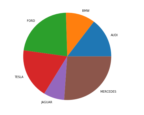
cars = ['AUDI', 'BMW', 'FORD', 'TESLA', 'JAGUAR', 'MERCEDES']
data = [23, 17, 35, 29, 12, 41]
Creating plot
fig = plt.figure(figsize=(10, 7)) plt.pie(data, labels=cars)
show plot
plt.show()
`
Output:
Customizing Pie Charts
Once you are familiar with the basics of **pie charts in Matplotlib, you can start customizing them to fit your needs. A pie chart can be customized on the basis several aspects:
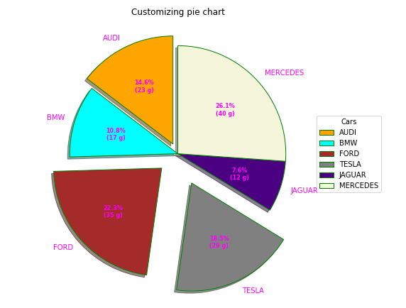
- **startangle: This attribute allows you to rotate the **pie chart in Python counterclockwise around the x-axis by the specified degrees.. By adjusting this angle, you can change the starting position of the first wedge, which can improve the overall presentation of the chart.
- **shadow: This boolean attribute adds a shadow effect below the rim of the pie. Setting this to **True can make your chart stand out and give it a more three-dimensional appearance, enhancing the overall look of your **pie chart in Matplotlib.
- **wedgeprops: This parameter accepts a Python dictionary to customize the properties of each wedge in the pie chart. You can specify various attributes such as
linewidth,edgecolor, andfacecolor. This level of customization allows you to enhance the visual distinction between wedges, making your **matplotlib pie chart more informative. - **frame: When set to **True, this attribute draws a frame around the **pie chart. This can help emphasize the chart's boundaries and improve its visibility, making it clearer when presenting data.
- **autopct: This attribute controls how the percentages are displayed on the wedges. You can customize the format string to define the appearance of the percentage labels on each slice.
The explode parameter separates a portion of the chart, and colors define each wedge's color. The autopct function customizes text display, and legend and title functions enhance chart readability and aesthetics.
Python `
Import libraries
import numpy as np import matplotlib.pyplot as plt
Creating dataset
cars = ['AUDI', 'BMW', 'FORD', 'TESLA', 'JAGUAR', 'MERCEDES']
data = [23, 17, 35, 29, 12, 41]
Creating explode data
explode = (0.1, 0.0, 0.2, 0.3, 0.0, 0.0)
Creating color parameters
colors = ("orange", "cyan", "brown", "grey", "indigo", "beige")
Wedge properties
wp = {'linewidth': 1, 'edgecolor': "green"}
Creating autocpt arguments
def func(pct, allvalues): absolute = int(pct / 100.*np.sum(allvalues)) return "{:.1f}%\n({:d} g)".format(pct, absolute)
Creating plot
fig, ax = plt.subplots(figsize=(10, 7)) wedges, texts, autotexts = ax.pie(data, autopct=lambda pct: func(pct, data), explode=explode, labels=cars, shadow=True, colors=colors, startangle=90, wedgeprops=wp, textprops=dict(color="magenta"))
Adding legend
ax.legend(wedges, cars, title="Cars", loc="center left", bbox_to_anchor=(1, 0, 0.5, 1))
plt.setp(autotexts, size=8, weight="bold") ax.set_title("Customizing pie chart")
show plot
plt.show()
`
Output:
By leveraging the capabilities of the **plt.pie() function in **Matplotlib, we can create informative and visually appealing **pie charts that help to communicate with data effectively. Whether you are presenting data to stakeholders or creating visual aids for your reports, mastering the art of plotting **pie charts in Python is a valuable skill.
Creating a Nested Pie Chart in Python
A **nested pie chart is an effective way to represent hierarchical data, allowing you to visualize multiple categories and subcategories in a single view. In **Matplotlib, you can create a **nested pie chart by overlaying multiple pie charts with different radii. Below, we’ll explore how to create this type of chart in Python.
Here’s a simple example of how to create a **nested pie chart using **Matplotlib:
Python `
Import libraries
from matplotlib import pyplot as plt import numpy as np
Creating dataset
size = 6 cars = ['AUDI', 'BMW', 'FORD', 'TESLA', 'JAGUAR', 'MERCEDES']
data = np.array([[23, 16], [17, 23], [35, 11], [29, 33], [12, 27], [41, 42]])
normalizing data to 2 pi
norm = data / np.sum(data)*2 * np.pi
obtaining ordinates of bar edges
left = np.cumsum(np.append(0, norm.flatten()[:-1])).reshape(data.shape)
Creating color scale
cmap = plt.get_cmap("tab20c") outer_colors = cmap(np.arange(6)*4) inner_colors = cmap(np.array([1, 2, 5, 6, 9, 10, 12, 13, 15, 17, 18, 20]))
Creating plot
fig, ax = plt.subplots(figsize=(10, 7), subplot_kw=dict(polar=True))
ax.bar(x=left[:, 0], width=norm.sum(axis=1), bottom=1-size, height=size, color=outer_colors, edgecolor='w', linewidth=1, align="edge")
ax.bar(x=left.flatten(), width=norm.flatten(), bottom=1-2 * size, height=size, color=inner_colors, edgecolor='w', linewidth=1, align="edge")
ax.set(title="Nested pie chart") ax.set_axis_off()
show plot
plt.show()
`
Output:
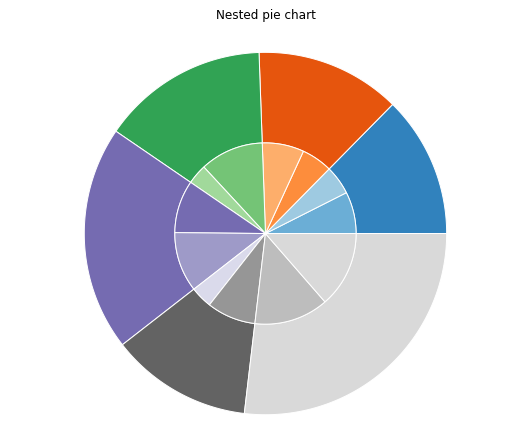
- The outer pie chart represents the main categories, while the inner pie chart represents subcategories related to one of those main categories. This structure is particularly useful for showing proportions within proportions, helping viewers quickly grasp the relationships within the data.
- **Center Circle: The **centre_circle is added to create the donut effect, providing a clean visual separation between the outer and inner pie charts.
As with a regular **pie chart in Python, you can customize various attributes, such as startangle, shadow, autopct, and wedgeprops, to enhance the overall aesthetics of your **nested pie chart.
Creating 3D Pie Charts
To create a proper 3D pie chart in **Matplotlib, you can use the following code snippet. Note that **Matplotlib does not have a direct function for 3D pie charts, but we can simulate it with a 3D surface plot or use a workaround with 2D pie charts:
Conclusion
In this article, we explored the fundamentals of creating and customizing **pie charts in Python using the **Matplotlib library. From constructing a simple **pie chart in Matplotlib to visualizing more complex datasets with 2D and **3D pie charts in Python, we have covered various aspects that can enhance the effectiveness of our visualizations.
By utilizing **plt.pie in Python, we learned how to present categorical data clearly, making it easier to convey insights to stakeholders.