Data Visualization in R (original) (raw)
Last Updated : 10 Apr, 2026
Data visualization is the process of representing data using charts, graphs and maps to make information easier to understand. It helps identify patterns, trends and relationships within large datasets. In R, data visualization is widely used because of its strong statistical foundation and graphical capabilities.
- R provides built-in plotting functions and advanced packages like ggplot2 and plotly.
- It allows high customization of graphs, including colors, labels, themes and layouts.
- It supports both basic visualizations and complex statistical graphics.
Types of Data Visualizations
Some of the various types of visualizations offered by R are:
1. Bar Plot
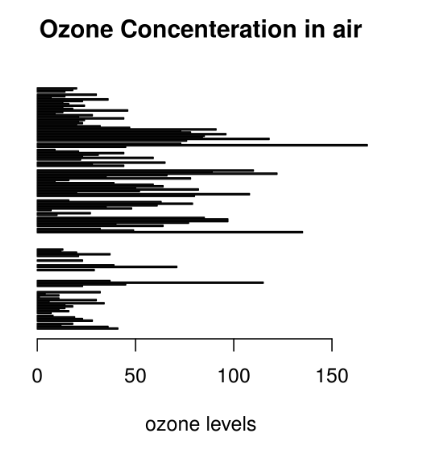
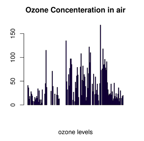
There are two types of bar plots: horizontal and vertical which represent data points as horizontal or vertical bars of certain lengths proportional to the value of the data item. They are generally used for continuous and categorical variable plotting. By setting the horiz parameter to true and false, we can get horizontal and vertical bar plots respectively.
**Horizontal Bar Plot
R `
barplot(airquality$Ozone, main = 'Ozone Concenteration in air', xlab = 'ozone levels', horiz = TRUE)
`
**Output:
**Vertical Bar Plot
R `
barplot(airquality$Ozone, main = 'Ozone Concenteration in air', xlab = 'ozone levels', col ='blue', horiz = FALSE)
`
**Output:
**Use Cases:
- Comparing categories
- Showing changes over time
- Summarizing grouped data
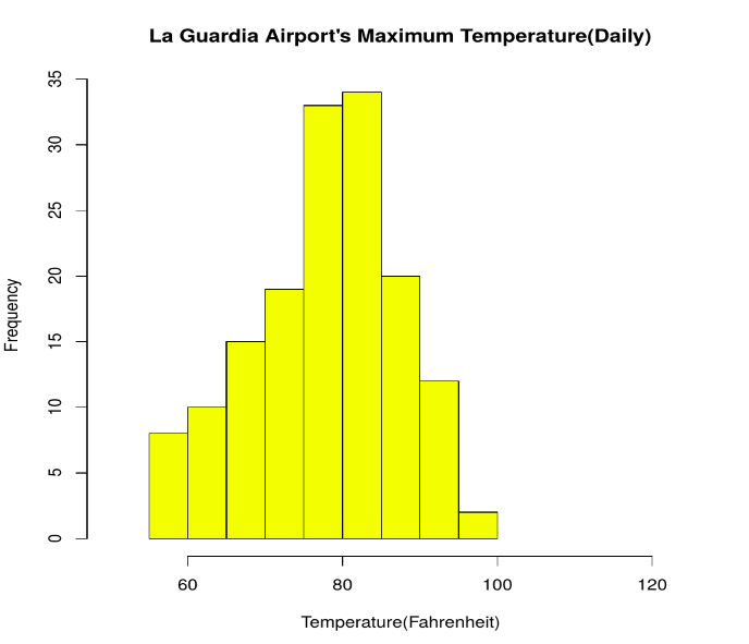
2. Histogram
A histogram shows the distribution of continuous data by grouping values into intervals called bins. It helps understand data spread and shape.
R `
data(airquality)
hist(airquality$Temp, main ="La Guardia Airport's Maximum Temperature(Daily)", xlab ="Temperature(Fahrenheit)", xlim = c(50, 125), col ="yellow", freq = TRUE)
`
**Output:
**Use Cases:
- Checking distribution symmetry
- Identifying skewness
- Detecting unusual patterns
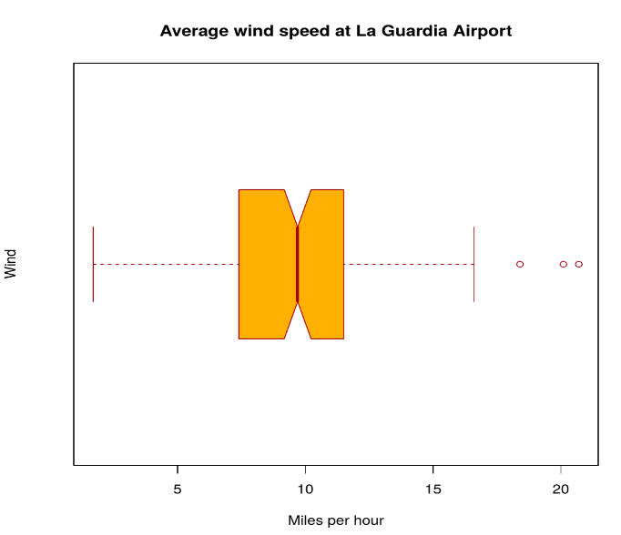
3. Box Plot
A box plot visually summarizes statistical properties of data, including:
- Minimum
- First quartile (Q1)
- Median
- Third quartile (Q3)
- Maximum
- Outliers R `
data(airquality)
boxplot(airquality$Wind, main = "Average wind speed at La Guardia Airport", xlab = "Miles per hour", ylab = "Wind", col = "orange", border = "brown", horizontal = TRUE, notch = TRUE)
`
**Output:
**Multiple Box Plots
R `
boxplot(airquality[, 1:4], main ='Box Plots for Air Quality Parameters')
`
**Output:
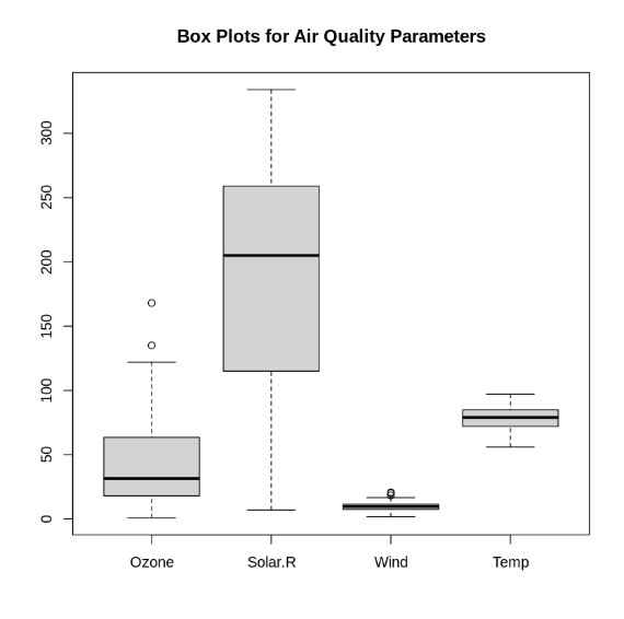
Multiple Box Plots
**Use Cases:
- To give a comprehensive statistical description of the data through a visual cue.
- To identify the outlier points that do not lie in the inter-quartile range of data.
4. Scatter Plot
A scatter plot is composed of many points on a Cartesian plane. Each point denotes the value taken by two parameters and helps us easily identify the relationship between them.
R `
data(airquality)
plot(airquality$Ozone, airquality$Month, main ="Scatterplot Example", xlab ="Ozone Concentration in parts per billion", ylab =" Month of observation ", pch = 19)
`
**Output:
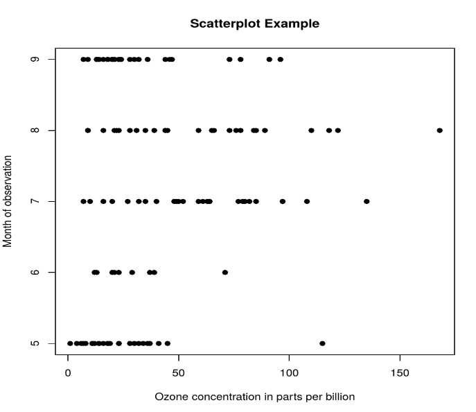
**Use Cases:
- To show whether an association exists between bivariate data.
- To measure the strength and direction of such a relationship.
5. Heat Map
Heatmap is defined as a graphical representation of data using colors to visualize the value of the matrix. heatmap() function is used to plot heatmap.
R `
data <- matrix(rnorm(25, 0, 5), nrow = 5, ncol = 5)
colnames(data) <- paste0("col", 1:5) rownames(data) <- paste0("row", 1:5)
heatmap(data)
`
**Output:

Heat Map
6. Map visualization
Here we are using maps package to visualize and display geographical maps using an R programming language.
R `
install.packages("maps") library(maps) map(database = "world")
df <- data.frame( city = c("New York", "Los Angeles", "Chicago", "Houston", "Phoenix"), lat = c(40.7128, 34.0522, 41.8781, 29.7604, 33.4484), lng = c(-74.0060, -118.2437, -87.6298, -95.3698, -112.0740) )
points(x = df$lng, y = df$lat, col = "Red")
`
**Output:
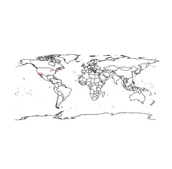
Map visualization in R
7. 3D Graphs
Here we will use preps() function, This function is used to create 3D surfaces in perspective view. This function will draw perspective plots of a surface over the x–y plane.
R `
cone <- function(x, y){ sqrt(x ^ 2 + y ^ 2) }
x <- y <- seq(-1, 1, length = 30) z <- outer(x, y, cone)
persp(x, y, z, main="Perspective Plot of a Cone", zlab = "Height", theta = 30, phi = 15, col = "orange", shade = 0.4 )
`
**Output:
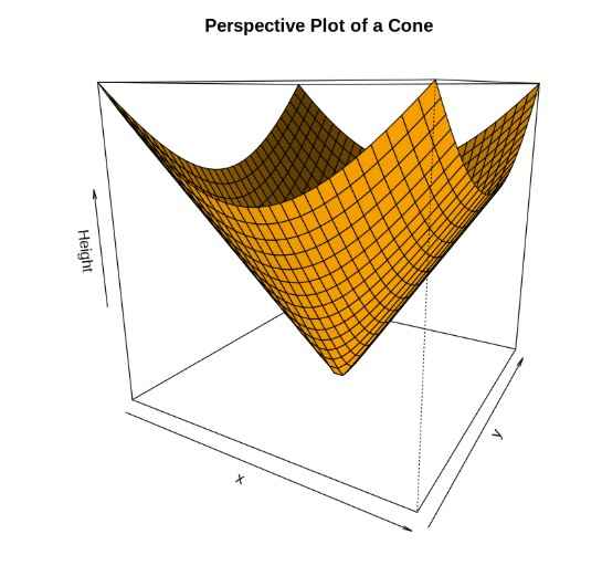
3D Graphs in R
You can download the complete code from here.
Applications
- Presenting analytical conclusions of the data to the non-analysts departments of your company.
- Health monitoring devices use data visualization to track any anomaly in blood pressure, cholesterol and others.
- To discover repeating patterns and trends in consumer and marketing data.
- Meteorologists use data visualization for assessing prevalent weather changes throughout the world.
- Real-time maps and geo-positioning systems use visualization for traffic monitoring and estimating travel time.
Advantages
R has the following advantages over other tools for data visualization:
- R offers a broad collection of visualization libraries along with extensive online guidance on their usage.
- R also offers data visualization in the form of 3D models and multi panel charts.
- Through R, we can easily customize our data visualization by changing axes, fonts, legends, annotations and labels.
Limitations
- R is only preferred for data visualization when done on an individual standalone server.
- Data visualization using R is slow for large amounts of data as compared to other counterparts.