Getting Started with Plotly in R (original) (raw)
Last Updated : 4 May, 2026
Plotly in R is an open-source interactive visualization library that enables users to create dynamic, web-based graphics directly from R. Unlike static plotting systems, Plotly generates interactive HTML visualizations that allow users to zoom, hover, pan and explore data in real time. It is widely used in data analysis, reporting, dashboards and web applications.
- Creates interactive and dynamic visualizations
- Supports both 2D and 3D charts
- Seamlessly integrates with Shiny applications
- Converts static ggplot2 plots into interactive graphics
Plotly
Steps to Install Plotly in R
Before creating interactive visualizations, we need to install the Plotly package in R. Plotly can be installed either from CRAN (stable version) or from GitHub (latest development version).
- CRAN provides the stable and tested version of Plotly.
- GitHub provides the latest development version with new features and updates.
- The devtools package is required to install from GitHub.
Install Plotly from CRAN
This installs the stable version of Plotly from CRAN.
R `
install.packages("plotly")
`
After installation, load the package:
R `
library(plotly)
`
Install the Development Version from GitHub
To access to the latest features and updates, you can install the development version from GitHub. First, install the devtools package:
R `
install.packages("devtools")
`
Then install Plotly from GitHub:
R `
devtools::install_github("ropensci/plotly.R")
`
After installation, load the library:
R `
library(plotly)
`
Understanding Plot_ly Function
The plot_ly() function is the core function used to create interactive visualizations in Plotly for R. It initializes a Plotly object and maps R data structures to the underlying plotly.js, enabling dynamic, browser-based charts with zooming, hovering and panning features.
- Serves as the foundation for building interactive plots in R
- Allows mapping of variables to visual attributes (color, size, text, etc.)
- Supports multiple chart types including scatter, bar, line and 3D plots
- Can be extended using layout and styling functions
Syntax
plot_ly(data = NULL,
x = NULL,
y = NULL,
color = NULL,
type = NULL,
mode = NULL,
marker = NULL,
text = NULL)
**Parameters:
- **data: The dataset (usually a data frame) containing the variables to be visualized.
- **x and y: Variables mapped to the x-axis and y-axis of the plot.
- **color: Used to group or categorize data points by color.
- **type: Specifies the type of plot (scatter, bar).
- **mode: Defines how data is displayed in scatter plots (markers, lines).
- **marker: A list that customizes marker appearance such as size, opacity or symbol.
- **text: Adds hover text information for interactive display.
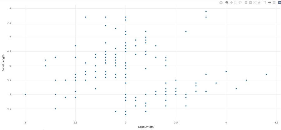
Scatter Plot with Colors Using Plotly
Scatter plots help visualize relationships between two variables. This example uses the iris dataset to plot Sepal Length vs. Sepal Width, with points colored by species for clear group distinction.
R `
library(plotly) library(dplyr)
data(iris)
plot_ly(iris, x = ~Sepal.Length, y = ~Sepal.Width, color = ~Species, type = "scatter", mode = "markers", marker = list(size = 10, opacity = 0.8)) %>% layout(title = "Scatter Plot of Sepal Length vs. Sepal Width", xaxis = list(title = "Sepal Length"), yaxis = list(title = "Sepal Width"))
`
**Output:
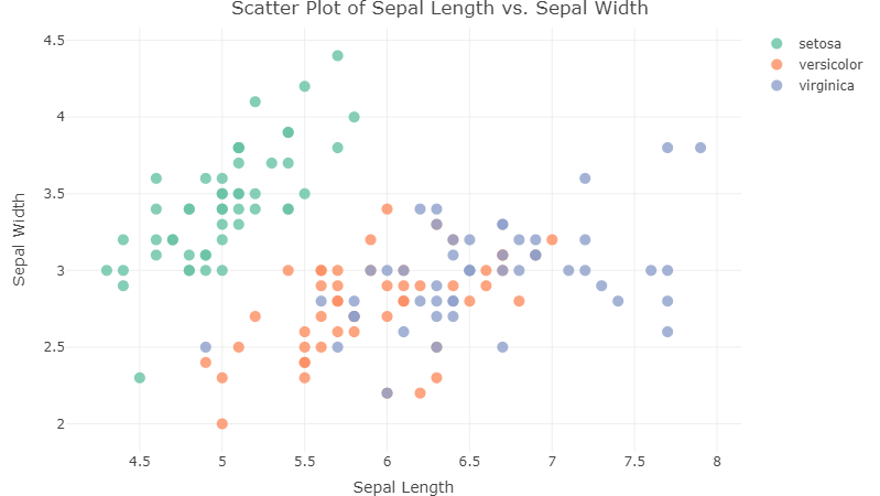
Scatter Plot with Plotly in R
Box Plot with Plotly
Box plots are useful for comparing data distributions across categories. This example uses the iris dataset to show Petal Length by Species, with jittered points and a standard deviation line for added insight.
R `
plot_ly(iris, x = ~Species, y = ~Petal.Length, type = "box", boxpoints = "all", jitter = 0.3, pointpos = -1.8, boxmean = "sd") %>% layout(title = "Box Plot of Petal Length by Species", xaxis = list(title = "Species"), yaxis = list(title = "Petal Length"))
`
**Output:
.png)
Box Plot with Plotly in R
3D Scatter Plot with Plotly
3D scatter plots are useful for visualizing relationships among three continuous variables. This example uses the iris dataset to plot Sepal Length, Sepal Width and Petal Length in a 3D space, with points colored by species.
R `
plot_ly(iris, x = ~Sepal.Length, y = ~Sepal.Width, z = ~Petal.Length, color = ~Species, type = "scatter3d", mode = "markers", marker = list(size = 8, opacity = 0.8)) %>% layout(title = "3D Scatter Plot of Sepal Length, Sepal Width, and Petal Length", scene = list(xaxis = list(title = "Sepal Length"), yaxis = list(title = "Sepal Width"), zaxis = list(title = "Petal Length")))
`
**Output:
.png)
3D Scatter Plot with Plotly in R
Heatmap Plot with Plotly
Heatmaps are useful for visualizing correlations or intensity patterns between variables. This example uses the iris dataset to display a correlation matrix of its numeric features with a Viridis color scale.
R `
plot_ly(z = ~cor(iris[, 1:4]), type = "heatmap", colorscale = "Viridis", showscale = FALSE) %>% layout(title = "Correlation Heatmap of Iris Features", xaxis = list(ticktext = colnames(iris[, 1:4]), tickvals = seq(0.5, 4.5, by = 1), title = "Features"), yaxis = list(ticktext = colnames(iris[, 1:4]), tickvals = seq(0.5, 4.5, by = 1), title = "Features"))
`
**Output:
.png)
Heatmap Plot with Plotly in R
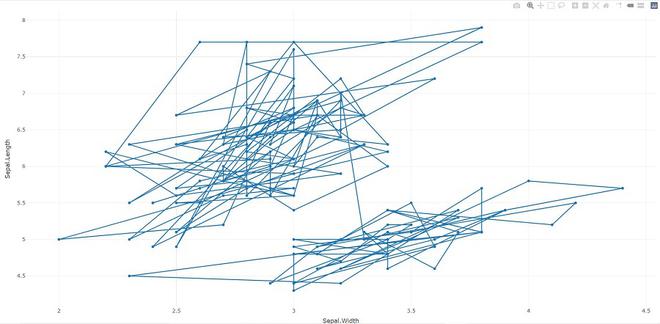
Adding Traces to Plotly Charts
Traces allow us to add new layers to an existing Plotly chart. This example adds both markers and lines to a scatter plot of Sepal Width vs. Sepal Length using the iris dataset.
R `
library(plotly)
p <- plot_ly(iris, x = ~Sepal.Width, y = ~Sepal.Length)
add_trace(p, type = "scatter", mode = "markers+lines")
`
**Output:
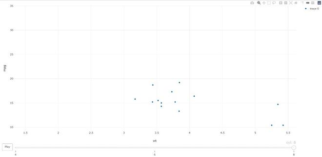
Animation in Plotly with animation_opts()
Plotly enables animated visualizations that show how data changes over time or across categories. The animation_opts() function controls the speed and transition behavior of these animations.
- Animations are created using the frame argument in plot_ly() or via ggplotly()
- Automatically includes play, pause and slider controls
- Allows customization of frame duration and transition effects
Syntax
animation_opts(p, frame = 500, transition = 500,
easing = "linear", redraw = TRUE, mode = "immediate")
Parameters:
- **frame: The time for each frame to display (in milliseconds).
- **transition: The speed at which one frame changes to the next.
- **easing: The type of animation effect (e.g., "linear" for a smooth transition).
- **redraw: If set to TRUE, the plot redraws for each new frame.
- **mode: When the animation should start. The default is "immediate".
Here we creates an animated scatter plot of weight (wt) versus miles per gallon (mpg) using the mtcars dataset, with animation frames based on cylinder count (cyl). The animation_opts() function sets the transition speed to 0 for immediate frame changes.
Python `
library(plotly)
plot_ly(mtcars, x = ~wt, y = ~mpg, frame = ~cyl) %>% animation_opts(transition = 0)
`
**Output:
Adding Data to a Plotly Visualization with add_data
The add_data() function allows us to add additional data to an existing Plotly visualization. This is useful when we want to layer new data or update a plot after its initial creation.
Syntax
add_data(p, data = NULL)
**Parameters:
- **p: The existing Plotly plot object.
- **data: The new data to be added to the plot.
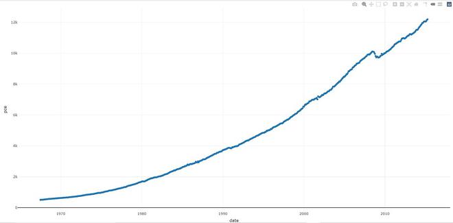
**Example: In this example, we will add the economics dataset to a Plotly plot and then add a trace (line plot) of date vs. pce (personal consumption expenditures).
R `
library(plotly)
plot_ly() %>% add_data(economics) %>% add_trace(x = ~date, y = ~pce)
`
**Output:
Saving Plotly Charts as Image Files
plotly_IMAGE function allows exporting an interactive Plotly visualization into a static image file. It supports multiple formats such as PNG, JPEG (raster), as well as SVG and PDF (vector graphics). This is useful for embedding charts into documents, presentations or reports where interactivity is not required.
Syntax
plotly_IMAGE(x, width = 1000, height = 500, format = "png", scale = 1, out_file, ...)
**Parameters:
- **x: The Plotly object to export.
- **width and **height: Dimensions of the output image in pixels.
- **format: Output format are "png", "jpeg", "svg" or "pdf".
- **scale: Scaling factor for the image.
- **out_file: The path where the file will be saved.
Example: The following example demonstrates how to export a Plotly chart as PNG, JPEG, SVG and PDF using the plotly_IMAGE() function, by specifying different output formats and file names.
R `
library(plotly)
p <- plot_ly(iris, x = ~Sepal.Width, y = ~Sepal.Length)
Png <- plotly_IMAGE(p, out_file = "plotly-test-image.png") Jpeg <- plotly_IMAGE(p, format = "jpeg", out_file = "plotly-test-image.jpeg")
Svg <- plotly_IMAGE(p, format = "svg",
out_file = "plotly-test-image.svg")
Pdf <- plotly_IMAGE(p, format = "pdf", out_file = "plotly-test-image.pdf")
`
**Output:
Plotly in R
The output shows a static scatter plot of Sepal Width vs. Sepal Length, exported as image files in various formats (PNG, JPEG, SVG and PDF) using the plotly_IMAGE() function.