Scatter Plot using Plotly in R (original) (raw)
Last Updated : 23 Jul, 2025
A scatter plot in R is a graphical tool used to display the relationship between two continuous variables. Each point represents one observation, with its position determined by values on the x and y axes.
Uses of Scatter Plot
We can use a scatter plot for the following
- To observe the relationship between two variables.
- To identify trends or patterns in data.
- To detect outliers.
Scatter Plots in R using Plotly
To create interactive scatter plots in R, we use the Plotly package, which offers interactive and customizable visualizations.
**1. Installing the Required Library
First, we have to install the Plotly package.
R `
install.packages("plotly")
`
**2. Loading the package
Now load the Plotly library to use its functions.
R `
library(plotly)
`
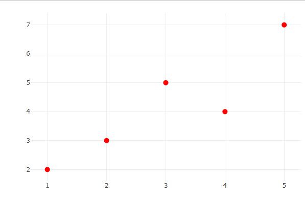
**3. Creating Basic Scatter Plot
Let's define two simple numeric vectors and create a basic scatter plot.
- **plot_ly(): This is the main function used to create interactive plots in R using the Plotly package. R `
x <- c(1, 2, 3, 4, 5) y <- c(2, 3, 5, 4, 7)
plot_ly(x = x, y = y, type = 'scatter', mode = 'markers')
`
**Output:

scatter plot using plotly in R
**4. Customizing Scatter Plots
We can enhance the plot by adding axis labels and a title.
- **x = x, y = y: These arguments specify the data to be plotted. The values in vector x are mapped to the x-axis and the values in vector y are mapped to the y-axis.
- **type = 'scatter': This tells Plotly to create a scatter plot, which displays individual data points.
- **mode = 'markers': This sets the plot to display only the data points (as dots or circles), without connecting lines or text labels. R `
plot_ly(x = x, y = y, type = 'scatter', mode = 'markers') %>% layout( xaxis = list(title = 'X-axis'), yaxis = list(title = 'Y-axis'), title = 'Customized Scatter Plot' )
`
**Output:

Customized Scatter Plot
**5. Changing Marker Color and Size
We adjust marker color and size to make the plot visually appealing.
R `
plot_ly(x = x, y = y, type = 'scatter', mode = 'markers', marker = list(color = 'red', size = 10))
`
**Output:
scatter plot using plotly in R
**6. Adding Regression Line
We overlay a regression line to show the trend in the data.
- **add_trace(): Adds a new layer to the existing plot. In this case, we’re adding a line to represent the regression model.
- **x = x: The x-values for the regression line match those of the original data.
- **y = lm(y ~ x)$fitted.values: Fits a simple linear regression model (y as a function of x) and extracts the predicted values to plot the trend.
- **mode = 'lines': Ensures the new trace is drawn as a continuous line, not as points or markers.
- **line = list(color = 'blue'): Sets the color of the regression line to blue.
- **name = 'Regression Line': Adds a legend label for the line trace. R `
plot_ly(x = x, y = y, type = 'scatter', mode = 'markers') %>% add_trace( x = x, y = lm(y ~ x)$fitted.values, mode = 'lines', line = list(color = 'blue'), name = 'Regression Line' )
`
**Output:
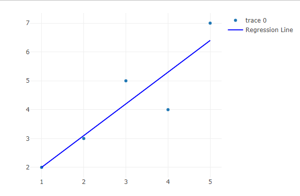
Adding Regression Line
**7. Multiple Scatter Plots
To create the first scatter plot, we start by plotting the first dataset (x1 and y1). In the code, plot_ly(x = x1, y = y1, type = 'scatter', mode = 'markers', name = 'Dataset 1'):
- **x = x1: Specifies the values of x1 will be plotted on the x-axis.
- **y = y1: Specifies the values of y1 will be plotted on the y-axis.
- **type = 'scatter': This defines the plot as a scatter plot.
- **mode = 'markers': This ensures that the points are plotted as individual markers (no connecting lines).
- **name = 'Dataset 1': Assigns a name to this trace for the legend, which will display as "Dataset 1".
Next, to add a second dataset (x2 and y2), we use add_trace(x = x2, y = y2, type = 'scatter', mode = 'markers', name = 'Dataset 2'):
- **x = x2: Specifies that x2 values will be plotted on the x-axis for the second dataset.
- **y = y2: Specifies that y2 values will be plotted on the y-axis for the second dataset.
- **type = 'scatter': Again, this defines the second trace as a scatter plot.
- **mode = 'markers': Ensures that the second dataset’s points are displayed as markers.
- **name = 'Dataset 2': Assigns the name "Dataset 2" to this second trace for the legend.
By using **add_trace(), the second dataset is added to the same plot, allowing both datasets to appear on the same graph with distinct labels.
R `
x1 <- c(1, 2, 3, 4, 5) y1 <- c(2, 3, 5, 4, 7)
x2 <- c(1, 2, 3, 4, 5) y2 <- c(3, 4, 2, 6, 5)
plot_ly(x = x1, y = y1, type = 'scatter', mode = 'markers', name = 'Dataset 1')%>% add_trace(x = x2, y = y2, type = 'scatter', mode = 'markers', name = 'Dataset 2')
`
**Output:

Multiple Scatter Plots
8. 3D Scatter Plot
We can also visualize data in three dimensions using scatter3d.
- **x, y, and **z: Represent the coordinates of each data point in 3D space.
- **type = 'scatter3d': Indicates that the plot will be three-dimensional.
- **mode = 'markers': Tells Plotly to display the data using markers.
- **marker = list(color = ...): Specifies how the markers should be colored. R `
x <- c(1, 2, 3, 4, 5) y <- c(2, 3, 5, 4, 7) z <- c(10, 8, 12, 9, 15) categories <- c("A", "B", "A", "C", "B")
category_colors <- c("red", "blue", "green")
plot_ly(x = x, y = y, z = z, type = 'scatter3d', mode = 'markers', marker = list(color = factor(categories, levels = unique(categories), labels = category_colors)))
`
**Output:

3D scatter plot
The 3D scatter plot makes it easy to see how the data points are spread out in space, with different colors showing different categories.