Social Media Usage Analytics Dashboard in R (original) (raw)
Last Updated : 23 Jun, 2025
A Social Media Usage Analytics Dashboard is a tool that helps businesses track and analyze their social media performance in one place. It collects data from various platforms like Facebook, Twitter and Instagram, providing real-time insights into key metrics such as follower growth, engagement rates (likes, shares, comments) and content performance.
The primary objective of the Social Media Usage Analytics Dashboard is to provide a comprehensive, real-time overview of social media performance. It aims to streamline data collection and visualization, enabling businesses to make informed decisions and optimize their social media strategies.
This dashboard enables marketers to:
- **Monitor Performance: See how well their social media strategies are working.
- **Identify Trends: Spot patterns in user engagement and content success.
- **Optimize Content: Learn what content works best and adjust accordingly.
- **Measure ROI: Assess the return on investment from social media efforts.
By visualizing this data, the dashboard makes it easier to make informed decisions and improve social media strategies effectively.
Here we use the "WeRateDogs" Twitter dataset is a collection of tweet data from the popular Twitter account @dog_rates. This account is known for its humorous and positive ratings of dog photos submitted by users. The dataset includes a variety of information about each tweet, including:
- **tweet_id: Unique identifier for each tweet.
- **in_reply_to_status_id: If the tweet is a reply, this field contains the ID of the original tweet.
- **in_reply_to_user_id: If the tweet is a reply, this field contains the user ID of the original tweet's author.
- **timestamp: The date and time when the tweet was created.
- **source: The source from which the tweet was posted (e.g., Twitter for iPhone).
- **text: The text content of the tweet.
- **retweeted_status_id: If the tweet is a retweet, this field contains the ID of the original tweet.
- **retweeted_status_user_id: If the tweet is a retweet, this field contains the user ID of the original tweet's author.
- **retweeted_status_timestamp: The date and time when the original tweet was retweeted.
- **expanded_urls: URLs included in the tweet.
- **rating_numerator: The numerator of the rating given to the dog (e.g., 12 in "12/10").
- **rating_denominator: The denominator of the rating given to the dog (e.g., 10 in "12/10").
- **name: The name of the dog, if mentioned.
- **doggo, floofer, pupper, puppo: Different categories of dogs mentioned in the tweet.
This dataset allows for analysis of various aspects of social media engagement, including the frequency of posts, the popularity of tweets (as measured by retweets and likes) and trends over time.
**Dataset link : twitter-archive-enhanced
Now we will discuss step by step to create Social Media Usage Analytics Dashboard in R Programming Language.
1. Installing and Loading the Required Libraries
First, ensure we have the necessary libraries installed. We can install them using the following commands:
R `
install.packages("shiny") install.packages("shinydashboard") install.packages("ggplot2") install.packages("dplyr") install.packages("tidyr") install.packages("readr") install.packages("DT")
library(shiny) library(shinydashboard) library(ggplot2) library(dplyr) library(tidyr) library(readr) library(DT)
`
2. Loading and Cleaning the Dataset
We can load our datatset using**read_csv()** and perform initial data cleaning.
R `
social_data <- read_csv("dataset.csv")
social_data <- social_data %>% mutate(date = as.Date(timestamp)) %>% mutate(retweet_count = ifelse(!is.na(retweeted_status_id), 1, 0)) %>% rename(likes = rating_numerator)
daily_data <- social_data %>% group_by(date) %>% summarise( likes = sum(likes, na.rm = TRUE), retweets = sum(retweet_count, na.rm = TRUE), tweets = n() )
`
3. Building the Shiny Dashboard
We create a Shiny app to make our analysis interactive. The basic structure of a Shiny app includes a UI and a server function. Define the layout and inputs for our dashboard. We define the structure using dashboardPage which includes:
- **Header: Title of the dashboard.
- **Sidebar: Menu items for navigating between different tabs ("Overview" and "Details").
- **Body: Contains tab items to display different plots and data tables.
- **First Row: Boxes for "Likes Over Time" and "Retweets Over Time" plots.
- **Second Row: Boxes for "Number of Tweets Over Time" and "Distribution of Ratings" plots.
- **Details Tab: Box for displaying a detailed data table of the dataset. R `
ui <- dashboardPage( dashboardHeader(title = "Social Media Analytics Dashboard"), dashboardSidebar( sidebarMenu( menuItem("Overview", tabName = "overview", icon = icon("dashboard")), menuItem("Details", tabName = "details", icon = icon("chart-line")) ) ), dashboardBody( tabItems( tabItem(tabName = "overview", fluidRow( box( title = "Likes Over Time", status = "primary", solidHeader = TRUE, collapsible = TRUE, plotOutput("likesPlot", height = 250) ), box( title = "Retweets Over Time", status = "primary", solidHeader = TRUE, collapsible = TRUE, plotOutput("retweetsPlot", height = 250) ) ), fluidRow( box( title = "Number of Tweets Over Time", status = "primary", solidHeader = TRUE, collapsible = TRUE, plotOutput("tweetsPlot", height = 250) ), box( title = "Distribution of Ratings", status = "primary", solidHeader = TRUE, collapsible = TRUE, plotOutput("ratingsPlot", height = 250) ) ) ), tabItem(tabName = "details", fluidRow( box( title = "Detailed Metrics", status = "primary", solidHeader = TRUE, collapsible = TRUE, dataTableOutput("detailsTable") ) ) ) ) ) )
`
4. Defining the Server Logic
We define the server logic to render the plot based on user input.
- **Likes Plot: Render a line plot showing likes over time.
- **Retweets Plot: Render a line plot showing retweets over time.
- **Tweets Plot: Render a line plot showing the number of tweets over time.
- **Ratings Plot: Render a histogram showing the distribution of ratings.
- **Detailed Metrics Table: Render a data table displaying the dataset. R `
server <- function(input, output) {
output$likesPlot <- renderPlot({ ggplot(daily_data, aes(x = date, y = likes)) + geom_line(color = "blue") + labs(title = "Likes Over Time", x = "Date", y = "Likes") + theme_minimal() })
output$retweetsPlot <- renderPlot({ ggplot(daily_data, aes(x = date, y = retweets)) + geom_line(color = "green") + labs(title = "Retweets Over Time", x = "Date", y = "Retweets") + theme_minimal() })
output$tweetsPlot <- renderPlot({ ggplot(daily_data, aes(x = date, y = tweets)) + geom_line(color = "purple") + labs(title = "Number of Tweets Over Time", x = "Date", y = "Number of Tweets") + theme_minimal() })
output$ratingsPlot <- renderPlot({ ggplot(social_data, aes(x = likes)) + geom_histogram(binwidth = 1, fill = "orange", color = "black") + labs(title = "Distribution of Ratings", x = "Rating", y = "Frequency") + theme_minimal() })
output$detailsTable <- renderDataTable({ datatable(social_data) }) }
`
5. Running the Application
We can run our Shiny app using the shinyApp function.
R `
shinyApp(ui = ui, server = server)
`
**Output:
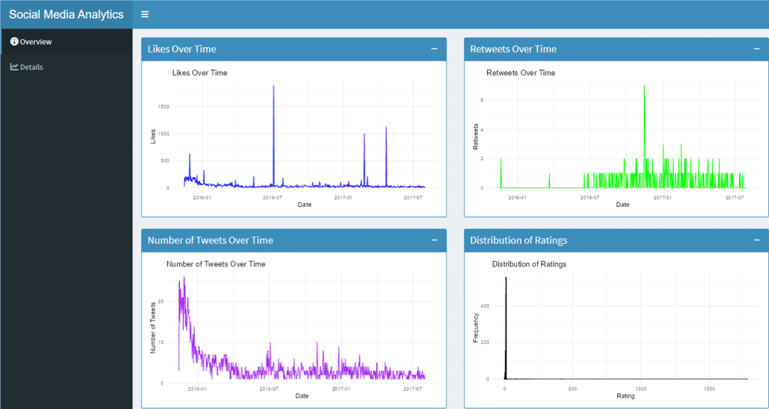
Social Media Usage Analytics Dashboard in R
Summary of the Dashboard
- **Likes Over Time: Visualizes the trend of likes over time.
- **Retweets Over Time: Visualizes the trend of retweets over time.
- **Number of Tweets Over Time: Visualizes the trend of tweet frequency over time.
- **Distribution of Ratings: Visualizes the distribution of dog ratings.
- **Detailed Metrics Table: Provides a detailed view of all data points in the dataset.
Conclusion
The Social Media Usage Analytics Dashboard provides a clear and interactive way to analyze the @dog_rates Twitter account's performance. By visualizing likes, retweets, tweet frequency and ratings, users can easily track engagement trends and gain insights into social media activity. This tool helps in understanding what content resonates most with the audience, making it valuable for optimizing social media strategies.