uibutton - Create push button or state button component - MATLAB (original) (raw)
Create push button or state button component
Syntax
Description
`btn` = uibutton creates a push button in a new figure and returns theButton object. MATLAB® calls the uifigure function to create the figure.
`btn` = uibutton([parent](#buimwfr-1%5Fsep%5Fmw%5Fa6330465-2069-40e4-857c-69da4d660066)) creates a button in the specified parent container. The parent can be a Figure object or one of its child containers.
`btn` = uibutton([style](#buimwfr-1-style)) creates a button of the specified style. The button style can be"push" or "state".
`btn` = uibutton([parent](#buimwfr-1%5Fsep%5Fmw%5Fa6330465-2069-40e4-857c-69da4d660066),[style](#buimwfr-1-style)) creates a button of the specified style in the specified parent container.
`btn` = uibutton(___,[Name,Value](#namevaluepairarguments)) creates a button with properties specified by one or more name-value arguments. For example, specify the button background color using the BackgroundColor property. Use this option with any of the input argument combinations in the previous syntaxes.
Examples
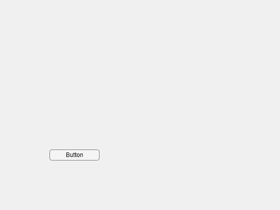
Create a push button in a UI figure.
fig = uifigure; b = uibutton(fig);
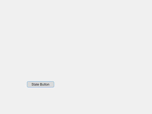
Create a state button in a UI figure.
fig = uifigure; b = uibutton(fig,"state");

Click the button. The button remains in the pressed state after you click it.
Create a state button in a UI figure, and customize its appearance by specifying property values.
fig = uifigure; b = uibutton(fig,"state", ... "Text","Play", ... "Icon","play.png", ... "IconAlignment","top", ... "Position",[100 100 50 50]);

Determine whether the state button is in its pressed state.
Programmatically update the button value so that it appears in its pressed state.

Create an app that plots some data when an app user presses a button.
In a file named plotApp.m, write a function that implements the app:
- Create a UI figure and a grid layout manager to lay out the app.
- Create UI axes and a button in the grid layout manager.
- Write a callback function named
plotButtonPushedthat plots some data in the UI axes, and assign the function to theButtonPushedFcncallback property. For more information about callbacks, see Create Callbacks for Apps Created Programmatically.
function plotApp fig = uifigure; g = uigridlayout(fig,[2 3]); g.RowHeight = {'1x','fit'}; g.ColumnWidth = {'1x','fit','1x'};
ax = uiaxes(g); ax.Layout.Row = 1; ax.Layout.Column = [1 3]; b = uibutton(g, ... "Text","Plot Data", ... "ButtonPushedFcn", @(src,event) plotButtonPushed(ax)); b.Layout.Row = 2; b.Layout.Column = 2; end
function plotButtonPushed(ax) x = linspace(0,2*pi,100); y = sin(x); plot(ax,x,y) end
Run the plotApp function. Click the button to plot the data.

Input Arguments
Style of button, specified as one of these values:
"push"— When clicked once, the button appears to press and release."state"— When clicked once, the button remains in the pressed or released state until it is clicked again.
Parent container, specified as a Figure object or one of its child containers: Tab, Panel, ButtonGroup, orGridLayout. If you do not specify a parent container, MATLAB calls the uifigure function to create a new Figure object that serves as the parent container.
Name-Value Arguments
Specify optional pairs of arguments asName1=Value1,...,NameN=ValueN, where Name is the argument name and Value is the corresponding value. Name-value arguments must appear after other arguments, but the order of the pairs does not matter.
Example: uibutton(fig,BackgroundColor="blue")
Before R2021a, use commas to separate each name and value, and enclose Name in quotes.
Example: uibutton(fig,"BackgroundColor","blue")
Each type of button object supports a different set of properties. For a full list of properties and descriptions for each type, see the associated property page.
- If
styleis"push"(default), see Button. - If
styleis"state", see StateButton.
Version History
Introduced in R2016a
Enable text markup by setting the Interpreter property. Specify the interpreter as "html","latex", "tex", or"none".
You can use these additional options when adding icons to a button:
- Specify the
Iconproperty as a predefined icon, such as'success'. - Specify the
IconAlignmentproperty as'leftmargin'or'rightmargin'to display the icon on the far left or far right of the button, regardless of the button text location.
Use the WordWrap property to prevent text from getting clipped horizontally when the width of the UI component is smaller than the text you want to display. Setting theWordWrap property to 'on' breaks the text into new lines so that each line fits within the component. It avoids breaking words when possible. When the property is set to 'off', the text does not wrap.