uidropdown - Create drop-down component - MATLAB (original) (raw)
Create drop-down component
Syntax
Description
`dd` = uidropdown creates a drop-down component in a new figure window and returns the DropDown object. MATLAB® calls the uifigure function to create the figure.
`dd` = uidropdown([parent](#buict8f-1%5Fsep%5Fmw%5Fa6330465-2069-40e4-857c-69da4d660066)) creates the drop-down component in the specified parent container. The parent can be a Figure object or one of its child containers.
`dd` = uidropdown(___,[Name,Value](#namevaluepairarguments)) specifies DropDown properties using one or more name-value arguments. For example, uidropdown("Editable","on") creates a drop-down component that enables typing. Use this option with any of the input argument combinations in the previous syntaxes.
Examples
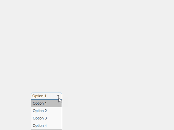
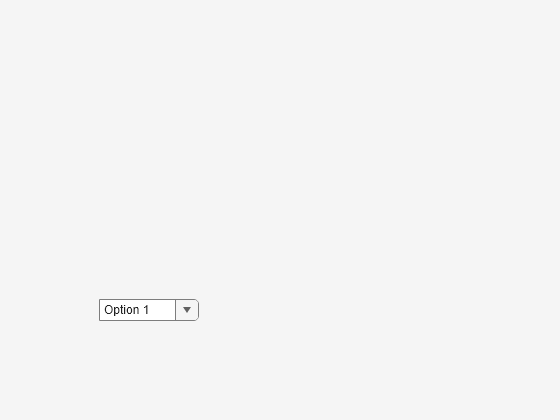
Create a drop-down component with the default items.
fig = uifigure; dd = uidropdown(fig);

Click anywhere in the component to open the drop-down list.
Create an editable drop-down component in a UI figure. Users can either choose from the existing items by clicking the drop-down arrow or enter their own value as text by clicking the component.
fig = uifigure; dd = uidropdown(fig,"Editable","on");
Create a drop-down component in a UI figure and specify the items.
fig = uifigure; dd = uidropdown(fig,"Items",["Red","Yellow","Blue","Green"]);

Determine the value associated with the selected item. When theItemsData property is empty (the default), the drop-down component Value property stores the name of the selected item as it appears in the Items property.
Associate a hexadecimal color code with each drop-down component item by specifying the ItemsData property.
dd.ItemsData = ["#F00" "#FF0" "#00F" "#0F0"];
When ItemsData is nonempty, the drop-down componentValue property stores the data associated with the selected item.
Since R2023a
Create a drop-down UI component with three items.
fig = uifigure; dd = uidropdown(fig,"Items",["Good","Fair","Poor"]);
Create three background color styles.
s1 = uistyle("BackgroundColor","#77AC30"); s2 = uistyle("BackgroundColor","#EDB120"); s3 = uistyle("BackgroundColor","#F77A8F");
Add the styles to the drop-down component items to change their background colors.
addStyle(dd,s1,"item",1); addStyle(dd,s2,"item",2); addStyle(dd,s3,"item",3);
The item background colors update, and the appearance of the component reflects the style of the selected item. The style does not change the color that displays when a user points to an item.

Create an app that changes the color of a plotted line when an app user makes a selection from a drop-down list.
In a file named plotOptions.m, write a function that implements the app:
- Create a UI figure and a grid layout manager to lay out the app.
- Create UI axes and a drop-down component in the grid layout manager.
- Write a callback function named
updatePlotthat changes the plot color based on the selected drop-down component item, and assign the function to theValueChangedFcncallback property. For more information about callbacks, see Create Callbacks for Apps Created Programmatically.
function plotOptions fig = uifigure; g = uigridlayout(fig); g.RowHeight = {'1x','fit','1x'}; g.ColumnWidth = {'1x','fit'};
ax = uiaxes(g); ax.Layout.Row = [1 3]; ax.Layout.Column = 1;
x = linspace(-2pi,2pi); y = sin(x); p = plot(ax,x,y,"Color","#F00");
dd = uidropdown(g, ... "Items",["Red","Yellow","Blue","Green"], ... "ItemsData",["#F00" "#FF0" "#00F" "#0F0"], ... "ValueChangedFcn",@(src,event) updatePlot(src,p)); dd.Layout.Row = 2; dd.Layout.Column = 2; end
function updatePlot(src,p) val = src.Value; p.Color = val; end
Run the plotOptions function. Select an item from the drop-down list to change the plot color.

Create an app that allows a user to choose an image to display. Because the app contains an editable drop-down component, write your code to handle users selecting an existing item and users entering their own value.
In a file named imageApp.m, write a function that implements the app:
- Create a UI figure and a grid layout manager to lay out the app.
- Create an editable drop-down component and an image component in the grid layout manager.
- Write a callback function named
updateImagethat changes the image based on the selected drop-down component item, and assign the function to theValueChangedFcncallback property. Query the callback event data to check if the new value was selected from the existing items or was entered by the user, and validate any user-entered value. For more information about callbacks, see Create Callbacks for Apps Created Programmatically.
function imageApp fig = uifigure; g = uigridlayout(fig,[2 3]); g.RowHeight = {22,'1x'}; g.ColumnWidth = {'1x','fit','1x'};
dd = uidropdown(g, ... "Editable","on", ... "Items",["peppers.png","street1.jpg"]); dd.Layout.Row = 1; dd.Layout.Column = 2;
im = uiimage(g,"ImageSource","peppers.png"); im.Layout.Row = 2; im.Layout.Column = [1 3];
dd.ValueChangedFcn = @(src,event)updateImage(src,event,im,fig); end
function updateImage(src,event,im,fig) val = src.Value; if event.Edited && ~exist(val,"file") im.ImageSource = ""; uialert(fig,"Enter a file on the MATLAB path","Invalid Image") else im.ImageSource = val; end end
Run the imageApp function and update the image by selecting an existing item or by entering your own image path.

Input Arguments
Parent container, specified as a Figure object or one of its child containers: Tab, Panel, ButtonGroup, orGridLayout. If you do not specify a parent container, MATLAB calls the uifigure function to create a new Figure object that serves as the parent container.
Name-Value Arguments
Specify optional pairs of arguments asName1=Value1,...,NameN=ValueN, where Name is the argument name and Value is the corresponding value. Name-value arguments must appear after other arguments, but the order of the pairs does not matter.
Example: uidropdown(Items=["Red","Yellow","Blue"]) specifies the options presented in the drop-down component.
Before R2021a, use commas to separate each name and value, and enclose Name in quotes.
Example: uidropdown("Items",["Red","Yellow","Blue"]) specifies the options presented in the drop-down component.
The properties listed here are a subset of the available properties. For the full list, see DropDown.
Drop-down menu opening callback, specified as one of these values:
- A function handle.
- A cell array in which the first element is a function handle. Subsequent elements in the cell array are the arguments to pass to the callback function.
- A character vector containing a valid MATLAB expression (not recommended). MATLAB evaluates this expression in the base workspace.
This property specifies a callback function to execute when the user clicks to open the drop-down menu. A possible use for this callback is to dynamically update the list of entries in the drop-down menu.
This callback function can access specific information about the user’s interaction with the drop-down. MATLAB passes this information in a DropDownOpeningData object as the second argument to your callback function. In App Designer, the argument is called event. You can query the object properties using dot notation. For example,event.Source returns the DropDown object that the user interacts with to trigger the callback. The DropDownOpeningData object is not available to callback functions specified as character vectors.
The following table lists the properties of the DropDownOpeningData object.
| Property | Value |
|---|---|
| Source | Component that executes the callback |
| EventName | 'DropDownOpening' |
For more information about writing callbacks, see Callbacks in App Designer.
Version History
Introduced in R2016a
Access the index of the component value in the list of items by using theValueIndex property.
Create styles for drop-down components using the uistyle function, and add the styles to individual items or entire drop-down components using the addStyle function.
Use the ClickedFcn callback property to program a response to a user clicking the drop-down component.
For more information, see DropDown.
Provide a short hint that describes the expected drop-down component input by using the Placeholder property.
For more information, see DropDown.