plot - 2-D line plot - MATLAB (original) (raw)
Main Content

Syntax
Description
Vector and Matrix Data
plot([X](#mw%5F6748a9ec-33eb-483b-b8f1-919954dfae40),[Y](#mw%5F52c5aef5-9f3e-4d29-b95f-485d73104bec)) creates a 2-D line plot of the data in Y versus the corresponding values in X.
- To plot a set of coordinates connected by line segments, specify
XandYas vectors of the same length. - To plot multiple sets of coordinates on the same set of axes, specify at least one of
XorYas a matrix.
plot([X](#mw%5F6748a9ec-33eb-483b-b8f1-919954dfae40),[Y](#mw%5F52c5aef5-9f3e-4d29-b95f-485d73104bec),[LineSpec](#btzitot%5Fsep%5Fmw%5F3a76f056-2882-44d7-8e73-c695c0c54ca8)) creates the plot using the specified line style, marker, and color.
plot([X](#mw%5F6748a9ec-33eb-483b-b8f1-919954dfae40)1,[Y](#mw%5F52c5aef5-9f3e-4d29-b95f-485d73104bec)1,...,[X](#mw%5F6748a9ec-33eb-483b-b8f1-919954dfae40)n,[Y](#mw%5F52c5aef5-9f3e-4d29-b95f-485d73104bec)n) plots multiple pairs of _x_- and_y_-coordinates on the same set of axes. Use this syntax as an alternative to specifying coordinates as matrices.
plot([X](#mw%5F6748a9ec-33eb-483b-b8f1-919954dfae40)1,[Y](#mw%5F52c5aef5-9f3e-4d29-b95f-485d73104bec)1,[LineSpec](#btzitot%5Fsep%5Fmw%5F3a76f056-2882-44d7-8e73-c695c0c54ca8)1,...,[X](#mw%5F6748a9ec-33eb-483b-b8f1-919954dfae40)n,[Y](#mw%5F52c5aef5-9f3e-4d29-b95f-485d73104bec)n,[LineSpec](#btzitot%5Fsep%5Fmw%5F3a76f056-2882-44d7-8e73-c695c0c54ca8)n) assigns specific line styles, markers, and colors to each_x_-y pair. You can specifyLineSpec for some_x_-y pairs and omit it for others. For example, plot(X1,Y1,"o",X2,Y2) specifies markers for the first _x_-y pair but not for the second pair.
plot([Y](#mw%5F52c5aef5-9f3e-4d29-b95f-485d73104bec)) plots Y against an implicit set of _x_-coordinates.
- If
Yis a vector, the_x_-coordinates range from 1 tolength(Y). - If
Yis a matrix, the plot contains one line for each column inY. The_x_-coordinates range from 1 to the number of rows inY.
If Y contains complex numbers, MATLAB® plots the imaginary part of Y versus the real part of Y. If you specify both X andY, the imaginary part is ignored.
plot([Y](#mw%5F52c5aef5-9f3e-4d29-b95f-485d73104bec),[LineSpec](#btzitot%5Fsep%5Fmw%5F3a76f056-2882-44d7-8e73-c695c0c54ca8)) plots Y using implicit _x_-coordinates, and specifies the line style, marker, and color.
Table Data
plot([tbl](#btzitot%5Fsep%5Fmw%5F1f5b8358-45d8-4c4d-8a0d-17e2da07c841),[xvar](#mw%5F08d91519-e234-43ae-aad7-307c49ddde7f),[yvar](#mw%5Fa9274880-b52a-4c2d-a563-eabbbab54d81)) plots the variables xvar and yvar from the table tbl. To plot one data set, specify one variable forxvar and one variable for yvar. To plot multiple data sets, specify multiple variables for xvar,yvar, or both. If both arguments specify multiple variables, they must specify the same number of variables. (since R2022a)
plot([tbl](#btzitot%5Fsep%5Fmw%5F1f5b8358-45d8-4c4d-8a0d-17e2da07c841),[yvar](#mw%5Fa9274880-b52a-4c2d-a563-eabbbab54d81)) plots the specified variable from the table against the row indices of the table. If the table is a timetable, the specified variable is plotted against the row times of the timetable. (since R2022a)
Additional Options
plot([ax](#btzitot-ax),___) displays the plot in the target axes. Specify the axes as the first argument in any of the previous syntaxes.
plot(___,[Name,Value](#namevaluepairarguments)) specifies Line properties using one or more name-value arguments. The properties apply to all the plotted lines. Specify the name-value arguments after all the arguments in any of the previous syntaxes. For a list of properties, see Line Properties.
p = plot(___) returns aLine object or an array of Line objects. Use p to modify properties of the plot after creating it. For a list of properties, see Line Properties.
Examples
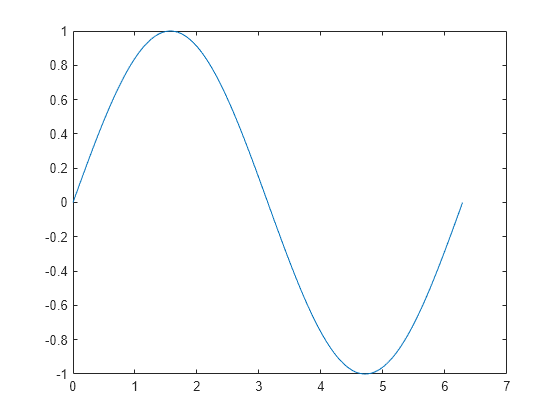
Create Line Plot
Create x as a vector of linearly spaced values between 0 and 2π. Use an increment of π/100 between the values. Create y as sine values of x. Create a line plot of the data.
x = 0:pi/100:2*pi; y = sin(x); plot(x,y)
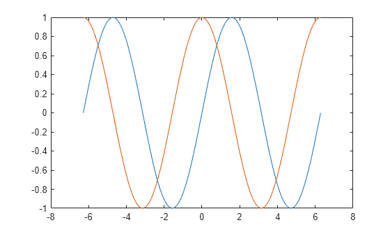
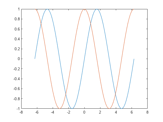
Plot Multiple Lines
Define x as 100 linearly spaced values between -2π and 2π. Define y1 and y2 as sine and cosine values of x. Create a line plot of both sets of data.
x = linspace(-2pi,2pi); y1 = sin(x); y2 = cos(x);
figure plot(x,y1,x,y2)
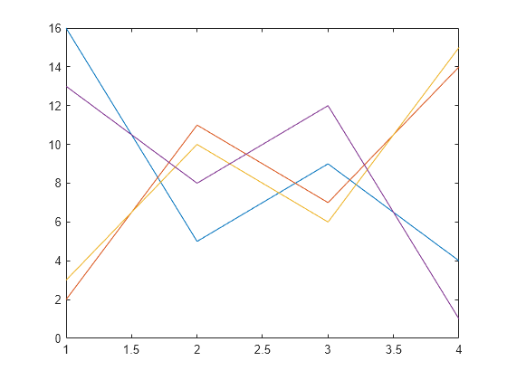
Create Line Plot From Matrix
Define Y as the 4-by-4 matrix returned by the magic function.
Y = 4×4
16     2     3    13
 5    11    10     8
 9     7     6    12
 4    14    15     1
Create a 2-D line plot of Y. MATLAB® plots each matrix column as a separate line.
Specify Line Style
Plot three sine curves with a small phase shift between each line. Use the default line style for the first line. Specify a dashed line style for the second line and a dotted line style for the third line.
x = 0:pi/100:2*pi; y1 = sin(x); y2 = sin(x-0.25); y3 = sin(x-0.5);
figure plot(x,y1,x,y2,'--',x,y3,':')
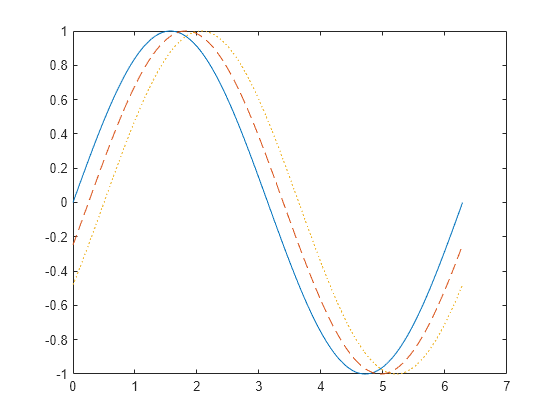
MATLAB® cycles the line color through the default color order.
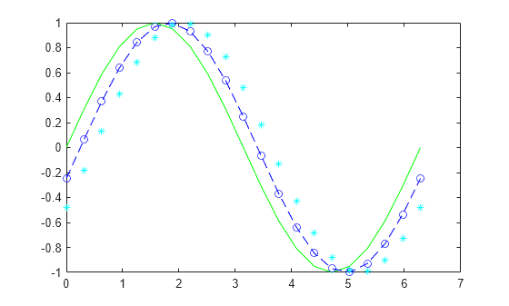
Specify Line Style, Color, and Marker
Plot three sine curves with a small phase shift between each line. Use a green line with no markers for the first sine curve. Use a blue dashed line with circle markers for the second sine curve. Use only cyan star markers for the third sine curve.
x = 0:pi/10:2*pi; y1 = sin(x); y2 = sin(x-0.25); y3 = sin(x-0.5);
figure plot(x,y1,'g',x,y2,'b--o',x,y3,'c*')
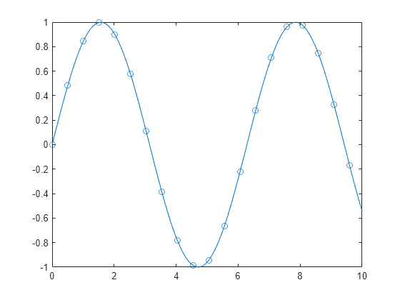
Display Markers at Specific Data Points
Create a line plot and display markers at every fifth data point by specifying a marker symbol and setting the MarkerIndices property as a name-value pair.
x = linspace(0,10); y = sin(x); plot(x,y,'-o','MarkerIndices',1:5:length(y))
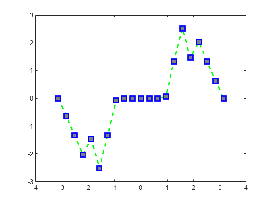
Specify Line Width, Marker Size, and Marker Color
Create a line plot and use the LineSpec option to specify a dashed green line with square markers. Use Name,Value pairs to specify the line width, marker size, and marker colors. Set the marker edge color to blue and set the marker face color using an RGB color value.
x = -pi:pi/10:pi; y = tan(sin(x)) - sin(tan(x));
figure plot(x,y,'--gs',... 'LineWidth',2,... 'MarkerSize',10,... 'MarkerEdgeColor','b',... 'MarkerFaceColor',[0.5,0.5,0.5])
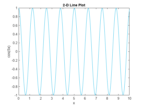
Add Title and Axis Labels
Use the linspace function to define x as a vector of 150 values between 0 and 10. Define y as cosine values of x.
x = linspace(0,10,150); y = cos(5*x);
Create a 2-D line plot of the cosine curve. Change the line color to a shade of blue-green using an RGB color value. Add a title and axis labels to the graph using the title, xlabel, and ylabel functions.
figure plot(x,y,'Color',[0,0.7,0.9])
title('2-D Line Plot') xlabel('x') ylabel('cos(5x)')
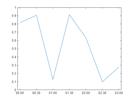
Plot Durations and Specify Tick Format
Define t as seven linearly spaced duration values between 0 and 3 minutes. Plot random data and specify the format of the duration tick marks using the 'DurationTickFormat' name-value pair argument.
t = 0:seconds(30):minutes(3); y = rand(1,7);
plot(t,y,'DurationTickFormat','mm:ss')
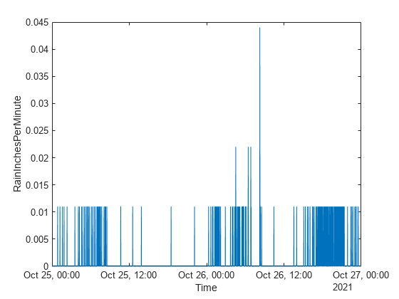
Plot Coordinates from a Table
Since R2022a
A convenient way to plot data from a table is to pass the table to the plot function and specify the variables to plot.
Read weather.csv as a timetable tbl. Then display the first three rows of the table.
tbl = readtimetable("weather.csv"); tbl = sortrows(tbl); head(tbl,3)
        Time            WindDirection    WindSpeed    Humidity    Temperature    RainInchesPerMinute    CumulativeRainfall    PressureHg    PowerLevel    LightIntensity
____________________    _____________    _________    ________    ___________    ___________________    __________________    __________    __________    ______________

25-Oct-2021 00:00:09         46               1          84          49.2                 0                     0               29.96          4.14             0
25-Oct-2021 00:01:09         45             1.6          84          49.2                 0                     0               29.96         4.139             0
25-Oct-2021 00:02:09         36             2.2          84          49.2                 0                     0               29.96         4.138             0
Plot the row times on the _x_-axis and the RainInchesPerMinute variable on the _y_-axis. When you plot data from a timetable, the row times are plotted on the _x_-axis by default. Thus, you do not need to specify the Time variable. Return the Line object as p. Notice that the axis labels match the variable names.
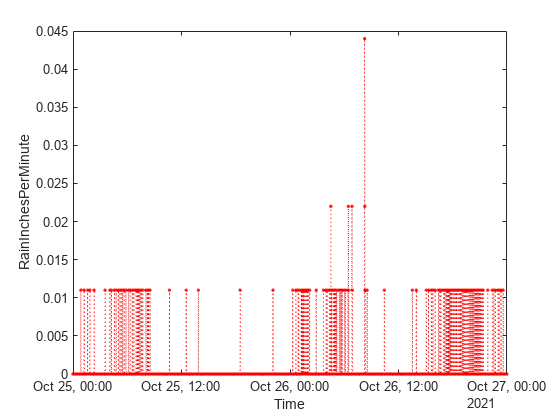
p = plot(tbl,"RainInchesPerMinute");
To modify aspects of the line, set the LineStyle, Color, and Marker properties on the Line object. For example, change the line to a red dotted line with point markers.
p.LineStyle = ":"; p.Color = "red"; p.Marker = ".";
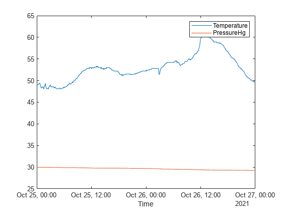
Plot Multiple Table Variables on One Axis
Since R2022a
Read weather.csv as a timetable tbl, and display the first few rows of the table.
tbl = readtimetable("weather.csv"); head(tbl,3)
        Time            WindDirection    WindSpeed    Humidity    Temperature    RainInchesPerMinute    CumulativeRainfall    PressureHg    PowerLevel    LightIntensity
____________________    _____________    _________    ________    ___________    ___________________    __________________    __________    __________    ______________

25-Oct-2021 00:00:09         46               1          84          49.2                 0                     0               29.96          4.14             0
25-Oct-2021 00:01:09         45             1.6          84          49.2                 0                     0               29.96         4.139             0
25-Oct-2021 00:02:09         36             2.2          84          49.2                 0                     0               29.96         4.138             0
Plot the row times on the _x_-axis and the Temperature and PressureHg variables on the _y_-axis. When you plot data from a timetable, the row times are plotted on the _x_-axis by default. Thus, you do not need to specify the Time variable.
Add a legend. Notice that the legend labels match the variable names.
plot(tbl,["Temperature" "PressureHg"]) legend
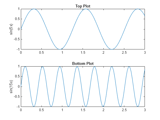
Specify Axes for Line Plot
Call the tiledlayout function to create a 2-by-1 tiled chart layout. Call the nexttile function to create an axes object and return the object as ax1. Create the top plot by passing ax1 to the plot function. Add a title and _y_-axis label to the plot by passing the axes to the title and ylabel functions. Repeat the process to create the bottom plot.
% Create data and 2-by-1 tiled chart layout x = linspace(0,3); y1 = sin(5x); y2 = sin(15x); tiledlayout(2,1)
% Top plot ax1 = nexttile; plot(ax1,x,y1) title(ax1,'Top Plot') ylabel(ax1,'sin(5x)')
% Bottom plot ax2 = nexttile; plot(ax2,x,y2) title(ax2,'Bottom Plot') ylabel(ax2,'sin(15x)')
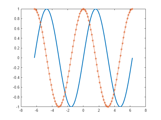
Modify Lines After Creation
Define x as 100 linearly spaced values between -2π and 2π. Define y1 and y2 as sine and cosine values of x. Create a line plot of both sets of data and return the two chart lines in p.
x = linspace(-2pi,2pi); y1 = sin(x); y2 = cos(x); p = plot(x,y1,x,y2);
Change the line width of the first line to 2. Add star markers to the second line. Use dot notation to set properties.
p(1).LineWidth = 2; p(2).Marker = '*';
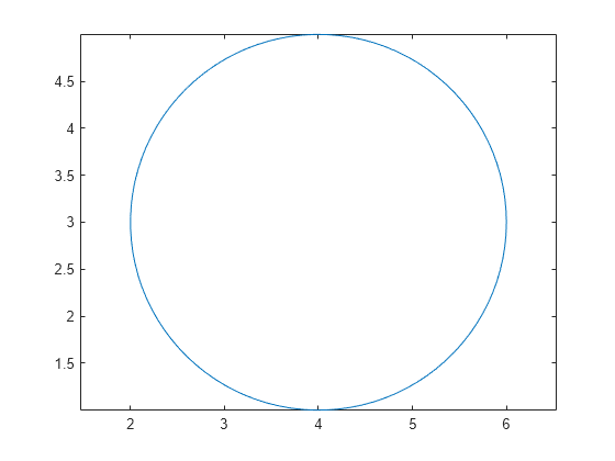
Plot Circle
Plot a circle centered at the point (4,3) with a radius equal to 2. Use axis equal to use equal data units along each coordinate direction.
r = 2; xc = 4; yc = 3;
theta = linspace(0,2pi); x = rcos(theta) + xc; y = r*sin(theta) + yc; plot(x,y) axis equal
Input Arguments
X — _x_-coordinates
scalar | vector | matrix
_x_-coordinates, specified as a scalar, vector, or matrix. The size and shape of X depends on the shape of your data and the type of plot you want to create. This table describes the most common situations.
| Type of Plot | How to Specify Coordinates |
|---|---|
| Single point | Specify X and Y as scalars and include a marker. For example:plot(1,2,"o") |
| One set of points | Specify X andY as any combination of row or column vectors of the same length. For example:plot([1 2 3],[4; 5; 6]) |
| Multiple sets of points (using vectors) | Specify consecutive pairs ofX and Y vectors. For example:plot([1 2 3],[4 5 6],[1 2 3],[7 8 9]) |
| Multiple sets of points(using matrices) | If all the sets share the same_x_- or_y_-coordinates, specify the shared coordinates as a vector and the other coordinates as a matrix. The length of the vector must match one of the dimensions of the matrix. For example:plot([1 2 3],[4 5 6; 7 8 9])If the matrix is square, MATLAB plots one line for each column in the matrix. Alternatively, specifyX and Y as matrices of equal size. In this case, MATLAB plots each column ofY against the corresponding column of X. For example:plot([1 2 3; 4 5 6],[7 8 9; 10 11 12]) |
Data Types: single | double | int8 | int16 | int32 | int64 | uint8 | uint16 | uint32 | uint64 | categorical | datetime | duration
Y — _y_-coordinates
scalar | vector | matrix
_y_-coordinates, specified as a scalar, vector, or matrix. The size and shape of Y depends on the shape of your data and the type of plot you want to create. This table describes the most common situations.
| Type of Plot | How to Specify Coordinates |
|---|---|
| Single point | Specify X and Y as scalars and include a marker. For example:plot(1,2,"o") |
| One set of points | Specify X andY as any combination of row or column vectors of the same length. For example:plot([1 2 3],[4; 5; 6])Alternatively, specify just the _y_-coordinates. For example:plot([4 5 6]) |
| Multiple sets of points (using vectors) | Specify consecutive pairs ofX and Y vectors. For example:plot([1 2 3],[4 5 6],[1 2 3],[7 8 9]) |
| Multiple sets of points(using matrices) | If all the sets share the same_x_- or_y_-coordinates, specify the shared coordinates as a vector and the other coordinates as a matrix. The length of the vector must match one of the dimensions of the matrix. For example:plot([1 2 3],[4 5 6; 7 8 9])If the matrix is square, MATLAB plots one line for each column in the matrix. Alternatively, specifyX and Y as matrices of equal size. In this case, MATLAB plots each column ofY against the corresponding column of X. For example:plot([1 2 3; 4 5 6],[7 8 9; 10 11 12]) |
Data Types: single | double | int8 | int16 | int32 | int64 | uint8 | uint16 | uint32 | uint64 | categorical | datetime | duration
LineSpec — Line style, marker, and color
string scalar | character vector
Line style, marker, and color, specified as a string scalar or character vector containing symbols. The symbols can appear in any order. You do not need to specify all three characteristics (line style, marker, and color). For example, if you omit the line style and specify the marker, then the plot shows only the marker and no line.
Example: "--or" is a red dashed line with circle markers.
| Line Style | Description | Resulting Line |
|---|---|---|
| "-" | Solid line |  |
| "--" | Dashed line |  |
| ":" | Dotted line |  |
| "-." | Dash-dotted line |  |
| Marker | Description | Resulting Marker |
|---|---|---|
| "o" | Circle |  |
| "+" | Plus sign |  |
| "*" | Asterisk |  |
| "." | Point |  |
| "x" | Cross |  |
| "_" | Horizontal line |  |
| "|" | Vertical line |  |
| "square" | Square |  |
| "diamond" | Diamond |  |
| "^" | Upward-pointing triangle |  |
| "v" | Downward-pointing triangle |  |
| ">" | Right-pointing triangle |  |
| "<" | Left-pointing triangle |  |
| "pentagram" | Pentagram |  |
| "hexagram" | Hexagram |  |
| Color Name | Short Name | RGB Triplet | Appearance |
|---|---|---|---|
| "red" | "r" | [1 0 0] |  |
| "green" | "g" | [0 1 0] |  |
| "blue" | "b" | [0 0 1] |  |
| "cyan" | "c" | [0 1 1] |  |
| "magenta" | "m" | [1 0 1] |  |
| "yellow" | "y" | [1 1 0] |  |
| "black" | "k" | [0 0 0] |  |
| "white" | "w" | [1 1 1] |  |
tbl — Source table
table | timetable
Source table containing the data to plot, specified as a table or a timetable.
xvar — Table variables containing _x_-coordinates
string array | character vector | cell array | pattern | numeric scalar or vector | logical vector | vartype()
Table variables containing the _x_-coordinates, specified using one of the indexing schemes from the table.
| Indexing Scheme | Examples |
|---|---|
| Variable names: A string, character vector, or cell array.A pattern object. | "A" or 'A' — A variable named A["A","B"] or {'A','B'} — Two variables named A andB"Var"+digitsPattern(1) — Variables named"Var" followed by a single digit |
| Variable index: An index number that refers to the location of a variable in the table.A vector of numbers.A logical vector. Typically, this vector is the same length as the number of variables, but you can omit trailing0 or false values. | 3 — The third variable from the table[2 3] — The second and third variables from the table[false false true] — The third variable |
| Variable type: A vartype subscript that selects variables of a specified type. | vartype("categorical") — All the variables containing categorical values |
The table variables you specify can contain numeric, categorical, datetime, or duration values. If xvar andyvar both specify multiple variables, the number of variables must be the same.
Example: plot(tbl,["x1","x2"],"y") specifies the table variables named x1 and x2 for the_x_-coordinates.
Example: plot(tbl,2,"y") specifies the second variable for the _x_-coordinates.
Example: plot(tbl,vartype("numeric"),"y") specifies all numeric variables for the _x_-coordinates.
yvar — Table variables containing _y_-coordinates
string array | character vector | cell array | pattern | numeric scalar or vector | logical vector | vartype()
Table variables containing the _y_-coordinates, specified using one of the indexing schemes from the table.
| Indexing Scheme | Examples |
|---|---|
| Variable names: A string, character vector, or cell array.A pattern object. | "A" or 'A' — A variable named A["A","B"] or {'A','B'} — Two variables named A andB"Var"+digitsPattern(1) — Variables named"Var" followed by a single digit |
| Variable index: An index number that refers to the location of a variable in the table.A vector of numbers.A logical vector. Typically, this vector is the same length as the number of variables, but you can omit trailing0 or false values. | 3 — The third variable from the table[2 3] — The second and third variables from the table[false false true] — The third variable |
| Variable type: A vartype subscript that selects variables of a specified type. | vartype("categorical") — All the variables containing categorical values |
The table variables you specify can contain numeric, categorical, datetime, or duration values. If xvar andyvar both specify multiple variables, the number of variables must be the same.
Example: plot(tbl,"x",["y1","y2"]) specifies the table variables named y1 and y2 for the_y_-coordinates.
Example: plot(tbl,"x",2) specifies the second variable for the _y_-coordinates.
Example: plot(tbl,"x",vartype("numeric")) specifies all numeric variables for the _y_-coordinates.
ax — Target axes
Axes object | PolarAxes object | GeographicAxes object
Target axes, specified as an Axes object, aPolarAxes object, or aGeographicAxes object. If you do not specify the axes, MATLAB plots into the current axes or it creates anAxes object if one does not exist.
To create a polar plot or geographic plot, specify ax as a PolarAxes or GeographicAxes object. Alternatively, call the polarplot or geoplot function.
Name-Value Arguments
Specify optional pairs of arguments asName1=Value1,...,NameN=ValueN, where Name is the argument name and Value is the corresponding value. Name-value arguments must appear after other arguments, but the order of the pairs does not matter.
Example: plot([0 1],[2 3],LineWidth=2)
Before R2021a, use commas to separate each name and value, and enclose Name in quotes.
Example: plot([0 1],[2 3],"LineWidth",2)
Note
The properties listed here are only a subset. For a complete list, seeLine Properties.
Color — Line color
[0 0.4470 0.7410] (default) | RGB triplet | hexadecimal color code | "r" | "g" | "b" | ...
Line color, specified as an RGB triplet, a hexadecimal color code, a color name, or a short name.
For a custom color, specify an RGB triplet or a hexadecimal color code.
- An RGB triplet is a three-element row vector whose elements specify the intensities of the red, green, and blue components of the color. The intensities must be in the range
[0,1], for example,[0.4 0.6 0.7]. - A hexadecimal color code is a string scalar or character vector that starts with a hash symbol (
#) followed by three or six hexadecimal digits, which can range from0toF. The values are not case sensitive. Therefore, the color codes"#FF8800","#ff8800","#F80", and"#f80"are equivalent.
Alternatively, you can specify some common colors by name. This table lists the named color options, the equivalent RGB triplets, and hexadecimal color codes.
| Color Name | Short Name | RGB Triplet | Hexadecimal Color Code | Appearance |
|---|---|---|---|---|
| "red" | "r" | [1 0 0] | "#FF0000" | |
| "green" | "g" | [0 1 0] | "#00FF00" | |
| "blue" | "b" | [0 0 1] | "#0000FF" | |
| "cyan" | "c" | [0 1 1] | "#00FFFF" | |
| "magenta" | "m" | [1 0 1] | "#FF00FF" | |
| "yellow" | "y" | [1 1 0] | "#FFFF00" | |
| "black" | "k" | [0 0 0] | "#000000" | |
| "white" | "w" | [1 1 1] | "#FFFFFF" | |
| "none" | Not applicable | Not applicable | Not applicable | No color |
Here are the RGB triplets and hexadecimal color codes for the default colors MATLAB uses in many types of plots.
| RGB Triplet | Hexadecimal Color Code | Appearance |
|---|---|---|
| [0 0.4470 0.7410] | "#0072BD" | ![Sample of RGB triplet [0 0.4470 0.7410], which appears as dark blue](https://www.mathworks.com/help/matlab/ref/colororder1.png) |
| [0.8500 0.3250 0.0980] | "#D95319" | ![Sample of RGB triplet [0.8500 0.3250 0.0980], which appears as dark orange](https://www.mathworks.com/help/matlab/ref/colororder2.png) |
| [0.9290 0.6940 0.1250] | "#EDB120" | ![Sample of RGB triplet [0.9290 0.6940 0.1250], which appears as dark yellow](https://www.mathworks.com/help/matlab/ref/colororder3.png) |
| [0.4940 0.1840 0.5560] | "#7E2F8E" | ![Sample of RGB triplet [0.4940 0.1840 0.5560], which appears as dark purple](https://www.mathworks.com/help/matlab/ref/colororder4.png) |
| [0.4660 0.6740 0.1880] | "#77AC30" | ![Sample of RGB triplet [0.4660 0.6740 0.1880], which appears as medium green](https://www.mathworks.com/help/matlab/ref/colororder5.png) |
| [0.3010 0.7450 0.9330] | "#4DBEEE" | ![Sample of RGB triplet [0.3010 0.7450 0.9330], which appears as light blue](https://www.mathworks.com/help/matlab/ref/colororder6.png) |
| [0.6350 0.0780 0.1840] | "#A2142F" | ![Sample of RGB triplet [0.6350 0.0780 0.1840], which appears as dark red](https://www.mathworks.com/help/matlab/ref/colororder7.png) |
Example: "blue"
Example: [0 0 1]
Example: "#0000FF"
Line style, specified as one of the options listed in this table.
| Line Style | Description | Resulting Line |
|---|---|---|
| "-" | Solid line | |
| "--" | Dashed line | |
| ":" | Dotted line | |
| "-." | Dash-dotted line | |
| "none" | No line | No line |
Line width, specified as a positive value in points, where 1 point = 1/72 of an inch. If the line has markers, then the line width also affects the marker edges.
The line width cannot be thinner than the width of a pixel. If you set the line width to a value that is less than the width of a pixel on your system, the line displays as one pixel wide.
Marker symbol, specified as one of the values listed in this table. By default, the object does not display markers. Specifying a marker symbol adds markers at each data point or vertex.
| Marker | Description | Resulting Marker |
|---|---|---|
| "o" | Circle | |
| "+" | Plus sign | |
| "*" | Asterisk | |
| "." | Point | |
| "x" | Cross | |
| "_" | Horizontal line | |
| "|" | Vertical line | |
| "square" | Square | |
| "diamond" | Diamond | |
| "^" | Upward-pointing triangle | |
| "v" | Downward-pointing triangle | |
| ">" | Right-pointing triangle | |
| "<" | Left-pointing triangle | |
| "pentagram" | Pentagram | |
| "hexagram" | Hexagram | |
| "none" | No markers | Not applicable |
Indices of data points at which to display markers, specified as a vector of positive integers. If you do not specify the indices, then MATLAB displays a marker at every data point.
Note
To see the markers, you must also specify a marker symbol.
Example: plot(x,y,"-o","MarkerIndices",[1 5 10]) displays a circle marker at the first, fifth, and tenth data points.
Example: plot(x,y,"-x","MarkerIndices",1:3:length(y)) displays a cross marker every three data points.
Example: plot(x,y,"Marker","square","MarkerIndices",5) displays one square marker at the fifth data point.
Marker outline color, specified as "auto", an RGB triplet, a hexadecimal color code, a color name, or a short name. The default value of"auto" uses the same color as the Color property.
For a custom color, specify an RGB triplet or a hexadecimal color code.
- An RGB triplet is a three-element row vector whose elements specify the intensities of the red, green, and blue components of the color. The intensities must be in the range
[0,1], for example,[0.4 0.6 0.7]. - A hexadecimal color code is a string scalar or character vector that starts with a hash symbol (
#) followed by three or six hexadecimal digits, which can range from0toF. The values are not case sensitive. Therefore, the color codes"#FF8800","#ff8800","#F80", and"#f80"are equivalent.
Alternatively, you can specify some common colors by name. This table lists the named color options, the equivalent RGB triplets, and hexadecimal color codes.
| Color Name | Short Name | RGB Triplet | Hexadecimal Color Code | Appearance |
|---|---|---|---|---|
| "red" | "r" | [1 0 0] | "#FF0000" | |
| "green" | "g" | [0 1 0] | "#00FF00" | |
| "blue" | "b" | [0 0 1] | "#0000FF" | |
| "cyan" | "c" | [0 1 1] | "#00FFFF" | |
| "magenta" | "m" | [1 0 1] | "#FF00FF" | |
| "yellow" | "y" | [1 1 0] | "#FFFF00" | |
| "black" | "k" | [0 0 0] | "#000000" | |
| "white" | "w" | [1 1 1] | "#FFFFFF" | |
| "none" | Not applicable | Not applicable | Not applicable | No color |
Here are the RGB triplets and hexadecimal color codes for the default colors MATLAB uses in many types of plots.
| RGB Triplet | Hexadecimal Color Code | Appearance |
|---|---|---|
| [0 0.4470 0.7410] | "#0072BD" | |
| [0.8500 0.3250 0.0980] | "#D95319" | |
| [0.9290 0.6940 0.1250] | "#EDB120" | |
| [0.4940 0.1840 0.5560] | "#7E2F8E" | |
| [0.4660 0.6740 0.1880] | "#77AC30" | |
| [0.3010 0.7450 0.9330] | "#4DBEEE" | |
| [0.6350 0.0780 0.1840] | "#A2142F" | |
Marker fill color, specified as "auto", an RGB triplet, a hexadecimal color code, a color name, or a short name. The "auto" option uses the same color as the Color property of the parent axes. If you specify"auto" and the axes plot box is invisible, the marker fill color is the color of the figure.
For a custom color, specify an RGB triplet or a hexadecimal color code.
- An RGB triplet is a three-element row vector whose elements specify the intensities of the red, green, and blue components of the color. The intensities must be in the range
[0,1], for example,[0.4 0.6 0.7]. - A hexadecimal color code is a string scalar or character vector that starts with a hash symbol (
#) followed by three or six hexadecimal digits, which can range from0toF. The values are not case sensitive. Therefore, the color codes"#FF8800","#ff8800","#F80", and"#f80"are equivalent.
Alternatively, you can specify some common colors by name. This table lists the named color options, the equivalent RGB triplets, and hexadecimal color codes.
| Color Name | Short Name | RGB Triplet | Hexadecimal Color Code | Appearance |
|---|---|---|---|---|
| "red" | "r" | [1 0 0] | "#FF0000" | |
| "green" | "g" | [0 1 0] | "#00FF00" | |
| "blue" | "b" | [0 0 1] | "#0000FF" | |
| "cyan" | "c" | [0 1 1] | "#00FFFF" | |
| "magenta" | "m" | [1 0 1] | "#FF00FF" | |
| "yellow" | "y" | [1 1 0] | "#FFFF00" | |
| "black" | "k" | [0 0 0] | "#000000" | |
| "white" | "w" | [1 1 1] | "#FFFFFF" | |
| "none" | Not applicable | Not applicable | Not applicable | No color |
Here are the RGB triplets and hexadecimal color codes for the default colors MATLAB uses in many types of plots.
| RGB Triplet | Hexadecimal Color Code | Appearance |
|---|---|---|
| [0 0.4470 0.7410] | "#0072BD" | |
| [0.8500 0.3250 0.0980] | "#D95319" | |
| [0.9290 0.6940 0.1250] | "#EDB120" | |
| [0.4940 0.1840 0.5560] | "#7E2F8E" | |
| [0.4660 0.6740 0.1880] | "#77AC30" | |
| [0.3010 0.7450 0.9330] | "#4DBEEE" | |
| [0.6350 0.0780 0.1840] | "#A2142F" | |
Marker size, specified as a positive value in points, where 1 point = 1/72 of an inch.
DatetimeTickFormat — Format for datetime tick labels
character vector | string
Format for datetime tick labels, specified as the comma-separated pair consisting of "DatetimeTickFormat" and a character vector or string containing a date format. Use the lettersA-Z and a-z to construct a custom format. These letters correspond to the Unicode® Locale Data Markup Language (LDML) standard for dates. You can include non-ASCII letter characters such as a hyphen, space, or colon to separate the fields.
If you do not specify a value for "DatetimeTickFormat", thenplot automatically optimizes and updates the tick labels based on the axis limits.
Example: "DatetimeTickFormat","eeee, MMMM d, yyyy HH:mm:ss" displays a date and time such as Saturday, April 19, 2014 21:41:06.
The following table shows several common display formats and examples of the formatted output for the date, Saturday, April 19, 2014 at 9:41:06 PM in New York City.
| Value of DatetimeTickFormat | Example |
|---|---|
| "yyyy-MM-dd" | 2014-04-19 |
| "dd/MM/yyyy" | 19/04/2014 |
| "dd.MM.yyyy" | 19.04.2014 |
| "yyyy年 MM月 dd日" | 2014年 04月 19日 |
| "MMMM d, yyyy" | April 19, 2014 |
| "eeee, MMMM d, yyyy HH:mm:ss" | Saturday, April 19, 2014 21:41:06 |
| "MMMM d, yyyy HH:mm:ss Z" | April 19, 2014 21:41:06 -0400 |
For a complete list of valid letter identifiers, see the Format property for datetime arrays.
DatetimeTickFormat is not a chart line property. You must set the tick format using the name-value pair argument when creating a plot. Alternatively, set the format using the xtickformat and ytickformat functions.
The TickLabelFormat property of the datetime ruler stores the format.
DurationTickFormat — Format for duration tick labels
character vector | string
Format for duration tick labels, specified as the comma-separated pair consisting of "DurationTickFormat" and a character vector or string containing a duration format.
If you do not specify a value for "DurationTickFormat", thenplot automatically optimizes and updates the tick labels based on the axis limits.
To display a duration as a single number that includes a fractional part, for example, 1.234 hours, specify one of the values in this table.
| Value of DurationTickFormat | Description |
|---|---|
| "y" | Number of exact fixed-length years. A fixed-length year is equal to 365.2425 days. |
| "d" | Number of exact fixed-length days. A fixed-length day is equal to 24 hours. |
| "h" | Number of hours |
| "m" | Number of minutes |
| "s" | Number of seconds |
Example: "DurationTickFormat","d" displays duration values in terms of fixed-length days.
To display a duration in the form of a digital timer, specify one of these values.
"dd:hh:mm:ss""hh:mm:ss""mm:ss""hh:mm"
In addition, you can display up to nine fractional second digits by appending up to nine S characters.
Example: "DurationTickFormat","hh:mm:ss.SSS" displays the milliseconds of a duration value to three digits.
DurationTickFormat is not a chart line property. You must set the tick format using the name-value pair argument when creating a plot. Alternatively, set the format using the xtickformat and ytickformat functions.
The TickLabelFormat property of the duration ruler stores the format.
Tips
- Use
NaNandInfvalues to create breaks in the lines. For example, this code plots the first two elements, skips the third element, and draws another line using the last two elements: plotuses colors and line styles based on the ColorOrder andLineStyleOrder properties of the axes.plotcycles through the colors with the first line style. Then, it cycles through the colors again with each additional line style.
You can change the colors and the line styles after plotting by setting theColorOrderorLineStyleOrderproperties on the axes. You can also call the colororder function to change the color order for all the axes in the figure.
Extended Capabilities
Tall Arrays
Calculate with arrays that have more rows than fit in memory.
Theplot function supports tall arrays with the following usage notes and limitations:
- Supported syntaxes for tall arrays
XandYare:plot(X,Y)plot(Y)plot(___,LineSpec)plot(___,Name,Value)plot(ax,___)
Xmust be in monotonically increasing order.- Categorical inputs are not supported.
- Tall inputs must be real column vectors.
- With tall arrays, the
plotfunction plots in iterations, progressively adding to the plot as more data is read. During the updates, a progress indicator shows the proportion of data that has been plotted. Zooming and panning is supported during the updating process, before the plot is complete. To stop the update process, press the pause button in the progress indicator.
For more information, see Visualization of Tall Arrays.
GPU Arrays
Accelerate code by running on a graphics processing unit (GPU) using Parallel Computing Toolbox™.
The plot function supports GPU array input with these usage notes and limitations:
- This function accepts GPU arrays, but does not run on a GPU.
For more information, see Run MATLAB Functions on a GPU (Parallel Computing Toolbox).
Distributed Arrays
Partition large arrays across the combined memory of your cluster using Parallel Computing Toolbox™.
Usage notes and limitations:
- This function operates on distributed arrays, but executes in the client MATLAB.
For more information, see Run MATLAB Functions with Distributed Arrays (Parallel Computing Toolbox).
Version History
Introduced before R2006a
R2022b: Plots created with tables preserve special characters in axis and legend labels
When you pass a table and one or more variable names to the plot function, the axis and legend labels now display any special characters that are included in the table variable names, such as underscores. Previously, special characters were interpreted as TeX or LaTeX characters.
For example, if you pass a table containing a variable named Sample_Number to the plot function, the underscore appears in the axis and legend labels. In R2022a and earlier releases, the underscores are interpreted as subscripts.
| Release | Label for Table Variable "Sample_Number" |
|---|---|
| R2022b |  |
| R2022a | 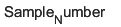 |
To display axis and legend labels with TeX or LaTeX formatting, specify the labels manually. For example, after plotting, call the xlabel orlegend function with the desired label strings.
xlabel("Sample_Number") legend(["Sample_Number" "Another_Legend_Label"])
R2022a: Pass tables directly to plot
Create plots by passing a table to the plot function followed by the variables you want to plot. When you specify your data as a table, the axis labels and the legend (if present) are automatically labeled using the table variable names.